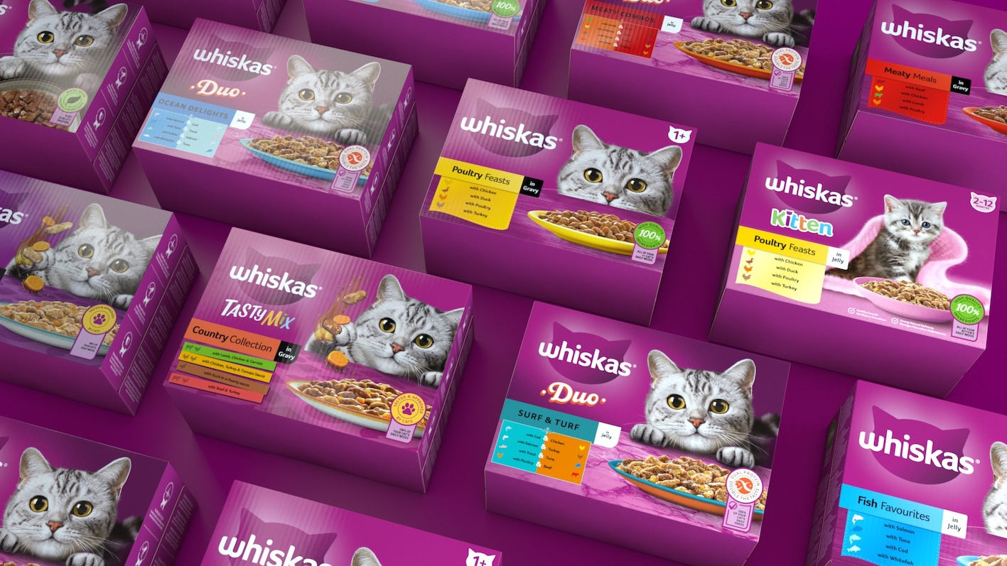
In the petcare sector, Whiskas has been a dominant brand since 1936, dedicated to creating a world where cats are happier thanks to their array of delicious products. Recently, there was a shared aspiration to reestablish Whiskas as a legacy brand and a leader in its category by transforming it into an experience-driven brand. The aim was to ensure that the revamped identity would set the pace for future brand development. Assistance was requested to create a new look that included an updated brand identity and packaging design that would enhance emotional engagement with pet parents and highlight the brand’s unique features, enabling it to stand out in the fierce petcare market.
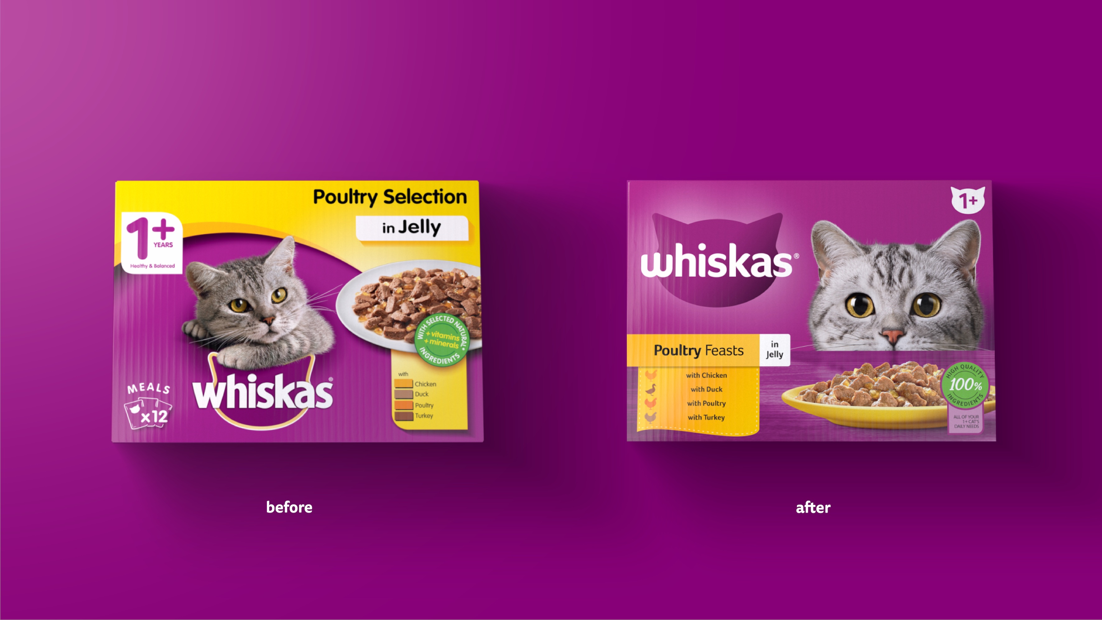
The existing identity for Whiskas was considered static and irrelevant, lacking connection and built for an analogue world. Consumer research showed that the brand was perceived as outdated and disengaged, issues that needed to be addressed directly in the brand refresh, without losing the essence of the brand. The objective was to enhance and modernize Whiskas’ key unique brand features to be suitable for a digital-first world and to develop a brand identity that was unmistakably Whiskas.
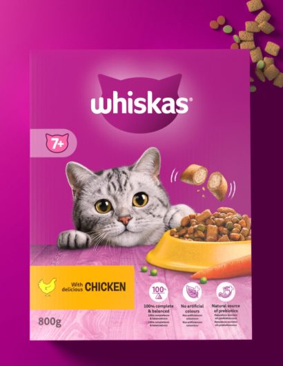
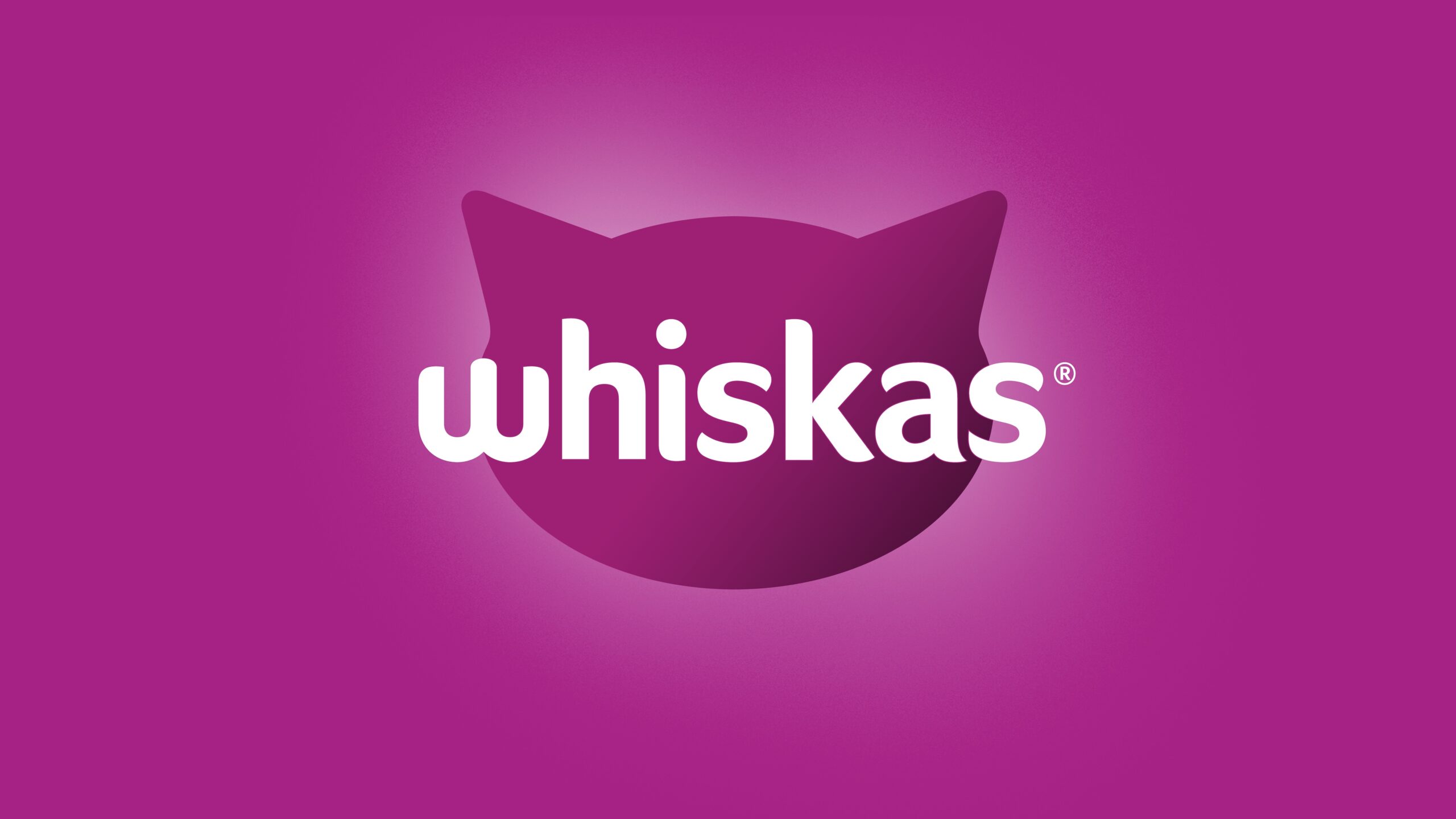
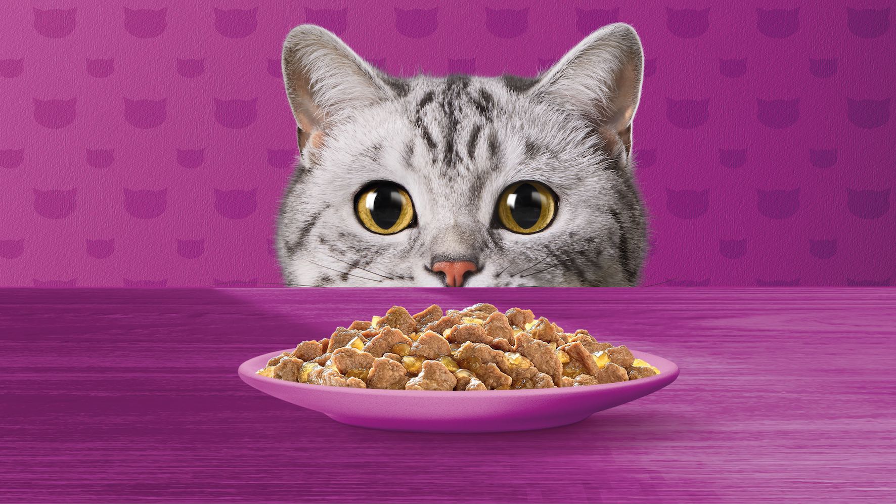
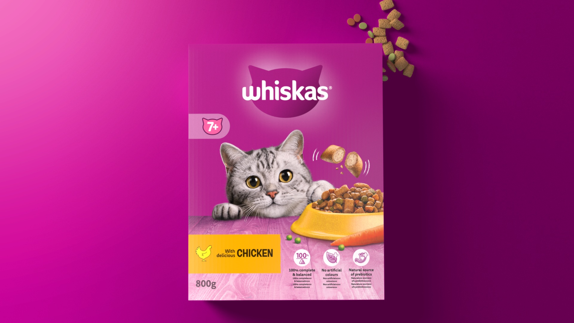
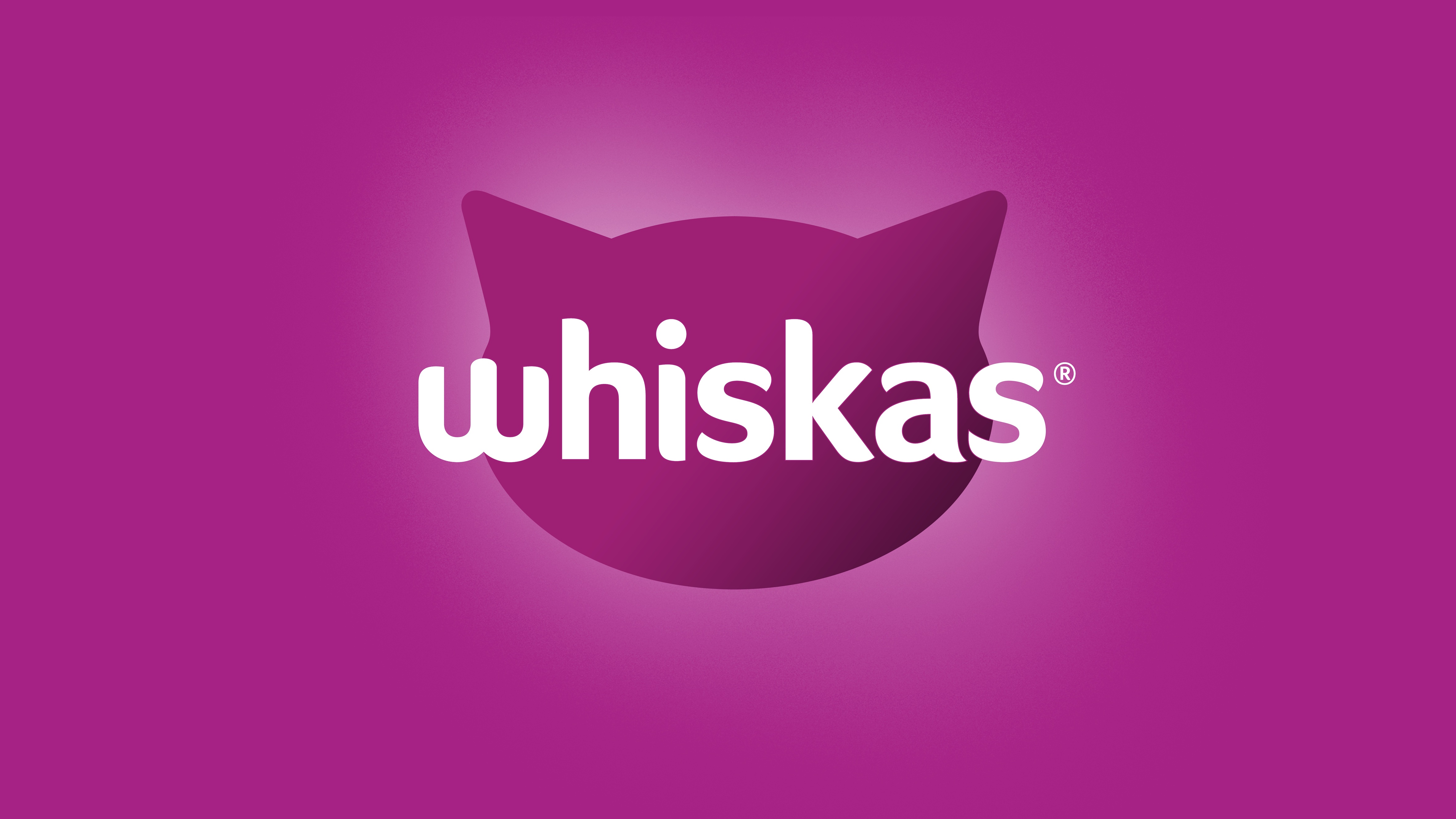
The approach was to leverage Whiskas’ features to build a brand world that was always new in its ability to future-proof design equities and innovate for the petcare category. The opportunity was identified to elevate the ‘W’ brand flag, transforming it into an engaging asset as part of the updated brand mark that animated the cat character by imitating a cat’s mouth. While the original Whiskas brand featured a static and passive cat, the updated identity brings the cat, Tommie, to life, creating a key emotional connection both on and off-pack. This has been accomplished by simplifying and enhancing distinctive assets to ensure that the brand world highlights the special relationship between cat and cat parent. Tommie was placed at the heart of the brand, with her big cat eyes front and centre, looking directly at the pet parent rather than a static off-side stare locked up to the brand flag, enabling cultural storytelling. The updated design highlights Whiskas’ iconic features to ensure the brand flag reflects distinct cat traits and is instantly recognizable.
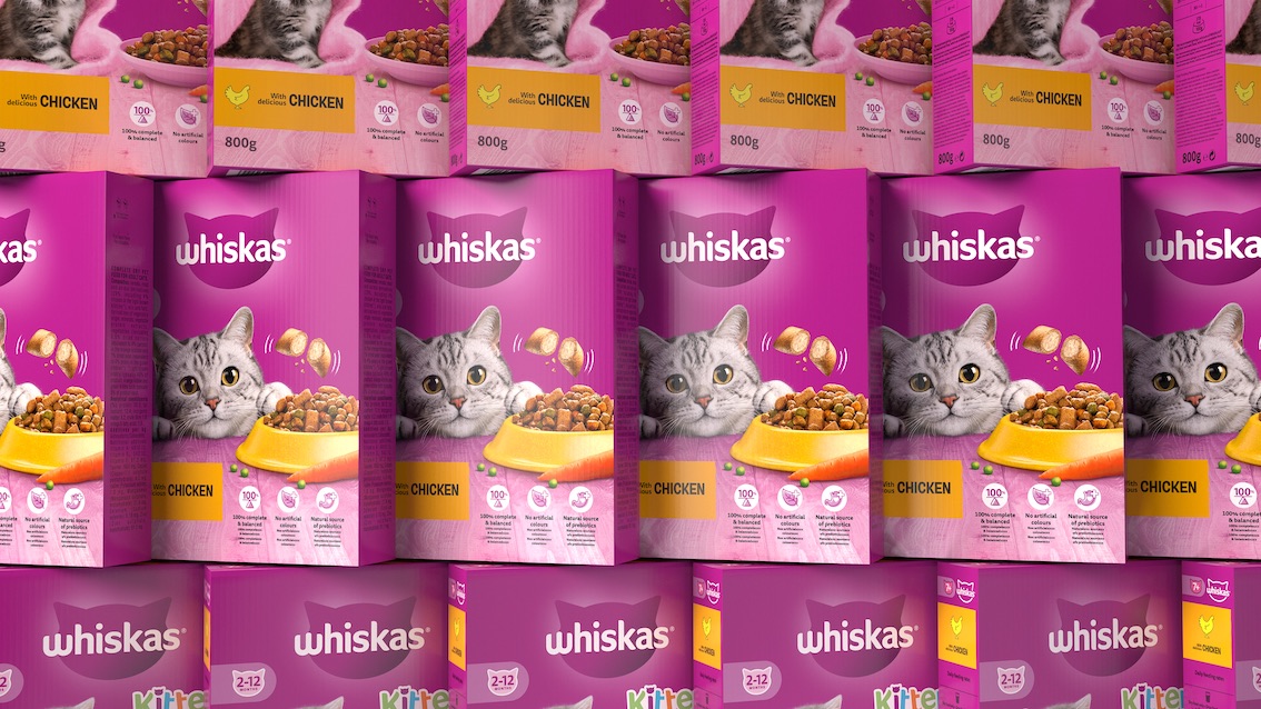
The renewed brand identity and updated portfolio packaging design celebrate Whiskas’ distinctive brand assets, ensuring the brand is instantly recognisable and fit for a digital-first world. The portfolio packaging redesign has developed a clear design system to ensure pop, pace, and pull at the shelf with pet parents. Pop is delivered through the distinctive purple, creating a strong brand block on the shelf ensuring instant recognition. Pace is achieved by putting Tommie at the heart of the pack, her eye-catching and expressive personality, along with indicating variety, helps to remind about heartwarming moments each pet parent can relate to. Lastly, pull is delivered through a clear navigation system with bold and graphic colours, icons, and claims, enabling easy consumer navigation at the shelf. With clear design principles and key Distinctive Brand Assets, the brand was reinvented to be iconically always new, while always unmistakably Whiskas, with the pet parent at the heart.