On Lovely Package today, we’re diving into the design details of Fenjiu’s “Clear Fragrance Memory”, a spirit with a rich history that dates back to the Republic of China era. This spirit, produced in Xinghua Village, Fenyang City, Shanxi Province, has been a part of Chinese culture for over 1,400 years.
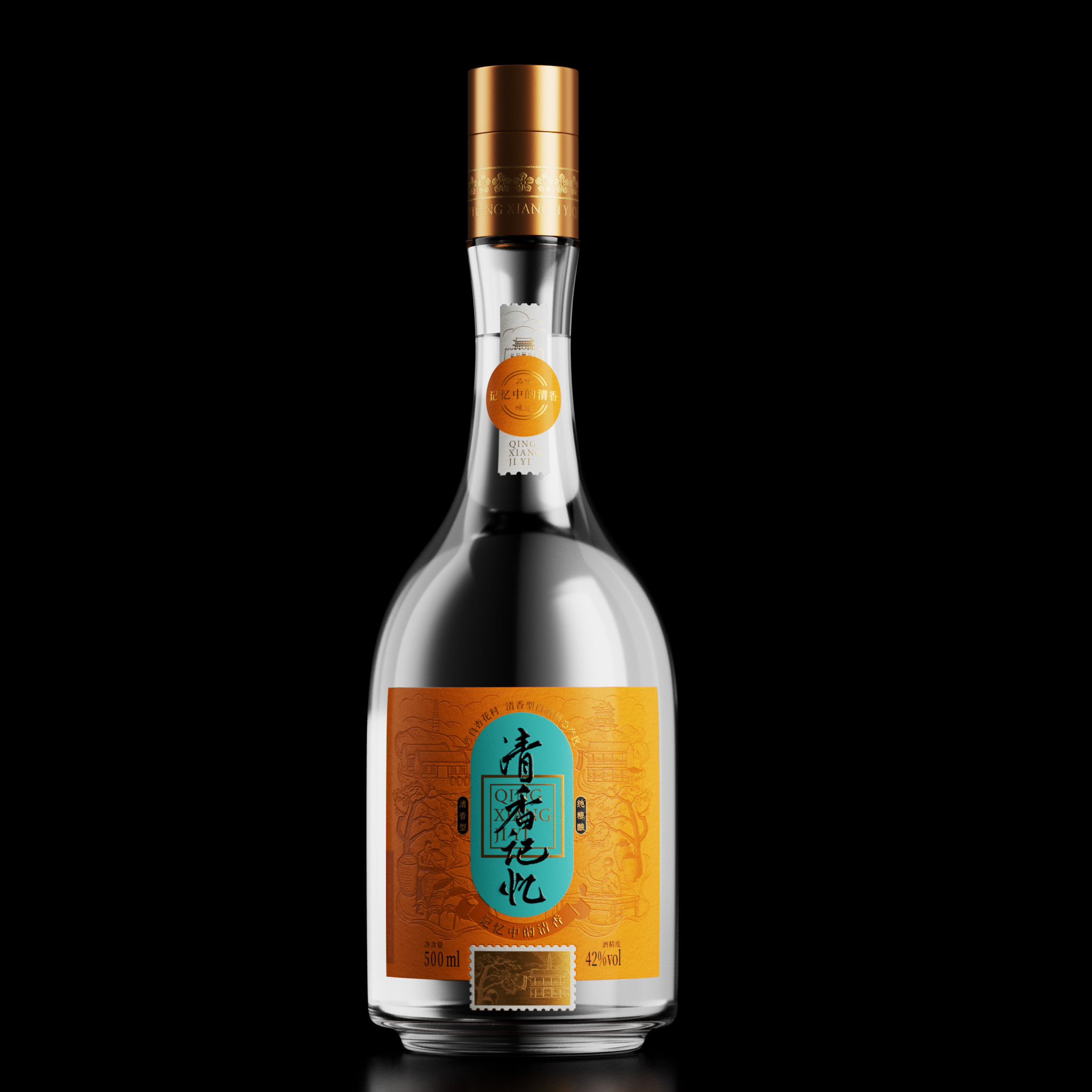
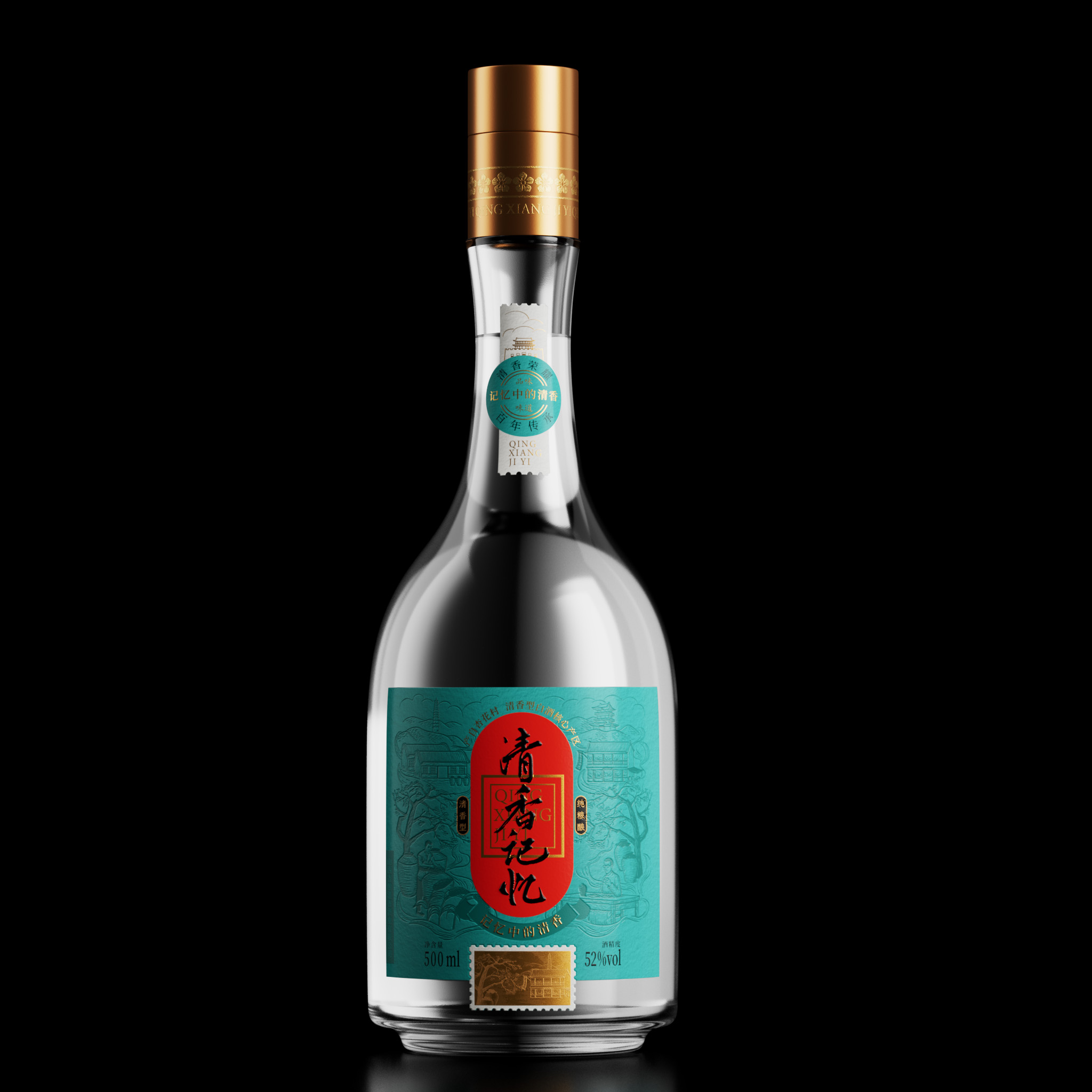
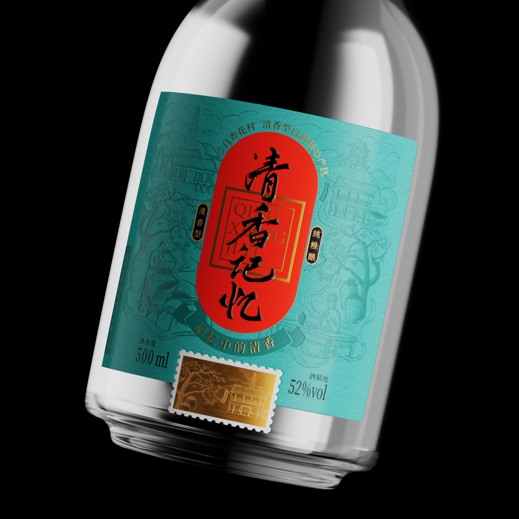
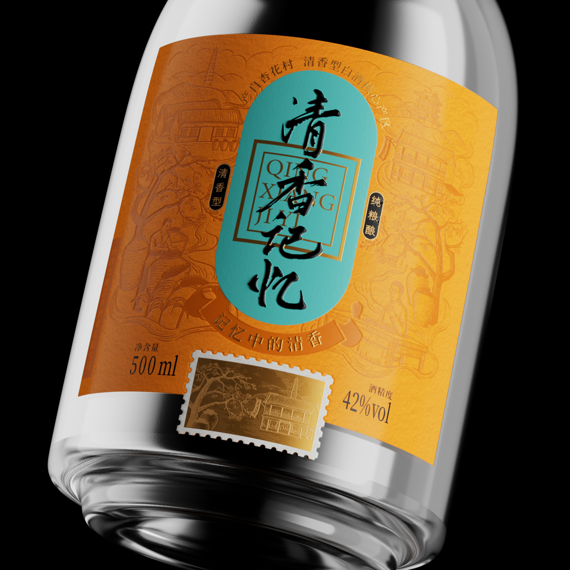
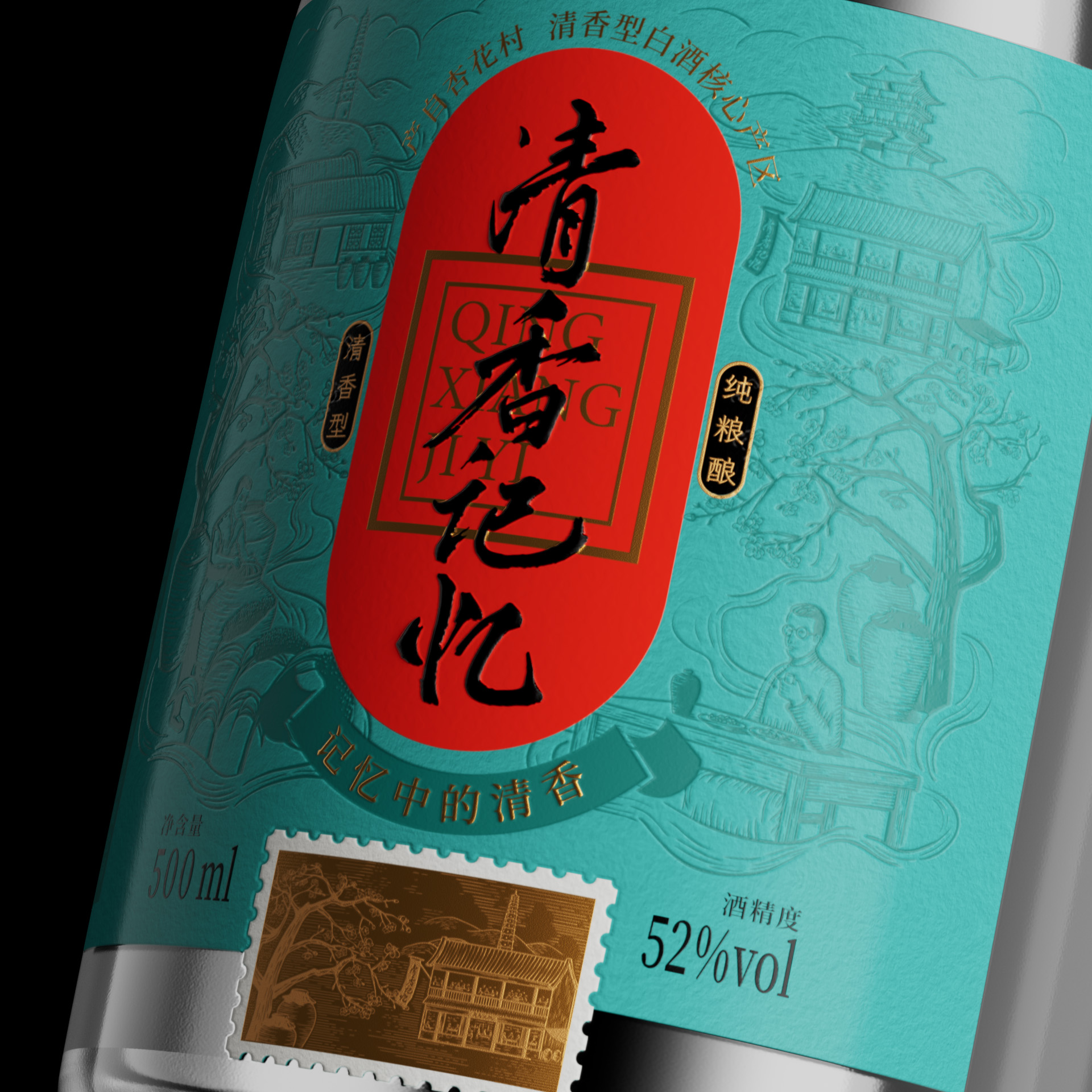
The design of “Clear Fragrance Memory” pays homage to the spirit’s history, drawing from elements such as apricot trees, taverns, Fenyang’s landmark buildings, wineries, winemakers, and wine crops. These elements come together to form a “picture in memory”, connecting the product with the characters of the Republic of China who were drinking in the tavern in the foreground.
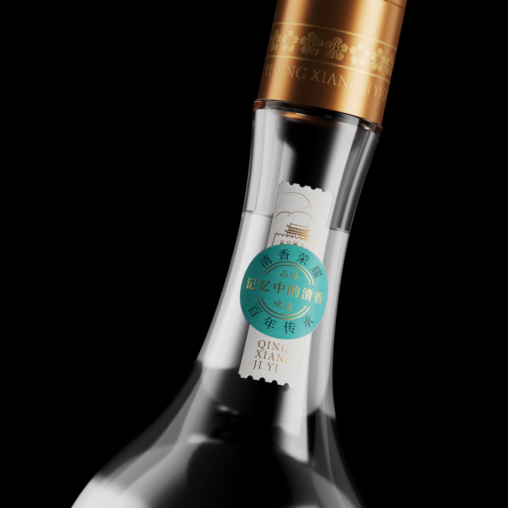
The bottle’s shape is a slight modification of the classic bottle design, adding a touch of elegance. The color scheme draws from traditional Chinese colors, using a fresh main color contrasted with orange to highlight the main information. The stamp design at the bottom serves as the cherry on top, expressing the theme of “time and memory”.
The Riverside Design Studio is the creative force behind this design. They are a China-based agency known for their innovative and thoughtful designs in the food and beverage industry.
This packaging design not only encapsulates the spirit’s rich history but also represents the brand’s evolution into the era of corporate management. It’s a beautiful blend of tradition and modernity, a fitting tribute to a spirit that has stood the test of time.
The design of “Clear Fragrance Memory” pays homage to the spirit’s history, drawing from elements such as apricot trees, taverns, Fenyang’s landmark buildings, wineries, winemakers, and wine crops. These elements come together to form a “picture in memory”, connecting the product with the characters of the Republic of China who were drinking in the tavern in the foreground.
The bottle’s shape is a slight modification of the classic bottle design, adding a touch of elegance. The color scheme draws from traditional Chinese colors, using a fresh main color contrasted with orange to highlight the main information. The stamp design at the bottom serves as the cherry on top, expressing the theme of “time and memory”.
The Riverside Design Studio is the creative force behind this design. They are a China-based agency known for their innovative and thoughtful designs in the food and beverage industry.
This packaging design not only encapsulates the spirit’s rich history but also represents the brand’s evolution into the era of corporate management. It’s a beautiful blend of tradition and modernity, a fitting tribute to a spirit that has stood the test of time.