At Lovely Package, we share the most innovative and creative packaging designs from around the globe. Today, we present to you the story of a unique vineyard that dates back to 1860, when a Frenchman named Ambrose Granjoux planted a small vineyard just outside Beechworth, Victoria, Australia. The dry-stone walled vineyard, or clos, has been rejuvenated by its new owners, who guide this low-yielding, organic vineyard, filled with single-staked vines and decomposed granite, clay, and slate soil, to produce fruit of the highest quality.
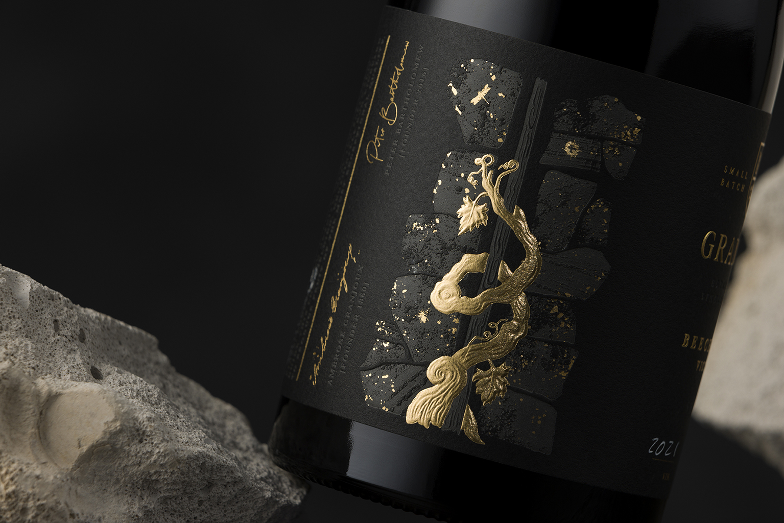
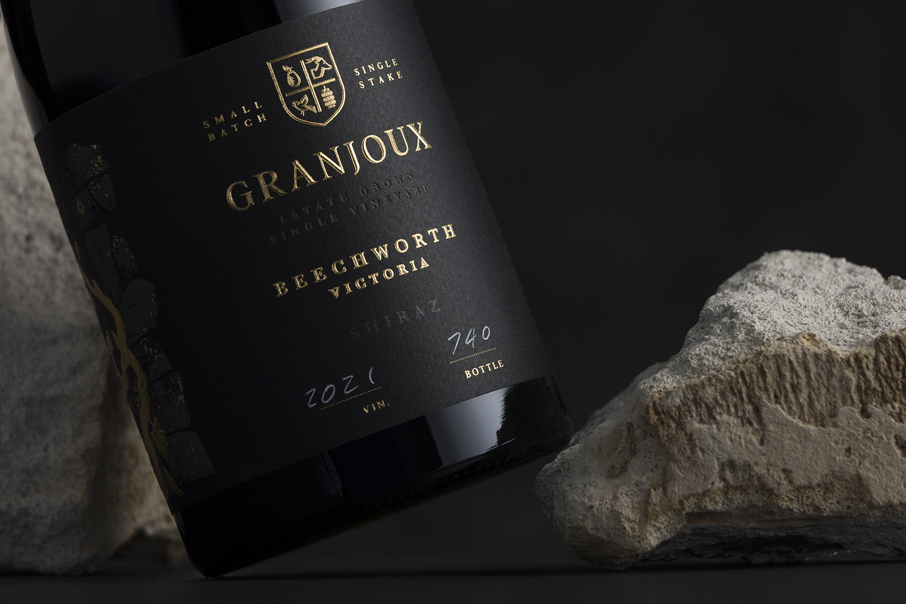
Studio Guild has lent their artistic prowess to create a premium, textural look that narrates the story of this bespoke vineyard. The small-batch range with premium finishes, including heat deboss, sculptured embossed foiling, and rooftop emboss typography, required multiple vintages to be printed. This enables the client to number and batch each year, further enhancing the unique, coveted nature of the product.
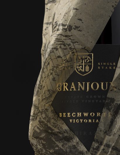
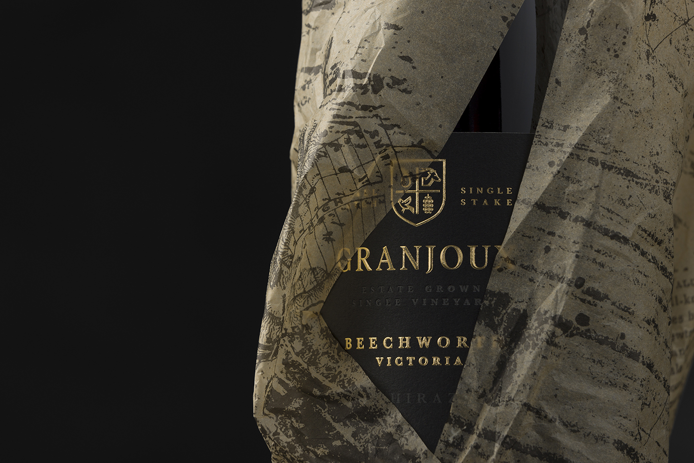
The vineyard’s logo identity features a modern spin on the traditional coat of arms style. The shield includes elements that represent stories within the vineyard, such as a pear tree over a century old, a wild goat symbolizing the new owner’s name, Batheolomew, and a mulberry tree of equal heritage. The bird symbolizes the tranquility and natural beauty of the property, which is home to many native birds.
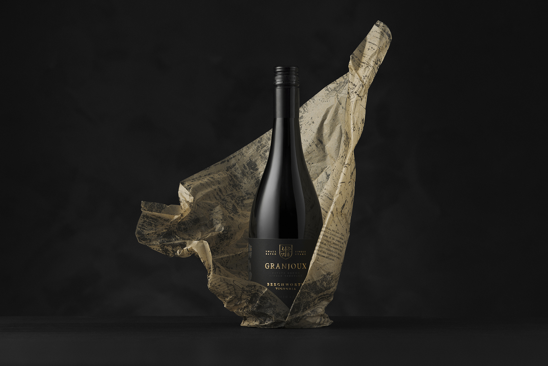
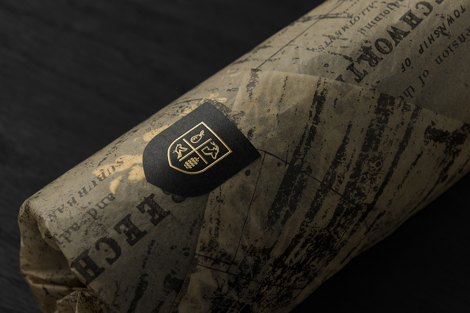
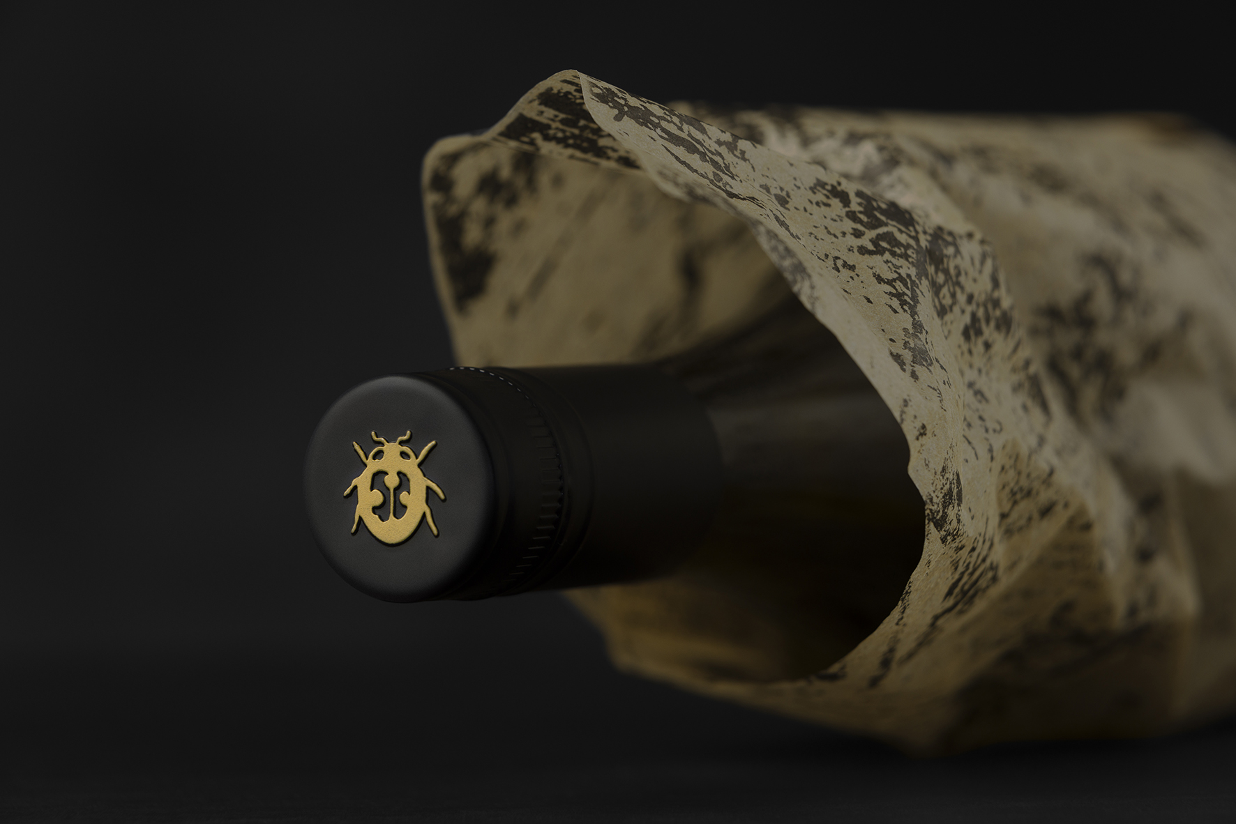
Adding to the allure of the premium offering is the branded lie-down box, inviting consumers to discover the treasures inside. Once opened, they encounter beautiful artisan tissue paper created using historical mapping and documents from the original site, all sealed with a gold foil sticker that hints at the premium offering inside.
This packaging design project was brought to life by the talented team at Studio Guild, including Creative Director/Designer Trish Dunstone, Illustrators Bella Goodwin Galea and Samantha Tully, and Photographer Mark Lobo. This packaging design journey for Granjoux’s revitalized vineyard is indeed a testament to the fusion of tradition, history, and modern design sensibility.
Studio Guild has lent their artistic prowess to create a premium, textural look that narrates the story of this bespoke vineyard. The small-batch range with premium finishes, including heat deboss, sculptured embossed foiling, and rooftop emboss typography, required multiple vintages to be printed. This enables the client to number and batch each year, further enhancing the unique, coveted nature of the product.
The vineyard’s logo identity features a modern spin on the traditional coat of arms style. The shield includes elements that represent stories within the vineyard, such as a pear tree over a century old, a wild goat symbolizing the new owner’s name, Batheolomew, and a mulberry tree of equal heritage. The bird symbolizes the tranquility and natural beauty of the property, which is home to many native birds.
Adding to the allure of the premium offering is the branded lie-down box, inviting consumers to discover the treasures inside. Once opened, they encounter beautiful artisan tissue paper created using historical mapping and documents from the original site, all sealed with a gold foil sticker that hints at the premium offering inside.
This packaging design project was brought to life by the talented team at Studio Guild, including Creative Director/Designer Trish Dunstone, Illustrators Bella Goodwin Galea and Samantha Tully, and Photographer Mark Lobo. This packaging design journey for Granjoux’s revitalized vineyard is indeed a testament to the fusion of tradition, history, and modern design sensibility.