On Lovely Package today, we’re delving into the world of functional coffee with Bevas. This unique brand was born from the idea of blending the finest quality Arabica coffee with a balanced selection of essential vitamins, minerals, and botanicals. The goal? To make drinking the coffee you love not just a delightful experience, but also a healthy one.
Bevas recognized that while consumers eagerly follow their coffee rituals, they often neglect to take their vitamins and supplements. This insight led to a winning proposition: combining the two.
The brand places a high emphasis on quality and health, as well as a strong commitment to sustainability and protecting wildlife habitats. These elements formed the key pillars for Bevas’ new identity and packaging range.
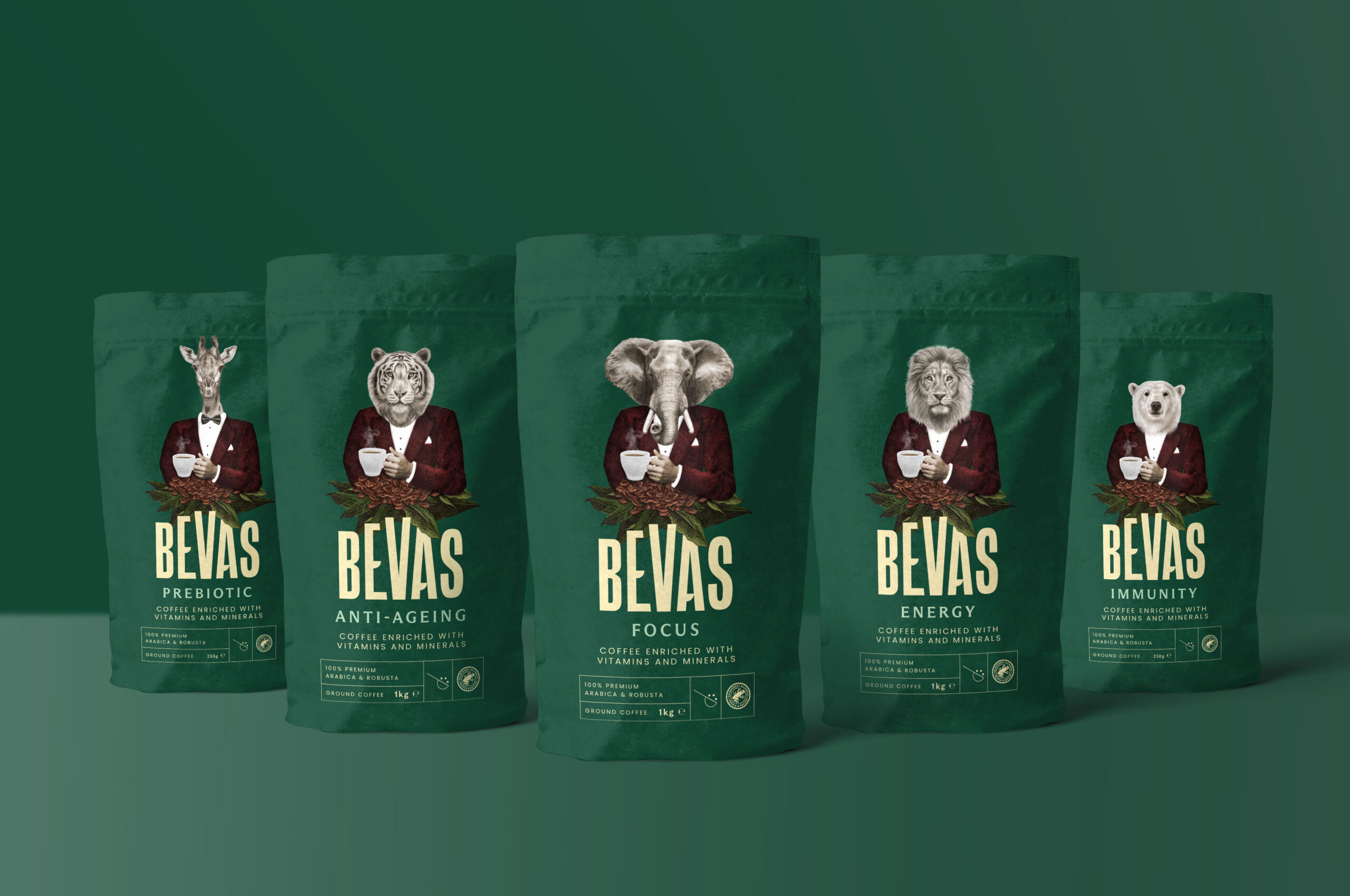
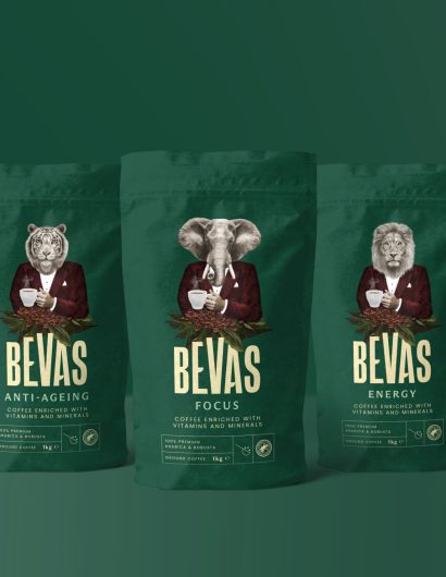
The packaging takes inspiration from the varied benefits of each coffee blend, such as Focus, Energy, Immunity, Anti-Ageing, and Pre-biotic. The designs hero animals renowned for these traits, with the elephant being the hero for the Focus blend, emphasizing the adage that an elephant never forgets.
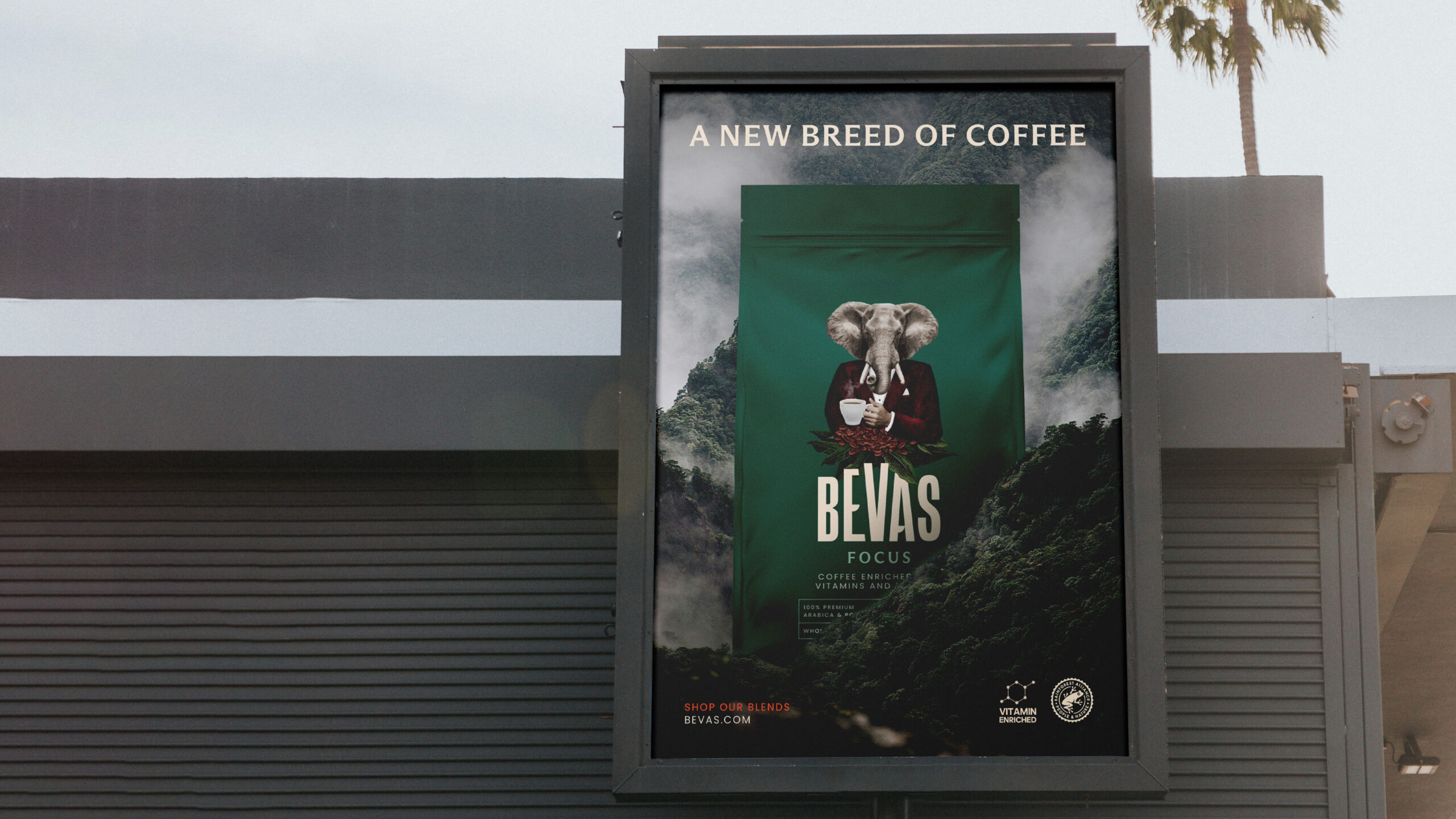
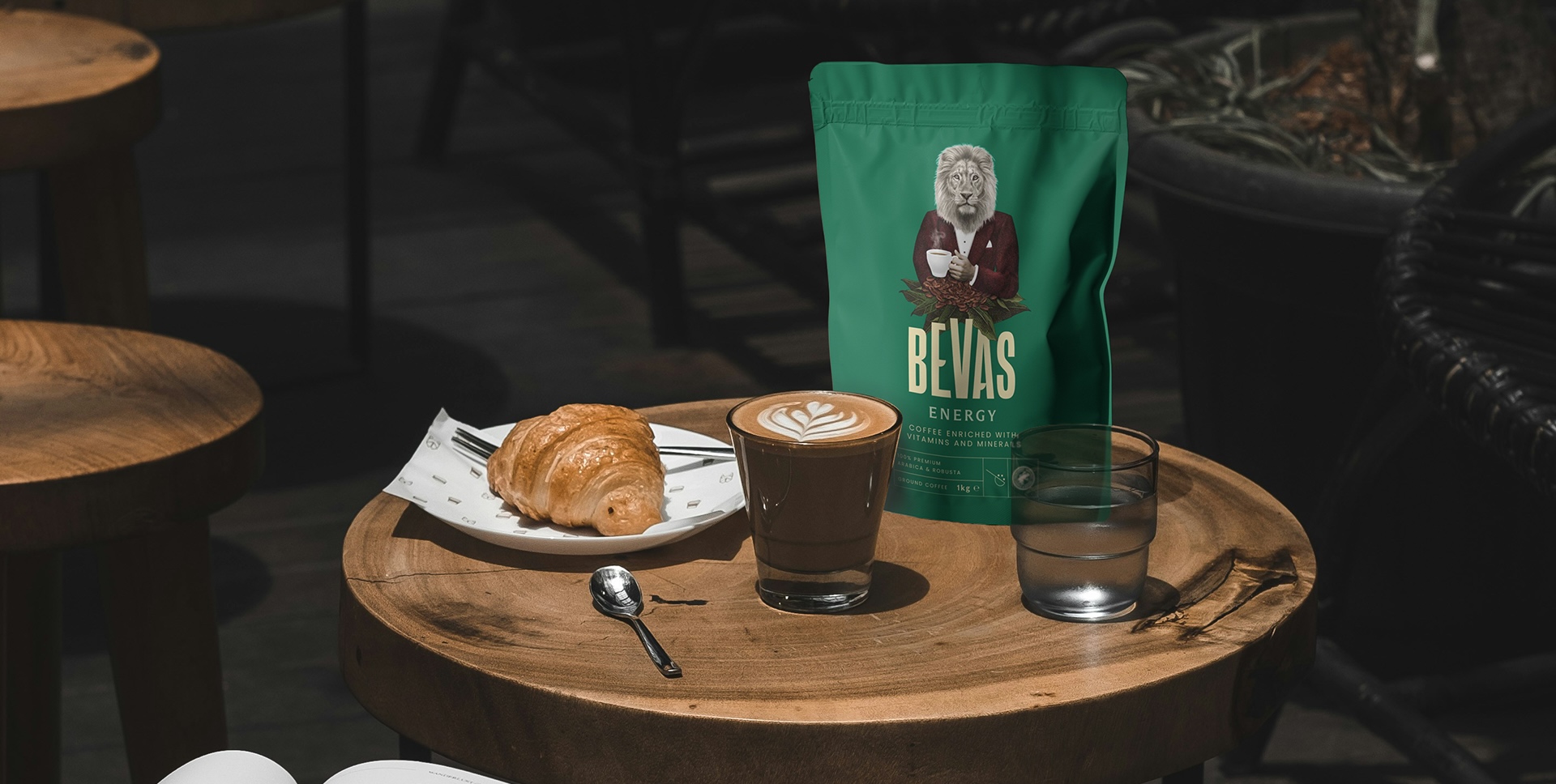
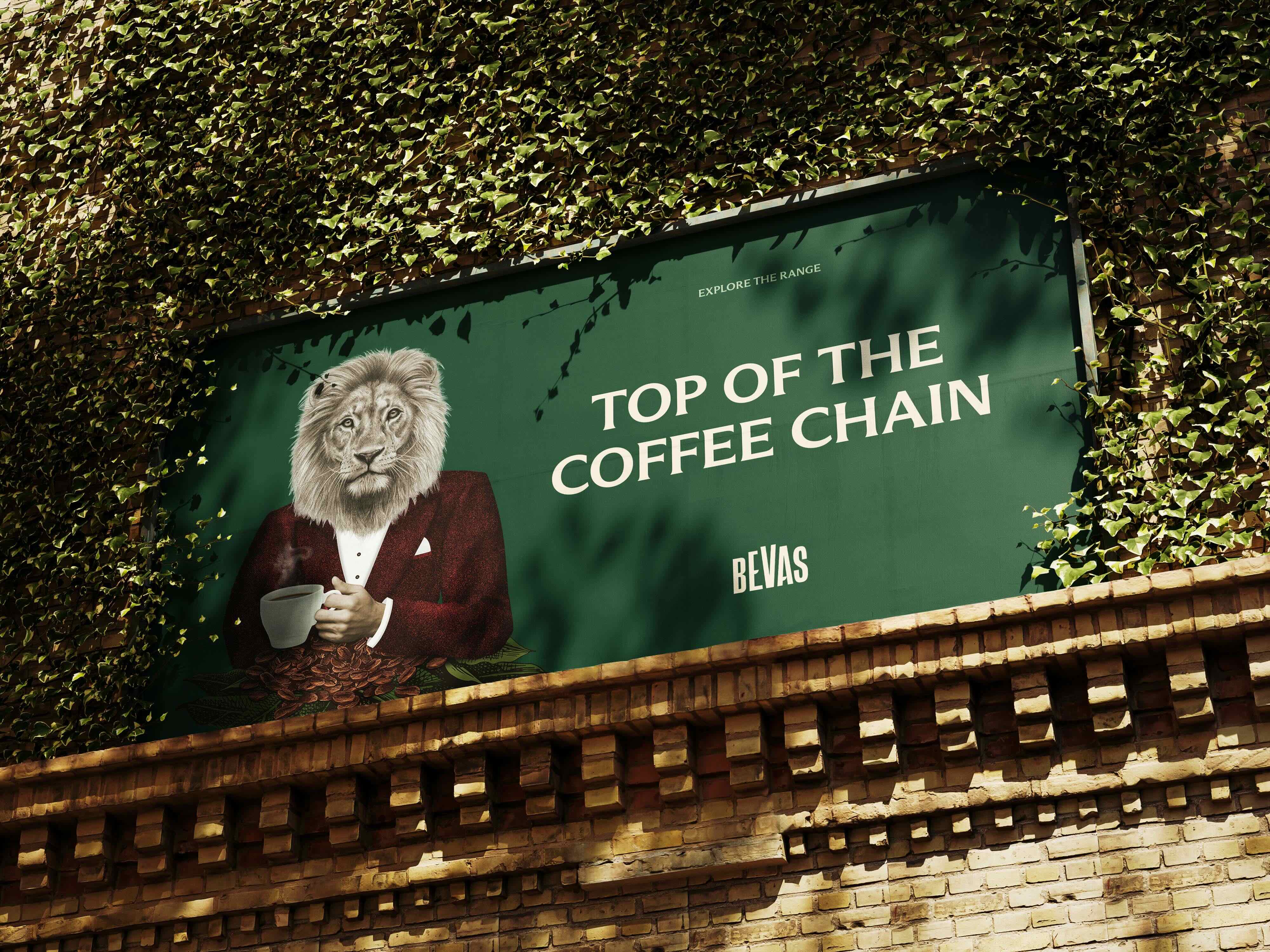
In terms of positioning, Bevas targets busy, high achievers with a premium brand world. The messaging assures customers that no compromise on taste has been made due to the vitamin enrichment. The illustration style, logomark, and overall rich colour palette all contribute to the overall premium feel of the brand, while the photography style nods to the provenance of the ingredients and the brand’s commitment to sustainability.
Bevas has already launched in Germany and has shown strong sales traction. The UK launch is set for 2024, so keep your eyes peeled for this unique coffee innovation.
The packaging design was crafted by the talented team at White Bear Studio, a creative agency based in London, United Kingdom. They’ve certainly brewed up a winner with Bevas!
Let us know what you think of the Bevas packaging design in the comments below.
Bevas recognized that while consumers eagerly follow their coffee rituals, they often neglect to take their vitamins and supplements. This insight led to a winning proposition: combining the two.
The brand places a high emphasis on quality and health, as well as a strong commitment to sustainability and protecting wildlife habitats. These elements formed the key pillars for Bevas’ new identity and packaging range.
The packaging takes inspiration from the varied benefits of each coffee blend, such as Focus, Energy, Immunity, Anti-Ageing, and Pre-biotic. The designs hero animals renowned for these traits, with the elephant being the hero for the Focus blend, emphasizing the adage that an elephant never forgets.
In terms of positioning, Bevas targets busy, high achievers with a premium brand world. The messaging assures customers that no compromise on taste has been made due to the vitamin enrichment. The illustration style, logomark, and overall rich colour palette all contribute to the overall premium feel of the brand, while the photography style nods to the provenance of the ingredients and the brand’s commitment to sustainability.
Bevas has already launched in Germany and has shown strong sales traction. The UK launch is set for 2024, so keep your eyes peeled for this unique coffee innovation.
The packaging design was crafted by the talented team at White Bear Studio, a creative agency based in London, United Kingdom. They’ve certainly brewed up a winner with Bevas!
Let us know what you think of the Bevas packaging design in the comments below.