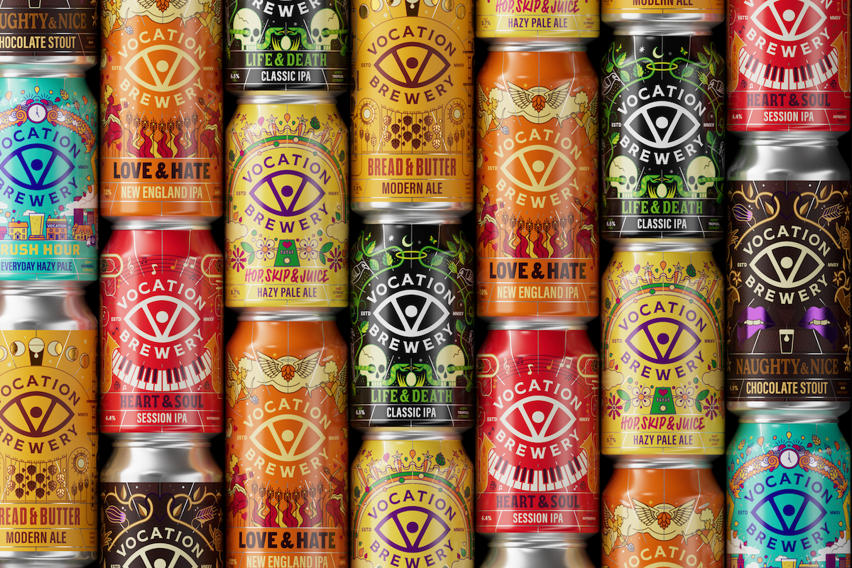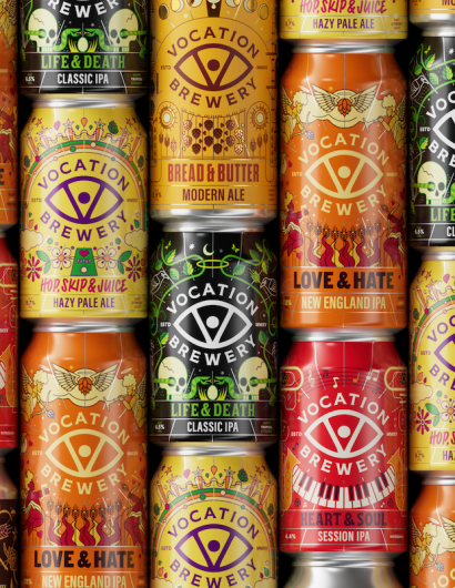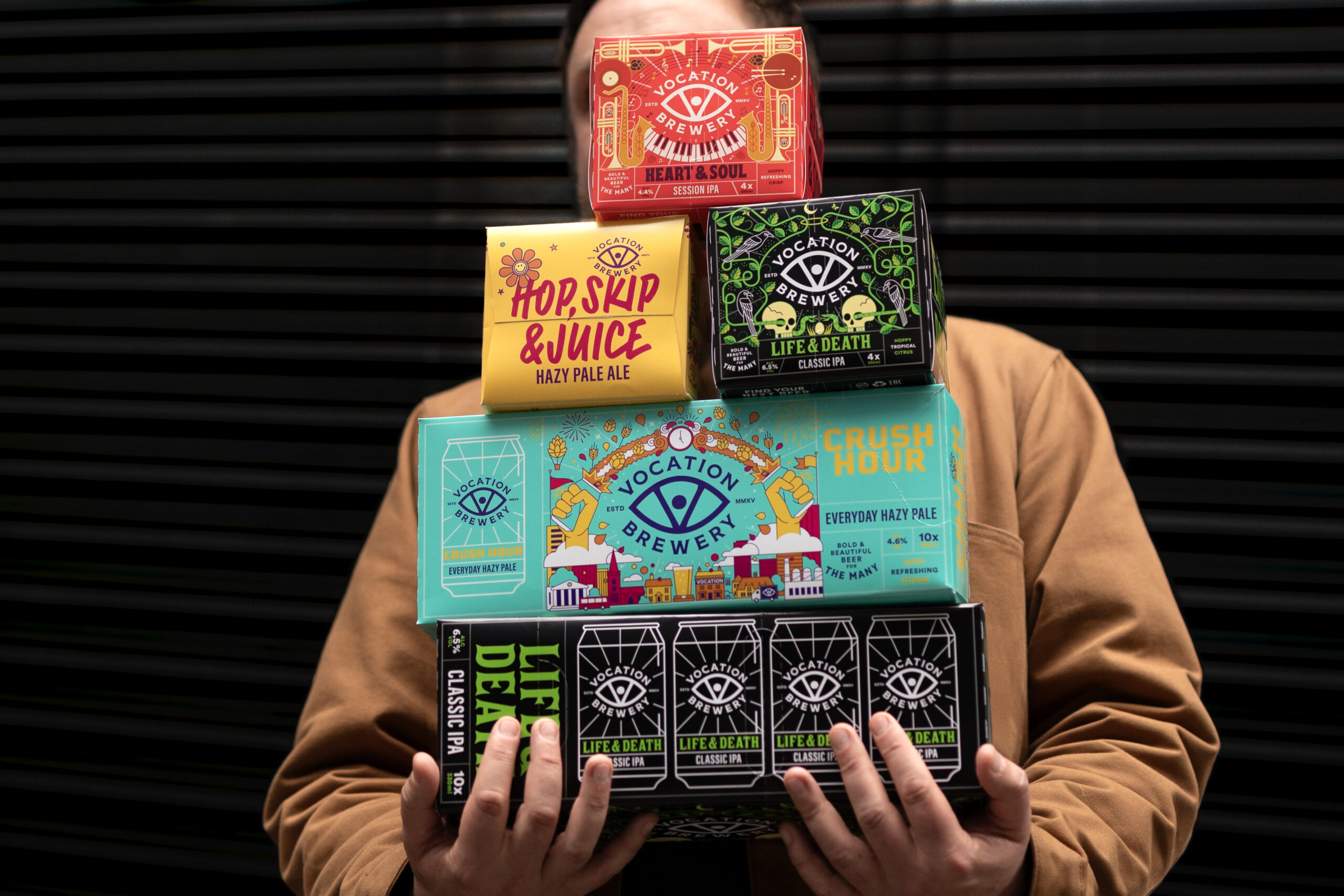
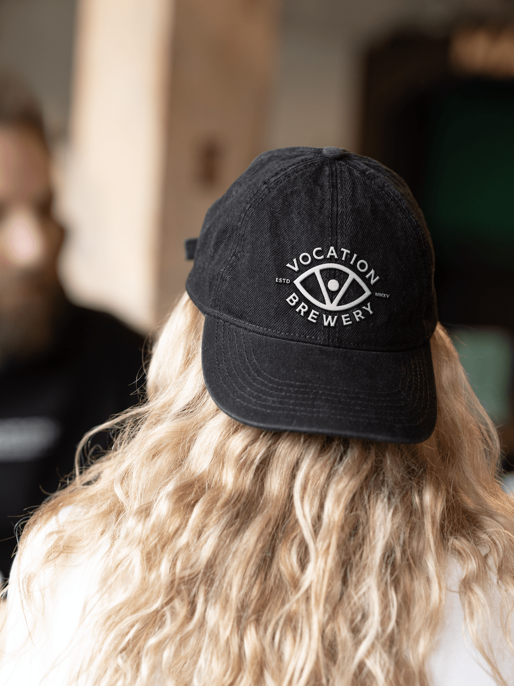
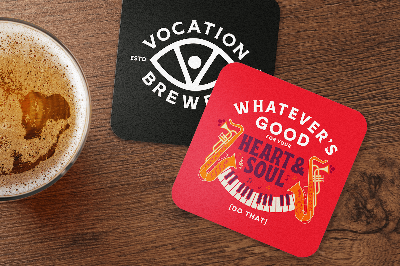
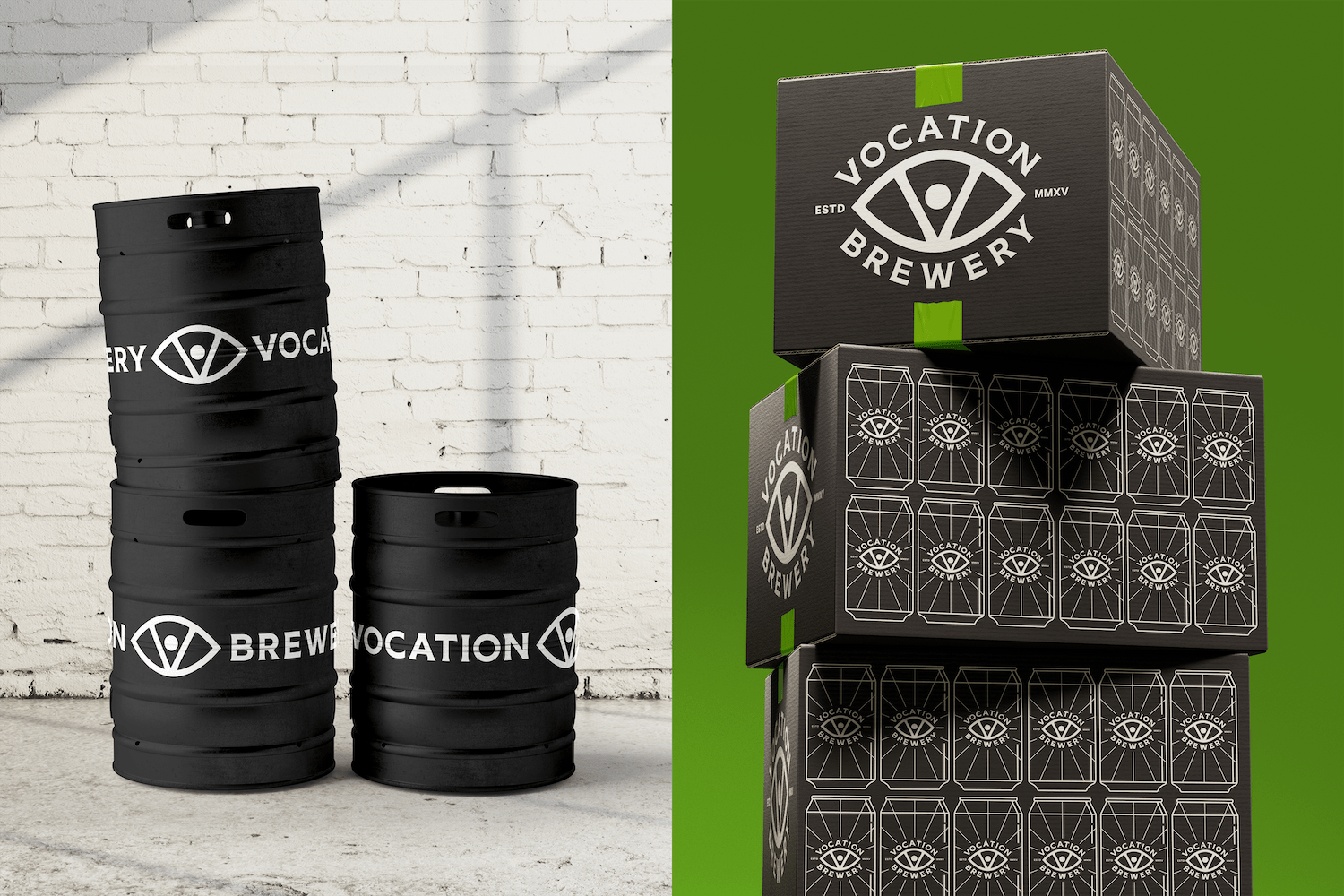
Turner Duckworth has unveiled a new visual identity and packaging system for Vocation Brewery, aligning with its newly-defined brand essence, ‘The single-minded pursuit of crafting exemplary beer.’ The design reinstates the brand’s beloved but latent ‘eye’ mark.
Vocation Brewery enlisted Turner Duckworth to fortify its place in an increasingly fragmented and competitive market, setting it up for future growth. The design studio sought to bring cohesion and consistency to the visual identity across all pack formats and channels to build saliency.
Tom Holmes, Head of Marketing at Vocation Brewery, expressed gratitude for their partnership with Turner Duckworth. He stated that the new identity drives brand awareness and that their packaging now communicates their relentless focus on brewing bold and beautiful beer.
David Thompson, Creative Director at Turner Duckworth’s London studio, noted that while Vocation Brewery had a spirit of independence and collaboration and was driven by making craft beer more accessible, this wasn’t always reflected in its branding.
Turner Duckworth identified that while there was “deep love” for the Vocation Brewery brand, it needed to be more relevant to keep up with the business’s pace of growth. The design studio aimed to make the brand distinctive and dimensional, helping it find an unmistakable mark.
The new visual identity emphasizes Vocation Brewery’s eye asset within the visual identity and packaging system, increasing on-shelf and in-venue standouts while building a distinctive, recognizable brand. Thompson elaborated that the eye represents their eye for detail and passion, or ‘vocation’.
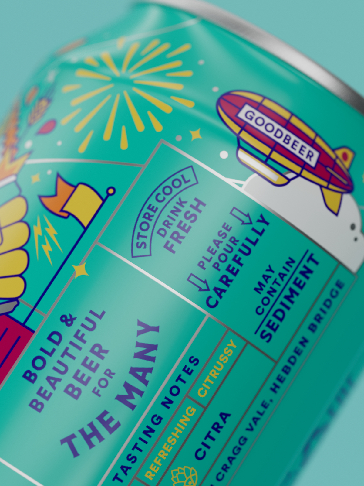
Turner Duckworth collaborated with illustrator Brian Steely to create new, meaningful illustrations for Vocation Brewery’s core range to add more storytelling to the brand and elevate off-pack assets.
The designers maintained the existing colour palettes so that customers would still recognize different beers in the range, adding illustrations to give the designs “their own personalities and a true sense of occasion”. The designs use illustrative nods to the brewing process, like imagery of hops and barley.
The rebrand also introduced a new tone of voice, using more “understandable, everyman language”. The aim was to convey Vocation Brewery’s knowledge and passion for its craft without getting overly technical.
Nicola Shellswell, Client Services Director of the Turner Duckworth London studio, expressed pride in the work and the successful collaboration with Vocation Brewery.