Designed by: PepsiCo Design & Innovation
Country: United States

Molson’s Successful Rebranding with BrandOpus: A Journey to Reignite Canada’s Passion for Iconic Brews

7
Molson, a cherished beer brand of Canada, has embarked on a mission to rekindle the nation’s love for its iconic brews. They have partnered with global branding agency BrandOpus to realize their vision. The outcome of this rebranding strategy has been positive, with Molson seeing growth across revenue, share, and volume in Canada versus the previous year, as of Q2 2023. This has led to the brand being the second best-selling beer at The Beer Store, Canada’s largest beer outlet, trailing only behind Coors Light.


Molson's Successful Rebranding with BrandOpus: A Journey to Reignite Canada's Passion for Iconic Brews


The aim behind the rebranding was to unify the various Molson beers under the Molson masterbrand. This new strategy is designed to give Canadians a clear understanding of why Molson exists and what it stands for. Leslie Malcolm, Vice President of Marketing in Canada at Molson Coors Beverage Company, explained their goal was to create a unique and clear visual identity that resonates with Canadians today.


Molson's Successful Rebranding with BrandOpus: A Journey to Reignite Canada's Passion for Iconic Brews


BrandOpus, Molson Coors’ branding partner for over eight years, has amplified the strategic insight that Molson ignites a sense of togetherness for every Canadian. The brand’s new creative thread “We Are Many,” created by BrandOpus, highlights the diversity of Canadian culture and its commitment to uniting the nation through its products.


Molson's Successful Rebranding with BrandOpus: A Journey to Reignite Canada's Passion for Iconic Brews


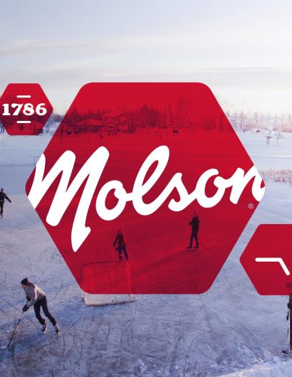
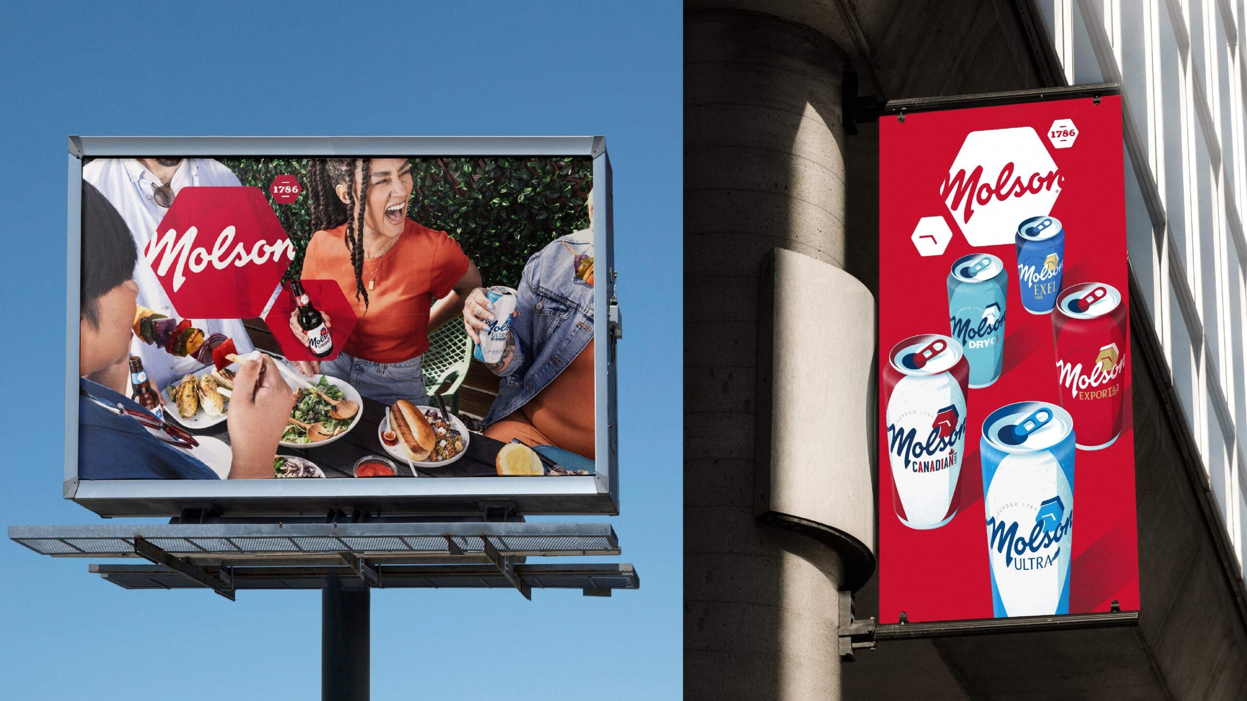
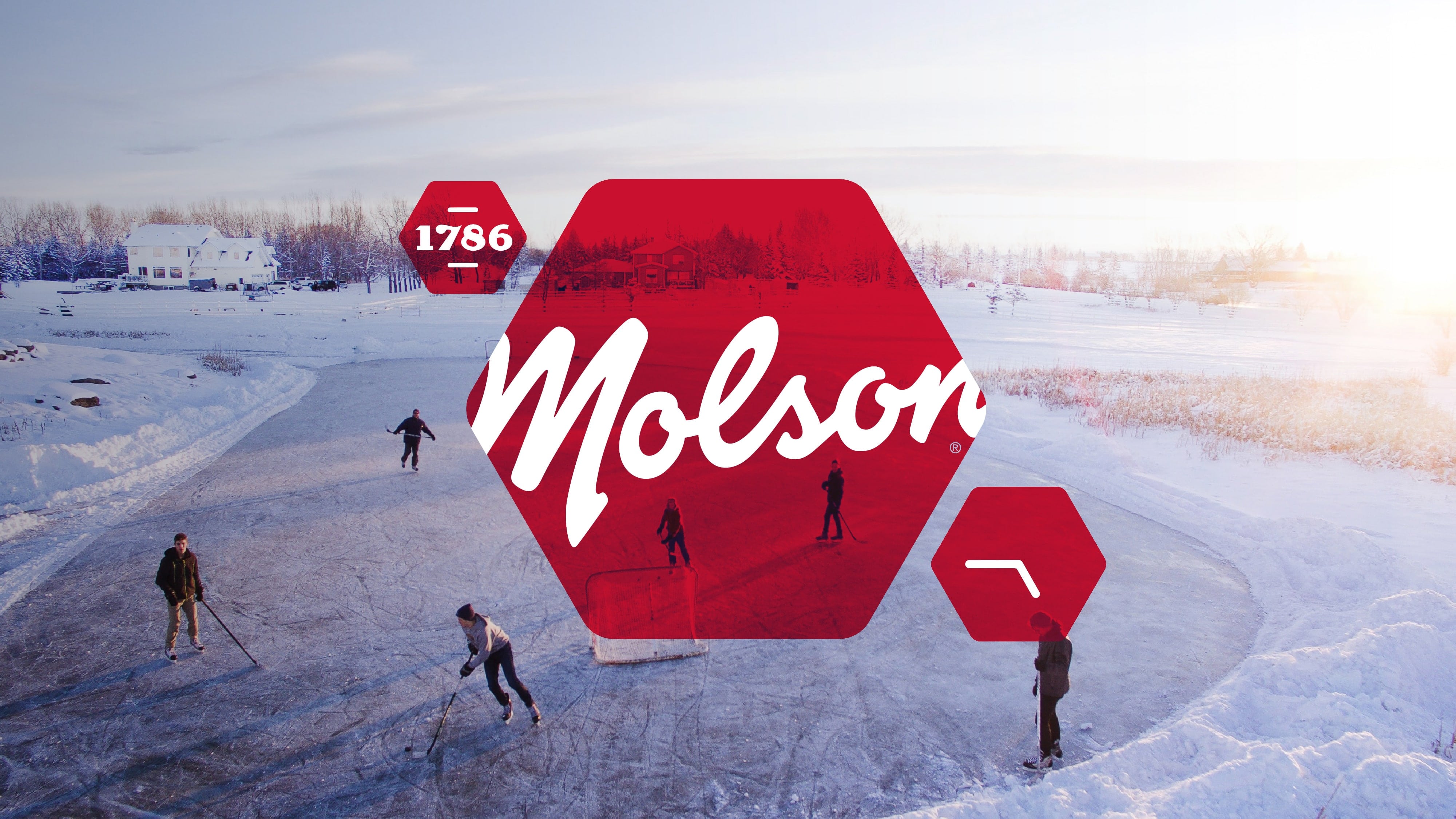
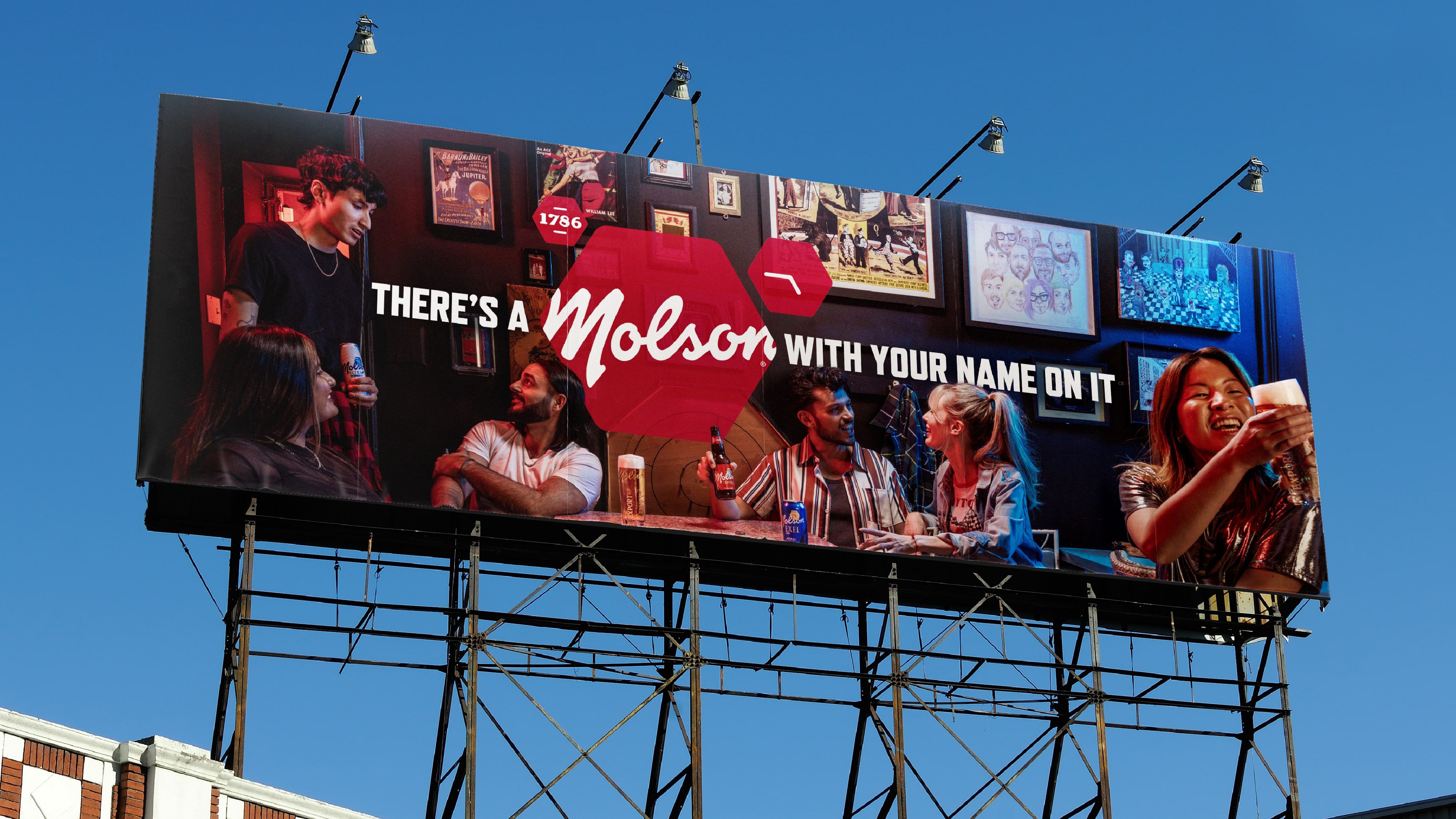
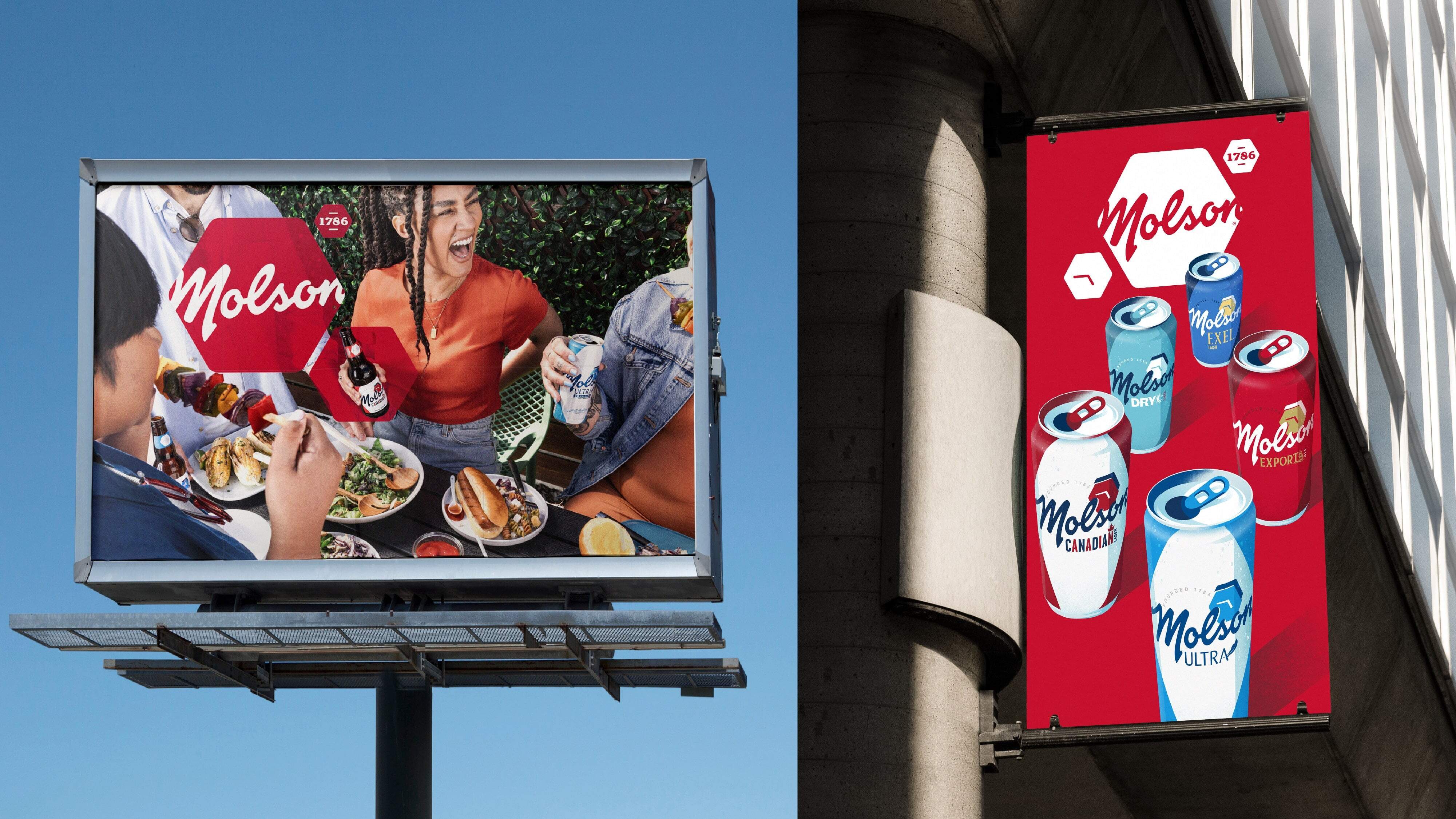
BrandOpus developed an adaptable system of a mosaic of hexagons to create a visual identity that reflects Molson’s unique position in the market. The new identity drives a clear representation of the many identities of Canada. The new Molson Masterbrand logo features the distinctive script wordmark within the hexagon, a strong multifaceted symbol of togetherness.


Molson's Successful Rebranding with BrandOpus: A Journey to Reignite Canada's Passion for Iconic Brews


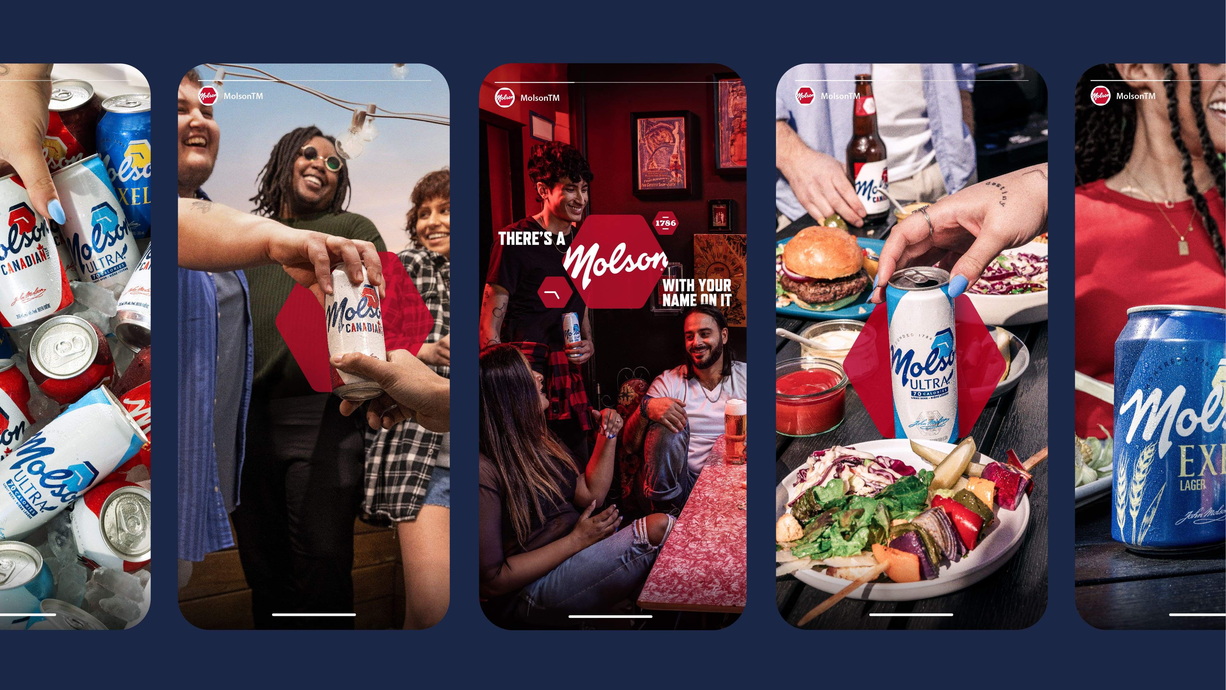
The brand’s identity is further complemented by an extensive library of journalistic-style photography, showcasing different slices of life. From backyard BBQs to rooftop parties, the illustrative assets depict brand assets such as the cans and Molson’s breweries spread across the country’s provinces, mirroring the connectivity of the brand.

This rebranding has been received well, with Malcolm stating that the new brand identity truly reflects their commitment to bringing Canadians together. Nir Wegrzyn, CEO of BrandOpus, noted the pride they take in partnering with Molson on this journey and believes the new design will work seamlessly across multiple channels while putting people and products at the heart of the brand.
7

Get the latest packaging design inspiration in your inbox:

Popular designs

Burma Love Rebrand

Love at First BiteAs an extension of the Burma Superstar restaurant in San Francisco, Burma Love Foods gives diners an opportunity to

The Port Vodka Lemon Water

Overview: In response to my client’s vision for a Cape Cod themed beverage brand, I embarked on the journey to create The Port

Pure Persian Honey

When we look closely at honey packaging, they are almost all in the usual format, and the ultimate in creativity is that

Over the wave

This Kombucha originates in Lombok, Indonesia, where its paradise beaches attract hundreds of surfers eager to ride the waves. When you surf,

Designed by: PepsiCo Design & Innovation
Country: United States

Molson’s Successful Rebranding with BrandOpus: A Journey to Reignite Canada’s Passion for Iconic Brews

7
Molson's Successful Rebranding with BrandOpus: A Journey to Reignite Canada's
Molson, a cherished beer brand of Canada, has embarked on a mission to rekindle the nation’s love for its iconic brews. They have partnered with global branding agency BrandOpus to realize their vision. The outcome of this rebranding strategy has been positive, with Molson seeing growth across revenue, share, and volume in Canada versus the previous year, as of Q2 2023. This has led to the brand being the second best-selling beer at The Beer Store, Canada’s largest beer outlet, trailing only behind Coors Light.


Molson's Successful Rebranding with BrandOpus: A Journey to Reignite Canada's Passion for Iconic Brews


The aim behind the rebranding was to unify the various Molson beers under the Molson masterbrand. This new strategy is designed to give Canadians a clear understanding of why Molson exists and what it stands for. Leslie Malcolm, Vice President of Marketing in Canada at Molson Coors Beverage Company, explained their goal was to create a unique and clear visual identity that resonates with Canadians today.


Molson's Successful Rebranding with BrandOpus: A Journey to Reignite Canada's Passion for Iconic Brews


BrandOpus, Molson Coors’ branding partner for over eight years, has amplified the strategic insight that Molson ignites a sense of togetherness for every Canadian. The brand’s new creative thread “We Are Many,” created by BrandOpus, highlights the diversity of Canadian culture and its commitment to uniting the nation through its products.


Molson's Successful Rebranding with BrandOpus: A Journey to Reignite Canada's Passion for Iconic Brews


BrandOpus developed an adaptable system of a mosaic of hexagons to create a visual identity that reflects Molson’s unique position in the market. The new identity drives a clear representation of the many identities of Canada. The new Molson Masterbrand logo features the distinctive script wordmark within the hexagon, a strong multifaceted symbol of togetherness.


Molson's Successful Rebranding with BrandOpus: A Journey to Reignite Canada's Passion for Iconic Brews


The brand’s identity is further complemented by an extensive library of journalistic-style photography, showcasing different slices of life. From backyard BBQs to rooftop parties, the illustrative assets depict brand assets such as the cans and Molson’s breweries spread across the country’s provinces, mirroring the connectivity of the brand.

This rebranding has been received well, with Malcolm stating that the new brand identity truly reflects their commitment to bringing Canadians together. Nir Wegrzyn, CEO of BrandOpus, noted the pride they take in partnering with Molson on this journey and believes the new design will work seamlessly across multiple channels while putting people and products at the heart of the brand.
7
Previous slide
Next slide

Explore more great package design

Get the latest on packaging design in your inbox: