Designed by: PepsiCo Design & Innovation
Country: United States

Transitioning CUDO Kombucha Packaging Design from Glass to Cans: A Brand Evolution

2

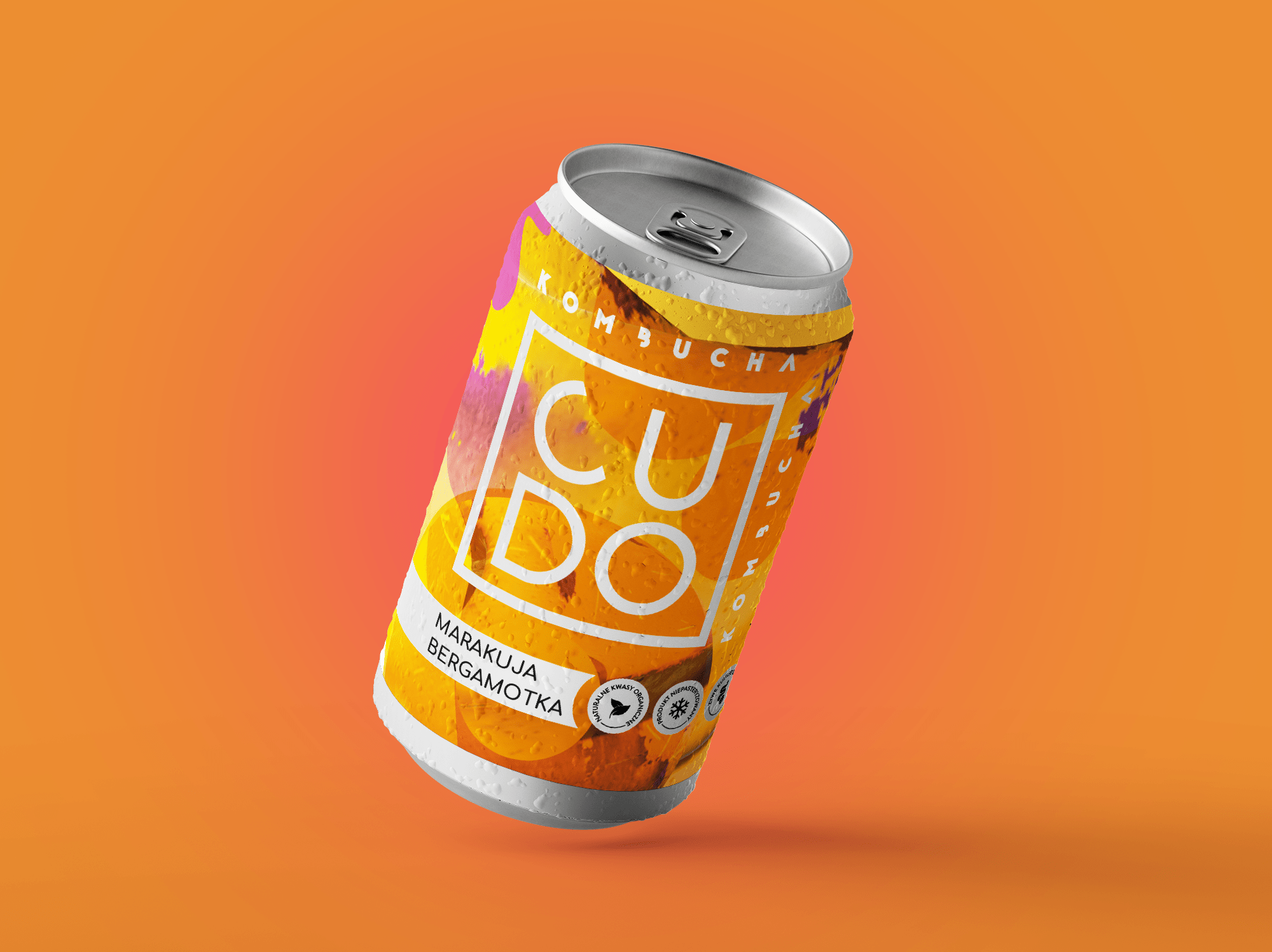
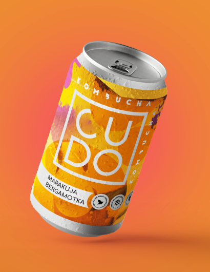
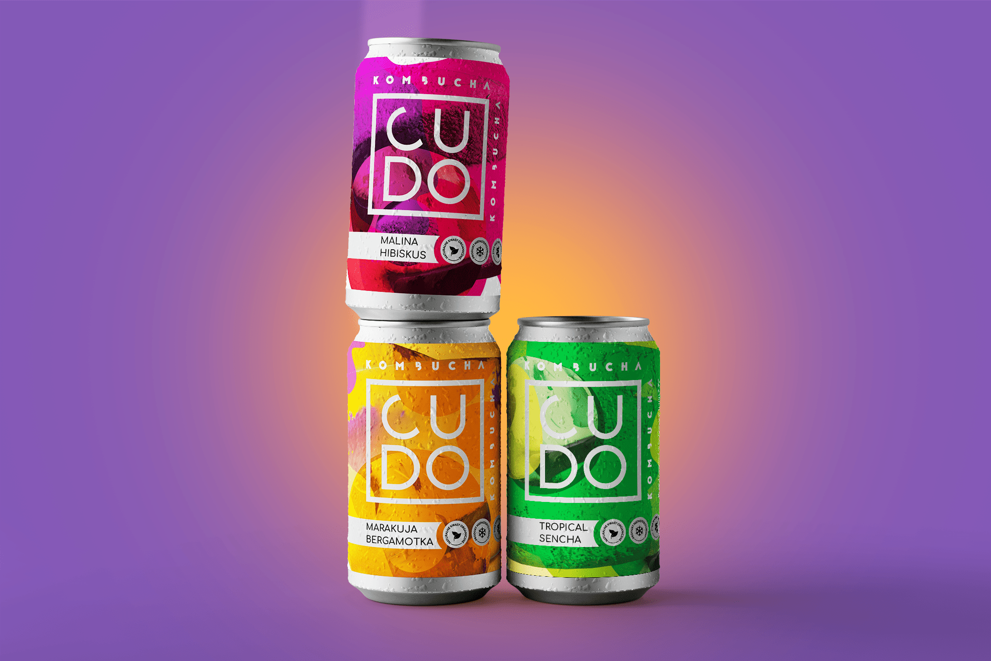
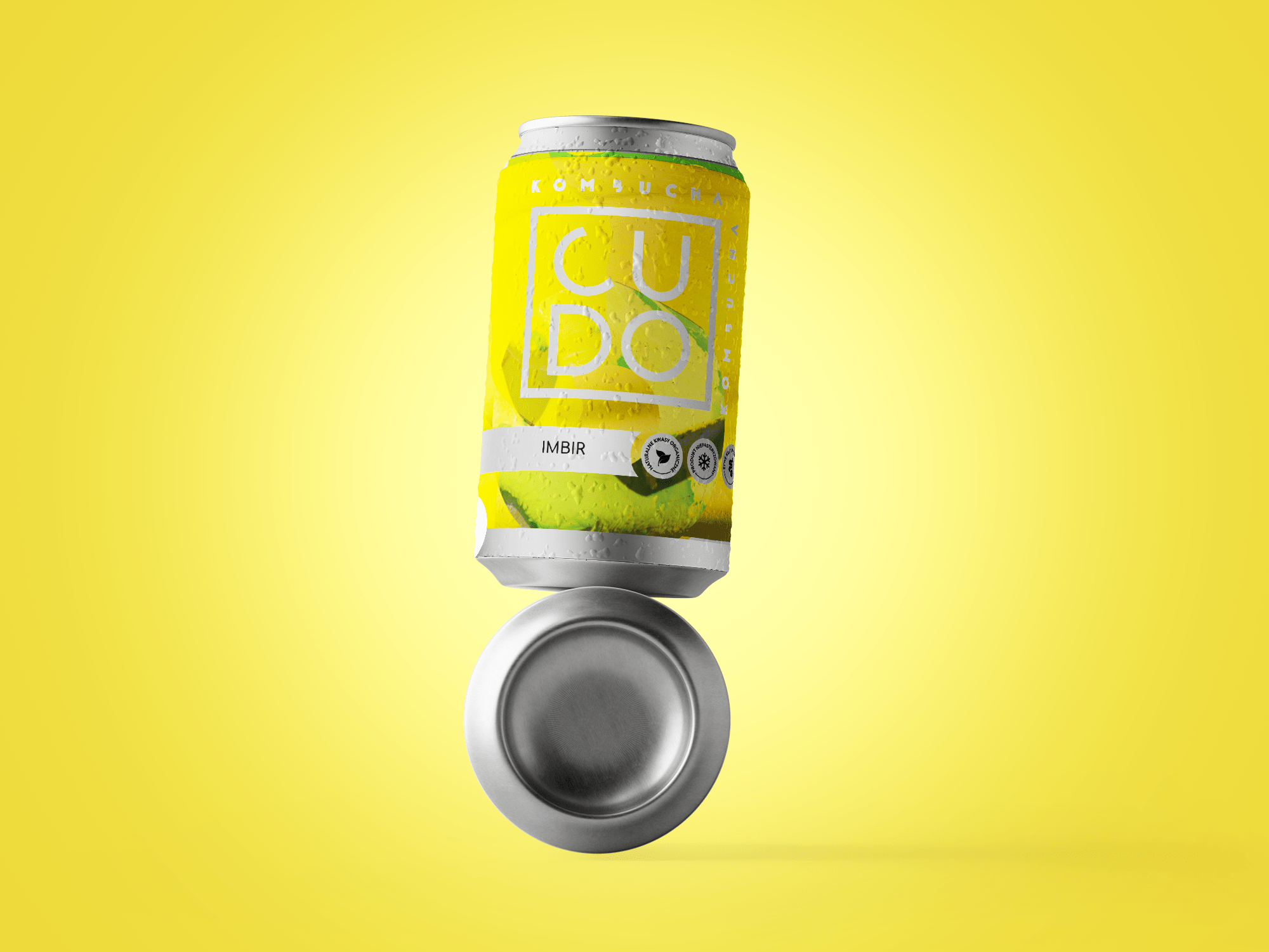
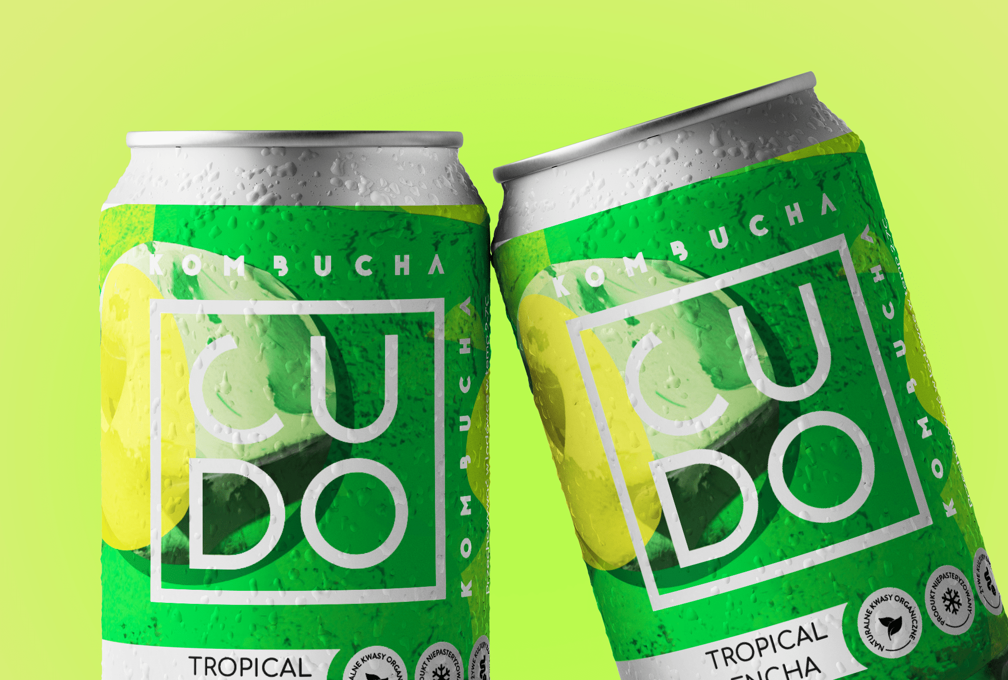
CUDO faced a major challenge when transitioning from minimalist glass packaging, featuring only their geometric logo, to can designs. The new packaging form required a different approach, with the brand hoping to expand its target audience and increase exposure. To achieve this, BrandyDesign from Warsaw, Poland, looked inward, drawing inspiration from the organic nature of kombucha itself. The result was a design featuring organic abstraction, enhanced with silver to convey quality, and asymmetrical spots to add a lively character.

The aim of this project was to create an inspiring and contemporary brand design. The BrandyDesign team took inspiration from the characteristic texture of kombucha mushrooms and the simplicity of the drink’s composition, resulting in bright, minimalist labels.

The end result is a design that captures the essence of the CUDO Kombucha brand, attracting customers with its originality and modern aesthetics. This project represents a significant milestone in the brand’s development, paving the way for broader consumer interest and market presence.


Transitioning CUDO Kombucha Packaging Design from Glass to Cans: A Brand Evolution

2

Work Category: Published Work

Get the latest packaging design inspiration in your inbox:

Popular designs

The Port Vodka Lemon Water

Overview: In response to my client’s vision for a Cape Cod themed beverage brand, I embarked on the journey to create The Port

Burma Love Rebrand

Love at First BiteAs an extension of the Burma Superstar restaurant in San Francisco, Burma Love Foods gives diners an opportunity to

Far Out Bar

Description: Far Out Bar is a cutting-edge packaging design project created for High Life Farms’ macrodose THC chocolate bars. This project involved

Pure Persian Honey

When we look closely at honey packaging, they are almost all in the usual format, and the ultimate in creativity is that

Designed by: PepsiCo Design & Innovation
Country: United States

Transitioning CUDO Kombucha Packaging Design from Glass to Cans: A Brand Evolution

2
Transitioning CUDO Kombucha Packaging Design from Glass to Cans: A

CUDO faced a major challenge when transitioning from minimalist glass packaging, featuring only their geometric logo, to can designs. The new packaging form required a different approach, with the brand hoping to expand its target audience and increase exposure. To achieve this, BrandyDesign from Warsaw, Poland, looked inward, drawing inspiration from the organic nature of kombucha itself. The result was a design featuring organic abstraction, enhanced with silver to convey quality, and asymmetrical spots to add a lively character.

The aim of this project was to create an inspiring and contemporary brand design. The BrandyDesign team took inspiration from the characteristic texture of kombucha mushrooms and the simplicity of the drink’s composition, resulting in bright, minimalist labels.

The end result is a design that captures the essence of the CUDO Kombucha brand, attracting customers with its originality and modern aesthetics. This project represents a significant milestone in the brand’s development, paving the way for broader consumer interest and market presence.


Transitioning CUDO Kombucha Packaging Design from Glass to Cans: A Brand Evolution

2

Work Category: Published Work

Previous slide
Next slide

Explore more great package design

Get the latest on packaging design in your inbox: