Description:
Far Out Bar is a cutting-edge packaging design project created for High Life Farms’ macrodose THC chocolate bars. This project involved developing an entirely new brand identity for Far Out Bar, focusing on a unique and cohesive visual experience that stands out on the shelf.
Background:
High Life Farms approached us to design packaging for their new line of macrodose THC chocolate bars. The vision was to create a brand that embodies a trippy, holographic experience, resonating with the product’s innovative mold that imprints a holographic pattern on the chocolate bars themselves.
Design Objective:
The primary goal was to design a brand and packaging that not only protect the product but also enhance the consumer experience through visual and tactile elements. We aimed to develop a cohesive brand identity that could unify the various chocolate bar designs while allowing each bar to maintain its distinctive character.
Design Process:
Brand Creation:
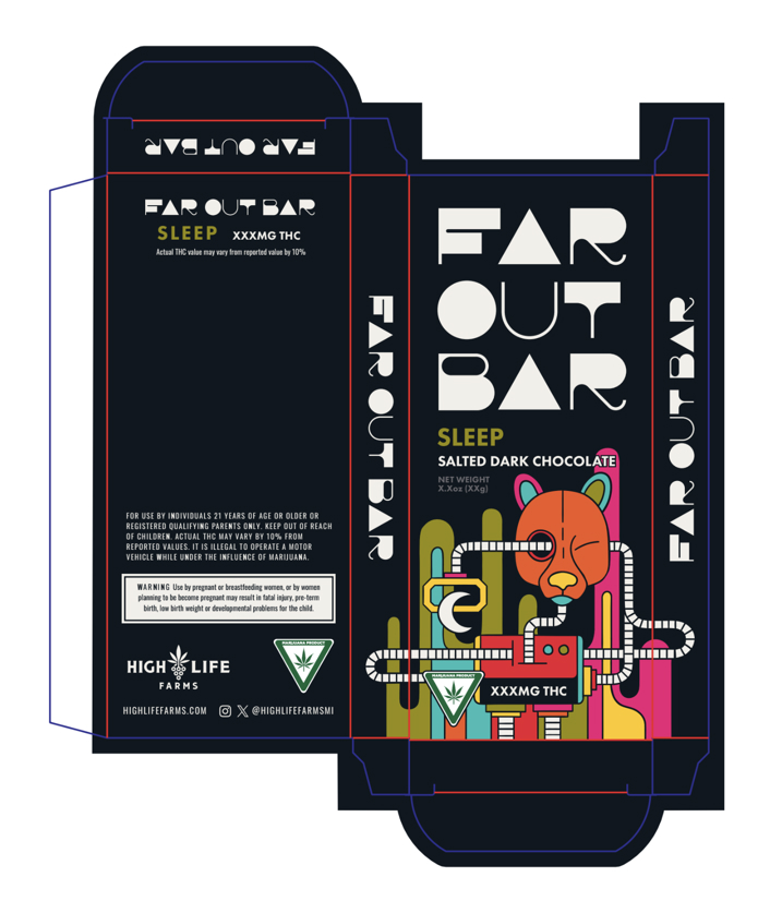
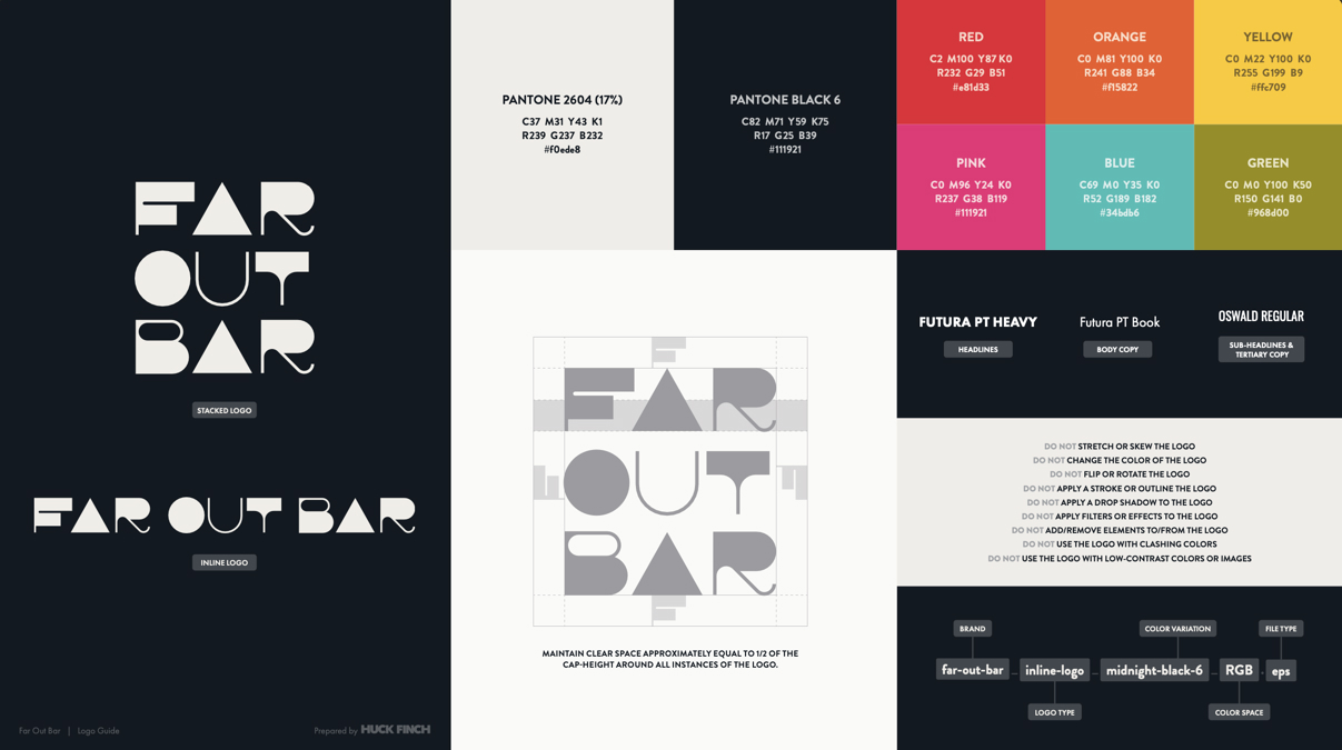
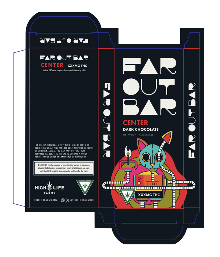
We developed a custom logotype and brand identity for Far Out Bar, emphasizing a modern and psychedelic aesthetic to match the holographic patterns of the chocolate bars.
Research & Conceptualization:
Our research focused on current trends in cannabis product packaging and consumer preferences for unique and engaging designs. The insights guided our conceptual direction towards a vibrant, holographic theme.
Material Selection:
To complement the holographic theme, we selected materials that could showcase the trippy visuals effectively. The packaging uses eco-friendly, recyclable materials that align with High Life Farms’ commitment to sustainability.
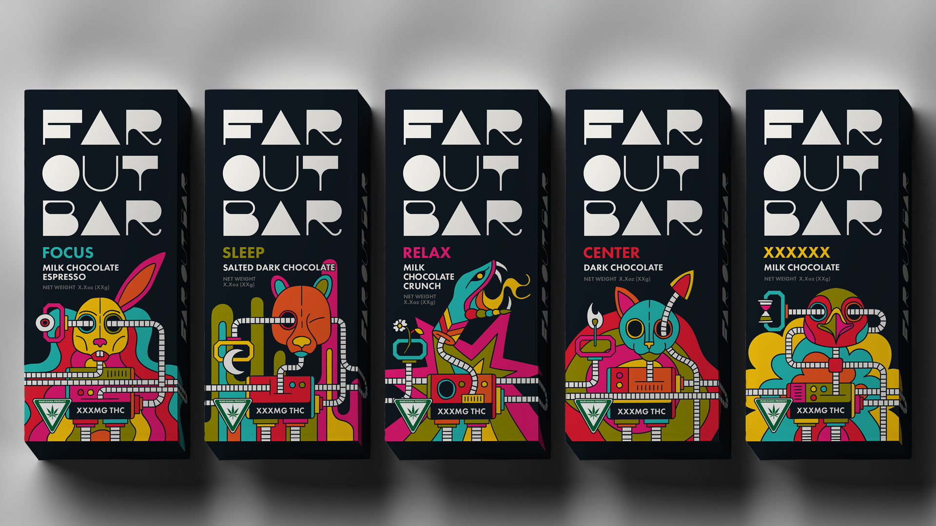
Design Execution:
The final design features a holographic pattern that flows seamlessly across the packaging, with cables connecting each bar design to create a unified display when placed side-by-side on the shelf. Each bar is represented by an animal and a unique symbol, adding an element of collectibility and individuality to the product line.
Challenges:
One of the significant challenges was creating a design system that was cohesive across different bar varieties yet distinctive enough for each bar to stand out individually. We addressed this by incorporating connecting cables and unique animal representations for each bar, ensuring a harmonious yet varied visual experience.
Impact and Results:
The Far Out Bar packaging has been exceptionally well-received, with positive feedback highlighting the innovative design and its ability to attract consumer attention. The cohesive yet distinctive packaging system has helped High Life Farms effectively showcase their product line, enhancing brand recognition and consumer engagement.
Conclusion:
Far Out Bar exemplifies the power of thoughtful, innovative design in creating a memorable consumer experience. By leaning into the trippy, holographic theme, we were able to develop a packaging design that not only protects the product but also elevates the brand’s presence in the market.