Designed by: PepsiCo Design & Innovation
Country: United States

Safeway Fruit Sodas

safeway1

Designed by Anthem | Country: United States

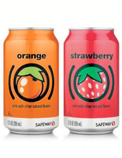
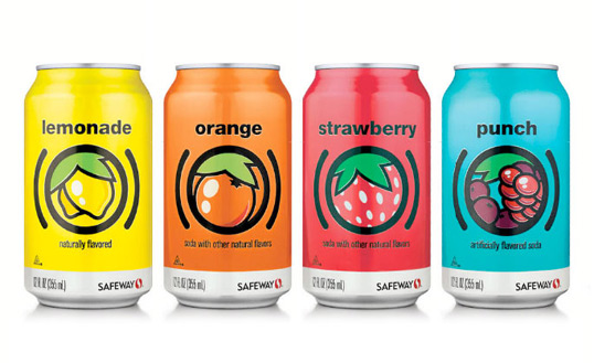
“As part of Safeway’s new Consumer Brands program, Anthem created a strategic point of difference on-shelf for their private label fruit sodas.

Previously lost among similarly designed brands, Safeway and Anthem developed a new cleaner, younger look that positions these cans far ahead of the pack and is making memorable impressions with shoppers.

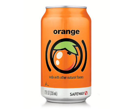
Drawing from a more progressive European design influence, the new system removes the extra layers that have become common to CSDs and reduces each flavor down to its essence. Each can’s artwork is crisp and iconic, framed with parentheses that succinctly explain the can’s contents. Simple, bold and fun, the design appeals to parents and kids alike.

Like the soda on the inside, the cans themselves are refreshing, and their unified, consistent look offers an eye-catching presence in the soda aisle.”
safeway2

Get the latest packaging design inspiration in your inbox:

Popular designs

Pure Persian Honey

When we look closely at honey packaging, they are almost all in the usual format, and the ultimate in creativity is that

The Port Vodka Lemon Water

Overview: In response to my client’s vision for a Cape Cod themed beverage brand, I embarked on the journey to create The Port

The Bra Guru

Most women are wearing the wrong size bra and that is a fact. The Bra Guru® is the first and only professional

Designed by: PepsiCo Design & Innovation
Country: United States

Safeway Fruit Sodas

safeway1

safeway1

Designed by Anthem | Country: United States

“As part of Safeway’s new Consumer Brands program, Anthem created a strategic point of difference on-shelf for their private label fruit sodas.

Previously lost among similarly designed brands, Safeway and Anthem developed a new cleaner, younger look that positions these cans far ahead of the pack and is making memorable impressions with shoppers.

Drawing from a more progressive European design influence, the new system removes the extra layers that have become common to CSDs and reduces each flavor down to its essence. Each can’s artwork is crisp and iconic, framed with parentheses that succinctly explain the can’s contents. Simple, bold and fun, the design appeals to parents and kids alike.

Like the soda on the inside, the cans themselves are refreshing, and their unified, consistent look offers an eye-catching presence in the soda aisle.”

safeway2

Explore more great package design

Get the latest on packaging design in your inbox: