Designed by: PepsiCo Design & Innovation
Country: United States

DOO Smoothie

doo1

Designed by B&T | Country: France

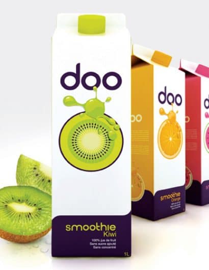
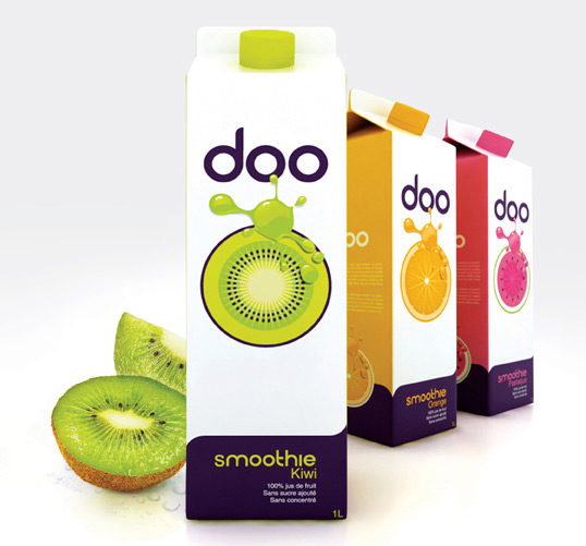
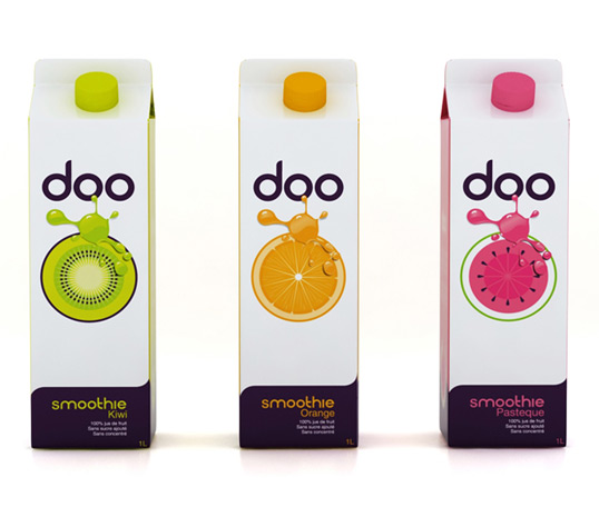
“DOO is a new smoothie french Brand. The meaning of the name comes from the french word “doux” which means sweet in English. We made the name shorter and easier to read. Somehow we wanted to find a fun way to write this word and, in the same time, keeping the same pronunciation. A B&T design, we love to work on pure and fresh design without adding stuff that needlessly overwhelms our design. We wanted these smoothies to be efficient and obvious for the consumer.

As the design is uncluttered we also wanted our flavor to be so. That’s the reason why chose 3 very simple flavors: Kiwi, Orange, and Watermelon, and we didn’t go into the multi-fruit blend.”
doo2

Get the latest packaging design inspiration in your inbox:

Popular designs

Miller 64 Rebrands & Relaunches as 64 Extra Light

Miller Brewing Company introduces Miller Extra Light, a rebranded version of Miller64, targeting the growing low-alcohol beer market with a focus on balance and moderation. Anne Pando, Director of Activation for Miller brands, highlights the shift, stating, “This isn’t just a packaging refresh – it’s a new opportunity for us,” emphasizing the strategic repositioning away from calories to low ABV content.

Introducing Nasbah: Egyptian Product Packaging Design

Uncover how the Egyptian product “Nasbah” is taking a contemporary approach to package design, making a mark in the local market. Learn how the design strategy influences consumer perception and enhances product appeal.

Designed by: PepsiCo Design & Innovation
Country: United States

DOO Smoothie

doo1

doo1

Designed by B&T | Country: France

“DOO is a new smoothie french Brand. The meaning of the name comes from the french word “doux” which means sweet in English. We made the name shorter and easier to read. Somehow we wanted to find a fun way to write this word and, in the same time, keeping the same pronunciation. A B&T design, we love to work on pure and fresh design without adding stuff that needlessly overwhelms our design. We wanted these smoothies to be efficient and obvious for the consumer.

As the design is uncluttered we also wanted our flavor to be so. That’s the reason why chose 3 very simple flavors: Kiwi, Orange, and Watermelon, and we didn’t go into the multi-fruit blend.”

doo2

Previous slide
Next slide
Get the latest on packaging design in your inbox: