Designed by: PepsiCo Design & Innovation
Country: United States

R.M.Gattefossé

gattefosse1

Designed by CA DESIGN | Creative Direction Tommaso Nicolao | Country: France

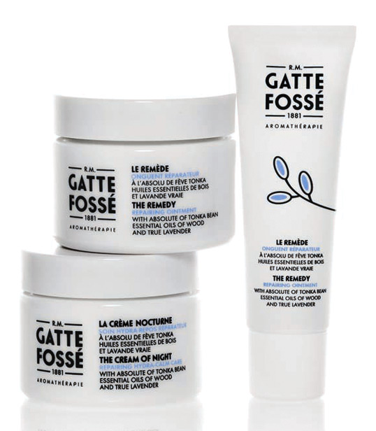
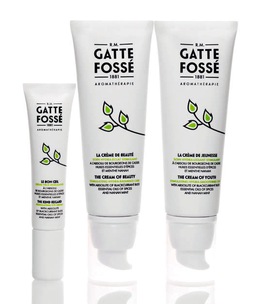
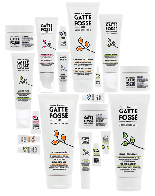
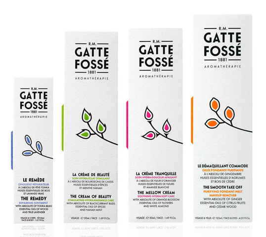
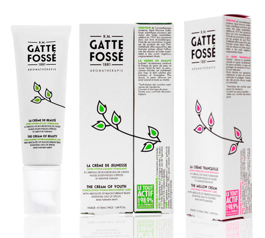
“The graphic concept behind this new cosmetic line is inspired by the codes of art deco. In the logo, the art deco reference is evident in the typography that conveys the historical savoir-faire of Mr. R.M.Gattefossé, who invented the aromatherapy industry in the 1930’s. The pictographic system conveys the art deco codes in a more contemporary manner in order to translate the cutting-edge scientific know-how of the company, while also bringing fun and color to the aesthetic of the packaging.

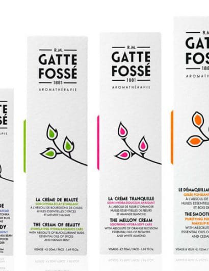
The right side of the packaging plays a main role in the linear for merchandising presentation, completing the icon and displaying important product details.

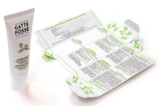
The inside of the packaging reveals itself like a secret garden, inviting us to delve into the box and discover the history of the brand. This allowed us to avoid printing an internal leaflet, thereby reducing paper and respecting the ecological goals of the company, also suggested by the highly-textured snow-white Fredrigoni Tintoretto paper.”
gattefosse2

gattefosse3

gattefosse4

gattefosse5

gattefosse6

gattefosse7

Get the latest packaging design inspiration in your inbox:

Popular designs

Far Out Bar

Description: Far Out Bar is a cutting-edge packaging design project created for High Life Farms’ macrodose THC chocolate bars. This project involved

Burma Love Rebrand

Love at First BiteAs an extension of the Burma Superstar restaurant in San Francisco, Burma Love Foods gives diners an opportunity to

The Bra Guru

Most women are wearing the wrong size bra and that is a fact. The Bra Guru® is the first and only professional

Designed by: PepsiCo Design & Innovation
Country: United States

R.M.Gattefossé

gattefosse1

gattefosse1

Designed by CA DESIGN | Creative Direction Tommaso Nicolao | Country: France

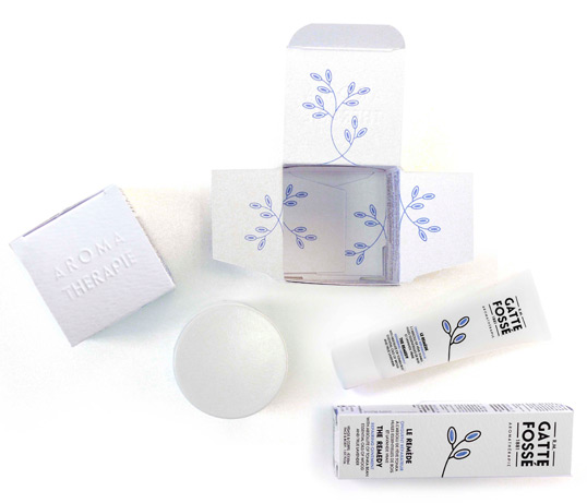
“The graphic concept behind this new cosmetic line is inspired by the codes of art deco. In the logo, the art deco reference is evident in the typography that conveys the historical savoir-faire of Mr. R.M.Gattefossé, who invented the aromatherapy industry in the 1930’s. The pictographic system conveys the art deco codes in a more contemporary manner in order to translate the cutting-edge scientific know-how of the company, while also bringing fun and color to the aesthetic of the packaging.

The right side of the packaging plays a main role in the linear for merchandising presentation, completing the icon and displaying important product details.

The inside of the packaging reveals itself like a secret garden, inviting us to delve into the box and discover the history of the brand. This allowed us to avoid printing an internal leaflet, thereby reducing paper and respecting the ecological goals of the company, also suggested by the highly-textured snow-white Fredrigoni Tintoretto paper.”
gattefosse2

gattefosse3

gattefosse4

gattefosse5

gattefosse6

gattefosse7

Previous slide
Next slide

Explore more great package design

Get the latest on packaging design in your inbox: