Designed by: PepsiCo Design & Innovation
Country: United States

Tennent’s

Tennent's

Designed by DesignBridge | Country: United Kingdom

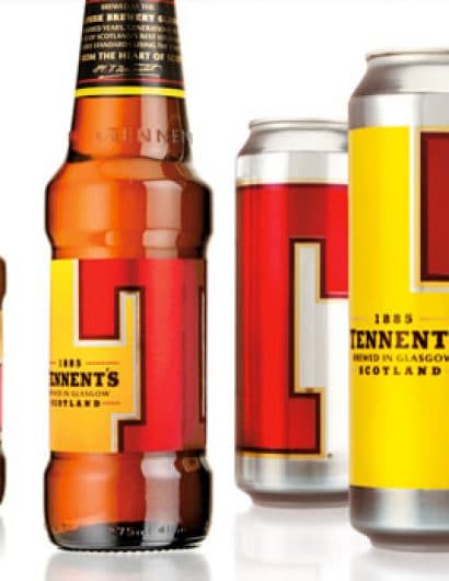
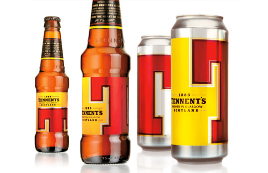
“To rebuild confidence in its background, we took the two prominent brand colours and made them mean something fresh, youthful and alive.

Red became blood to represent the gritty, down to earth, urban life force of Glasgow. Yellow was gold to stand for the quality of brewing expertise and warmth of both the city and its people.”

Get the latest packaging design inspiration in your inbox:

Popular designs

The Bra Guru

Most women are wearing the wrong size bra and that is a fact. The Bra Guru® is the first and only professional

Pure Persian Honey

When we look closely at honey packaging, they are almost all in the usual format, and the ultimate in creativity is that

Over the wave

This Kombucha originates in Lombok, Indonesia, where its paradise beaches attract hundreds of surfers eager to ride the waves. When you surf,

Designed by: PepsiCo Design & Innovation
Country: United States

Tennent’s

tennents

Tennent's

Designed by DesignBridge | Country: United Kingdom

“To rebuild confidence in its background, we took the two prominent brand colours and made them mean something fresh, youthful and alive.

Red became blood to represent the gritty, down to earth, urban life force of Glasgow. Yellow was gold to stand for the quality of brewing expertise and warmth of both the city and its people.”

Previous slide
Next slide

Explore more great package design

Get the latest on packaging design in your inbox: