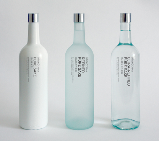
Designed by Jamie Conkleton | Country: United Kingdom
Beautiful packaging concepts from this recent graduate.
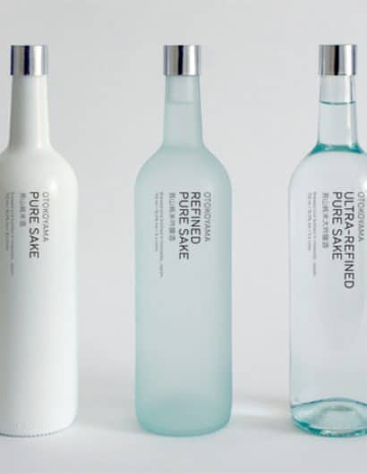
“The aim of this project was to produce a simple range of sake aimed at a western audience. By limiting the range to the three basic varieties and eliminating the confusing Japanese terminology my intention was to make it as clear as possible. To produce the different grades of sakes the rice grain is polished to remove the proteins and oils from its exterior. The more the rice is polished the better the outcome. This process of refinement is high-lighted through the decreasing opacity of the bottles.”


