Designed by: PepsiCo Design & Innovation
Country: United States

Works with Water

workswithwater1

Designed by Elmwood | Country: United Kingdom | Buy it

“Elmwood was tasked with looking at the company’s entire brand, from product names and tone of voice to logos and packaging designs.

“We felt Works with Water needed a powerful new look and feel to capture the product offering and new sachet delivery formats. Acne, blood pressure and cholesterol levels are all serious conditions which the branding needs to reflect,” said founder, Jules Birch.

The key theme of “rescue” was created, around which the products could be positioned.

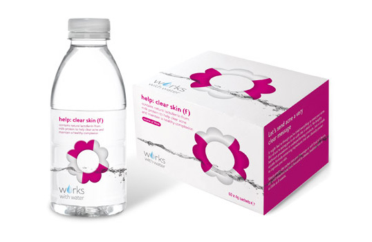
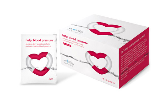
“We created an iconic graphic device, the lifebuoy, which instantly communicates the central idea, ‘rescue,’” explained Caroline Dilloway from Elmwood.

“The device was strong enough to unite the range, but flexible enough to reflect the various product benefits, for example a flower for the clear skin product and a heart for blood pressure.”

Product names were developed along the lines of help: clear skin and help: blood pressure.

“Our goal was to create beautiful yet effective packaging, with a clear and simple naming structure, which communicates the benefit of each product,” continued Dilloway.

“The design had to balance science with consumer appeal, clinical enough to gain trust yet attractive enough to sit comfortably on your desk or bathroom shelf, in order to encourage consumers to try it.”
workswithwater2

Via How-Do

Get the latest packaging design inspiration in your inbox:

Popular designs

Over the wave

This Kombucha originates in Lombok, Indonesia, where its paradise beaches attract hundreds of surfers eager to ride the waves. When you surf,

The Bra Guru

Most women are wearing the wrong size bra and that is a fact. The Bra Guru® is the first and only professional

The Port Vodka Lemon Water

Overview: In response to my client’s vision for a Cape Cod themed beverage brand, I embarked on the journey to create The Port

Designed by: PepsiCo Design & Innovation
Country: United States

Works with Water

workswithwater1

workswithwater1

Designed by Elmwood | Country: United Kingdom | Buy it

“Elmwood was tasked with looking at the company’s entire brand, from product names and tone of voice to logos and packaging designs.

“We felt Works with Water needed a powerful new look and feel to capture the product offering and new sachet delivery formats. Acne, blood pressure and cholesterol levels are all serious conditions which the branding needs to reflect,” said founder, Jules Birch.

The key theme of “rescue” was created, around which the products could be positioned.

“We created an iconic graphic device, the lifebuoy, which instantly communicates the central idea, ‘rescue,’” explained Caroline Dilloway from Elmwood.

“The device was strong enough to unite the range, but flexible enough to reflect the various product benefits, for example a flower for the clear skin product and a heart for blood pressure.”

Product names were developed along the lines of help: clear skin and help: blood pressure.

“Our goal was to create beautiful yet effective packaging, with a clear and simple naming structure, which communicates the benefit of each product,” continued Dilloway.

“The design had to balance science with consumer appeal, clinical enough to gain trust yet attractive enough to sit comfortably on your desk or bathroom shelf, in order to encourage consumers to try it.”

workswithwater2

Via How-Do

Previous slide
Next slide

Explore more great package design

Get the latest on packaging design in your inbox: