Designed by: PepsiCo Design & Innovation
Country: United States

Lanjaron Mineral Water

Lanjaron Mineral Water

Designed by Grupo Berro & Tridimage | Country: Argentina

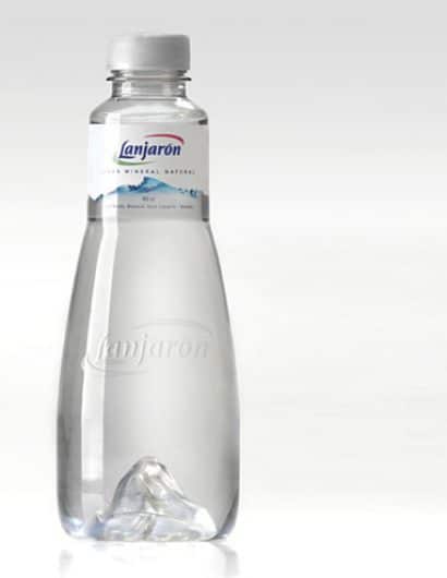
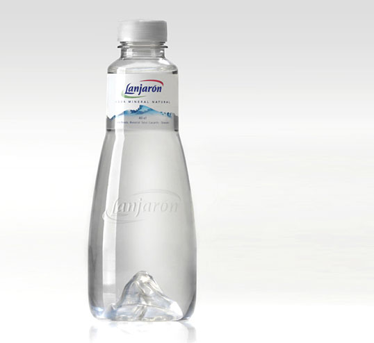
“The new Lanjaron Mineral Water package design is the result of a strategic collaboration between two Argentine package design firms: Tridimage (structural design) and Grupo Berro (graphic design) to develop an exclusive mineral water bottle for the Spanish market. The premium 40cl PET bottle is targeted to the premium restaurant & hotel segment mostly populated by traditional glass bottles and graphics.

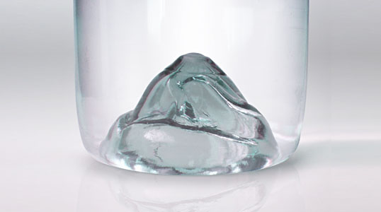
The sleek, clear, grooveless shape of the bottle magnifies the Mulhacén mountain (Sierra Nevada, Spain) arising from its base, conveying the sense of purity and natural origin of the brand in a single powerful message.

As this new design was aimed at competing in the premium arena, a high level of sophistication was an absolute must. Hence, the minimal label area maximizes the transparence of the bottle and the graphic design crowns this “waterdrop” with a clean, stylish, white and silver palette.

This development implied stretching the possibilities of current PET blow-molding technology”
Lanjaron Mineral Water

Get the latest packaging design inspiration in your inbox:

Popular designs

Over the wave

This Kombucha originates in Lombok, Indonesia, where its paradise beaches attract hundreds of surfers eager to ride the waves. When you surf,

Far Out Bar

Description: Far Out Bar is a cutting-edge packaging design project created for High Life Farms’ macrodose THC chocolate bars. This project involved

Designed by: PepsiCo Design & Innovation
Country: United States

Lanjaron Mineral Water

lanjaron1

Lanjaron Mineral Water

Designed by Grupo Berro & Tridimage | Country: Argentina

“The new Lanjaron Mineral Water package design is the result of a strategic collaboration between two Argentine package design firms: Tridimage (structural design) and Grupo Berro (graphic design) to develop an exclusive mineral water bottle for the Spanish market. The premium 40cl PET bottle is targeted to the premium restaurant & hotel segment mostly populated by traditional glass bottles and graphics.

The sleek, clear, grooveless shape of the bottle magnifies the Mulhacén mountain (Sierra Nevada, Spain) arising from its base, conveying the sense of purity and natural origin of the brand in a single powerful message.

As this new design was aimed at competing in the premium arena, a high level of sophistication was an absolute must. Hence, the minimal label area maximizes the transparence of the bottle and the graphic design crowns this “waterdrop” with a clean, stylish, white and silver palette.

This development implied stretching the possibilities of current PET blow-molding technology”

Lanjaron Mineral Water

Previous slide
Next slide

Explore more great package design

Get the latest on packaging design in your inbox: