Designed by: PepsiCo Design & Innovation
Country: United States

Antipodes

antipodes1

Country: New Zealand | Buy it

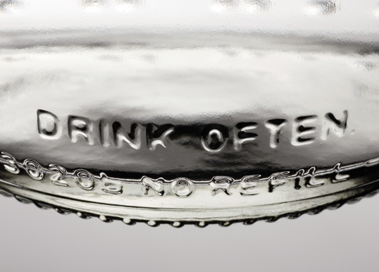
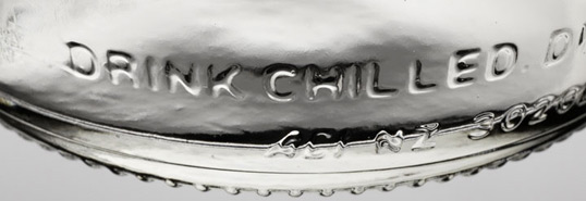
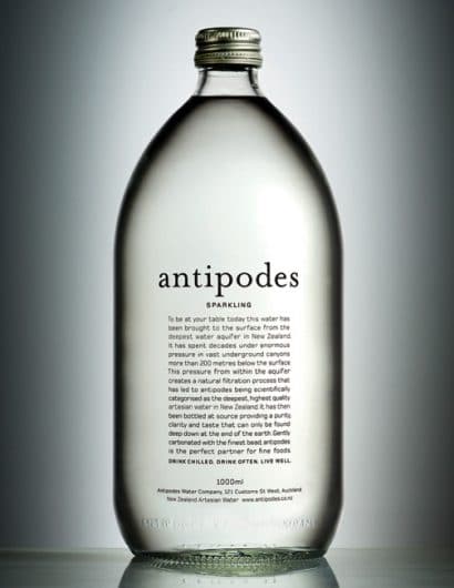
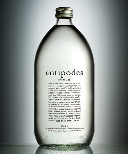
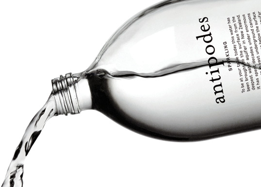
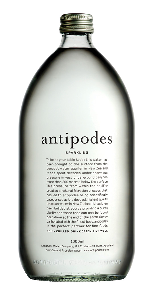
“It didn’t have to stand out on a supermarket shelf, because it would never be on one. We didn’t want it to stand out on a restaurant table either – even though it would most certainly be on one. We wanted it to compliment a table setting rather than dominate it. We believe the heroes of the table should be the wine and food, not the water bottle. So we kept the bottle short and fat and we kept it clean and simple. We wanted it to look as pure on the outside as it in fact was on the inside.”
antipodes2

antipodes3

antipodes4

antipodes5

antipodes6

Get the latest packaging design inspiration in your inbox:

Popular designs

Burma Love Rebrand

Love at First BiteAs an extension of the Burma Superstar restaurant in San Francisco, Burma Love Foods gives diners an opportunity to

Over the wave

This Kombucha originates in Lombok, Indonesia, where its paradise beaches attract hundreds of surfers eager to ride the waves. When you surf,

The Port Vodka Lemon Water

Overview: In response to my client’s vision for a Cape Cod themed beverage brand, I embarked on the journey to create The Port

Designed by: PepsiCo Design & Innovation
Country: United States

Antipodes

antipodes1

antipodes1

Country: New Zealand | Buy it

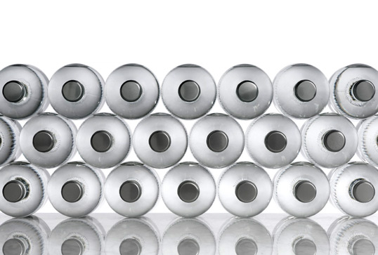
“It didn’t have to stand out on a supermarket shelf, because it would never be on one. We didn’t want it to stand out on a restaurant table either – even though it would most certainly be on one. We wanted it to compliment a table setting rather than dominate it. We believe the heroes of the table should be the wine and food, not the water bottle. So we kept the bottle short and fat and we kept it clean and simple. We wanted it to look as pure on the outside as it in fact was on the inside.”
antipodes2

antipodes3

antipodes4

antipodes5

antipodes6

Previous slide
Next slide

Explore more great package design

Get the latest on packaging design in your inbox: