Designed by: PepsiCo Design & Innovation
Country: United States

Student Work – David Baertz

protector1

Designed by David Baertz | Country: Germany

“The Protector product line is based on the idea of creating beauty products for men, who don’t want to be metrosexual. A few years ago, the media started to proclaim the “new masculinity”, for example Burger King (e.g. the “men’s academy”). Regarding this fact, is designed the “protector series”.

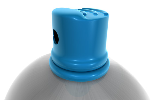
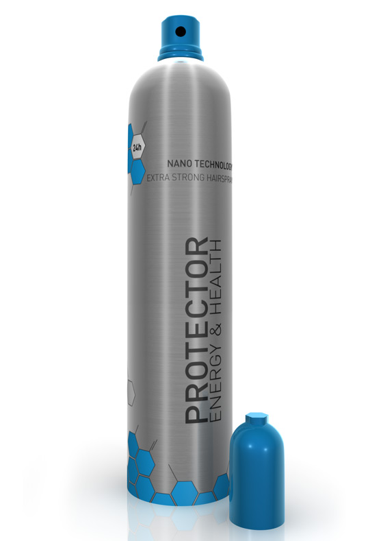
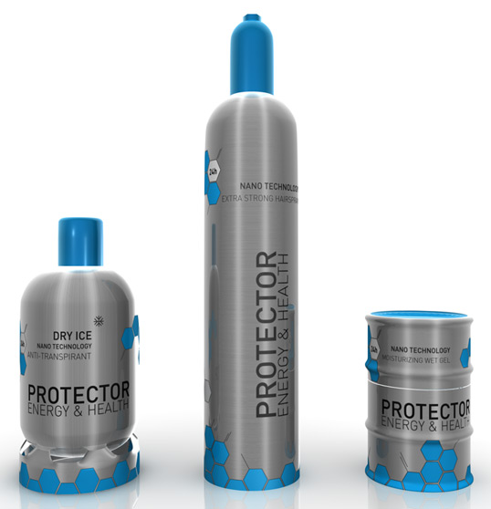
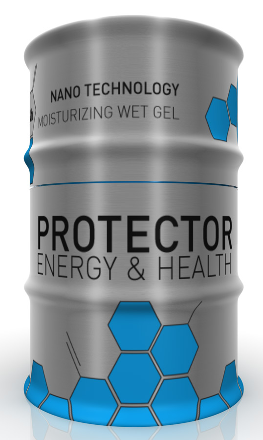
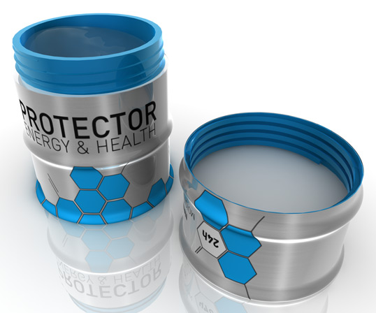
It was made for men, who care about their outer appearance but don’t want to be metrosexual. The name “protector” itself sounds very masculine, because it implies, that there is something to be protected from. The claim “energy & health” stresses the sector of the product and mediates power and vitality. The synthesis of “clean” and “masculine” is also shown in the design of the products. The “male aspect” is embodied by the industrial form (gas bottle, oil barrel).

The “clean aspect” can be found in the relation to chemistry. The hexagonal forms represent chemical bondings. The color blue was chosen, because of it’s relation to both “male” and “technical” associations. Target group: Upper class males, 20-35 y.o.”
protector2

protector3

protector4

protector5

protector6

Get the latest packaging design inspiration in your inbox:

Popular designs

Far Out Bar

Description: Far Out Bar is a cutting-edge packaging design project created for High Life Farms’ macrodose THC chocolate bars. This project involved

Over the wave

This Kombucha originates in Lombok, Indonesia, where its paradise beaches attract hundreds of surfers eager to ride the waves. When you surf,

Designed by: PepsiCo Design & Innovation
Country: United States

Student Work – David Baertz

protector1

protector1

Designed by David Baertz | Country: Germany

“The Protector product line is based on the idea of creating beauty products for men, who don’t want to be metrosexual. A few years ago, the media started to proclaim the “new masculinity”, for example Burger King (e.g. the “men’s academy”). Regarding this fact, is designed the “protector series”.

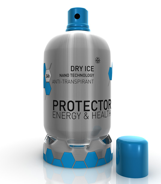
It was made for men, who care about their outer appearance but don’t want to be metrosexual. The name “protector” itself sounds very masculine, because it implies, that there is something to be protected from. The claim “energy & health” stresses the sector of the product and mediates power and vitality. The synthesis of “clean” and “masculine” is also shown in the design of the products. The “male aspect” is embodied by the industrial form (gas bottle, oil barrel).

The “clean aspect” can be found in the relation to chemistry. The hexagonal forms represent chemical bondings. The color blue was chosen, because of it’s relation to both “male” and “technical” associations. Target group: Upper class males, 20-35 y.o.”
protector2

protector3

protector4

protector5

protector6

Previous slide
Next slide

Explore more great package design

Get the latest on packaging design in your inbox: