Designed by Isabela Serta | Country: Brazil
“The idea of this project is to promote a more healthy food consumption and, concurrently, to also promote sustainable local agriculture, which involves methods that do not harm the environment, respect workers and animals, provide fair wages to farmers and support farming communities.
Sustainability has a lot to do with buying food as locally as possible, so it is important that the package informs the benefits that buying locally grown can bring to the consumer and to the support of family farms and rural communities.
There are many other reasons why buying local food is both rewarding and delicious, including enjoying the taste of fresh food, improved health and nutrition and environmental stewardship. A person who appreciates food likes to feel all the senses that involves cooking, eating and serving it.
The sense of touch (when preparing a plate), sense of smell(when feeling the aroma), vision (when seeing an attractive plate, pleasant to the eye), sense of hearing (when hearing the sound of food being cooked) and finally sense of taste (when appreciating the taste of it). All this preparation involves patience, calm and no hurry. The whole process is an experience, which starts in the moment you go to the market to buy fresh ingredients to do your cooking.
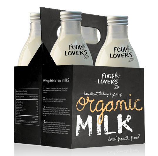
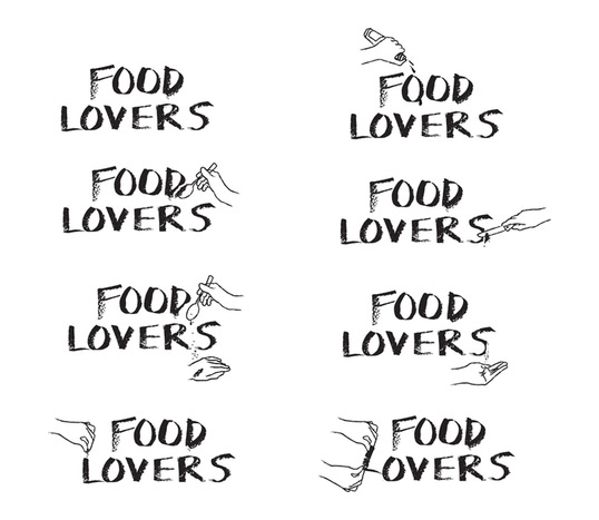
I have created a brand for a little market, that sells products of its own farm. Is called FOOD LOVERS. This brand is for people who appreciate tasty food, like to know where they came from, and care about all the elements involved in its production. The typography was created after a research on little markets, where the products are traditionally mentioned on a blackboard, in large separated letters written with a piece of chalk.
The idea of the hand in the brand come up because it is the greatest instrument that a person needs to do cooking. With the hand the sauce is tasted, the salt is sprinkled, the dough is kneaded, the quantity of oil is controlled, the limon is squeezed, the bread is sliced, and so on. The changing symbol shows the movement of the whole process of cooking. The hands interact with the typography of chalk, “tasting” and “preparing” it, as if it was fresh food, came right from the farm.
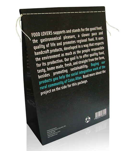
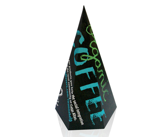
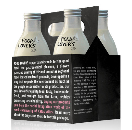
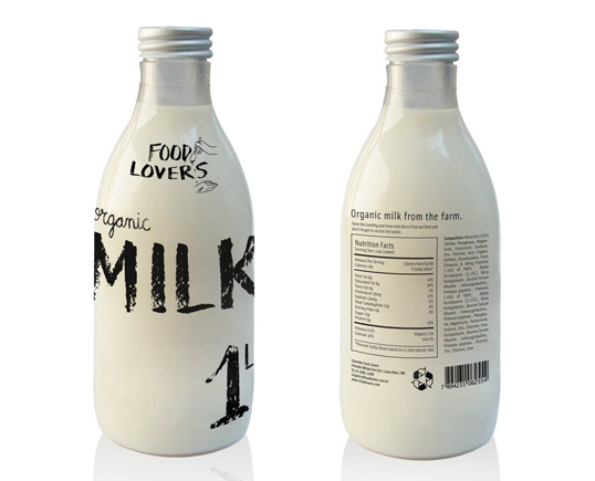
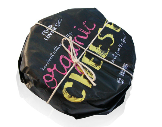
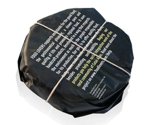
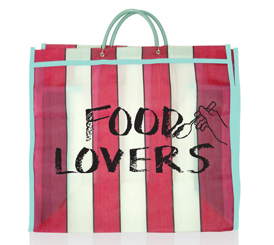
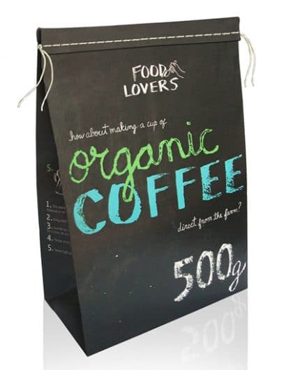
I have made a set of five packages and a fair bag. All the products has references of particular things that reminds old packages, regarding the idea that food used to be more natural and healthy than nowadays.
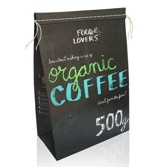
This elements are shown on all five packages: the cheese (packed with one sheet of craft paper wrapped up with a twine), the bottle of milk made with glass, the coffee packed with a twine, the traditional bag fair, and the little cone package of coffee, resembling packages that used to be sold in small quantities. All of the packages have a phrase inviting people to try this food, in a familiar and welcoming way.”
Work winner of the competition of IED in Packaging Design for the course of 2009/10.
