Designed by: PepsiCo Design & Innovation
Country: United States

Amsterdam Brewing Company

Amsterdam Brewing Company

Designed by Brand&Tonic | Country: Canada

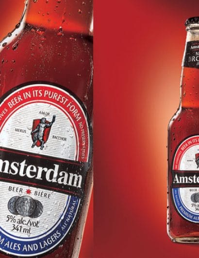
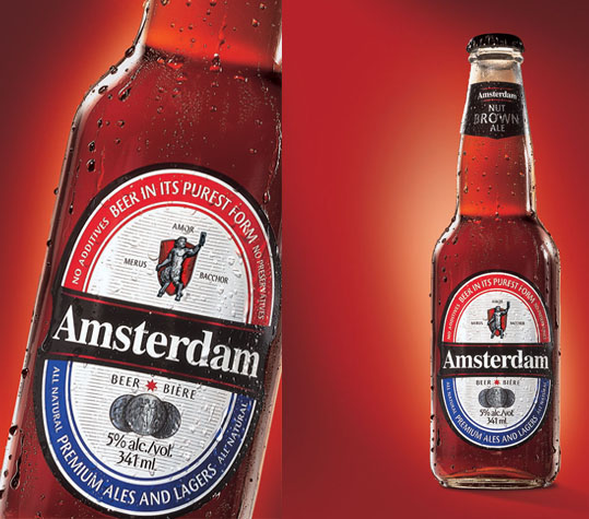
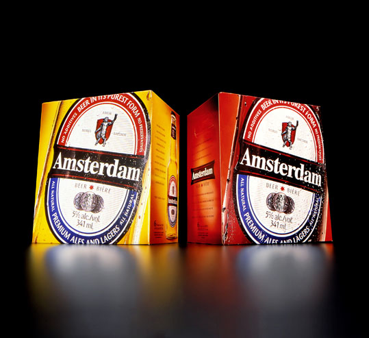
The Amsterdam Brewing Company has been a Toronto establishment for decades. As their popularity has grown, so have their brands and image with the help of Brand&Tonic.

“Purity, Passion and Revelry. Identifying and calling out the three tenets of the Amsterdam Brewing Company immediately attracted a larger audience for it’s products. The Satyr, a natural born storyteller whose presence and strength of character exemplify the new brand, was enlisted to represent these three tenets both on and off the label.

Another key factor in growing the brand was to celebrate the product both in content and in form. The solution was a new clear bottle, redesigned label and new secondary packaging to create the experience of fresh, premium taste both on the shelf and in your hand.”
 

Amsterdam Brewing Company

Get the latest packaging design inspiration in your inbox:

Popular designs

Over the wave

This Kombucha originates in Lombok, Indonesia, where its paradise beaches attract hundreds of surfers eager to ride the waves. When you surf,

The Port Vodka Lemon Water

Overview: In response to my client’s vision for a Cape Cod themed beverage brand, I embarked on the journey to create The Port

The Bra Guru

Most women are wearing the wrong size bra and that is a fact. The Bra Guru® is the first and only professional

Burma Love Rebrand

Love at First BiteAs an extension of the Burma Superstar restaurant in San Francisco, Burma Love Foods gives diners an opportunity to

Designed by: PepsiCo Design & Innovation
Country: United States

Amsterdam Brewing Company

amsterdam_brown1

Amsterdam Brewing Company

Designed by Brand&Tonic | Country: Canada

The Amsterdam Brewing Company has been a Toronto establishment for decades. As their popularity has grown, so have their brands and image with the help of Brand&Tonic.

“Purity, Passion and Revelry. Identifying and calling out the three tenets of the Amsterdam Brewing Company immediately attracted a larger audience for it’s products. The Satyr, a natural born storyteller whose presence and strength of character exemplify the new brand, was enlisted to represent these three tenets both on and off the label.

Another key factor in growing the brand was to celebrate the product both in content and in form. The solution was a new clear bottle, redesigned label and new secondary packaging to create the experience of fresh, premium taste both on the shelf and in your hand.”


Amsterdam Brewing Company

Previous slide
Next slide

Explore more great package design

Get the latest on packaging design in your inbox: