Designed by: PepsiCo Design & Innovation
Country: United States

Kaffe 1668

k1

Designed by Megan Cummins | Country: United States

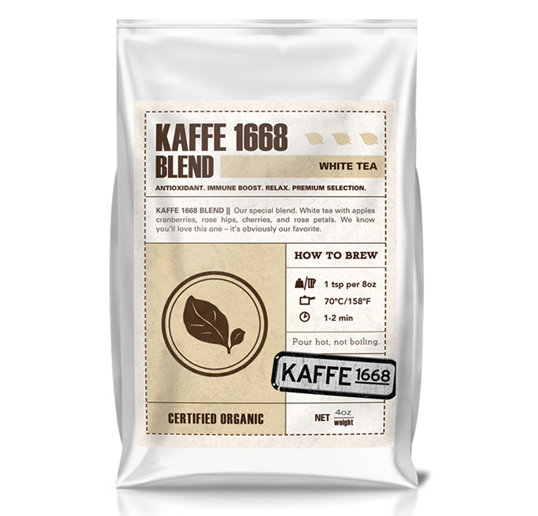
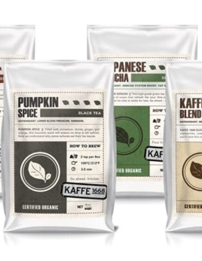
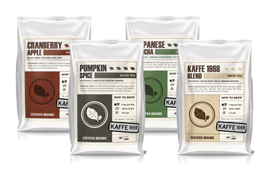
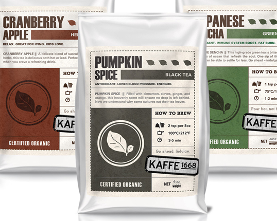
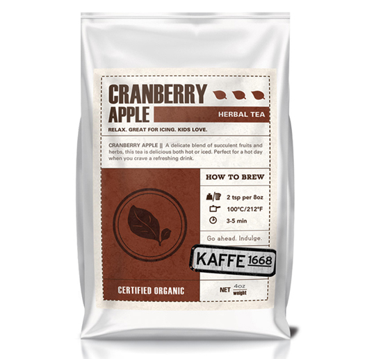
“I recently did work for a start-up company in downtown Manhattan. They were on a very tight budget and needing everything to be printed from their standard 8.5×11 printer. One particular challenge of branding them was the packaging for their line of teas. They had over 20 teas, 6 varieties, each with their own unique description, health benefits, and brewing instructions. Needless to say, it was a fun challenge in real-world information design applied to packaging. I was able to arrange all of the necessary information on single labels which they adhered to the stock bags they had. The labels were small enough to fit two per standard letter size paper- saving not only money, but also paper.”
k6

kaf1

kaf2

kaf3

Get the latest packaging design inspiration in your inbox:

Popular designs

Far Out Bar

Description: Far Out Bar is a cutting-edge packaging design project created for High Life Farms’ macrodose THC chocolate bars. This project involved

Pure Persian Honey

When we look closely at honey packaging, they are almost all in the usual format, and the ultimate in creativity is that

The Bra Guru

Most women are wearing the wrong size bra and that is a fact. The Bra Guru® is the first and only professional

Over the wave

This Kombucha originates in Lombok, Indonesia, where its paradise beaches attract hundreds of surfers eager to ride the waves. When you surf,

Designed by: PepsiCo Design & Innovation
Country: United States

Kaffe 1668

k1

k1

Designed by Megan Cummins | Country: United States

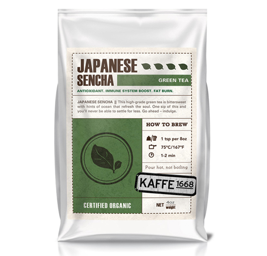
“I recently did work for a start-up company in downtown Manhattan. They were on a very tight budget and needing everything to be printed from their standard 8.5×11 printer. One particular challenge of branding them was the packaging for their line of teas. They had over 20 teas, 6 varieties, each with their own unique description, health benefits, and brewing instructions. Needless to say, it was a fun challenge in real-world information design applied to packaging. I was able to arrange all of the necessary information on single labels which they adhered to the stock bags they had. The labels were small enough to fit two per standard letter size paper- saving not only money, but also paper.”
k6

kaf1

kaf2

kaf3

Previous slide
Next slide

Explore more great package design

Get the latest on packaging design in your inbox: