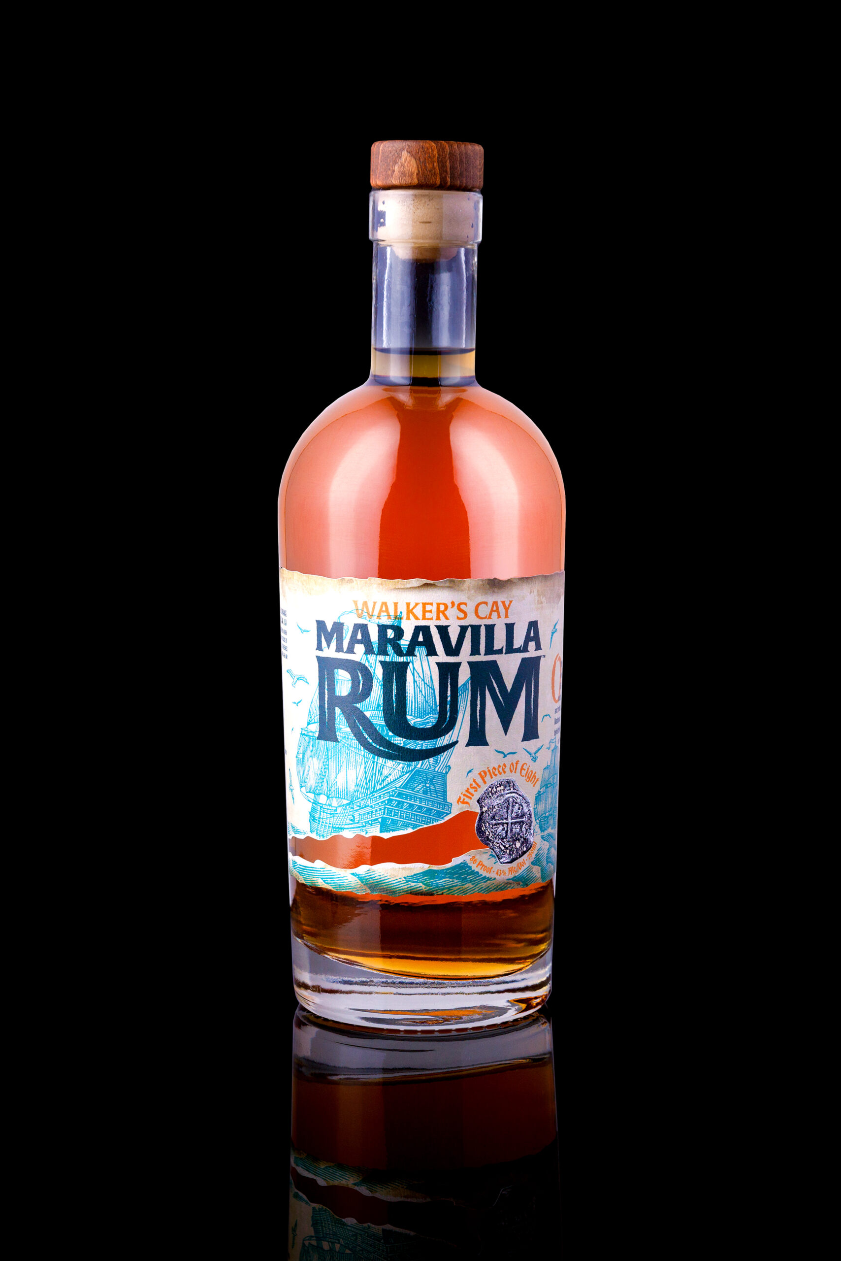
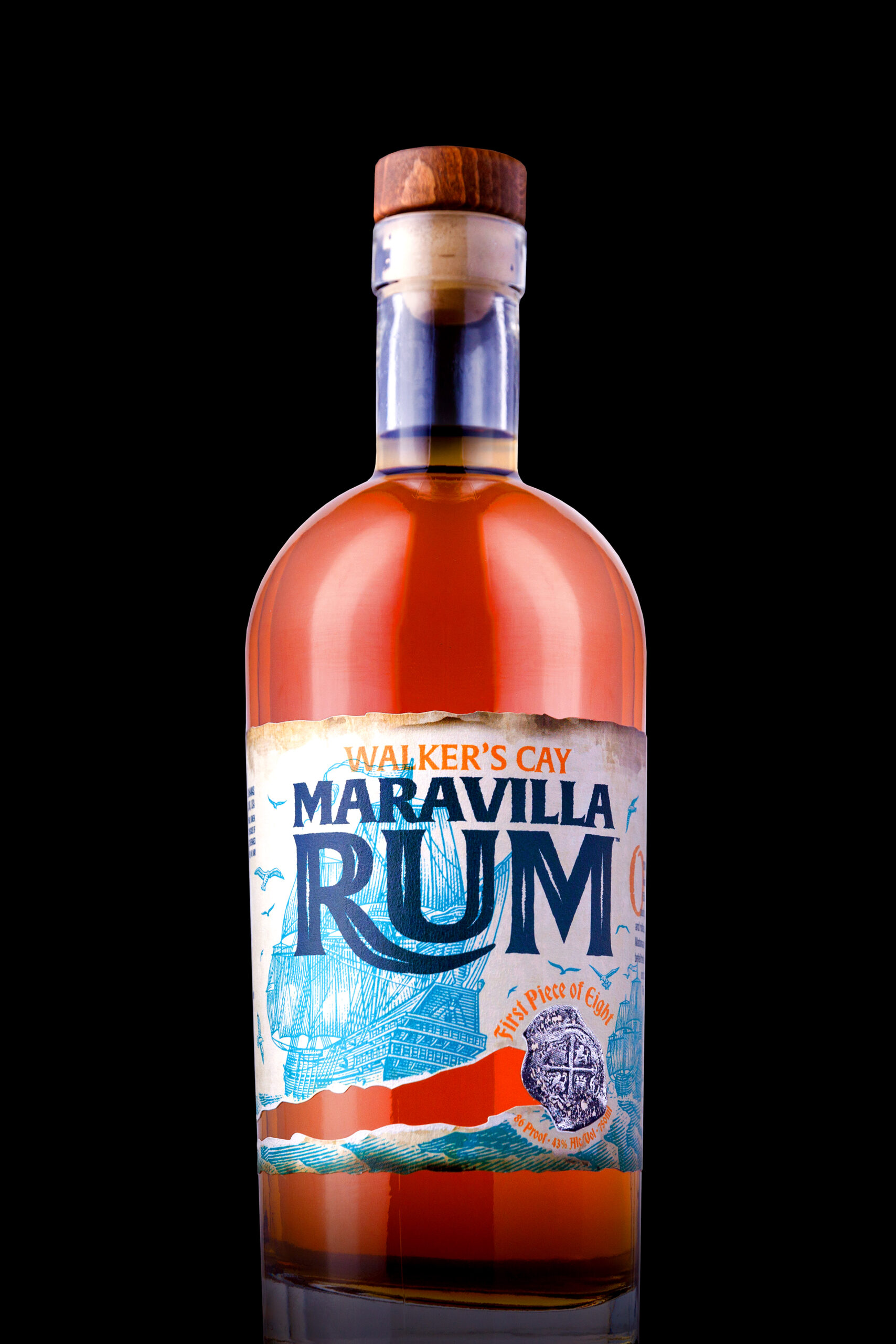
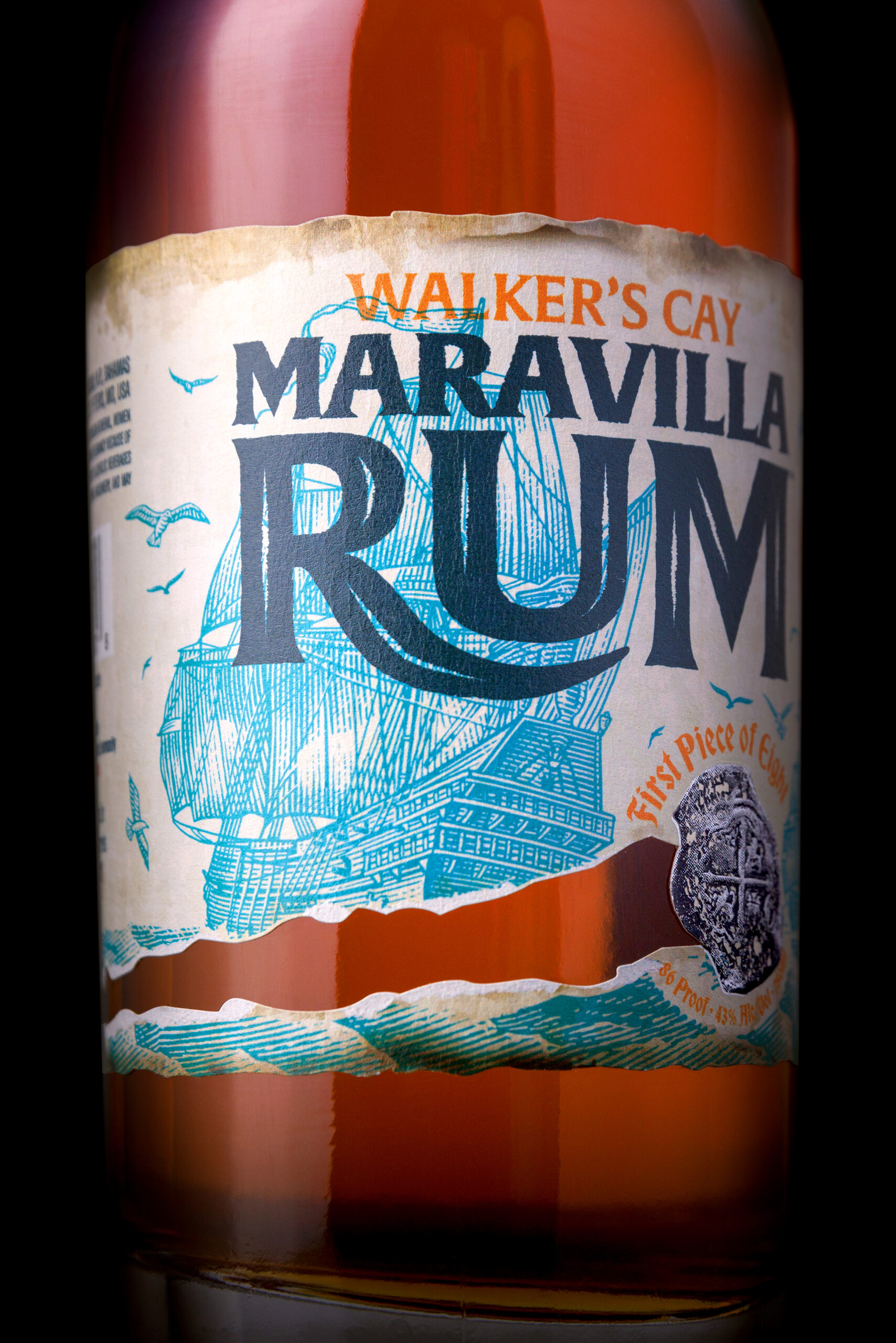
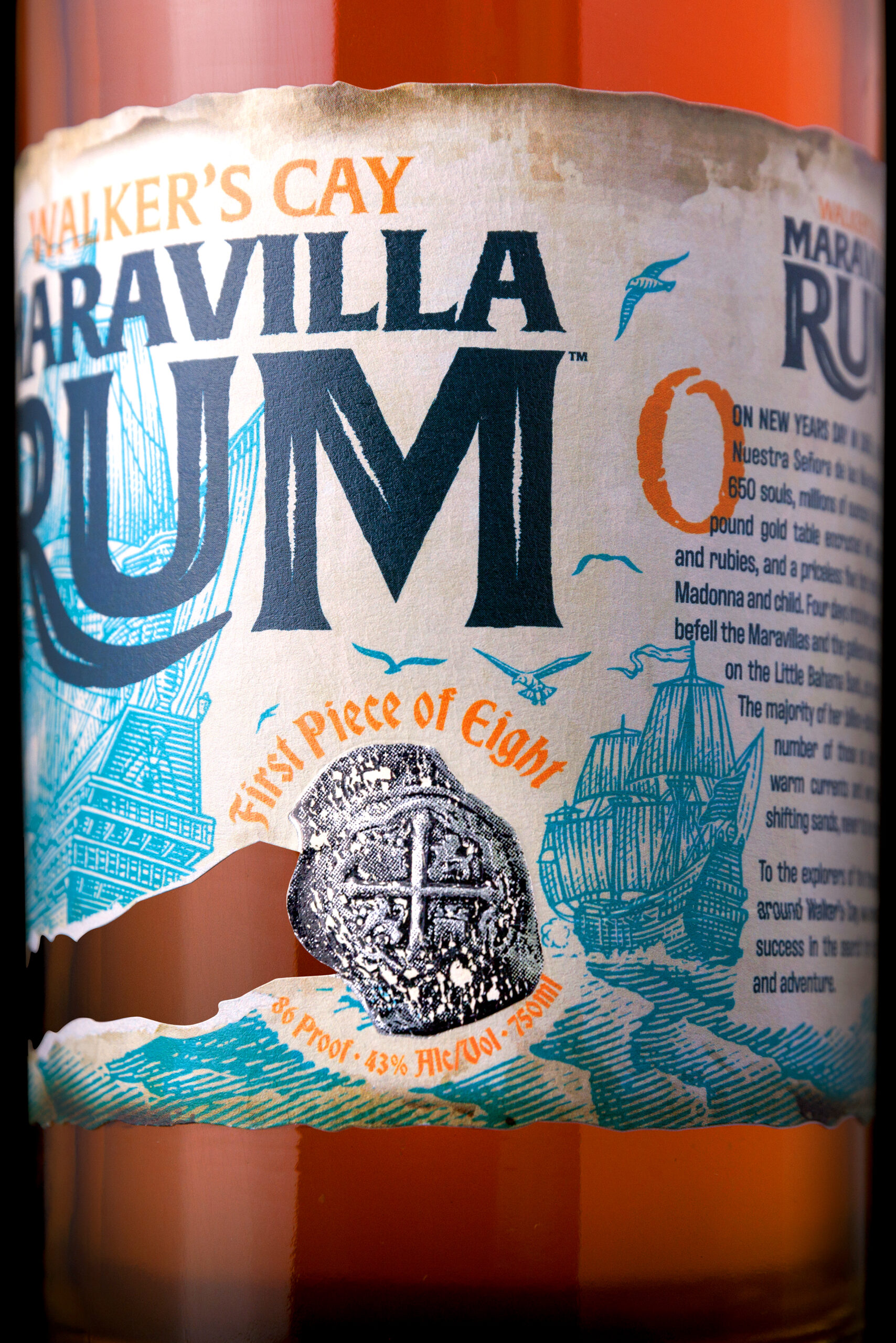
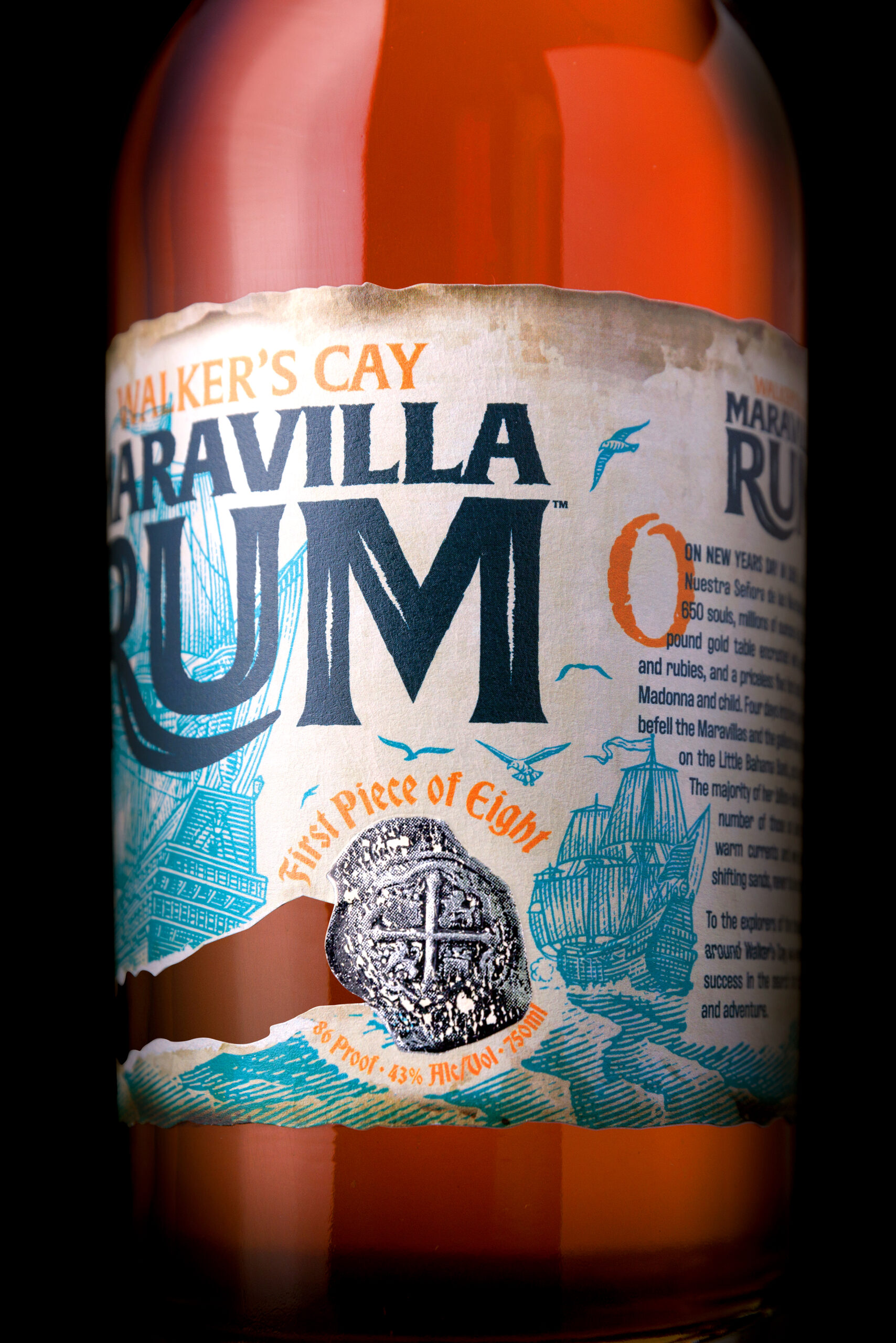
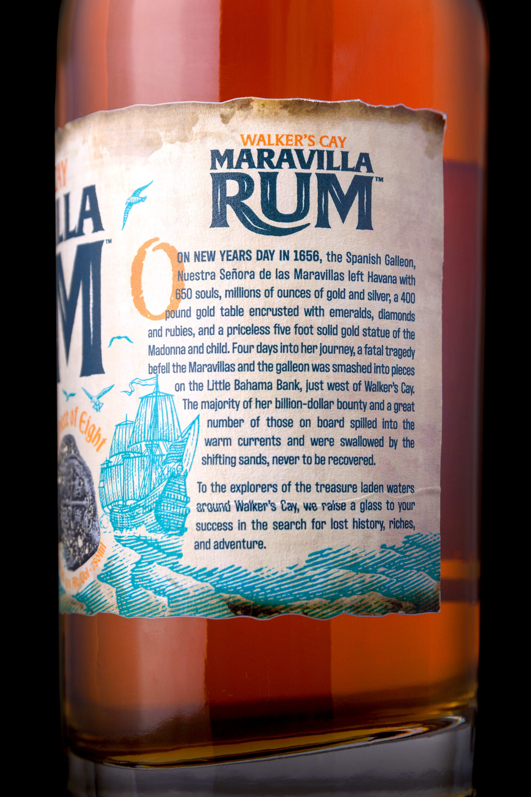
The branding and label for the Maravilla Rum represents the fateful trip of the Spanish Galleon, Nuestra Senora de las Maravillas on New Year’s Day in 1656. Four days into her journey she smashed to pieces on Little Bahama Bank with 650 souls on board. In addition to the tragic loss of life, millions of ounces of gold and silver were spread across the ocean floor along with a 400lb gold table encrusted with emeralds, diamonds and ruby’s, and a priceless 5ft statue of Madonna and child. To this day, most of this treasure remains undiscovered.
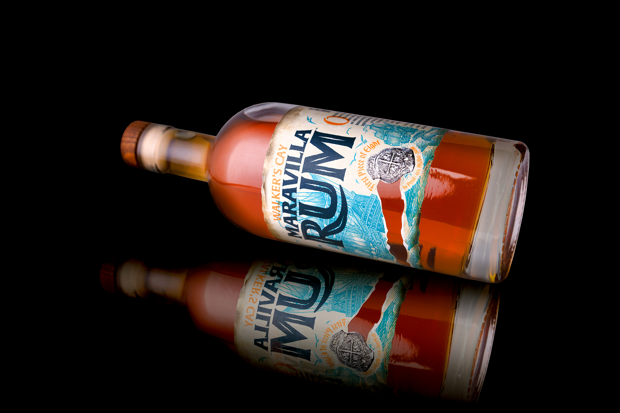
In developing the creative we imagined the rum itself as part of this lost treasure, found hundred’s of years later, weathered and worn, as it washes up along the shore. And with the crew lost at sea, we use the label to reveal elements of the story. For instance, the position, angle and direction of the Maravilla are important as they illustrate the harrowing fait that awaits as she sets sail towards the tear in the label, never to return. The puff of smoke on the port side of the distant ship is cannon fire which was sent as a warning of the high ground ahead (unfortunately this was not seen in time). The medallion fixed to the face, known as a “Piece of Eight”, is treasure found in the wreckage, worn away from the shifting tides of the salt waters.
All that said, the treasure is certainly not lost forever. Although not shown, on the underside of the label there is a treasure map to the last know whereabouts of the Nuestra Senora de las Maravillas. The map is slowly revealed as you responsibly enjoy your bottle of Maravilla Rum.
We had fun exploring the history of the Nuestra Senora de las Maravillas, but there are a number of tactile elements that help bring life to this label. The label appears weathered and torn along the edges and tear, and thanks the production team at Resource Label we were able to create 3 different dies to give an individuality to the bottles – creating a sense of ownership for the consumer. The medallion, although obviously not the real thing, was given a specific foil treatment to give the impression of treasure but also account for the aforementioned shifting tides that would wear away the shine of the metal. Lastly, we used a heavier stock to foster the look of an actual label that would be used during the 1600’s which gave us the opportunity to create a deboss effect along the story side, accounting for a very slight, deliberate “tear/offset” within the last paragraph of the story.
The team at Fat Basset Design is incredibly proud of the completed work but it was a total team effort. So we’d be remiss not to mention the talent of Steven Noble whose illustration gave us the foundation to move forward; Resource Label Group printing which brought life to our vision; and MacKenzie Hennessey whose photography gave the creative a breath of fresh air.