Designed by: PepsiCo Design & Innovation
Country: United States

Adirondack Whisky

adirondack

Designed by: Joe Farquharson | Country: United States

“Brand concept and packaging design for a fictional single malt whisky (spelled with no ‘e’, Scotch-style) and distillery based in upstate New York.

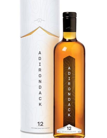
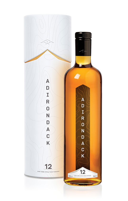
The bottle is tall and slim with broad shoulders; coupled with the contour lines used on the labels and the cylinder, it hints at the height and shape of the mountain range that it is surrounded by. Labels are set in muted brown and silver tones to highlight the strength of the whisky’s color. The brand name ‘Adirondack’ is printed vertically on the bottle’s front, transposed over the rear label graphic, adding depth and movement. All facets of the packaging honor the geography of the area it comes from while still presenting the simple, classy image popular with younger consumers.”

Get the latest packaging design inspiration in your inbox:

Popular designs

Pure Persian Honey

When we look closely at honey packaging, they are almost all in the usual format, and the ultimate in creativity is that

Over the wave

This Kombucha originates in Lombok, Indonesia, where its paradise beaches attract hundreds of surfers eager to ride the waves. When you surf,

The Bra Guru

Most women are wearing the wrong size bra and that is a fact. The Bra Guru® is the first and only professional

Designed by: PepsiCo Design & Innovation
Country: United States

Adirondack Whisky

adirondack

Designed by: Joe Farquharson | Country: United States

“Brand concept and packaging design for a fictional single malt whisky (spelled with no ‘e’, Scotch-style) and distillery based in upstate New York.

The bottle is tall and slim with broad shoulders; coupled with the contour lines used on the labels and the cylinder, it hints at the height and shape of the mountain range that it is surrounded by. Labels are set in muted brown and silver tones to highlight the strength of the whisky’s color. The brand name ‘Adirondack’ is printed vertically on the bottle’s front, transposed over the rear label graphic, adding depth and movement. All facets of the packaging honor the geography of the area it comes from while still presenting the simple, classy image popular with younger consumers.”

Previous slide
Next slide

Explore more great package design

Get the latest on packaging design in your inbox: