Designed by: PepsiCo Design & Innovation
Country: United States

Alchemist

lovely-package-alchemist-1

Designed by SVYR | Country: Canada

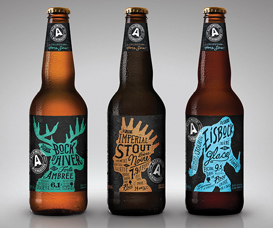
“Totally non-commercial specialty beers. A brand keeping true to real microbrewery beers lovers.

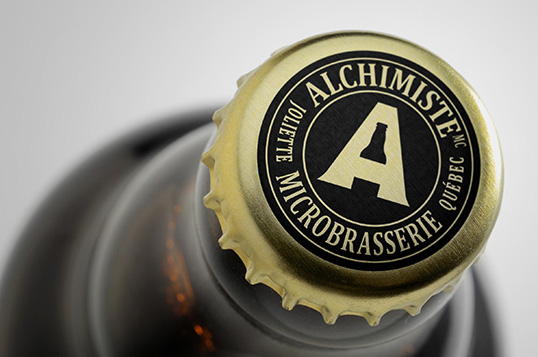
Context: The Alchemist is a well known microbrewery from Joliette in Québec, Canada. I have previously rebranded its commercial beer line up.

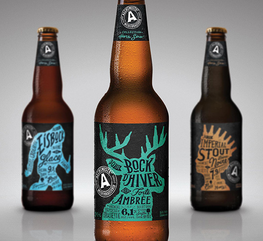
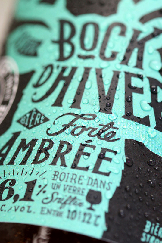
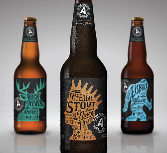
Challenge: Create a new look for the Alchemist specialty beers that resonate with true microbrewery enthusiasts. A look that is strong enough to compensate the fact the the bottles would have the same size as commercial beers.

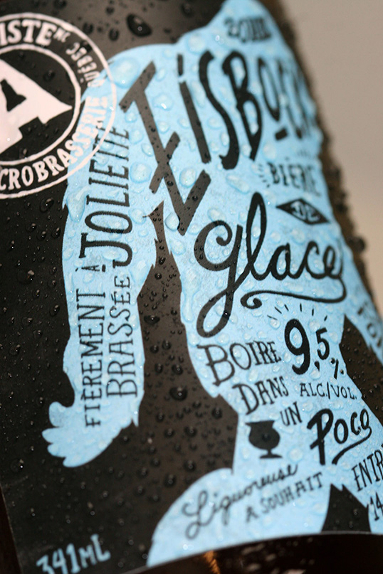
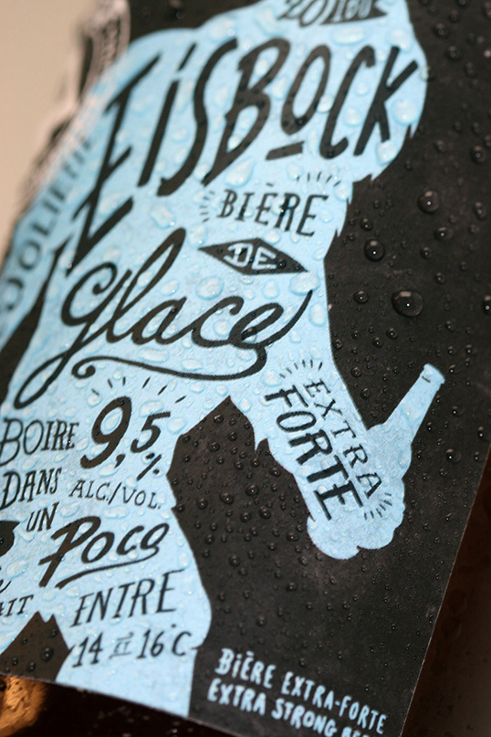
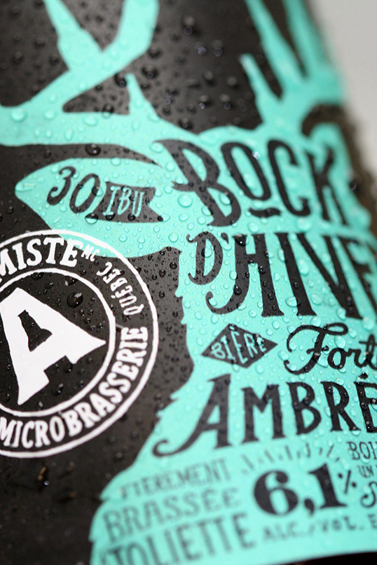
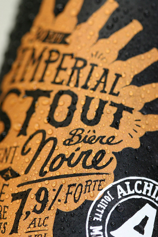
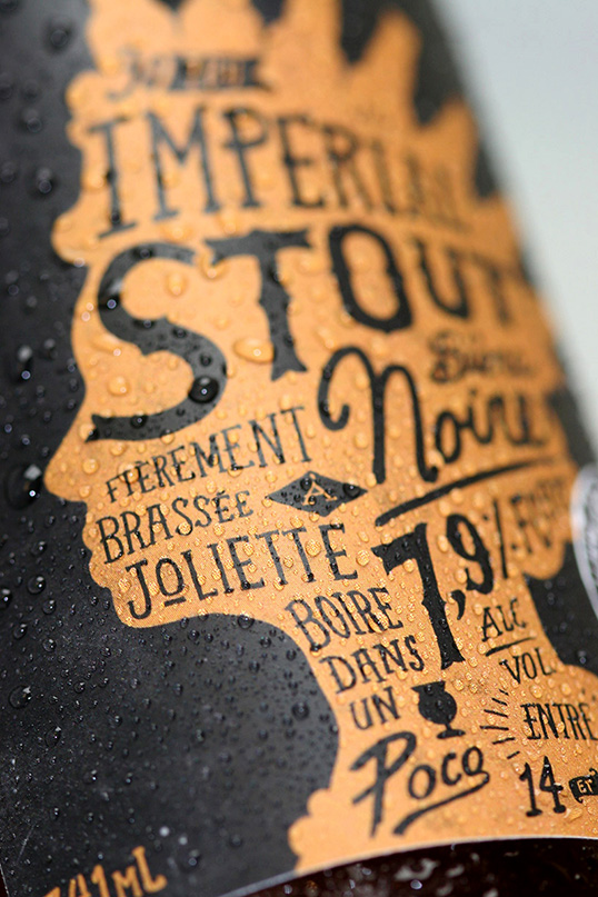
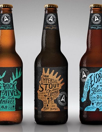
Solution: Stepping away from the somewhat commercial looking mainstream line up and go for a completely different approach. A 100% hand crafted design that reflect what true microbrewery is all about. Using an illustrative approach that is inspired by the beers names, with hidden beer bottles (a wink to the hidden beer bottle in negative space in the brand logo). I also created a specific specialty brand stamp to make sure that there is a separation between the commercial line up logo and this sub-brand.”

lovely-package-alchemist-8 lovely-package-alchemist-10 lovely-package-alchemist-9 lovely-package-alchemist-2 lovely-package-alchemist-3 lovely-package-alchemist-4 lovely-package-alchemist-5 lovely-package-alchemist-7 lovely-package-alchemist-6 lovely-package-alchemist-11

Get the latest packaging design inspiration in your inbox:

Popular designs

Burma Love Rebrand

Love at First BiteAs an extension of the Burma Superstar restaurant in San Francisco, Burma Love Foods gives diners an opportunity to

The Bra Guru

Most women are wearing the wrong size bra and that is a fact. The Bra Guru® is the first and only professional

The Port Vodka Lemon Water

Overview: In response to my client’s vision for a Cape Cod themed beverage brand, I embarked on the journey to create The Port

Designed by: PepsiCo Design & Innovation
Country: United States

Alchemist

lovely-package-alchemist-1

Designed by SVYR | Country: Canada

“Totally non-commercial specialty beers. A brand keeping true to real microbrewery beers lovers.

Context: The Alchemist is a well known microbrewery from Joliette in Québec, Canada. I have previously rebranded its commercial beer line up.

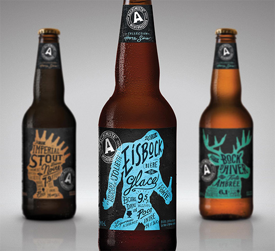
Challenge: Create a new look for the Alchemist specialty beers that resonate with true microbrewery enthusiasts. A look that is strong enough to compensate the fact the the bottles would have the same size as commercial beers.

Solution: Stepping away from the somewhat commercial looking mainstream line up and go for a completely different approach. A 100% hand crafted design that reflect what true microbrewery is all about. Using an illustrative approach that is inspired by the beers names, with hidden beer bottles (a wink to the hidden beer bottle in negative space in the brand logo). I also created a specific specialty brand stamp to make sure that there is a separation between the commercial line up logo and this sub-brand.”
lovely-package-alchemist-8 lovely-package-alchemist-10 lovely-package-alchemist-9 lovely-package-alchemist-2 lovely-package-alchemist-3 lovely-package-alchemist-4 lovely-package-alchemist-5 lovely-package-alchemist-7 lovely-package-alchemist-6 lovely-package-alchemist-11

Previous slide
Next slide

Explore more great package design

Get the latest on packaging design in your inbox: