Designed by: PepsiCo Design & Innovation
Country: United States

Alexey Lysogorov Designs The Packaging of Morojenka Ice Cream

Designed by: Alexey Lysogorov | Country: Kyrgyzstan

Morojenka, a new Kyrgyzstan-based ice cream brand, is set to take the Asian market by storm. “Morojenka” is another word for ice cream in some Central Asian languages. The word literally describes the brand, which is an added advantage for the company.

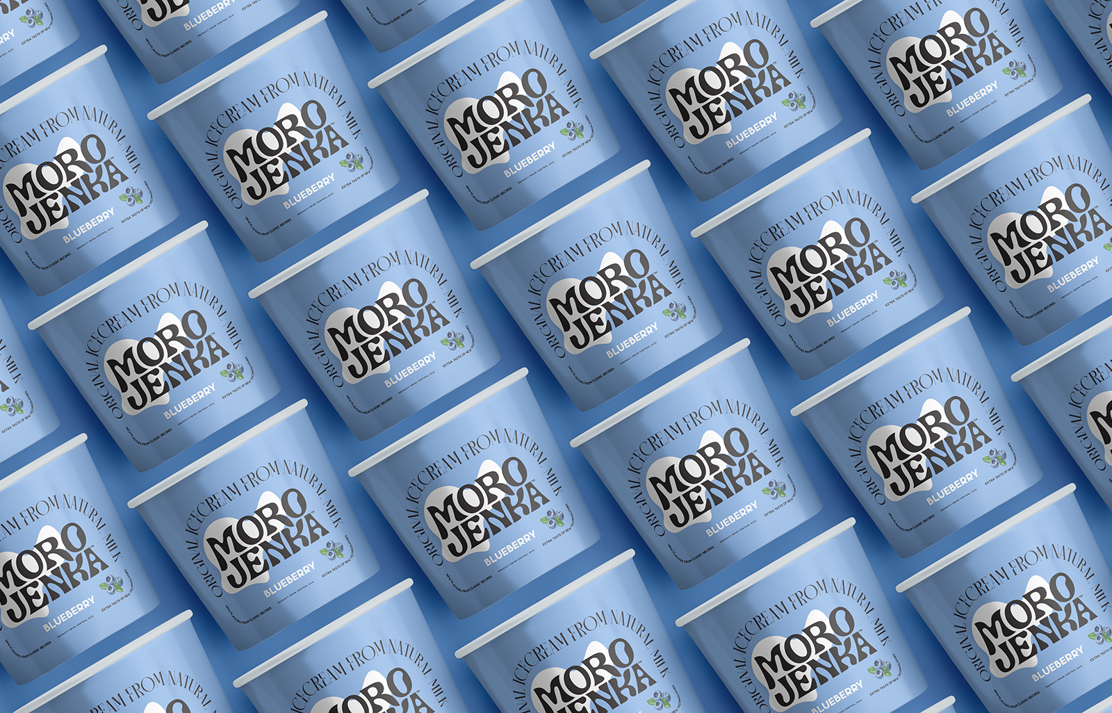
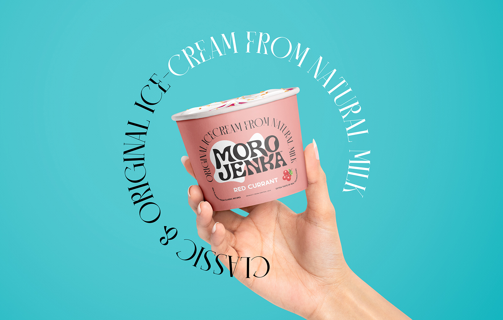
Designed by Alexey Lysogorov, the branding and packaging graphically accentuate the varied flavors of Morojenka.

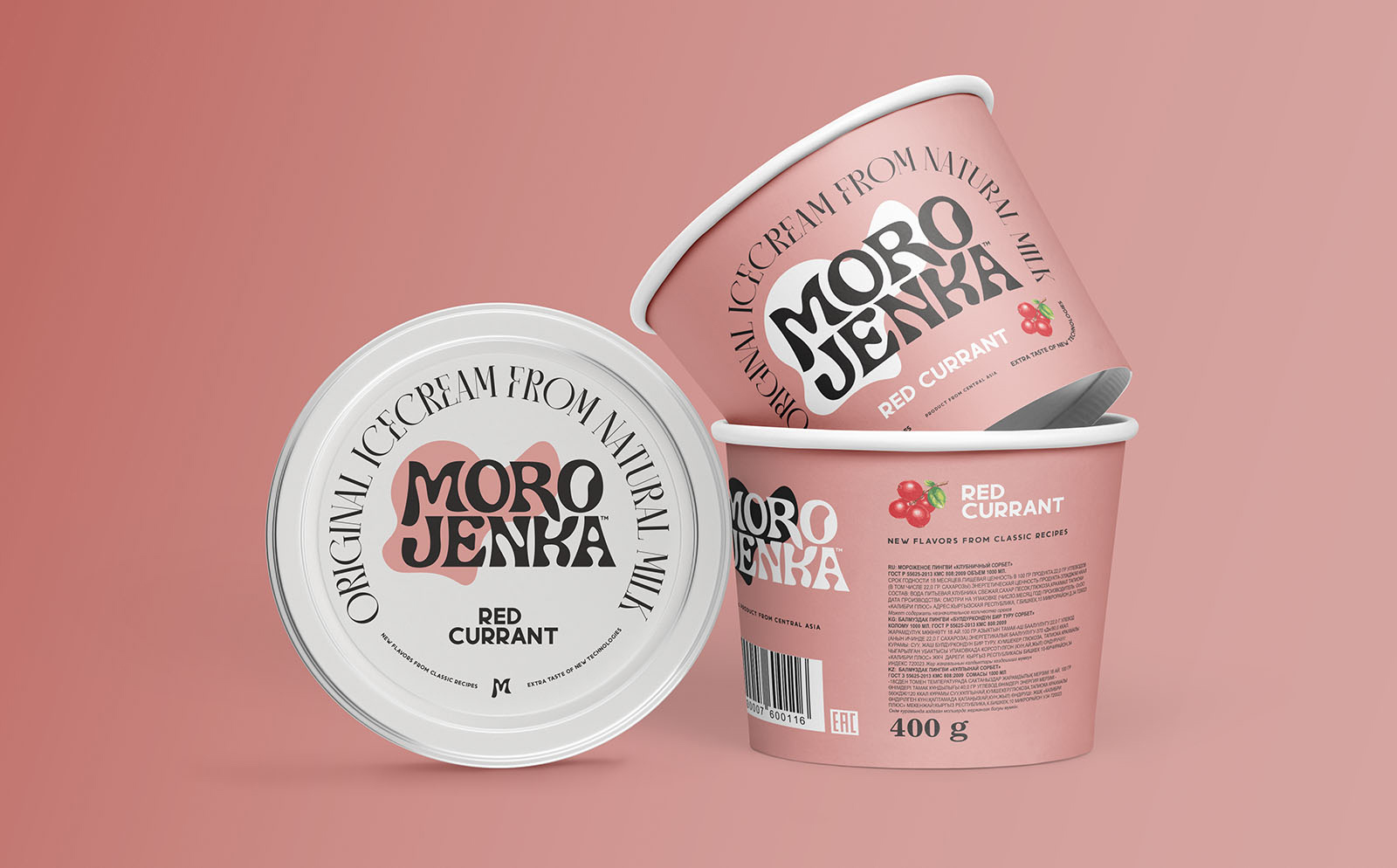
“The design is inspired by Art Nouveau (Modern). Sleek shapes and classic fonts are great for classic ice cream recipes and its real forms: streamlined, flexible and tasty. The design of “Morojenka” is certainly not an imitation or a reconstruction of 19th century labels. “Morojenka” is just inspiration from the past but created using modern graphic design language…”
Alexey Lysogorov Designs The Packaging of Morojenka Ice Cream

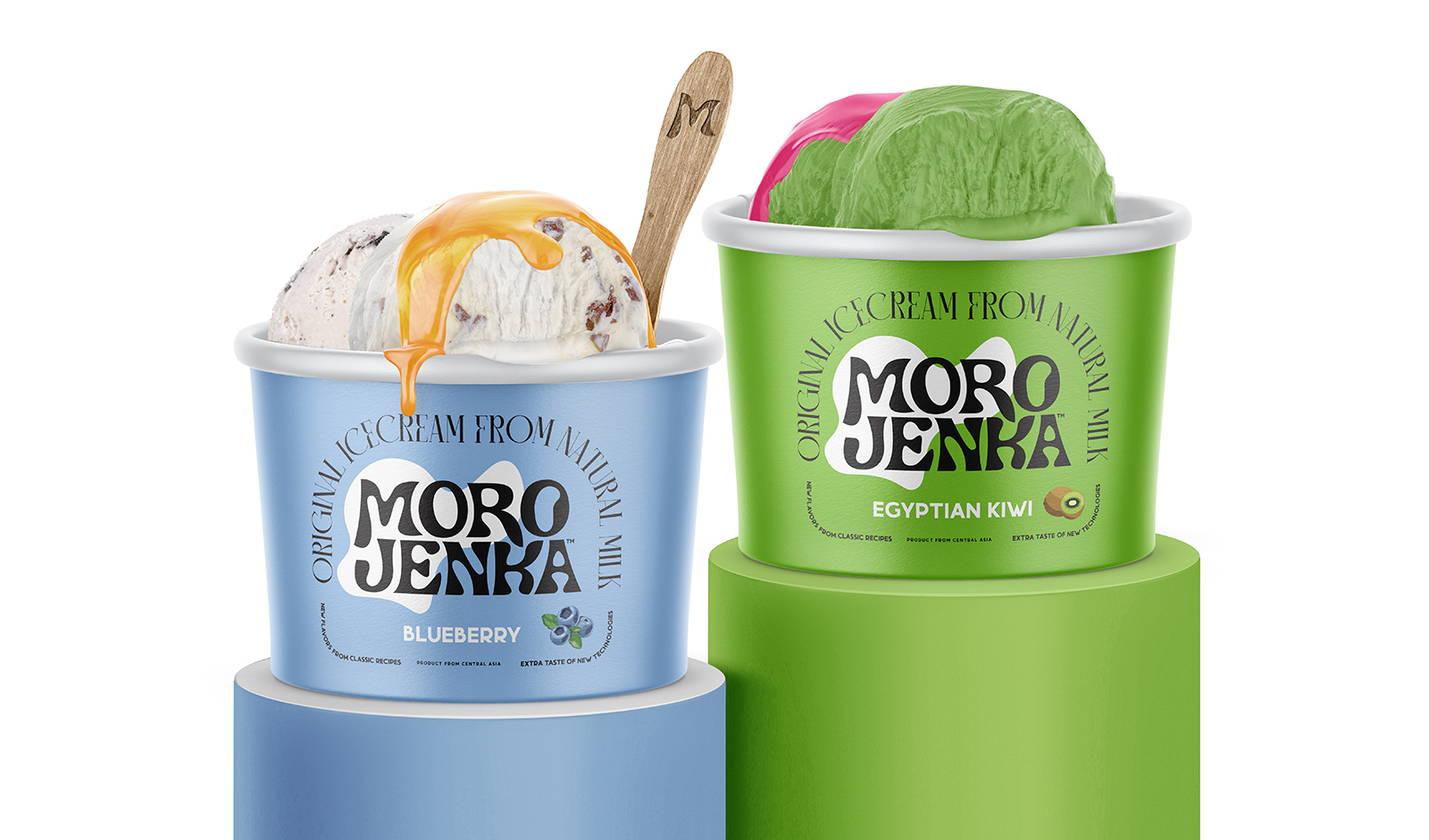
The brand has launched four flavors and has been packaged using simple color schemes. The colors of the cup and the products match, making it easier for the customers to choose their favorite flavor.

“…With a simple construction where the brand’s logo remains a predominantly black and white identifier, new flavors in the brand’s lineup will easily emerge in the future. The design can be easily inserted into any other media: bags, posters, brand advertising. By simply changing the color background, a branding system was developed for different advertising media.


Get the latest packaging design inspiration in your inbox:

Popular designs

Pure Persian Honey

When we look closely at honey packaging, they are almost all in the usual format, and the ultimate in creativity is that

Over the wave

This Kombucha originates in Lombok, Indonesia, where its paradise beaches attract hundreds of surfers eager to ride the waves. When you surf,

Designed by: PepsiCo Design & Innovation
Country: United States

Alexey Lysogorov Designs The Packaging of Morojenka Ice Cream

Designed by: Alexey Lysogorov | Country: Kyrgyzstan

Morojenka, a new Kyrgyzstan-based ice cream brand, is set to take the Asian market by storm. “Morojenka” is another word for ice cream in some Central Asian languages. The word literally describes the brand, which is an added advantage for the company.

Designed by Alexey Lysogorov, the branding and packaging graphically accentuate the varied flavors of Morojenka.

“The design is inspired by Art Nouveau (Modern). Sleek shapes and classic fonts are great for classic ice cream recipes and its real forms: streamlined, flexible and tasty. The design of “Morojenka” is certainly not an imitation or a reconstruction of 19th century labels. “Morojenka” is just inspiration from the past but created using modern graphic design language…”
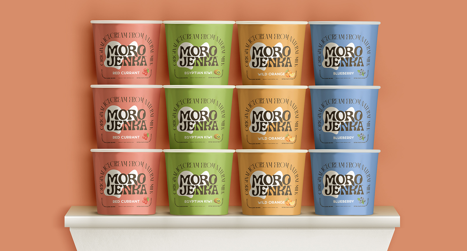
Alexey Lysogorov Designs The Packaging of Morojenka Ice Cream

The brand has launched four flavors and has been packaged using simple color schemes. The colors of the cup and the products match, making it easier for the customers to choose their favorite flavor.

“…With a simple construction where the brand’s logo remains a predominantly black and white identifier, new flavors in the brand’s lineup will easily emerge in the future. The design can be easily inserted into any other media: bags, posters, brand advertising. By simply changing the color background, a branding system was developed for different advertising media.

Previous slide
Next slide

Explore more great package design

Get the latest on packaging design in your inbox: