Designed by: PepsiCo Design & Innovation
Country: United States

Amrut Whiskey Packaging Design

2

Designed by: Studio Boam | Country: France

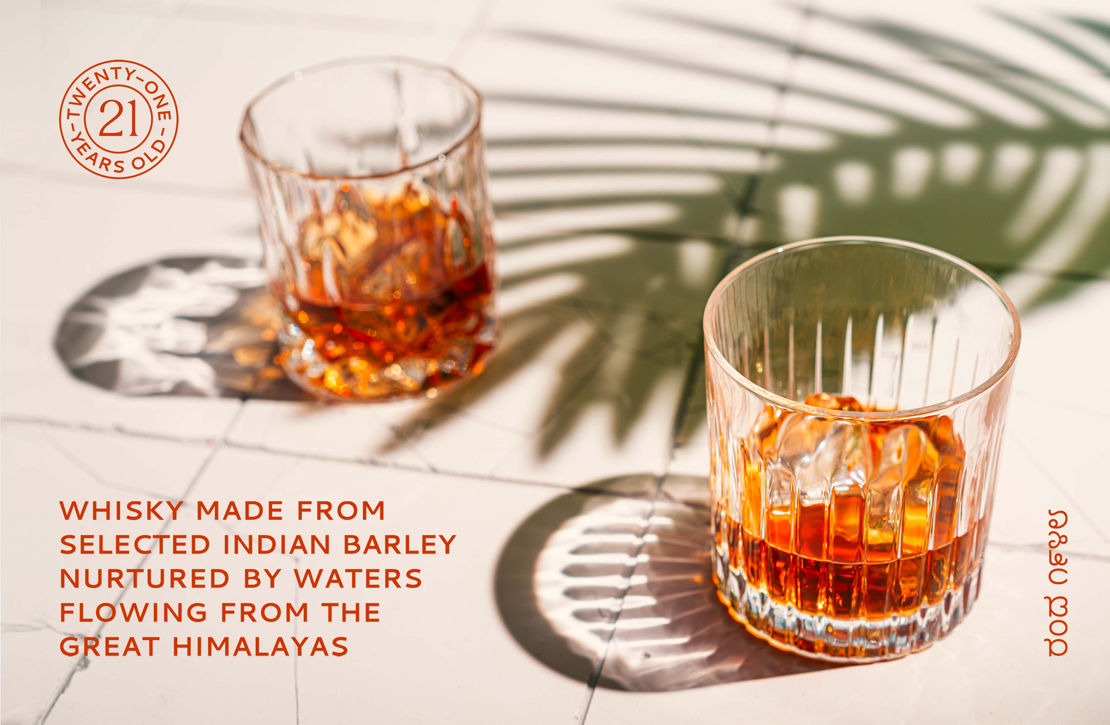
King Cobra, snake charmers, rope magic, and dense jungles are some images that pop up in a European’s mind when they think of India. Amrut, an Indian-origin whiskey, uses similar images on its packaging label to attract customers.

“A journey between myth and tradition

Amrut, is a whiskey of Indian origin, but with a bottle originating from the more European-inspired codes of the existing spirits in the range.

With this limited series, Studio Boam is reconciling codes drawn from both the culture and the imagination of the Asian continent.”
Amrut Whiskey Packaging Design

The packaging

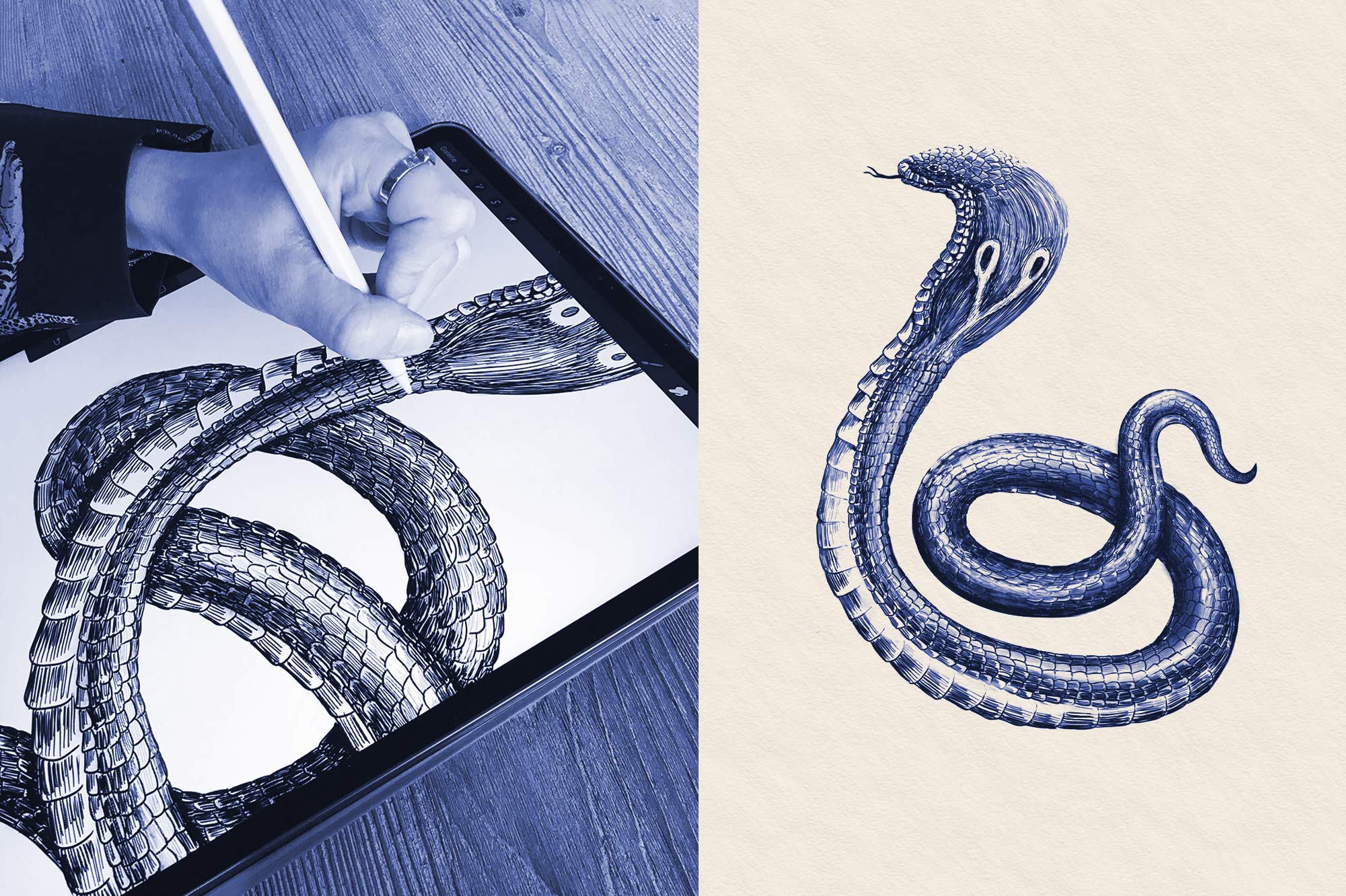
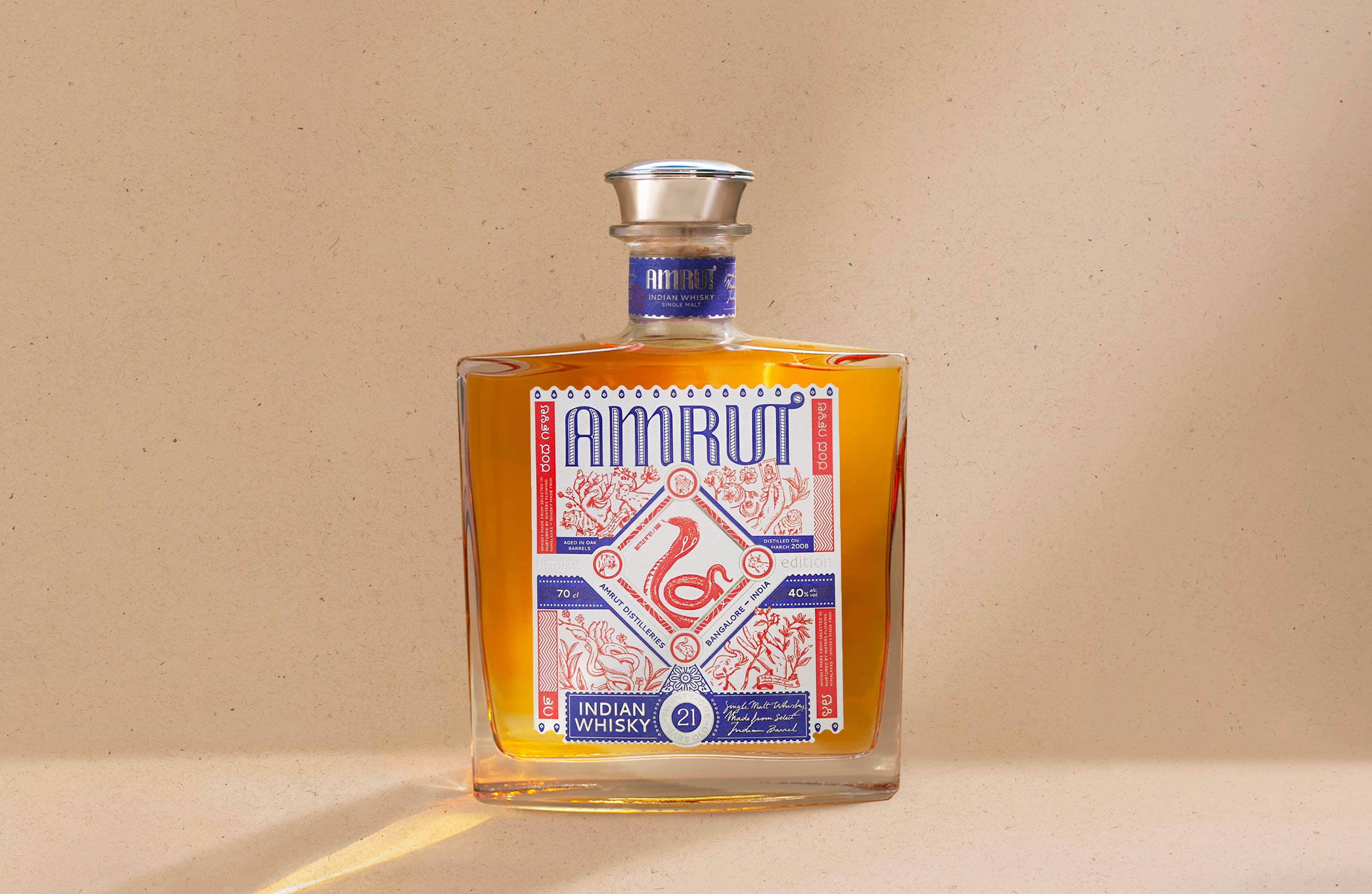
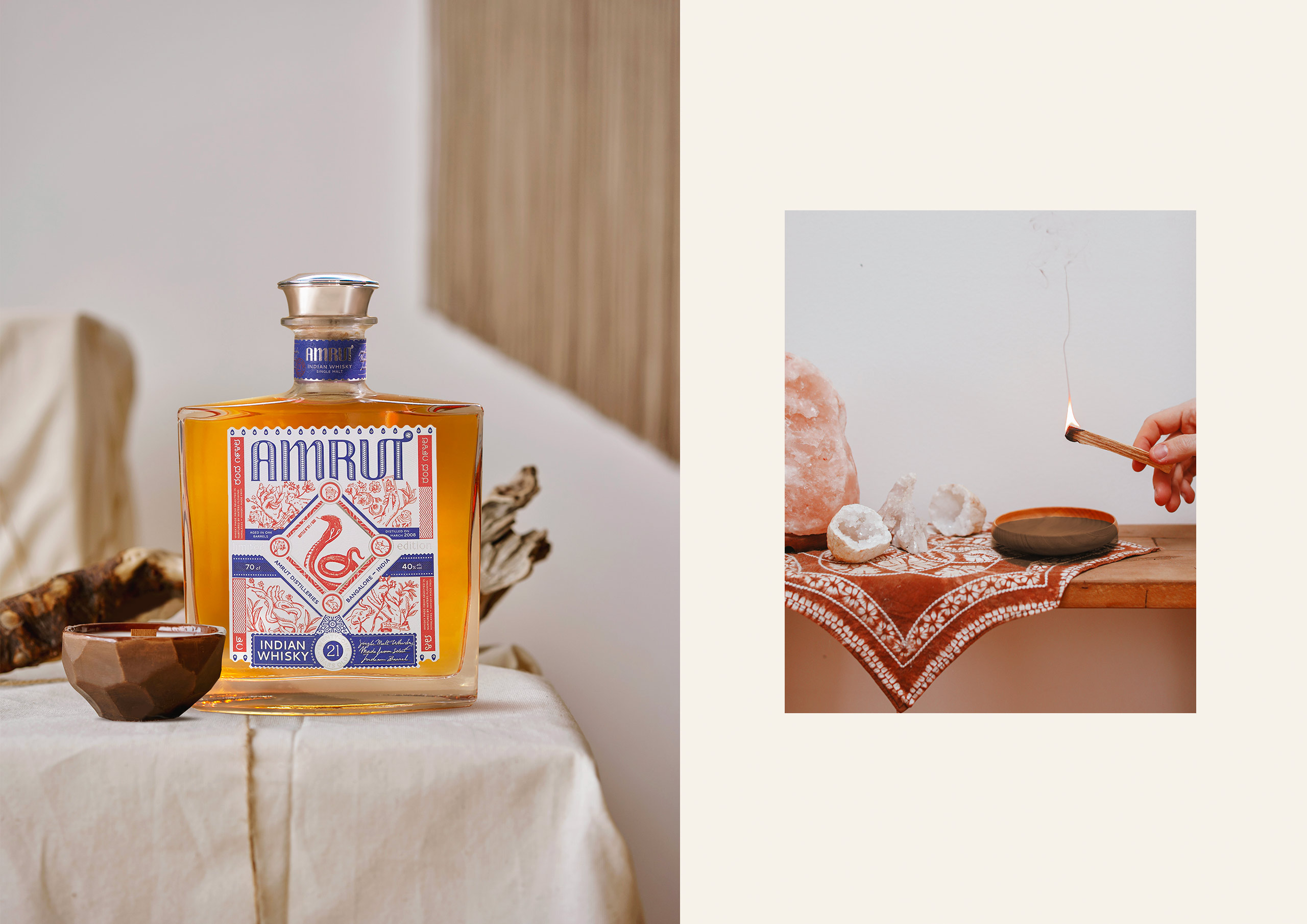
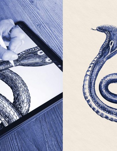
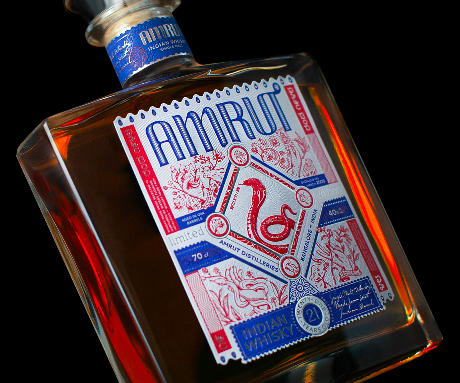
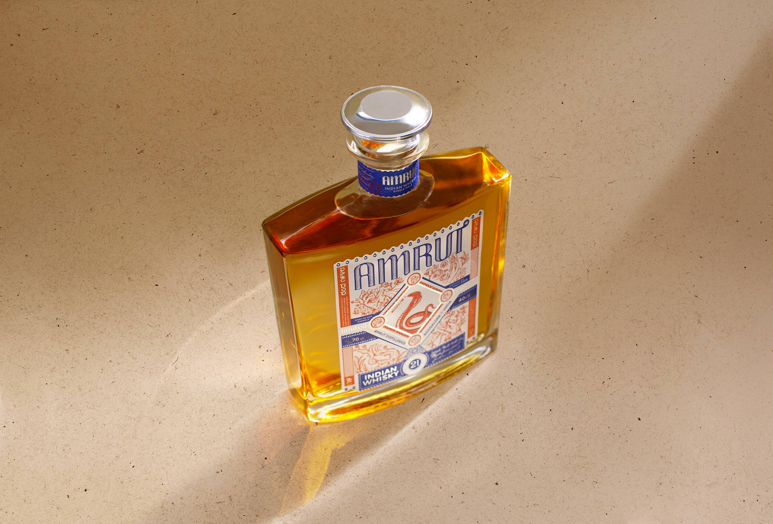
Amrut partnered with Studio Boam, an award-winning Paris-based branding agency, to create packaging designs that would highlight the spirit’s Indian origins. The focal point of the packaging design is a King Cobra sitting majestically at the center of the label. The dreamlike decors that surround the hooded serpent evoke mystical feelings associated with India.

“The Studio’s approach was to work on a simple label, in keeping with the geometry of the decanter but to make it rich in cultural and graphic evocations.

We conceived of a label subdivided into several sections with many small decorative and narrative elements that subtly evoke myth-filled dreamlike decors.

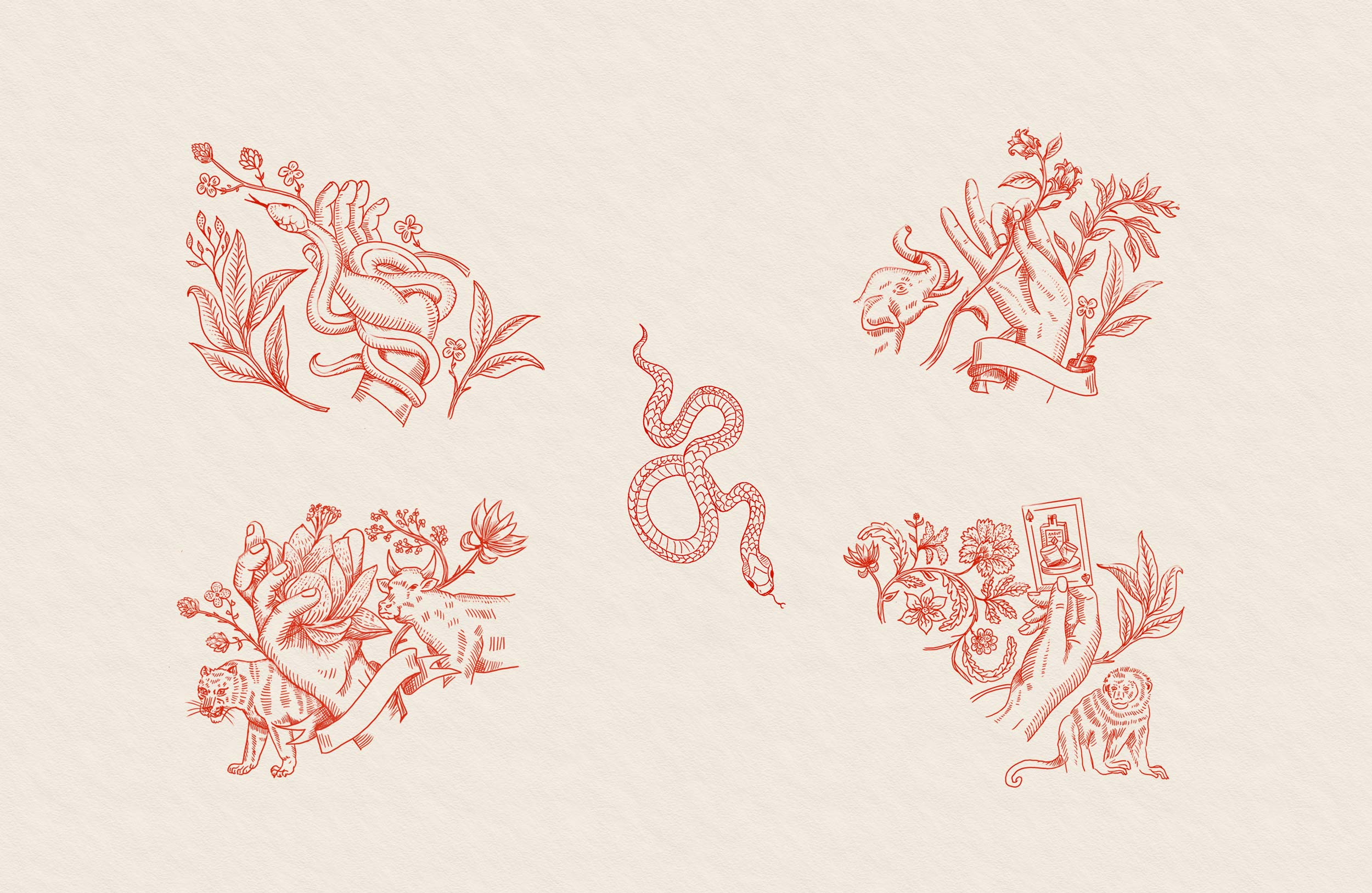
Around a central window occupied by an Indian cobra, four ‘scenes’ are revealed with the common element being illustrations of animals and their associated deities. They interact with each other to form a composition teeming with detail, both light in its treatment and stylish in the design of its patterns.

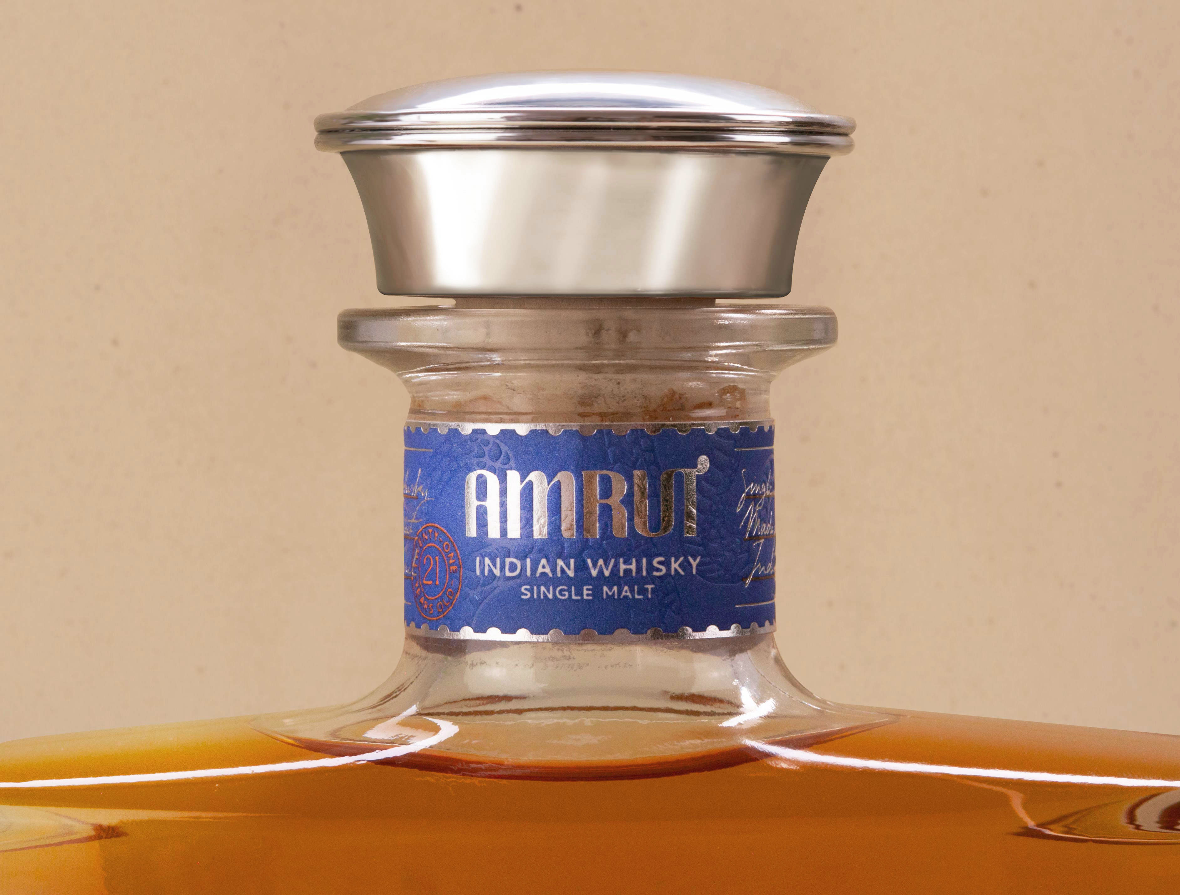
Just a touch of silver hot stamping underlines and intensifies the duotone blue and red colors of the whole. A subtle frame that picks up on traditional Indian motifs, on the paper and in color, immersing us further within the world and the culture of India while retaining a certain restraint in its expression.

2

Get the latest packaging design inspiration in your inbox:

Popular designs

The Port Vodka Lemon Water

Overview: In response to my client’s vision for a Cape Cod themed beverage brand, I embarked on the journey to create The Port

Over the wave

This Kombucha originates in Lombok, Indonesia, where its paradise beaches attract hundreds of surfers eager to ride the waves. When you surf,

Burma Love Rebrand

Love at First BiteAs an extension of the Burma Superstar restaurant in San Francisco, Burma Love Foods gives diners an opportunity to

Designed by: PepsiCo Design & Innovation
Country: United States

Amrut Whiskey Packaging Design

2
Amrut 9

Designed by: Studio Boam | Country: France

King Cobra, snake charmers, rope magic, and dense jungles are some images that pop up in a European’s mind when they think of India. Amrut, an Indian-origin whiskey, uses similar images on its packaging label to attract customers.

“A journey between myth and tradition

Amrut, is a whiskey of Indian origin, but with a bottle originating from the more European-inspired codes of the existing spirits in the range.

With this limited series, Studio Boam is reconciling codes drawn from both the culture and the imagination of the Asian continent.”
Amrut Whiskey Packaging Design

The packaging

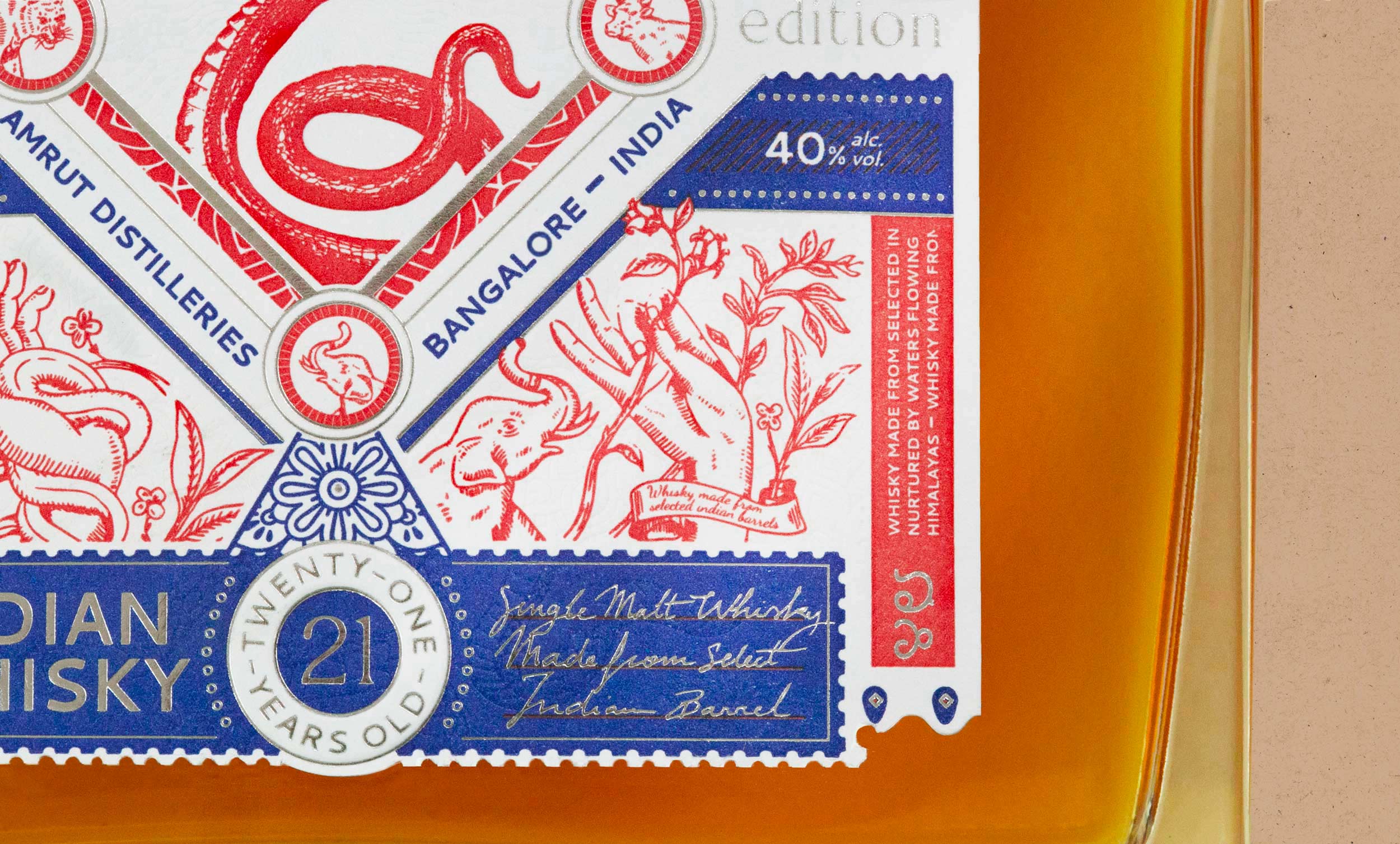
Amrut partnered with Studio Boam, an award-winning Paris-based branding agency, to create packaging designs that would highlight the spirit’s Indian origins. The focal point of the packaging design is a King Cobra sitting majestically at the center of the label. The dreamlike decors that surround the hooded serpent evoke mystical feelings associated with India.

“The Studio’s approach was to work on a simple label, in keeping with the geometry of the decanter but to make it rich in cultural and graphic evocations.

We conceived of a label subdivided into several sections with many small decorative and narrative elements that subtly evoke myth-filled dreamlike decors.

Around a central window occupied by an Indian cobra, four ‘scenes’ are revealed with the common element being illustrations of animals and their associated deities. They interact with each other to form a composition teeming with detail, both light in its treatment and stylish in the design of its patterns.

Just a touch of silver hot stamping underlines and intensifies the duotone blue and red colors of the whole. A subtle frame that picks up on traditional Indian motifs, on the paper and in color, immersing us further within the world and the culture of India while retaining a certain restraint in its expression.

2
Previous slide
Next slide

Explore more great package design

Get the latest on packaging design in your inbox: