Designed by Squad Ink | Country: Australia
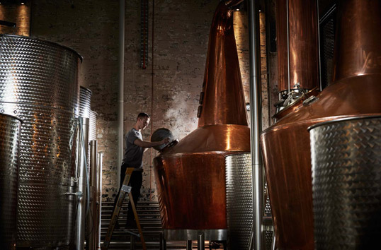
“Archie Rose Distilling Co. is the first independent distillery of craft spirits in the City of Sydney since 1853. Archie Rose honours this rich history while offering Sydney-siders the chance to experience genuine grain-to-glass spirit production onsite with an incredible cocktail bar to boot.
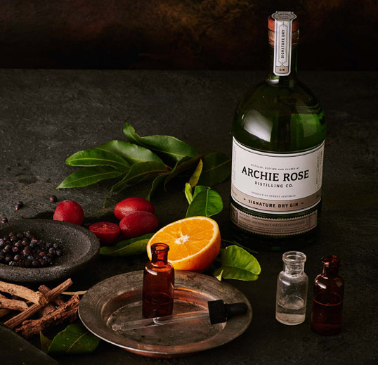
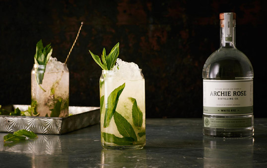
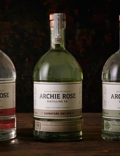
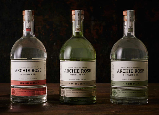
Squad Ink was engaged to brand, package and launch this incredible craft distillery and range of spirits, including a Dry Gin, Original Vodka and a White Rye.
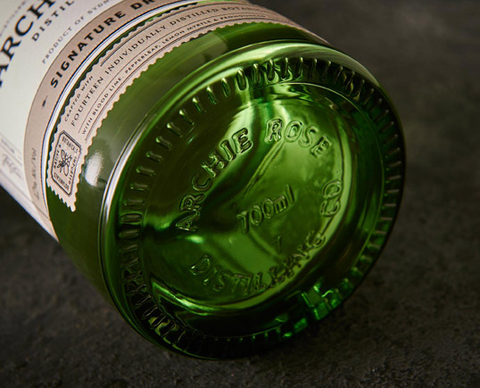
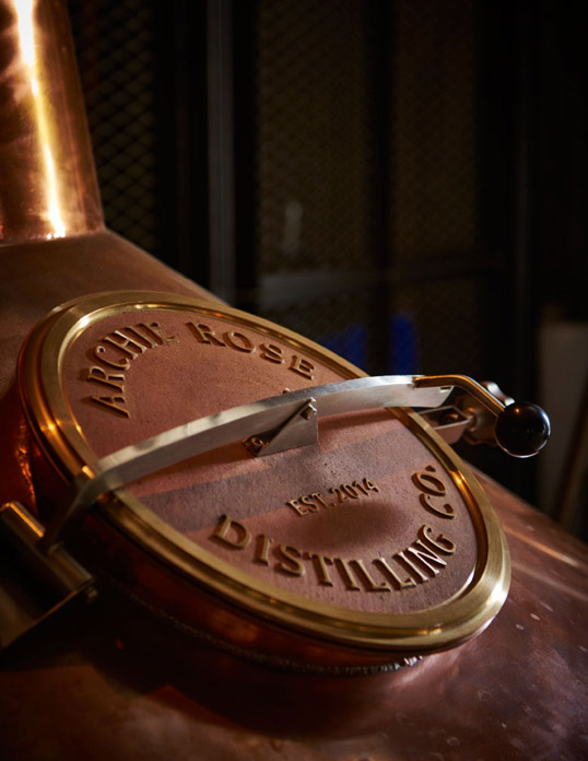
We opted for a heavy-weighted base, bullet style bottle that borrows its shape from the copper pot stills from which the gin, vodka and whisky flow. It’s a nod to the classic whisky bottles of the prohibition era in the United States – confident yet completely unpretentious. Of course, the specific bottle we sketched out didn’t exist as a stock bottle so we had a custom mould created. This opportunity allowed us to distribute more glass in specific areas, such as the neck and shoulder, making way for an authentic mottled glass appearance and heavy in-hand assertiveness. We also added a 360 degree recessed label indentation across the so that the full-wrapped belly label could be profiled as a hallmark design feature. We also embossed “Archie Rose Distilling Co.” out of the base of the bottle in the fashion of a craftsman’s mark – subtle and out of plain sight.”
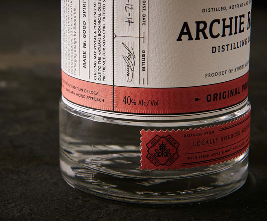
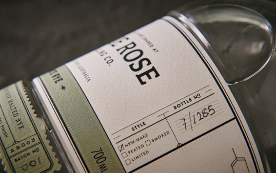
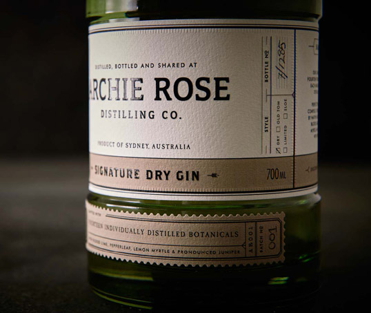
“Our approach for the label design is about honouring a ‘function led aesthetic’. Archie Rose is more than an alcohol brand it‘s a fully functional distillery with all products literally ‘made by hand’. More specifically, the production of the spirits from loading the various grain into the mash ton for fermentation to grinding and chopping botanicals to be loaded into the gin still is a very hands on process. Finally, the bottles are filled, capped, neck labelled and individually marked and signed. All aspects of the labels’ design and production have been considered to reinforce this truth. The success of the respective label design is a result of the carefully curated content that appears on them. Delivering this result required an in-depth understanding of spirit production at Archie Rose and the key ingredients used.
We’ve created packaging that is not only beautiful to admire but also wonderfully detailed and intriguing in a way that it beckons you to sit down with it and explore every piece of information it offers.”
