Designed by: PepsiCo Design & Innovation
Country: United States

Aroma

Aroma

Designed by 2yolk | Country: Greece

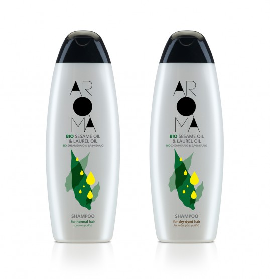
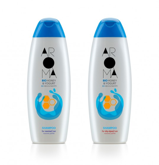
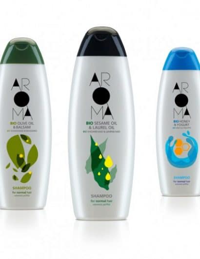
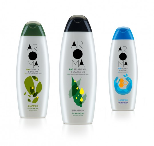
“We created the AROMA brand for an extensive range of Greek personal care products available in supermarkets. The range takes its name from the natural scented essential oils and other select organic ingredients contained in the products. (‘aroma’ in Greek being the word for perfume, scent or fragrance).

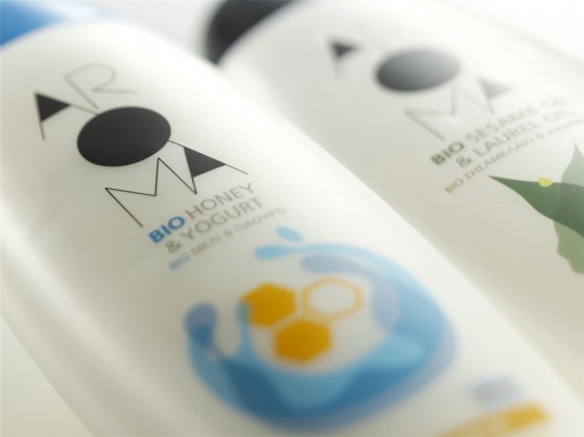
Our main concern was to differentiate the range from the competition on long shelves displaying this class of product in supermarkets. This is the reason why we avoided realist illustrations of fruits or water splashes.

For each of the three AROMA lines, we chose stylized, abstract depictions of the two main ingredients: olive leaves dancing with balsam flowers, bay leaves and golden sesame oil, and milk and honey. The typography is sharp and black, an interesting counterpoint to the bright colour palette of the graphic design.”

Aroma

Aroma

Aroma

Aroma


Get the latest packaging design inspiration in your inbox:

Popular designs

The Port Vodka Lemon Water

Overview: In response to my client’s vision for a Cape Cod themed beverage brand, I embarked on the journey to create The Port

Far Out Bar

Description: Far Out Bar is a cutting-edge packaging design project created for High Life Farms’ macrodose THC chocolate bars. This project involved

The Bra Guru

Most women are wearing the wrong size bra and that is a fact. The Bra Guru® is the first and only professional

Designed by: PepsiCo Design & Innovation
Country: United States

Aroma

lovely-package-aroma-1

Aroma

Designed by 2yolk | Country: Greece

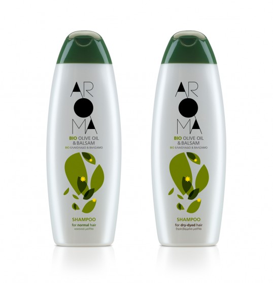
“We created the AROMA brand for an extensive range of Greek personal care products available in supermarkets. The range takes its name from the natural scented essential oils and other select organic ingredients contained in the products. (‘aroma’ in Greek being the word for perfume, scent or fragrance).

Our main concern was to differentiate the range from the competition on long shelves displaying this class of product in supermarkets. This is the reason why we avoided realist illustrations of fruits or water splashes.

For each of the three AROMA lines, we chose stylized, abstract depictions of the two main ingredients: olive leaves dancing with balsam flowers, bay leaves and golden sesame oil, and milk and honey. The typography is sharp and black, an interesting counterpoint to the bright colour palette of the graphic design.”
Aroma

Aroma

Aroma

Aroma


Previous slide
Next slide

Explore more great package design

Get the latest on packaging design in your inbox: