Designed by: PepsiCo Design & Innovation
Country: United States

Asavo Cosmetics Packaging Design

Designed by: Caroline Rubik | Country: Germany

Bettina, the founder of Asavo Cosmetics, makes these handcrafted beauty products at the foothills of the picturesque German Alps. From soaps to body oils, Bettina uses only natural ingredients in the various cosmetic products she creates. “Her goal is not only to use the power of nature but above all to use it in a way that conserves resources.”

“The impulse to found Asavo was given to her by her one-and-a-half-year-old niece, who tried to consume a cream from a tube. The question quickly arose as to how much of the ingredients such a small body could tolerate. The question was never finally answered, but the fact that there are alternatives was: There is no need to use substances in cosmetics that are controversial as to whether or not they have a negative effect on the human organism.

Asavo Cosmetics Packaging Design

The packaging

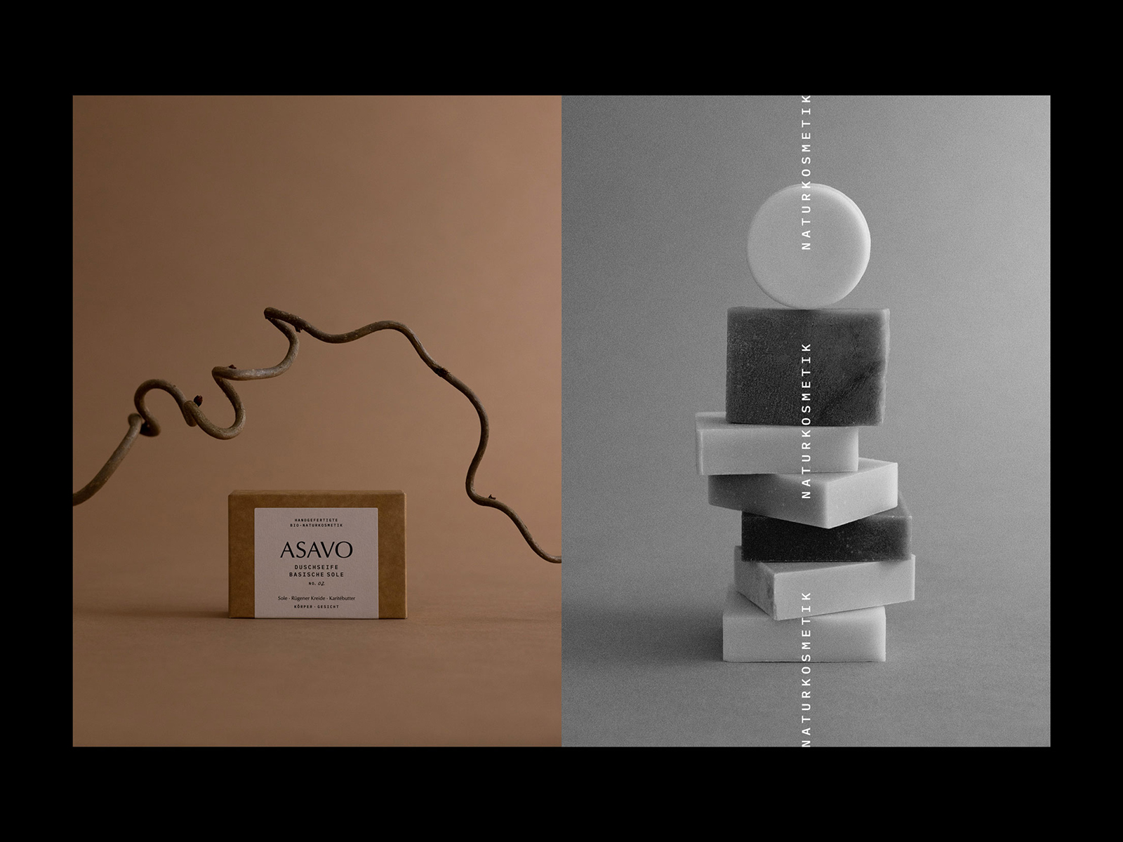
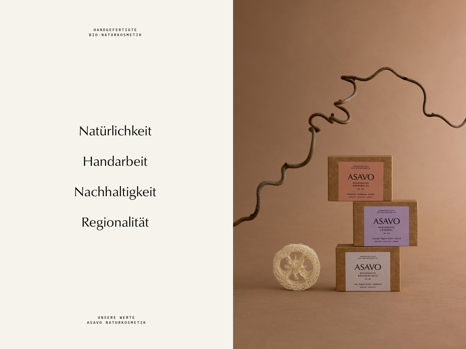
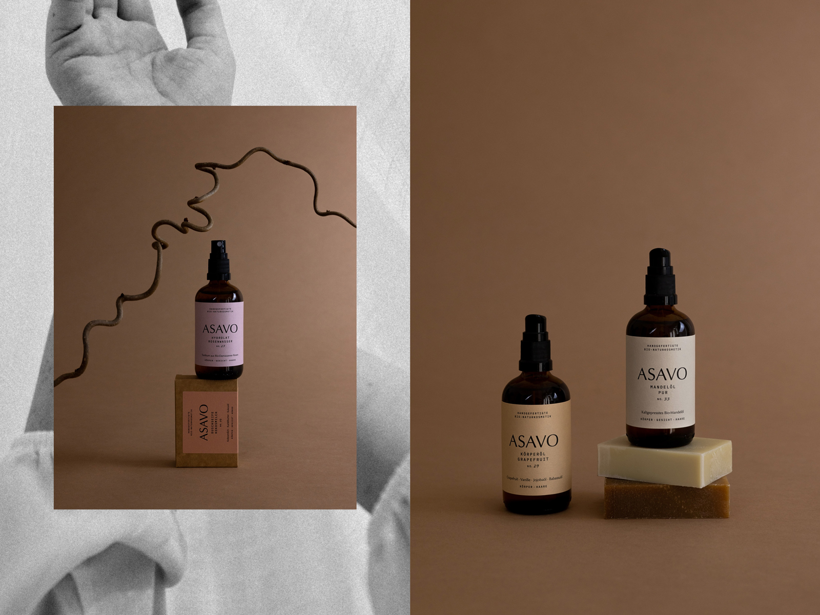
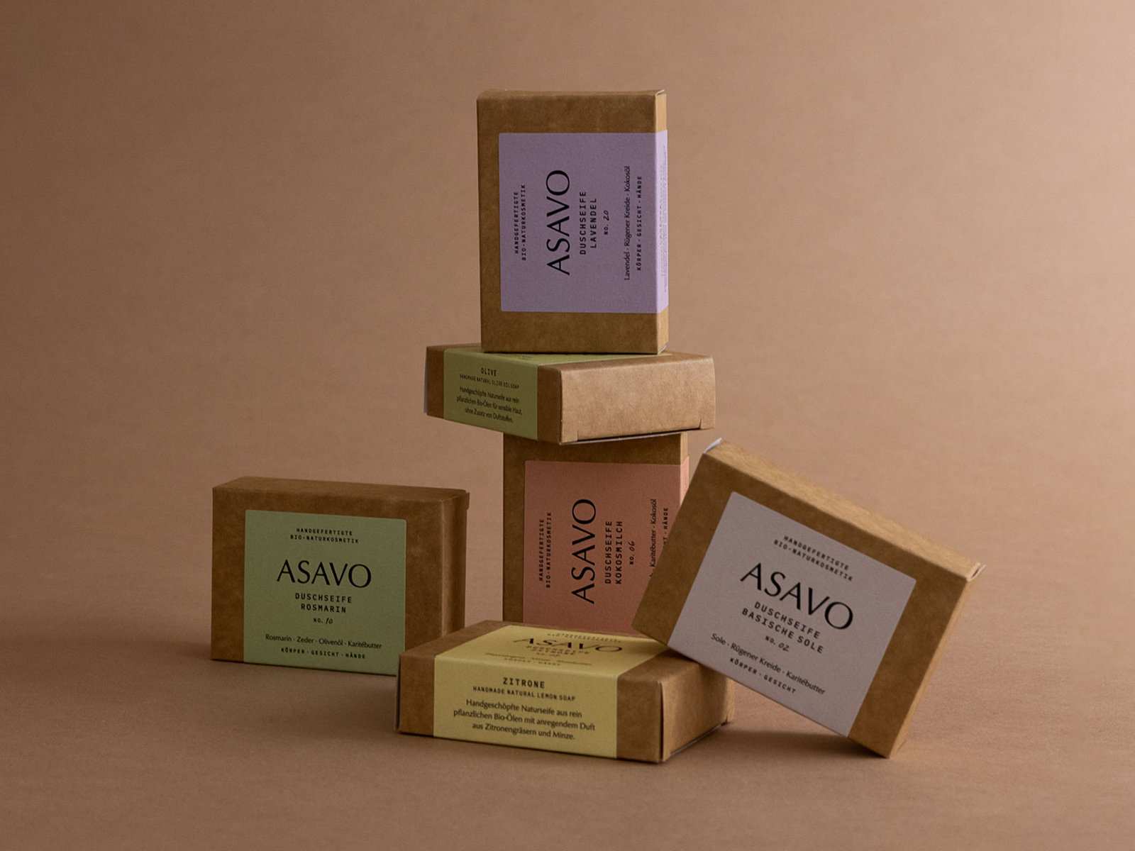
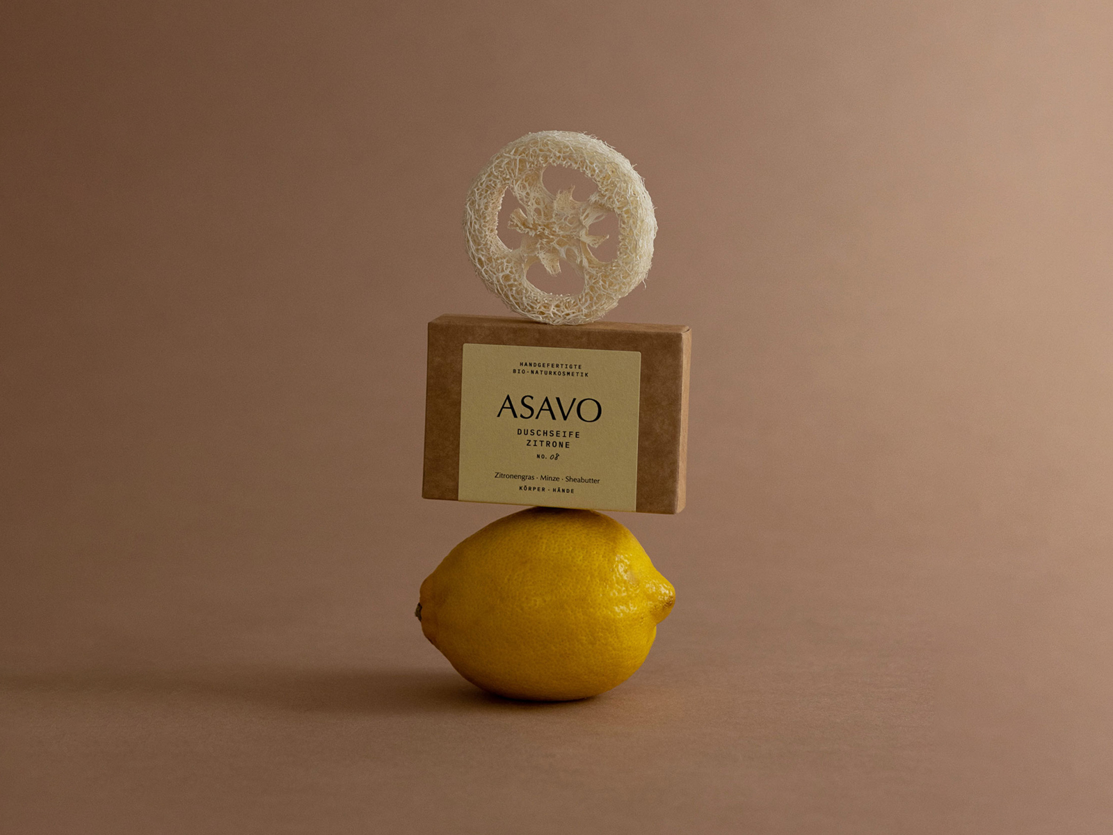
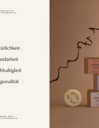
Bettina partnered with Caroline Rubik, a Cologne-based art director, to create the packaging designs for her products. Caroline’s creations are in line with the company’s values and vision. Furthermore, the packaging of each product matches the color of its primary ingredients, along with highlighting the purity and beauty of nature, just like the beautiful Alps. 

“Overall, it was important to me to transfer the sustainable approach and the focus on the essentials equally to the product labels. Each product now has a color that matches its main ingredient. The basic products are all given a uniform beige tone. I deliberately chose soft, natural and light colors to focus on the purity of nature here as well. In addition, the products are numbered consecutively, on the one hand to underline the artisan character of the own manufacture, on the other hand to give each product an individual and discrete touch.


Get the latest packaging design inspiration in your inbox:

Popular designs

Burma Love Rebrand

Love at First BiteAs an extension of the Burma Superstar restaurant in San Francisco, Burma Love Foods gives diners an opportunity to

Pure Persian Honey

When we look closely at honey packaging, they are almost all in the usual format, and the ultimate in creativity is that

Far Out Bar

Description: Far Out Bar is a cutting-edge packaging design project created for High Life Farms’ macrodose THC chocolate bars. This project involved

Designed by: PepsiCo Design & Innovation
Country: United States

Asavo Cosmetics Packaging Design

6-caroline-rubik-asavo-world-brand-design

Designed by: Caroline Rubik | Country: Germany

Bettina, the founder of Asavo Cosmetics, makes these handcrafted beauty products at the foothills of the picturesque German Alps. From soaps to body oils, Bettina uses only natural ingredients in the various cosmetic products she creates. “Her goal is not only to use the power of nature but above all to use it in a way that conserves resources.”

“The impulse to found Asavo was given to her by her one-and-a-half-year-old niece, who tried to consume a cream from a tube. The question quickly arose as to how much of the ingredients such a small body could tolerate. The question was never finally answered, but the fact that there are alternatives was: There is no need to use substances in cosmetics that are controversial as to whether or not they have a negative effect on the human organism.

Asavo Cosmetics Packaging Design

The packaging

Bettina partnered with Caroline Rubik, a Cologne-based art director, to create the packaging designs for her products. Caroline’s creations are in line with the company’s values and vision. Furthermore, the packaging of each product matches the color of its primary ingredients, along with highlighting the purity and beauty of nature, just like the beautiful Alps. 

“Overall, it was important to me to transfer the sustainable approach and the focus on the essentials equally to the product labels. Each product now has a color that matches its main ingredient. The basic products are all given a uniform beige tone. I deliberately chose soft, natural and light colors to focus on the purity of nature here as well. In addition, the products are numbered consecutively, on the one hand to underline the artisan character of the own manufacture, on the other hand to give each product an individual and discrete touch.

Previous slide
Next slide

Explore more great package design

Get the latest on packaging design in your inbox: