Designed by: PepsiCo Design & Innovation
Country: United States

Barista

lovely-package-barista-1

Designed by Neolab by Knowit | Country: Norway

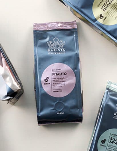
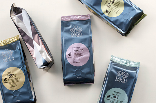
“Single Origin vs mixed products: Friele has changed their product line strategy and as a part of this we cleaned up the Barista line. The old Barista line had both espresso and blends mixed in between the singles. By moving them out we made a stronger concept and a stronger and more logic product line by presenting single origin products only. 

The re-design mission: The old Barista had over time become a blurry mix of 8 different blends and grinds and roasts. 

The shelf impact was weak and the remote signals of each product could have been stronger. 

We missed a stop-signal from a distance. We missed the freshness signal whole beans represents. We missed the link to micro roasted products.

New packaging machines gave Friele new packages and possibilities for new design. The packaging structure was not unique but well fitted for large industrial production. It also gave space for a more graphic look.”
lovely-package-barista-4

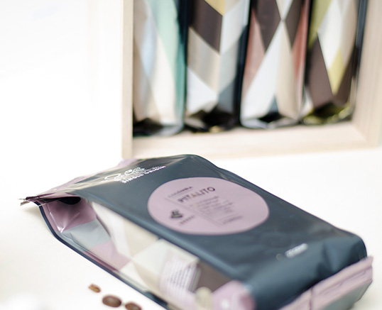
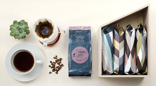
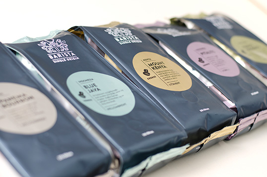
“We searched for a ‘between coffeshop/micro roast and retail’- expression. More freshly hand brewed and less retail coffee signals. Stronger remote signal, better navigation – since navigation in retail shelves has other demands than in the coffee shop shelf. Talking to a more demanding target group we went for a fresh, modern but delicate expression. A soft metallic blue gave us a distinction to the category. Circles in pastels made a stop effect and linked the products together even if they are separated (as they often are in the coffee shelf). All together a more graphic look with stronger impact and fresh contrasting color codes to separate country of origin. A set of patterns was designed for each of the origins.”
lovely-package-barista-3

“A work was done on names and profiles – included new roasting profiles, cupping and new descriptions on each of the products. 

Beeing a fact- and knowledge based product we needed to simplify the language and make the names purely logic. Names = coffee mill and cooperatives. We used the micro roasters own coffee language. This is a true everyday single origin line at a nice price.

The design has moved from a dark, continental monochrome to a fresh, scandinavian look.

A scandinavian look for a scandinavian roast.”
lovely-package-barista-2

Get the latest packaging design inspiration in your inbox:

Popular designs

Designed by: PepsiCo Design & Innovation
Country: United States

Barista

lovely-package-barista-1

lovely-package-barista-1

Designed by Neolab by Knowit | Country: Norway

“Single Origin vs mixed products: Friele has changed their product line strategy and as a part of this we cleaned up the Barista line. The old Barista line had both espresso and blends mixed in between the singles. By moving them out we made a stronger concept and a stronger and more logic product line by presenting single origin products only. 

The re-design mission: The old Barista had over time become a blurry mix of 8 different blends and grinds and roasts. 

The shelf impact was weak and the remote signals of each product could have been stronger. 

We missed a stop-signal from a distance. We missed the freshness signal whole beans represents. We missed the link to micro roasted products.

New packaging machines gave Friele new packages and possibilities for new design. The packaging structure was not unique but well fitted for large industrial production. It also gave space for a more graphic look.”

lovely-package-barista-4

“We searched for a ‘between coffeshop/micro roast and retail’- expression. More freshly hand brewed and less retail coffee signals. Stronger remote signal, better navigation – since navigation in retail shelves has other demands than in the coffee shop shelf. Talking to a more demanding target group we went for a fresh, modern but delicate expression. A soft metallic blue gave us a distinction to the category. Circles in pastels made a stop effect and linked the products together even if they are separated (as they often are in the coffee shelf). All together a more graphic look with stronger impact and fresh contrasting color codes to separate country of origin. A set of patterns was designed for each of the origins.”

lovely-package-barista-3

“A work was done on names and profiles – included new roasting profiles, cupping and new descriptions on each of the products. 

Beeing a fact- and knowledge based product we needed to simplify the language and make the names purely logic. Names = coffee mill and cooperatives. We used the micro roasters own coffee language. This is a true everyday single origin line at a nice price.

The design has moved from a dark, continental monochrome to a fresh, scandinavian look.

A scandinavian look for a scandinavian roast.”

lovely-package-barista-2

Previous slide
Next slide
Get the latest on packaging design in your inbox: