Designed by: PepsiCo Design & Innovation
Country: United States

Barú

Barú

Designed by Creneau International | Country: Belgium

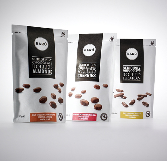
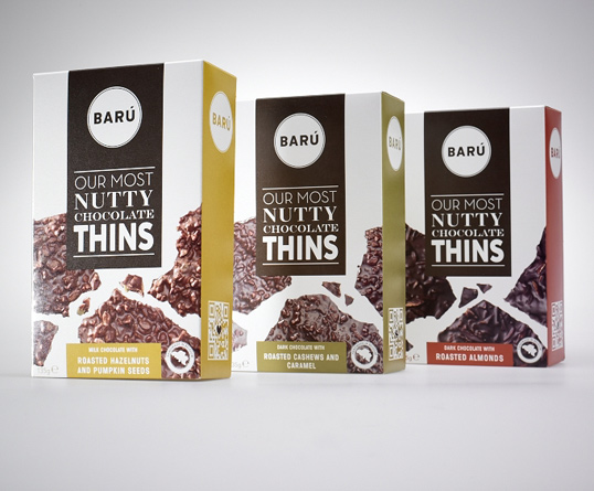
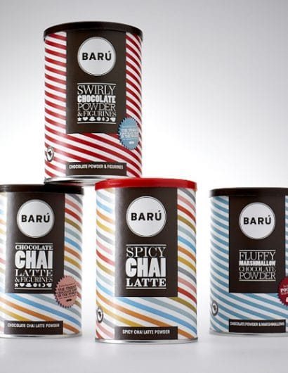
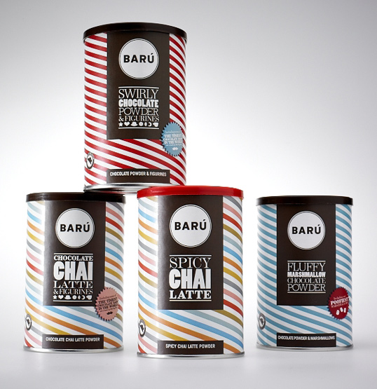
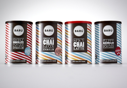
“Dark and pure, rich and honest, funny and crazy … as long as it says Barú on the outside, you know you’re in for a delicious treat. Drawing inspiration from Barú’s finest fluffy, swirly and nutty chocolates and sipping from their sensational chai tea, Creneau International designed a range of packaging that put the funk back in the chocolate and the glee back in the tea.

The best chocolates are little bites of happiness and the designers wanted the packaging to show just that. Adorned with retro colours and patterns, central to each wrapping is the signature element of the brown rectangular bar with the round Barú logo in it. The packaging features an array of typefaces reflecting the crazy playfulness and wonderful taste sensations.”

Barú

Barú

Barú

Get the latest packaging design inspiration in your inbox:

Popular designs

The Port Vodka Lemon Water

Overview: In response to my client’s vision for a Cape Cod themed beverage brand, I embarked on the journey to create The Port

Pure Persian Honey

When we look closely at honey packaging, they are almost all in the usual format, and the ultimate in creativity is that

Over the wave

This Kombucha originates in Lombok, Indonesia, where its paradise beaches attract hundreds of surfers eager to ride the waves. When you surf,

Designed by: PepsiCo Design & Innovation
Country: United States

Barú

baru1

Barú

Designed by Creneau International | Country: Belgium

“Dark and pure, rich and honest, funny and crazy … as long as it says Barú on the outside, you know you’re in for a delicious treat. Drawing inspiration from Barú’s finest fluffy, swirly and nutty chocolates and sipping from their sensational chai tea, Creneau International designed a range of packaging that put the funk back in the chocolate and the glee back in the tea.

The best chocolates are little bites of happiness and the designers wanted the packaging to show just that. Adorned with retro colours and patterns, central to each wrapping is the signature element of the brown rectangular bar with the round Barú logo in it. The packaging features an array of typefaces reflecting the crazy playfulness and wonderful taste sensations.”
Barú

Barú

Barú

Previous slide
Next slide

Explore more great package design

Get the latest on packaging design in your inbox: