Designed by Pentagram | Country: United States | Fonts: Nobel BL, Belizio
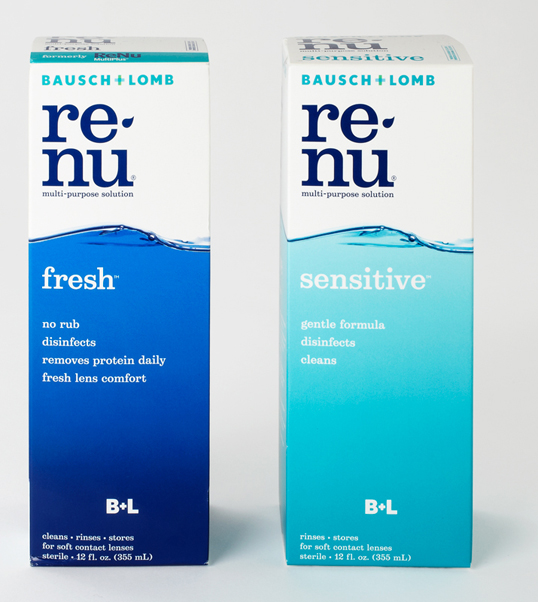
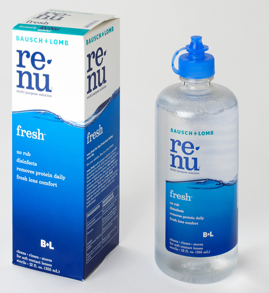
Paula Scher (partner-in-charge and designer) and Lisa Kitschenberg (designer) have redesigned the identity and packaging for renu® multi-purpose solution, one of Bausch + Lomb’s signature products and the category leader in contact lens solutions. The renu® identity and packaging have been designed to stand apart from the competition in the category, which includes brands from manufacturers like Alcon, Allergan, Johnson & Johnson and Ciba Vision. The packaging of all these brands uses colors of blue and green and motifs of waves, curves and circles (or bubbles) to allude to water, liquid and moisture. The new renu® packaging drops the allusion and uses an actual photograph of a wave of water that wraps around the package.

The renu™ packaging redesign avoids the unrecognizable overhaul of other recent redesigns and instead reinterprets the familiar brand elements in a new way. The placement of the new wave is the same as on the brand’s previous packaging, with the color band wrapping around the lower two-thirds of the box. The two renu® sub-brands—renu® fresh™ and renu® sensitive™—are clearly designated by different colors. The solutions are now dispensed in the new translucent bottles introduced by Bausch + Lomb that allow users to see how much solution is left in them.


