
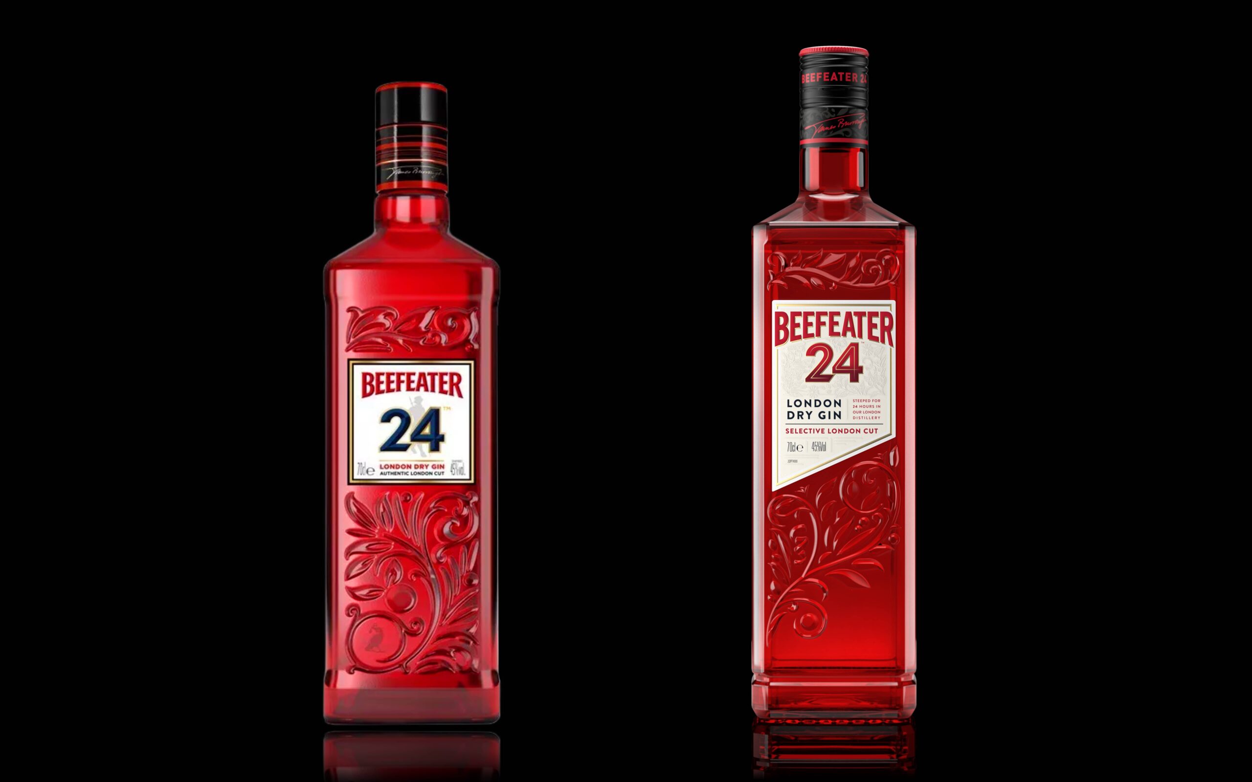
At Lovely Package, we’re always on the lookout for innovative and sustainable packaging designs that catch our eye. Today, we’re excited to feature the collaboration between Boundless Brand Design and Beefeater Gin, who have come together to design a remarkable new look for the Beefeater 24 bottle.
This new design celebrates the twenty-four-hour energy of London, the heart, and home of Beefeater 24. Boundless Brand Design was tasked with re-imagining the iconic red bottle, with a focus on sustainability and standout quality.
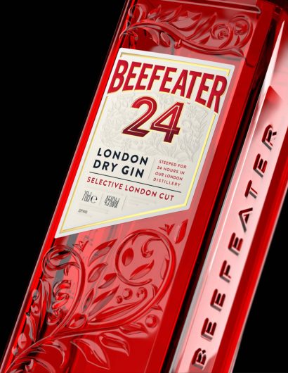
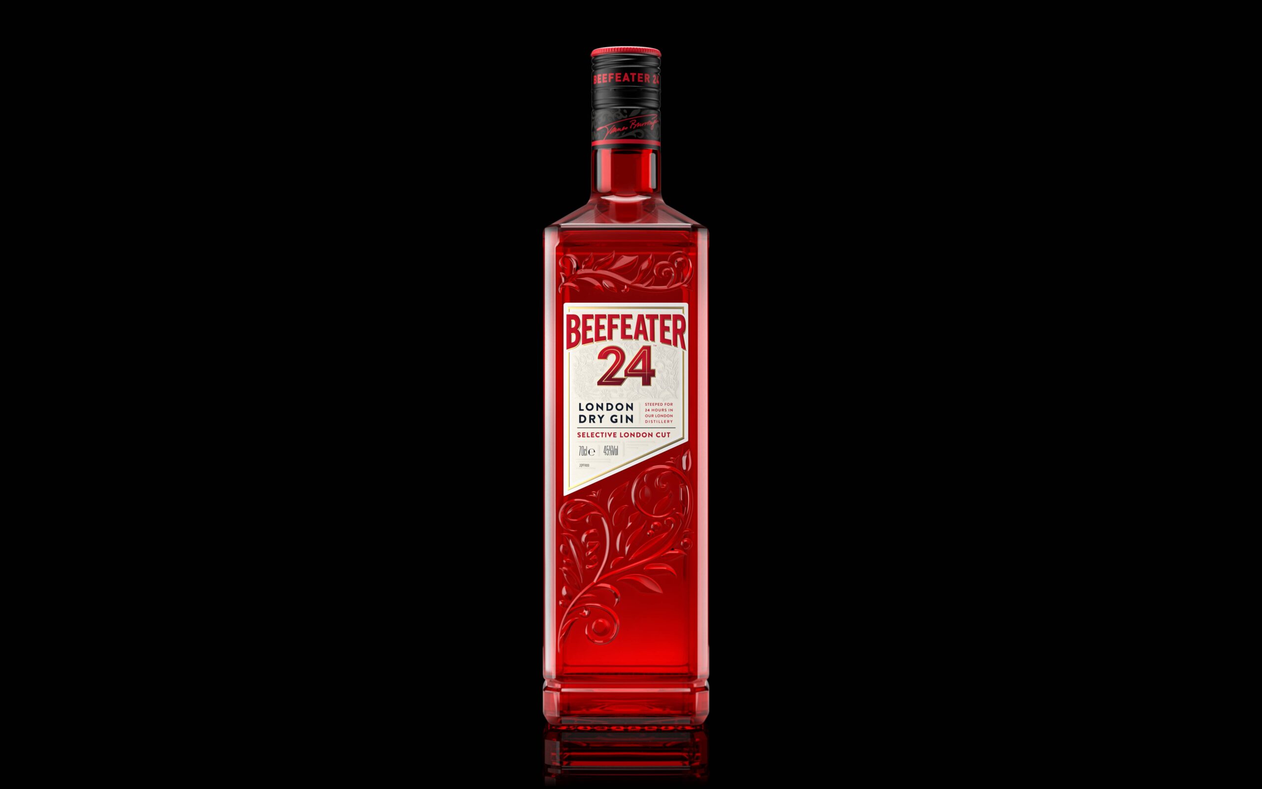
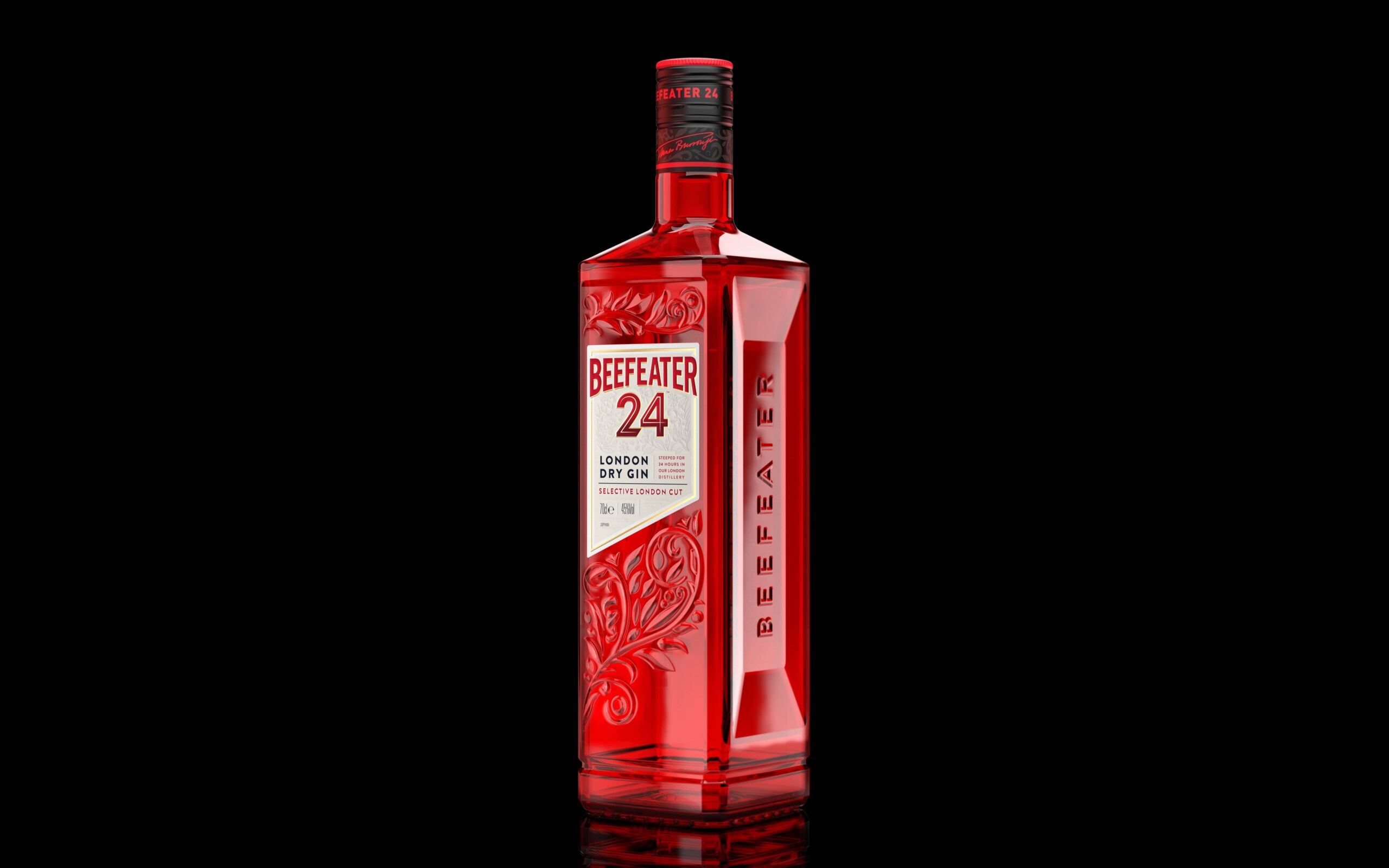
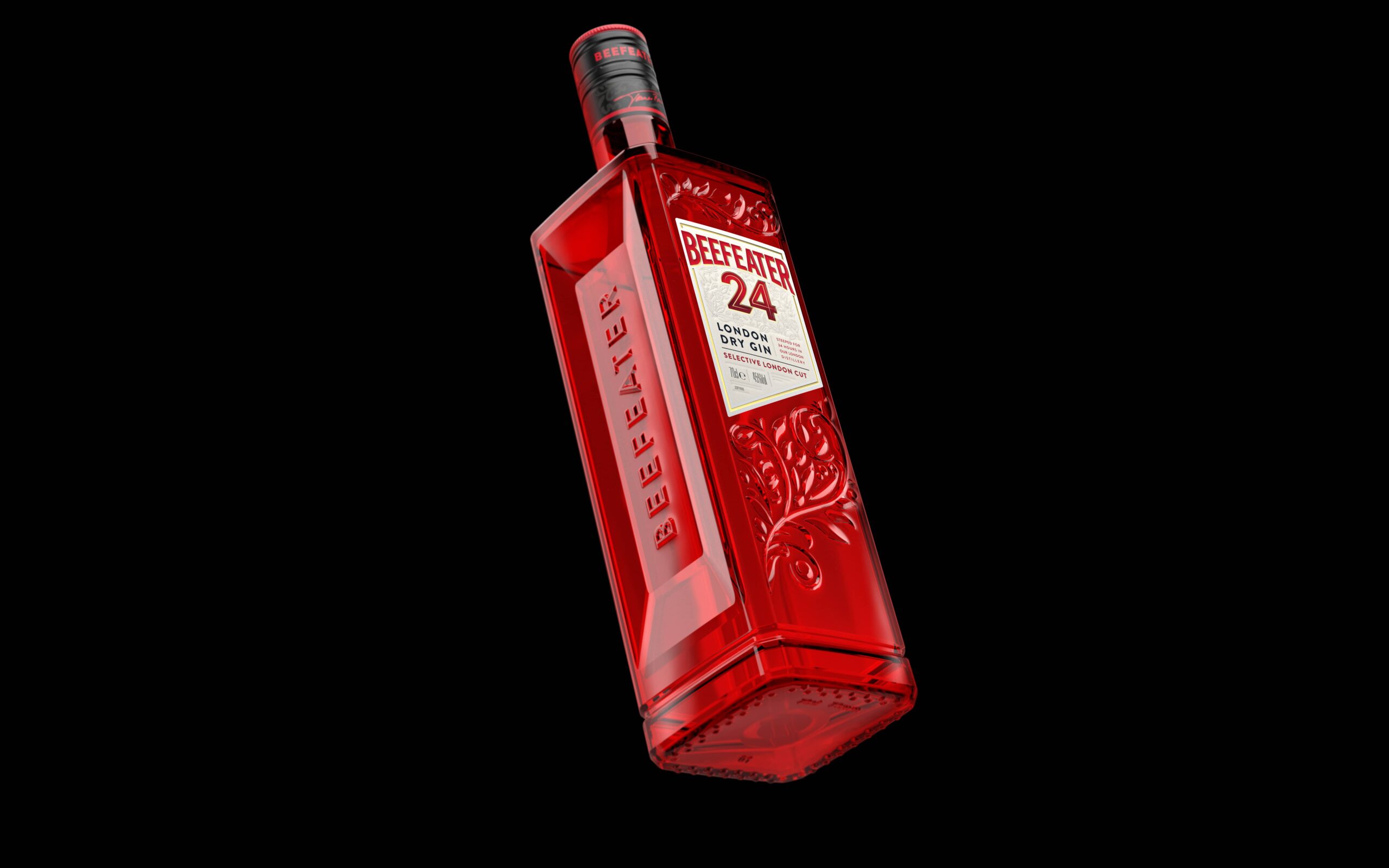
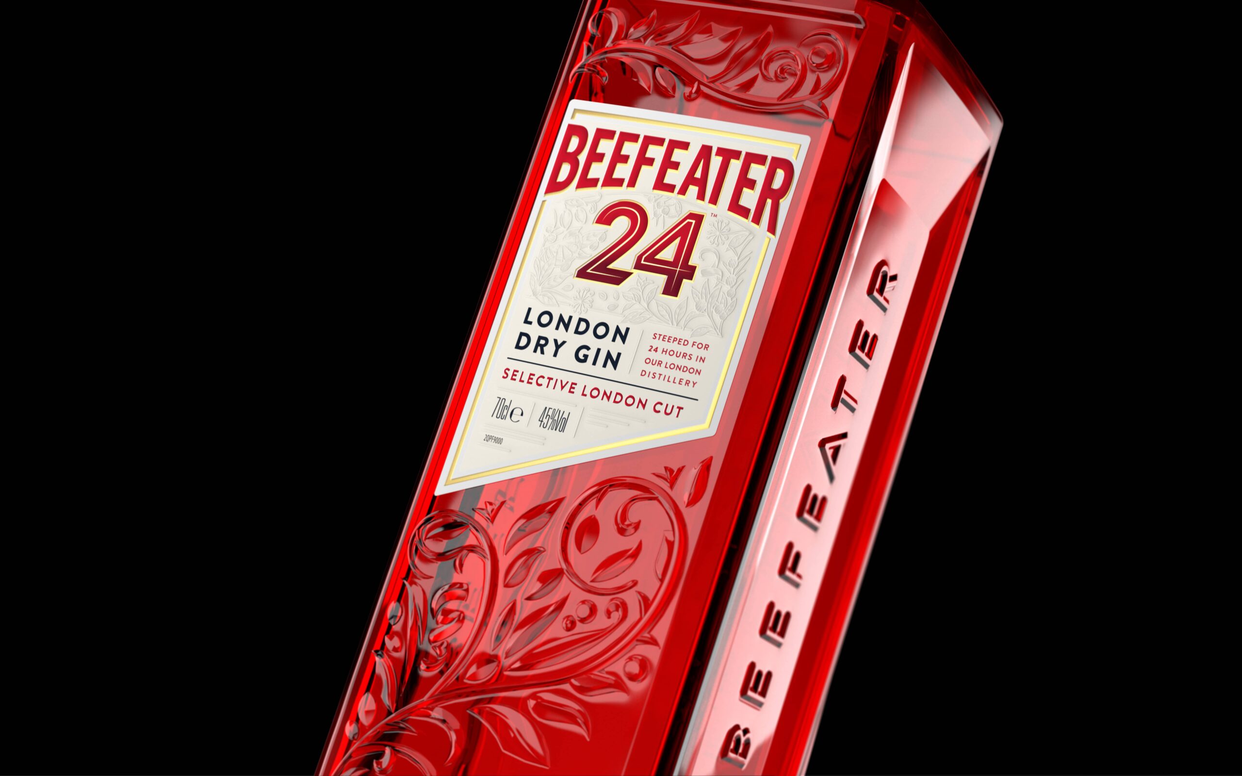
Boundless created a new elevated structure for the bottle, taller than its predecessor and beautifully crafted with embossed botanicals for added tactility. The new bottle is not only aesthetically pleasing but also offers practical advantages like an easier grip for faster serving, thanks to its London brick shape. The label is sliced at a 24-degree angle to represent the twenty-four-hour steeping of the botanicals, giving birth to a new strapline “A cut above”.
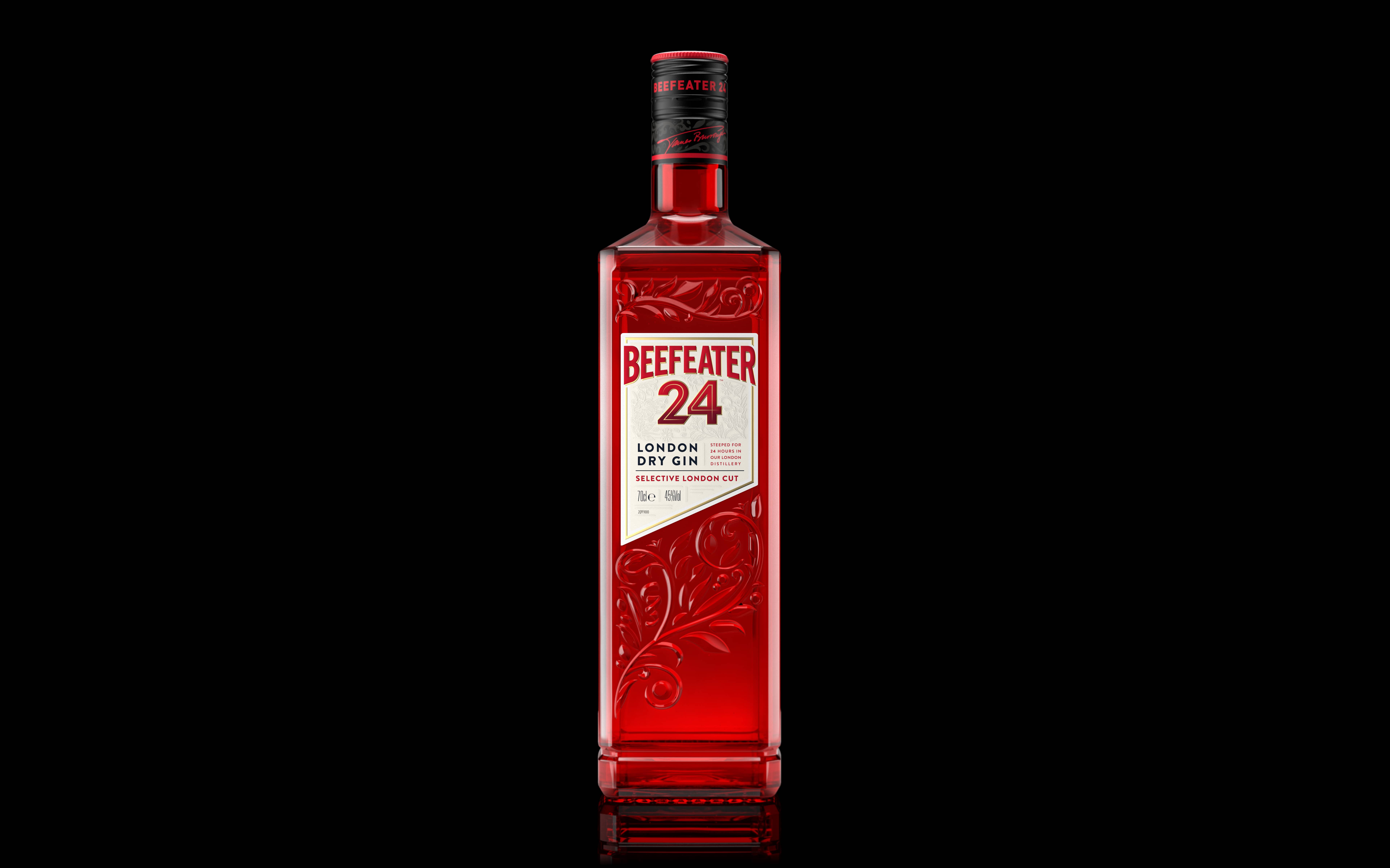

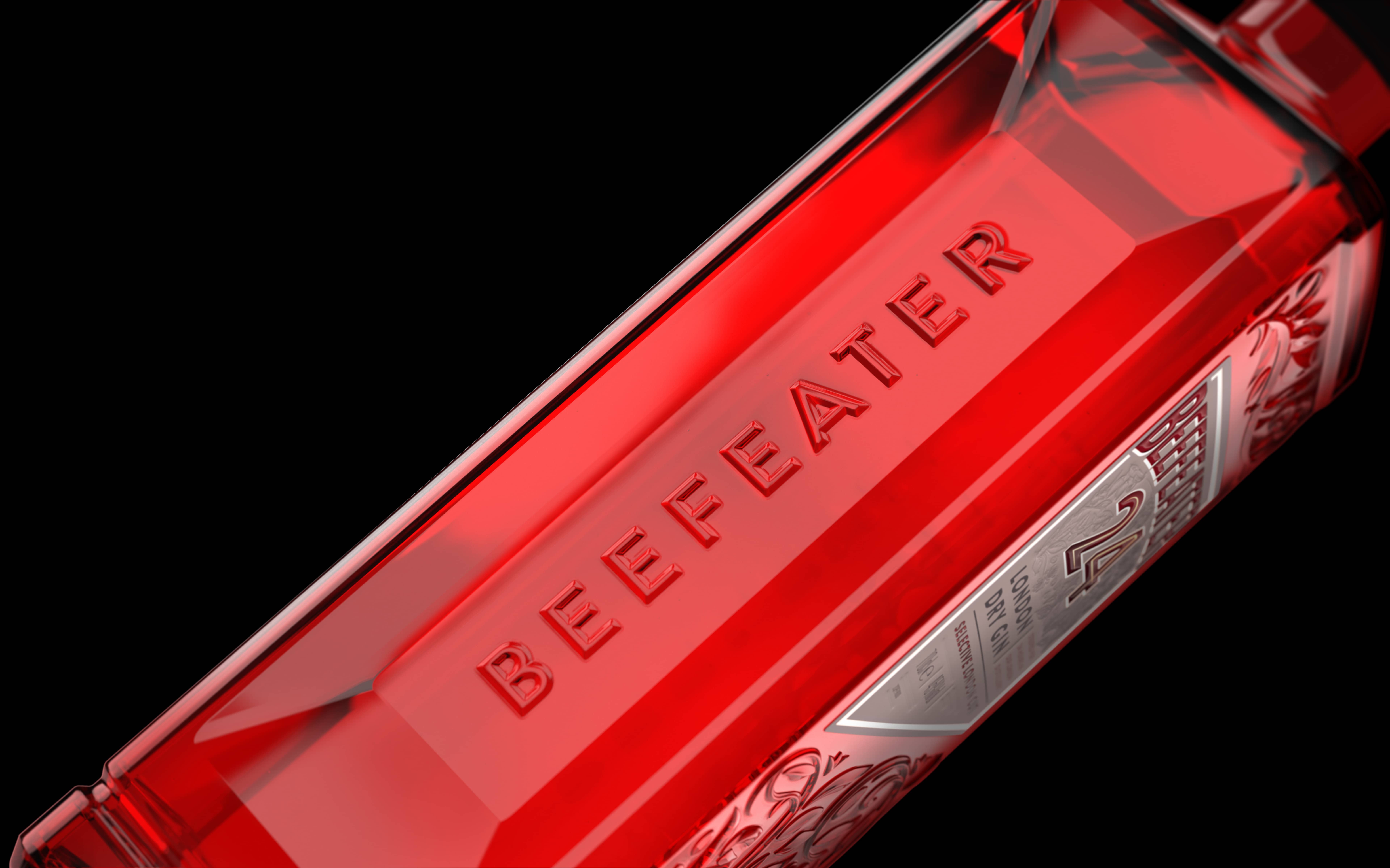


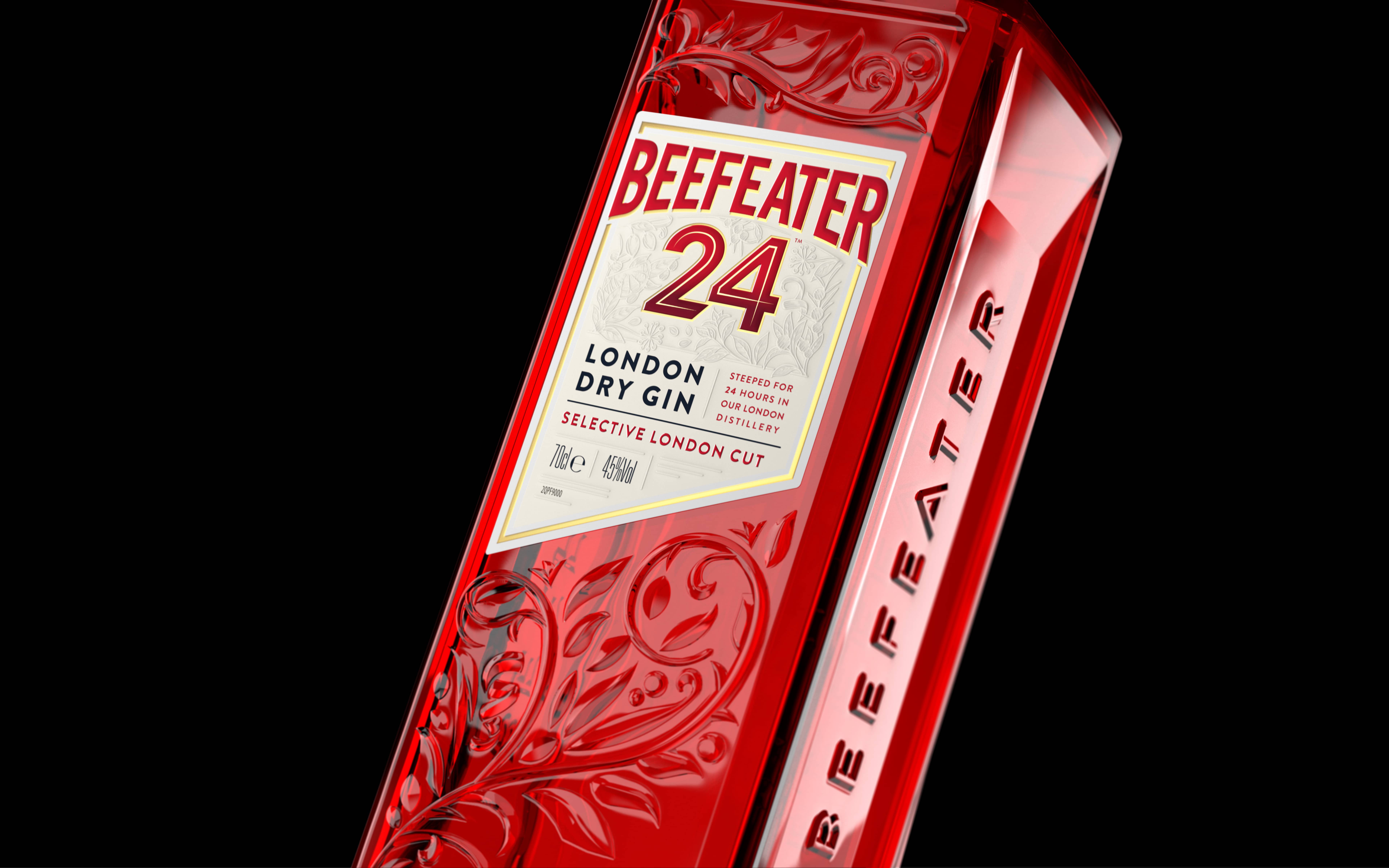
The new Beefeater 24 pack boasts impressive sustainability credentials with a 90% plastic reduction on the closure and back label, along with 30% less aluminium and a 22% glass reduction.
Hamish Shand, the Founder and Executive Creative Director of Boundless Brand Design, shares, “The new bottle epitomizes high-energy moments, seamlessly blending craftsmanship, premium quality, and sustainable credentials. It has been a pleasure to bring this vision to life, and we eagerly anticipate its poised presence on the back bar.”
We invite you to toast to the elegance and sustainability of the new Beefeater 24 bottle. Cheers to a design that’s truly a cut above!


