Designed by: PepsiCo Design & Innovation
Country: United States

Belgian Dubbel Packaging Design

1

Designed by: Laudir Jaeger | Country: Brazil

The Belgian Dubbel first appeared in the Middle Age in the monasteries of Belgium. The most popular brands, even today, are from the Belgian Trappist monasteries. Farol and Brummers, Brazilian breweries, partnered to create a traditional Belgian-style beer inspired by the Dubbel.

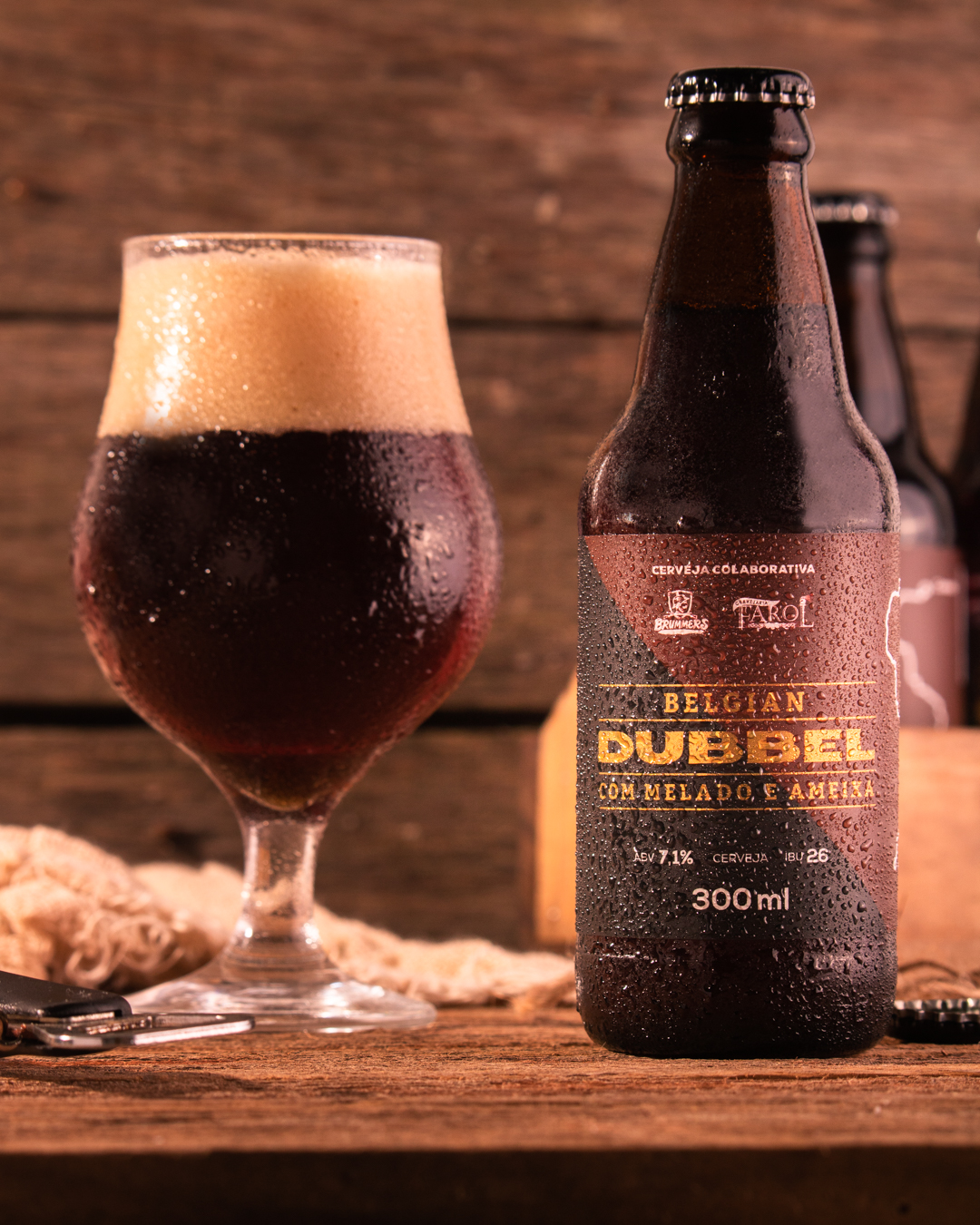
The Brazilian breweries, Farol (located in Canela, Rio Grande do Sul) and Brummers (located in Parobé, Rio Grande do Sul) have teamed up to innovate a traditional Belgian style. By adding molasses and prune to the recipe, the production of the special edition of the Belgian Dubbel has a slightly sweet touch, highlighting some already distinctive notes of the drink.

Belgian Dubbel Packaging Design

The packaging

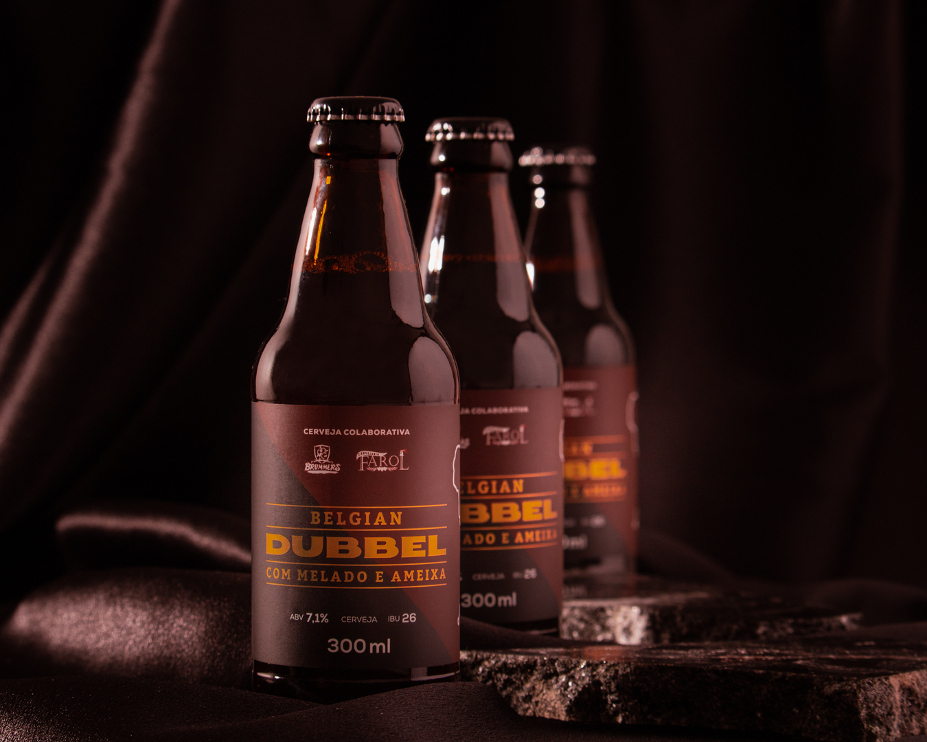
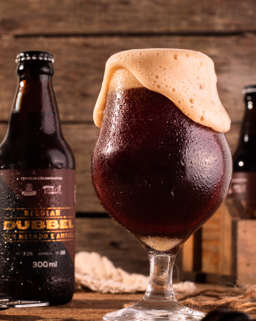
The Brazilian breweries approached Laudir Jaeger, a Santa Cruz do Sul-based art director, to create packaging designs highlighting Belgian traditions. The Brazilian art director used minimalist designs and colors inspired by the Belgian flag to create attractive packaging illustrations.

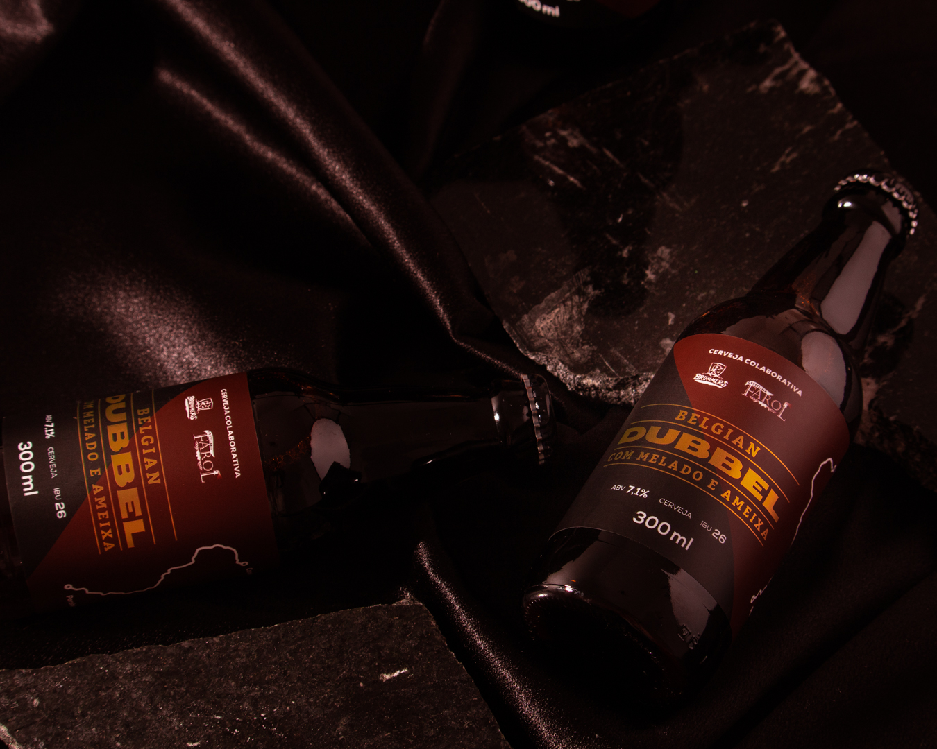
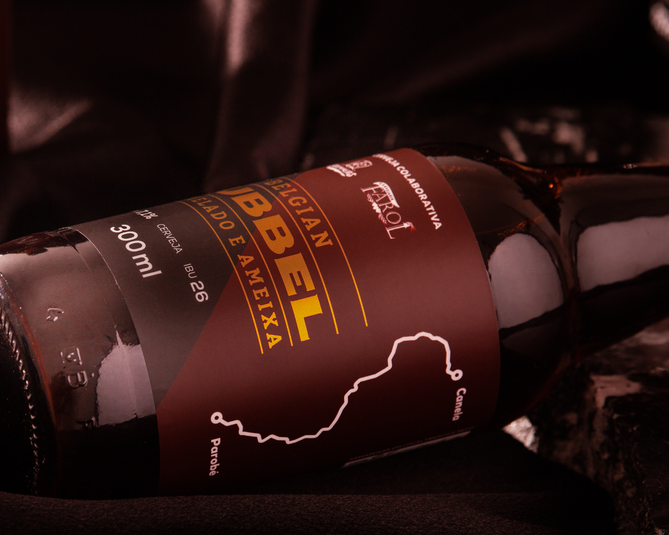
“The designer Laudir Jaeger has built a clean and sophisticated visual. The minimalist layout is emphasized by the lettering in gold, doing justice to the exclusivity of the drink. After all, only a single batch of this special edition was produced.

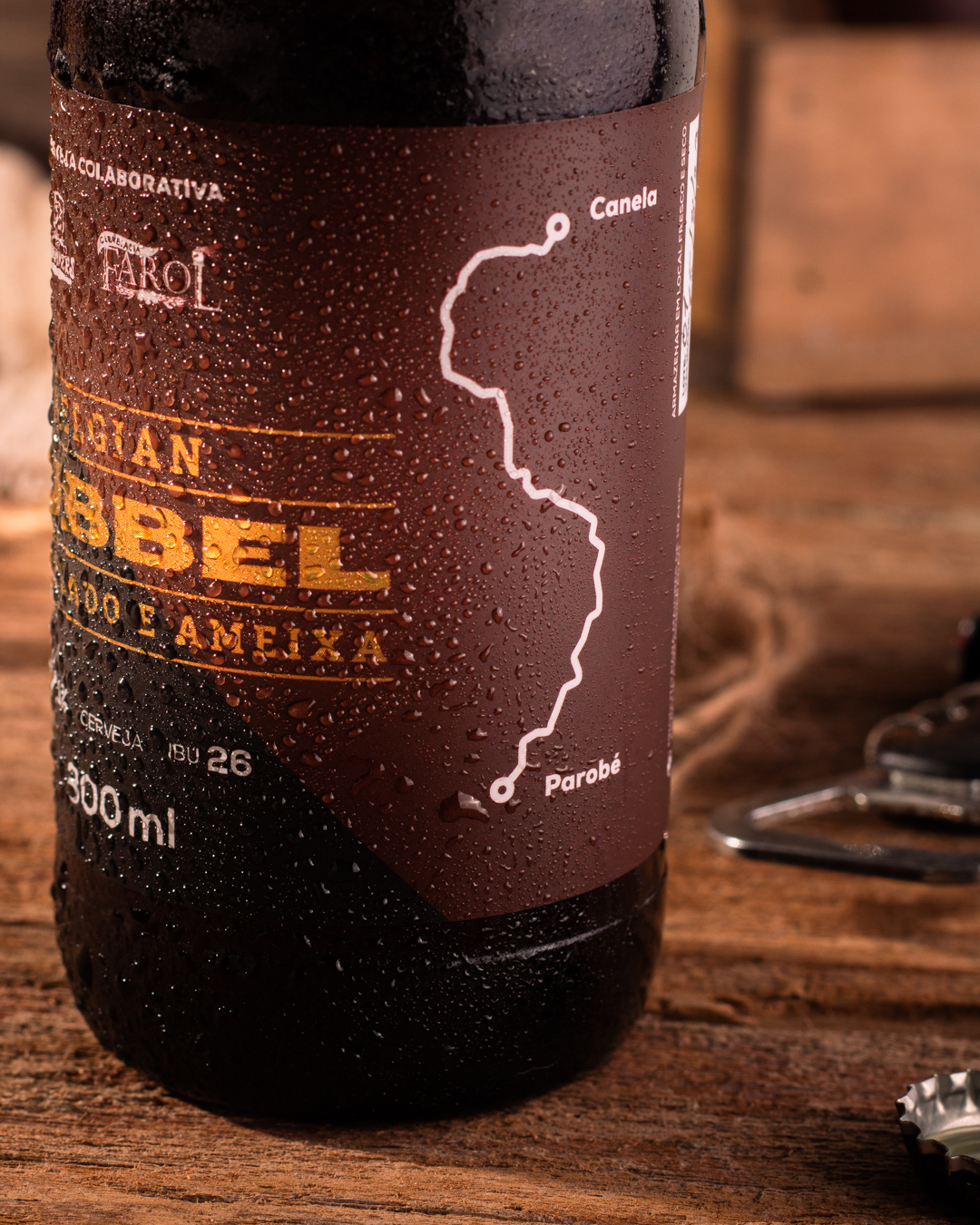
Another detail that draws attention, shows the wealth of information, and honors both the trajectory and the partnership between Farol and Brummers is the illustration of a road connecting these two breweries on the side of the label.”

1

Get the latest packaging design inspiration in your inbox:

Popular designs

Tropicana’s Branding & Packaging Redesign by Sunhouse

Tropicana rejuvenates its brand with Sunhouse, blending modern iconicity and heritage. The redesign emphasizes Tropicana’s legacy, highlighting its unique story and craftsmanship, making it stand out as the original, superior orange juice.

Studio La Regina Revamps Packaging Design for 7 Colli Amaro

Studio La Regina has transformed the packaging of 7 Colli, an artisan amaro with a loyal following, to support its distribution expansion. The new design features a sleek cylindrical bottle and a striking label with a deep black background, gold foil text, and a distinctive, multi-colored number 7.

Designed by: PepsiCo Design & Innovation
Country: United States

Belgian Dubbel Packaging Design

1
IMG_6264-Editar

Designed by: Laudir Jaeger | Country: Brazil

The Belgian Dubbel first appeared in the Middle Age in the monasteries of Belgium. The most popular brands, even today, are from the Belgian Trappist monasteries. Farol and Brummers, Brazilian breweries, partnered to create a traditional Belgian-style beer inspired by the Dubbel.

The Brazilian breweries, Farol (located in Canela, Rio Grande do Sul) and Brummers (located in Parobé, Rio Grande do Sul) have teamed up to innovate a traditional Belgian style. By adding molasses and prune to the recipe, the production of the special edition of the Belgian Dubbel has a slightly sweet touch, highlighting some already distinctive notes of the drink.

Belgian Dubbel Packaging Design

The packaging

The Brazilian breweries approached Laudir Jaeger, a Santa Cruz do Sul-based art director, to create packaging designs highlighting Belgian traditions. The Brazilian art director used minimalist designs and colors inspired by the Belgian flag to create attractive packaging illustrations.

“The designer Laudir Jaeger has built a clean and sophisticated visual. The minimalist layout is emphasized by the lettering in gold, doing justice to the exclusivity of the drink. After all, only a single batch of this special edition was produced.

Another detail that draws attention, shows the wealth of information, and honors both the trajectory and the partnership between Farol and Brummers is the illustration of a road connecting these two breweries on the side of the label.”

1
Previous slide
Next slide
Get the latest on packaging design in your inbox: