Designed by: PepsiCo Design & Innovation
Country: United States

Bellman Beer Packaging Design

1

Designed by: Everland Agency | Country: Sweden

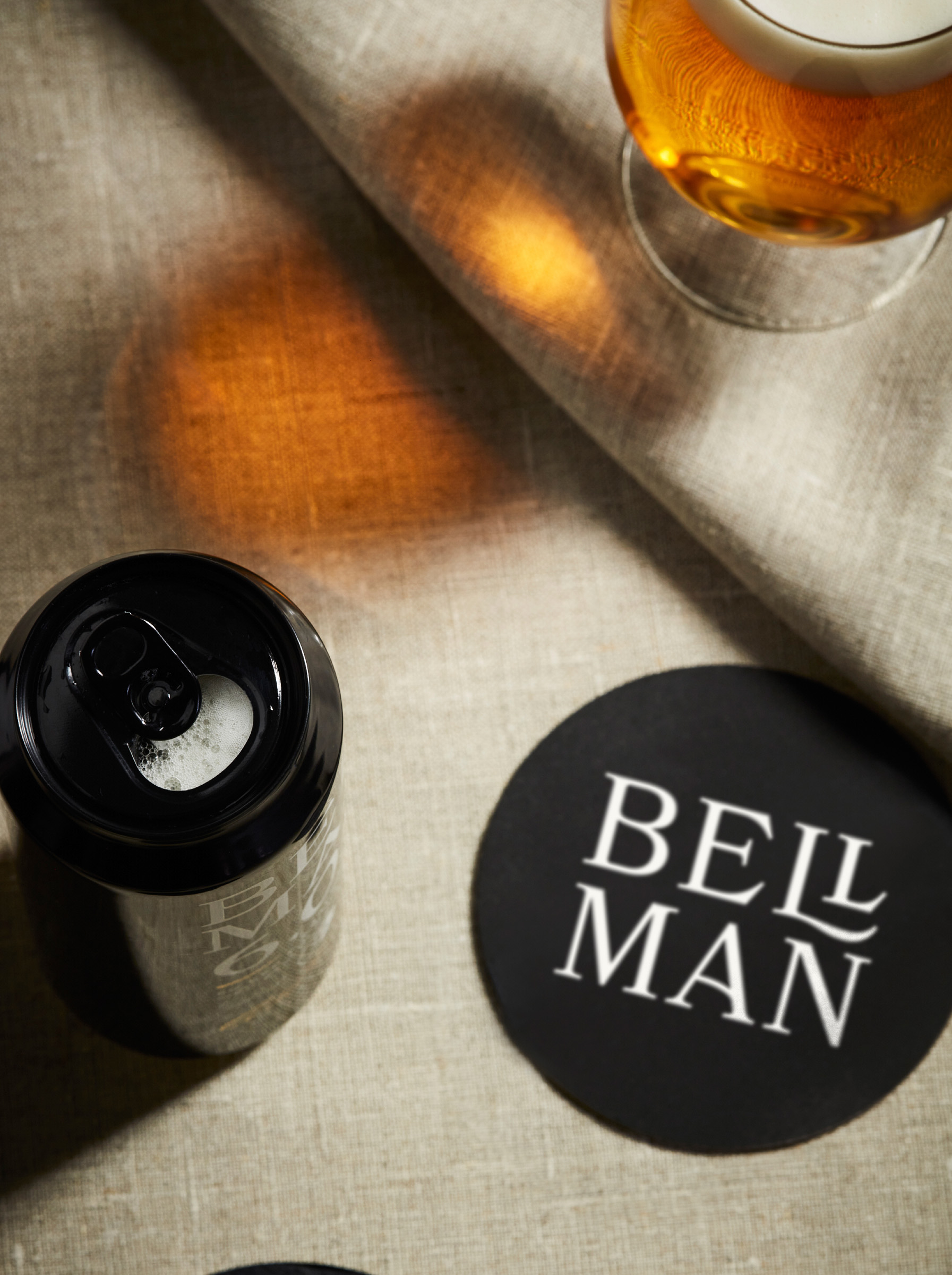
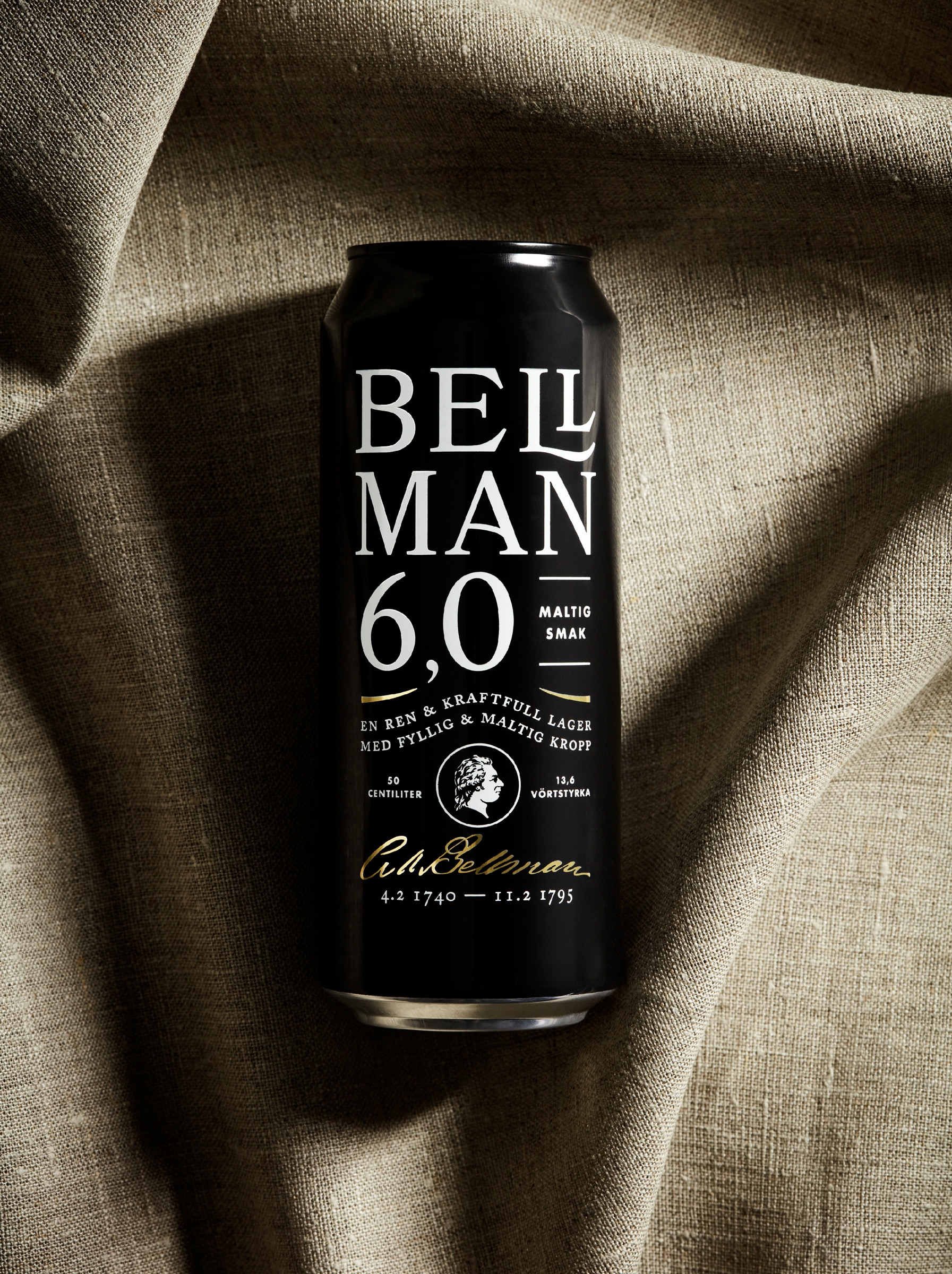
Bellman, one of Sweden’s most popular beer brands, recently revealed its new look. The new look highlights the brand’s character and its origins. The design elements amplify the sophisticated nature of the product but not at the cost of sacrificing the brand’s friendly characteristics.

“The beloved Swedish beer Bellman is back with a fresh look, emphasizing its origin and character. Scandinavian design agency Everland helped Carlsberg Sweden with a redesign that shares a poem of quality.

“‘Double beer brings good mood’, the famous Swedish poet Carl Bellman wrote in one of his epistles. As a tribute, the strong pilsner beer Bellmann is guaranteed to create a warm and friendly atmosphere at every serving.”
Bellman Beer Packaging Design

The packaging

Bellman approached Everland, a Scandinavian boutique agency, to create packaging designs that would reflect “the craft and care that goes into one of Sweden’s most classic beers.”

Inspired by the idea of ‘small tweaks, big impact,’ Everland used simple design elements to communicate the brand story of Sweden’s favorite beer brand.

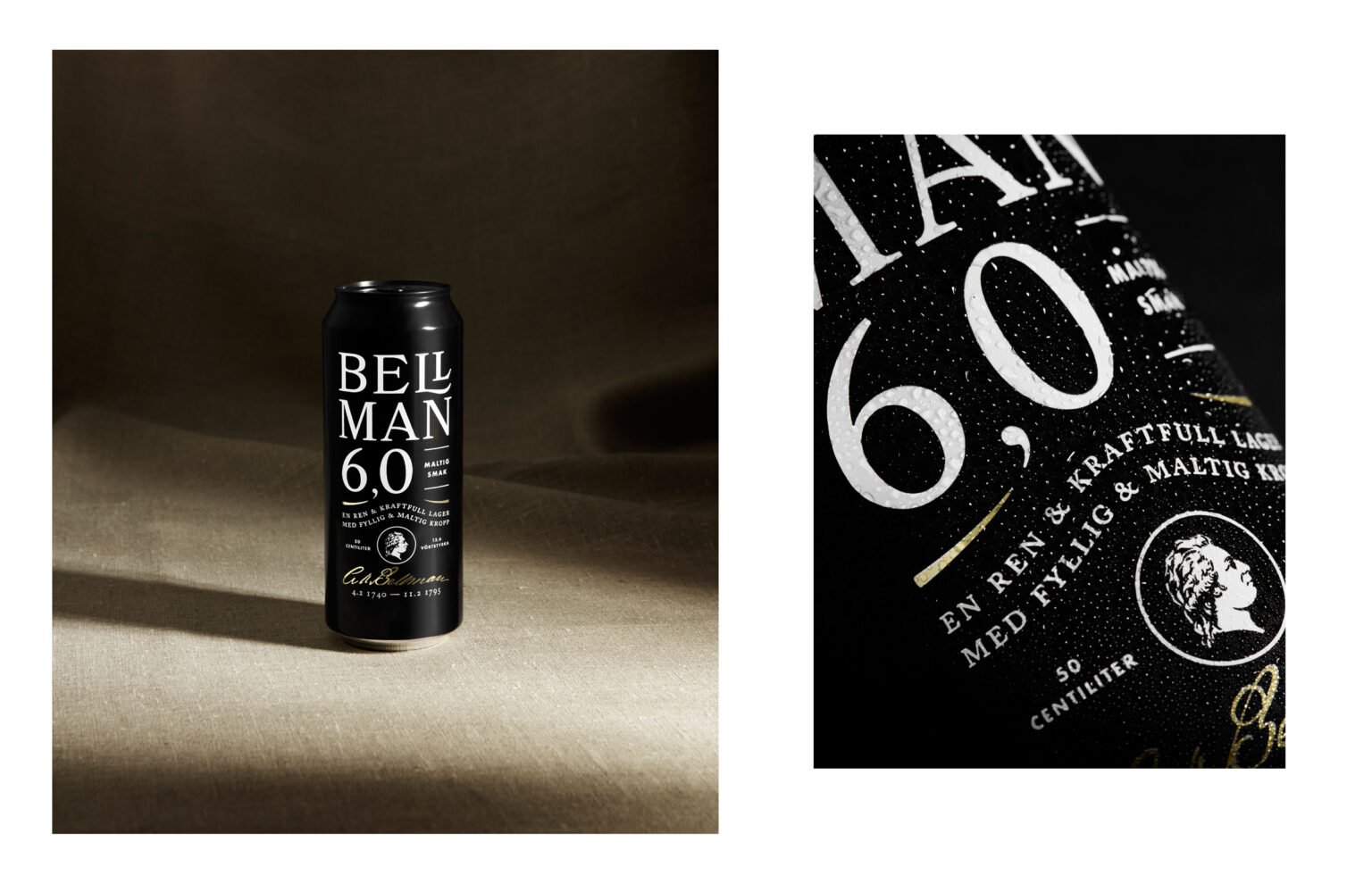
“The revised design builds the product brand through clear and impactful communication. Design elements are refined, amplified, and added to give more character. And the poem on the back label tells the product’s original story.

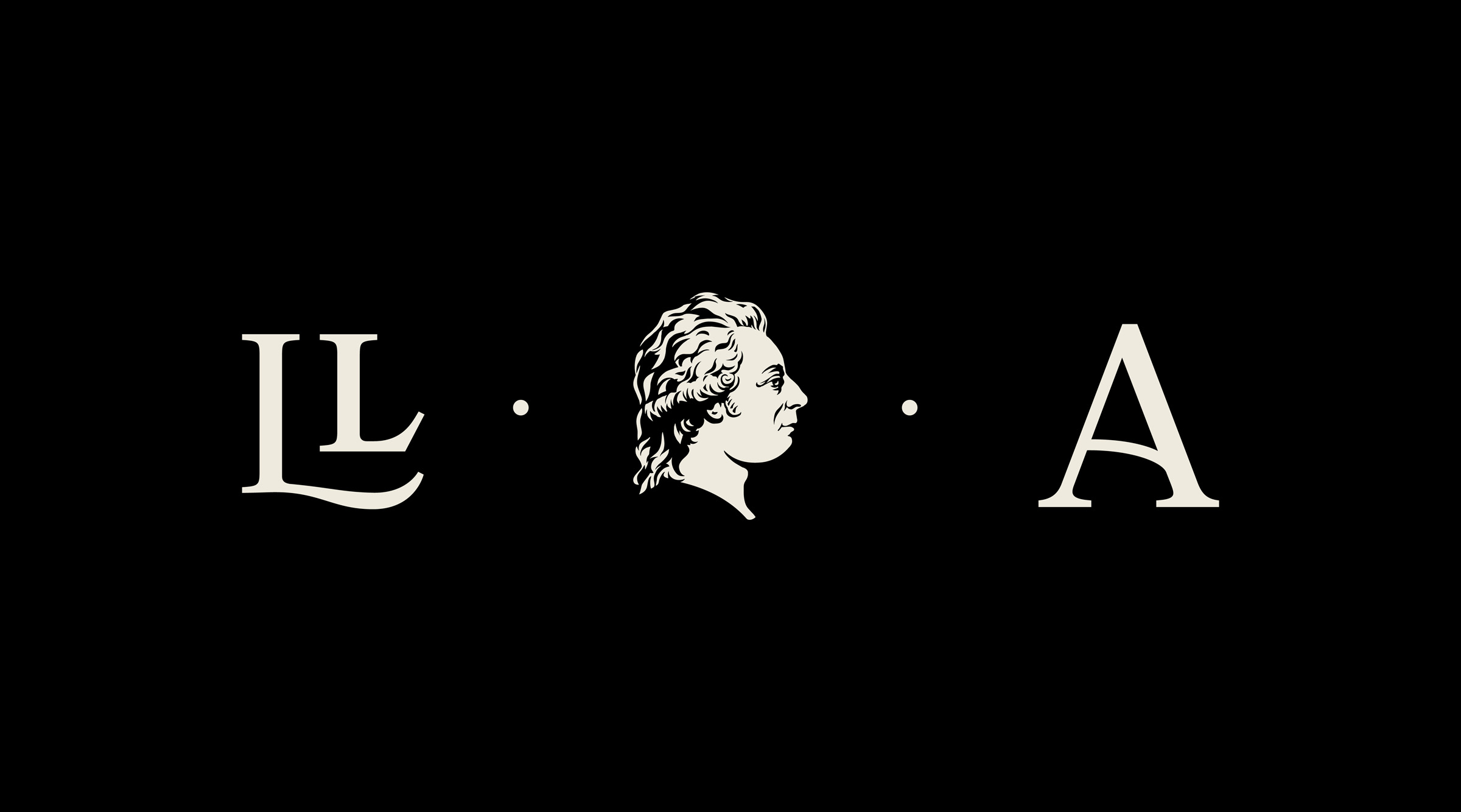
‘We emphasized the craft and character of the brand. The logotype was redesigned for better stand-out and beautiful use of space, combining the two L’s,’ explains Carl Larsson, Creative Director & Partner at Everland. ‘Also, the portrait of Bellman was updated and enriched with more details to reflect the beer’s muse better, so to speak.’”

1

Get the latest packaging design inspiration in your inbox:

Popular designs

Burma Love Rebrand

Love at First BiteAs an extension of the Burma Superstar restaurant in San Francisco, Burma Love Foods gives diners an opportunity to

Over the wave

This Kombucha originates in Lombok, Indonesia, where its paradise beaches attract hundreds of surfers eager to ride the waves. When you surf,

Pure Persian Honey

When we look closely at honey packaging, they are almost all in the usual format, and the ultimate in creativity is that

Designed by: PepsiCo Design & Innovation
Country: United States

Bellman Beer Packaging Design

1
naturfrisk_brus

Designed by: Everland Agency | Country: Sweden

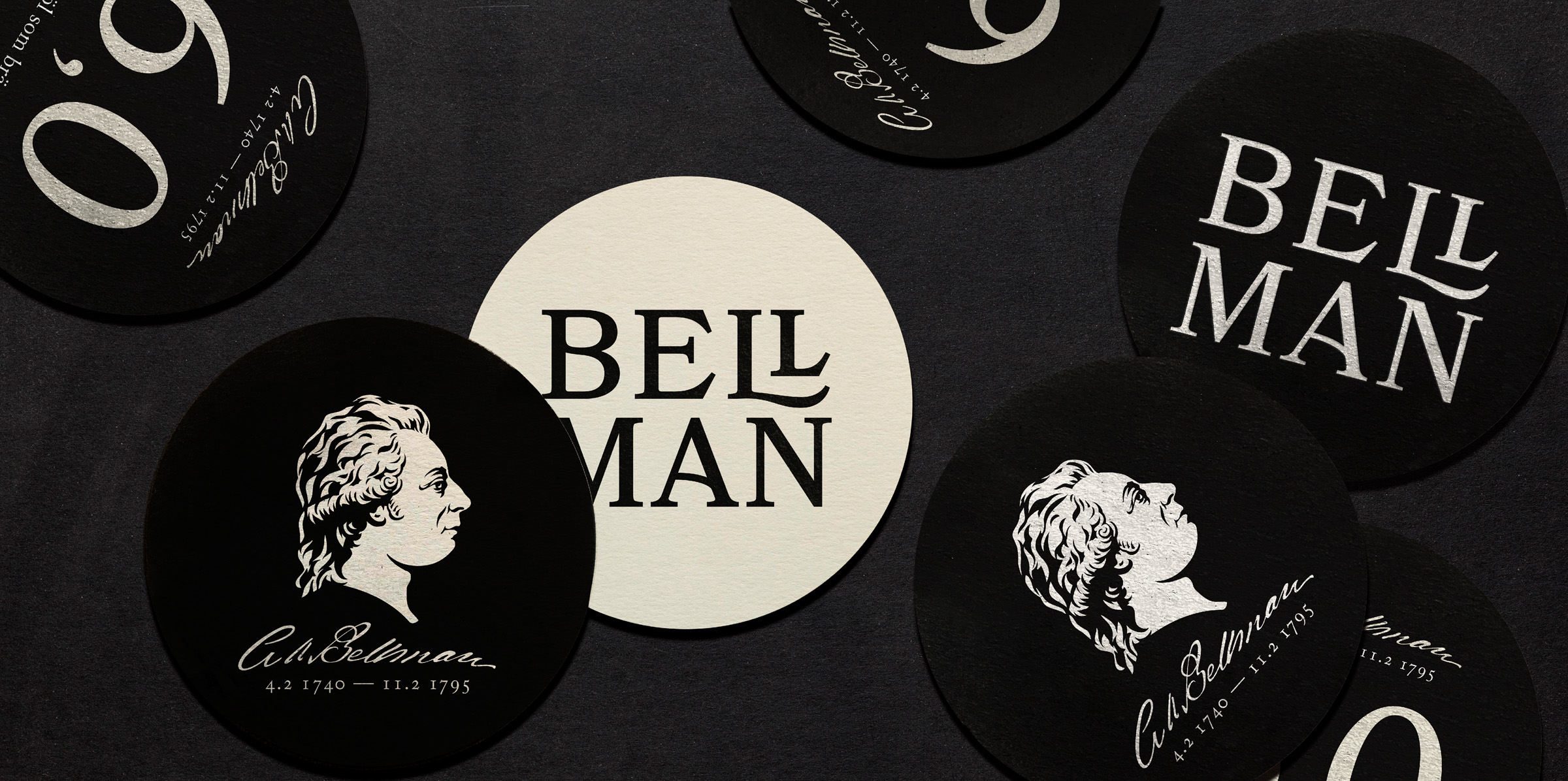
Bellman, one of Sweden’s most popular beer brands, recently revealed its new look. The new look highlights the brand’s character and its origins. The design elements amplify the sophisticated nature of the product but not at the cost of sacrificing the brand’s friendly characteristics.

“The beloved Swedish beer Bellman is back with a fresh look, emphasizing its origin and character. Scandinavian design agency Everland helped Carlsberg Sweden with a redesign that shares a poem of quality.

“‘Double beer brings good mood’, the famous Swedish poet Carl Bellman wrote in one of his epistles. As a tribute, the strong pilsner beer Bellmann is guaranteed to create a warm and friendly atmosphere at every serving.”
Bellman Beer Packaging Design

The packaging

Bellman approached Everland, a Scandinavian boutique agency, to create packaging designs that would reflect “the craft and care that goes into one of Sweden’s most classic beers.”

Inspired by the idea of ‘small tweaks, big impact,’ Everland used simple design elements to communicate the brand story of Sweden’s favorite beer brand.

“The revised design builds the product brand through clear and impactful communication. Design elements are refined, amplified, and added to give more character. And the poem on the back label tells the product’s original story.

‘We emphasized the craft and character of the brand. The logotype was redesigned for better stand-out and beautiful use of space, combining the two L’s,’ explains Carl Larsson, Creative Director & Partner at Everland. ‘Also, the portrait of Bellman was updated and enriched with more details to reflect the beer’s muse better, so to speak.’”

1
Previous slide
Next slide

Explore more great package design

Get the latest on packaging design in your inbox: