Designed by: PepsiCo Design & Innovation
Country: United States

Bib & Tucker

lovely-package-bib-&-tucker

Designed by Studio 32 North | Country: United States

“The bourbon: During America’s rough and tumble early days, the term “bib & tucker” was used to describe your finest attire, the kind you’d wear to a wedding or special dance. Along those same lines of thinking, we’re putting forth our finest. Produced by 35 Maple Street SpiritsBib & Tucker is a delightfully smooth bourbon sporting notes of chestnut, and it’s crafted with a sense of dedication that can only come when you know you’re making something truly special.

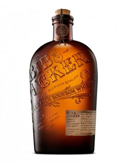
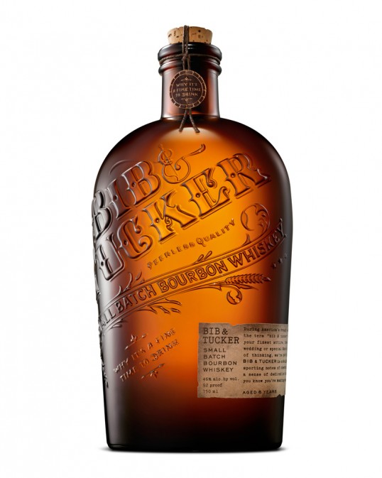
The approach: Taking cues from the name and the era in which the term was commonly used, Bib & Tucker takes the form of an enlarged amber flask, replete with a deeply embossed logo and scrolled embellishments. The ornate hand-lettering, dark brown hemp thread and circular bobbin label-like sticker are all meant to underscore the fanciness of the attire that Bib & Tucker refers to. The tagline aptly sums up the bourbon, “Why it’s a fine time to drink.”

Get the latest packaging design inspiration in your inbox:

Popular designs

Inverey: A Unique Barrel-Aged Scottish Gin Packaging Design

Inverey stands out with its image that captures the essence of the rugged Highland countryside. Breaking away from the norm, the label design does not feature the traditional tartan. Instead, it presents an organised structure of intertwining circles, rhombuses, four-pointed stars and dots born out of their intersection.

Dama Blanca: Packaging Design for Salt of Cádiz

Discover the artisanal salt packaging design for Dama Blanca, a family project from Salinas of Cádiz. The design reflects the brand’s 3000-year history, authenticity and love for the sea, using natural materials and a sea-inspired palette.

Designed by: PepsiCo Design & Innovation
Country: United States

Bib & Tucker

lovely-package-bib-&-tucker

lovely-package-bib-&-tucker

Designed by Studio 32 North | Country: United States

“The bourbon: During America’s rough and tumble early days, the term “bib & tucker” was used to describe your finest attire, the kind you’d wear to a wedding or special dance. Along those same lines of thinking, we’re putting forth our finest. Produced by 35 Maple Street SpiritsBib & Tucker is a delightfully smooth bourbon sporting notes of chestnut, and it’s crafted with a sense of dedication that can only come when you know you’re making something truly special.

The approach: Taking cues from the name and the era in which the term was commonly used, Bib & Tucker takes the form of an enlarged amber flask, replete with a deeply embossed logo and scrolled embellishments. The ornate hand-lettering, dark brown hemp thread and circular bobbin label-like sticker are all meant to underscore the fanciness of the attire that Bib & Tucker refers to. The tagline aptly sums up the bourbon, “Why it’s a fine time to drink.”

Previous slide
Next slide
Get the latest on packaging design in your inbox: