Designed by: PepsiCo Design & Innovation
Country: United States

Big Cork Vineyards

lovely-package-big-cork-vineyards-1

Designed by Jar Design | Country: United States

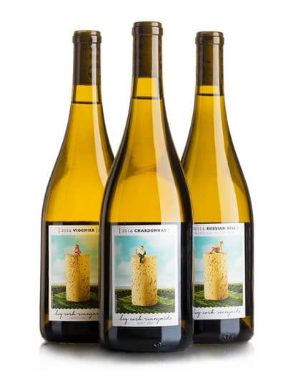
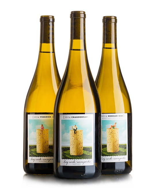
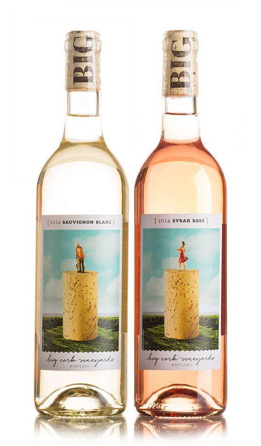
“Big Cork Vineyards, a startup winery in Maryland, came to us with a problem: they wanted to make a BIG impact as they launched their new winery and 10,000 sq ft state-of-the-art tasting room… but they were stuck with fragmented and out-dated graphics from a local design firm assigned to the initial round of design efforts for the project. Jar’s goal was to rebrand, giving Big Cork a palette of unique, proprietary and memorable assets to rebuild on, so that the name didn’t always overshadow the product, or the guest’s experience, in an overtly sexual way. Once the key attributes of the brand were solidified (clever, unexpected, happy, adventurous, playful and discover) we were free to create a wide range of designs, labels, stationery, photography, signage, interior design, and more… relaunching to much press, fanfare and success.”
lovely-package-big-cork-vineyards-2 lovely-package-big-cork-vineyards-3

Get the latest packaging design inspiration in your inbox:

Popular designs

Studio La Regina Designs Zafferano del Re

The “Zafferano del Re” logo features a contemporary depiction of King Alaric’s face framed within an irregular circle, evoking the design of ancient gold coins. Each package enhances this historical connection with a treasure map included inside, tying back to the legend of Alaric’s buried treasure.

Designed by: PepsiCo Design & Innovation
Country: United States

Big Cork Vineyards

lovely-package-big-cork-vineyards-1

lovely-package-big-cork-vineyards-1

Designed by Jar Design | Country: United States

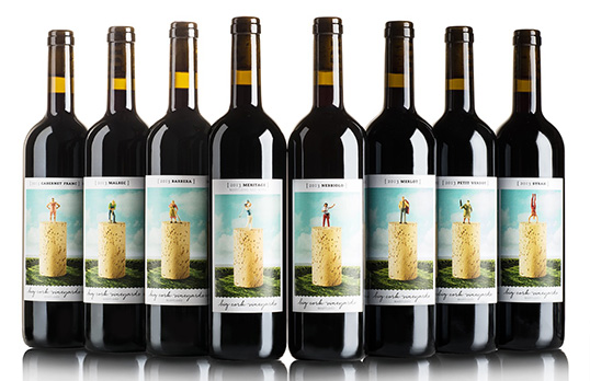
“Big Cork Vineyards, a startup winery in Maryland, came to us with a problem: they wanted to make a BIG impact as they launched their new winery and 10,000 sq ft state-of-the-art tasting room… but they were stuck with fragmented and out-dated graphics from a local design firm assigned to the initial round of design efforts for the project. Jar’s goal was to rebrand, giving Big Cork a palette of unique, proprietary and memorable assets to rebuild on, so that the name didn’t always overshadow the product, or the guest’s experience, in an overtly sexual way. Once the key attributes of the brand were solidified (clever, unexpected, happy, adventurous, playful and discover) we were free to create a wide range of designs, labels, stationery, photography, signage, interior design, and more… relaunching to much press, fanfare and success.”
lovely-package-big-cork-vineyards-2 lovely-package-big-cork-vineyards-3

Previous slide
Next slide
Get the latest on packaging design in your inbox: