Designed by: PepsiCo Design & Innovation
Country: United States

Bloody Drinks: Bold Packaging Design and Typography for a Striking Brand

12

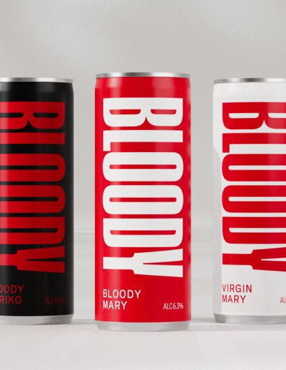
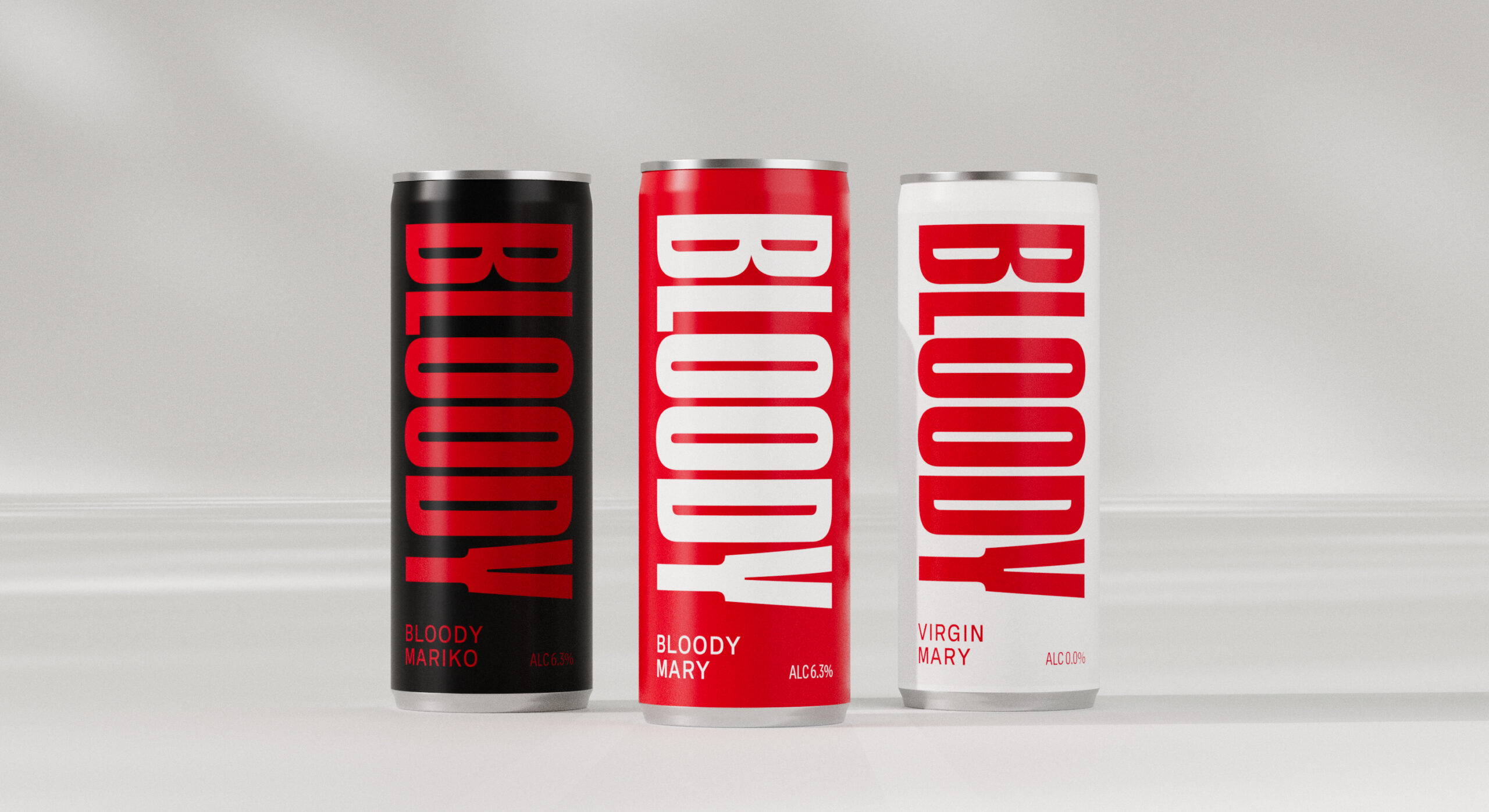
At first glance, the bright red can and bold declaration of “BLOODY” on Bloody Drinks might be mistaken for a scream of someone stubbing their toe.

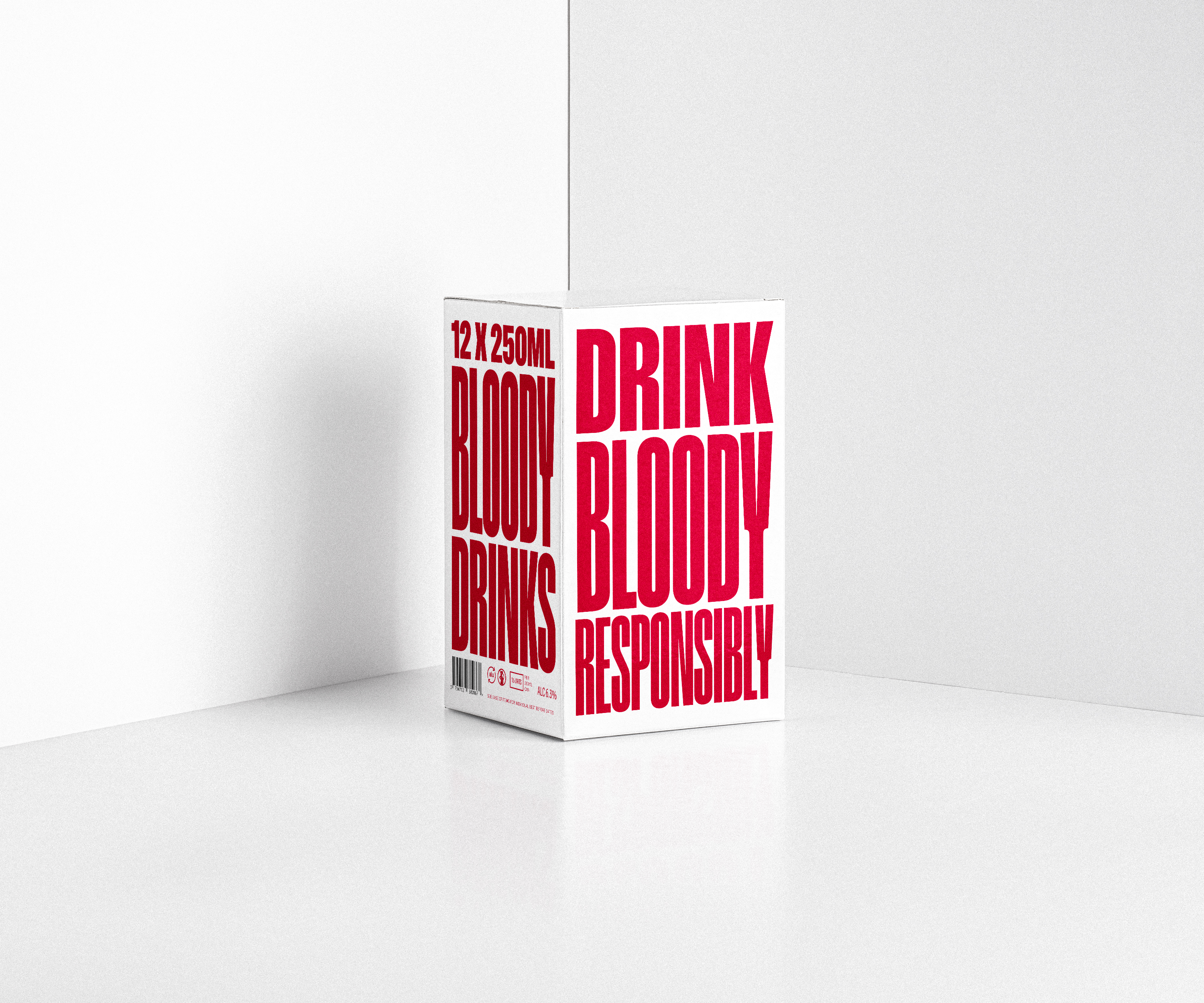
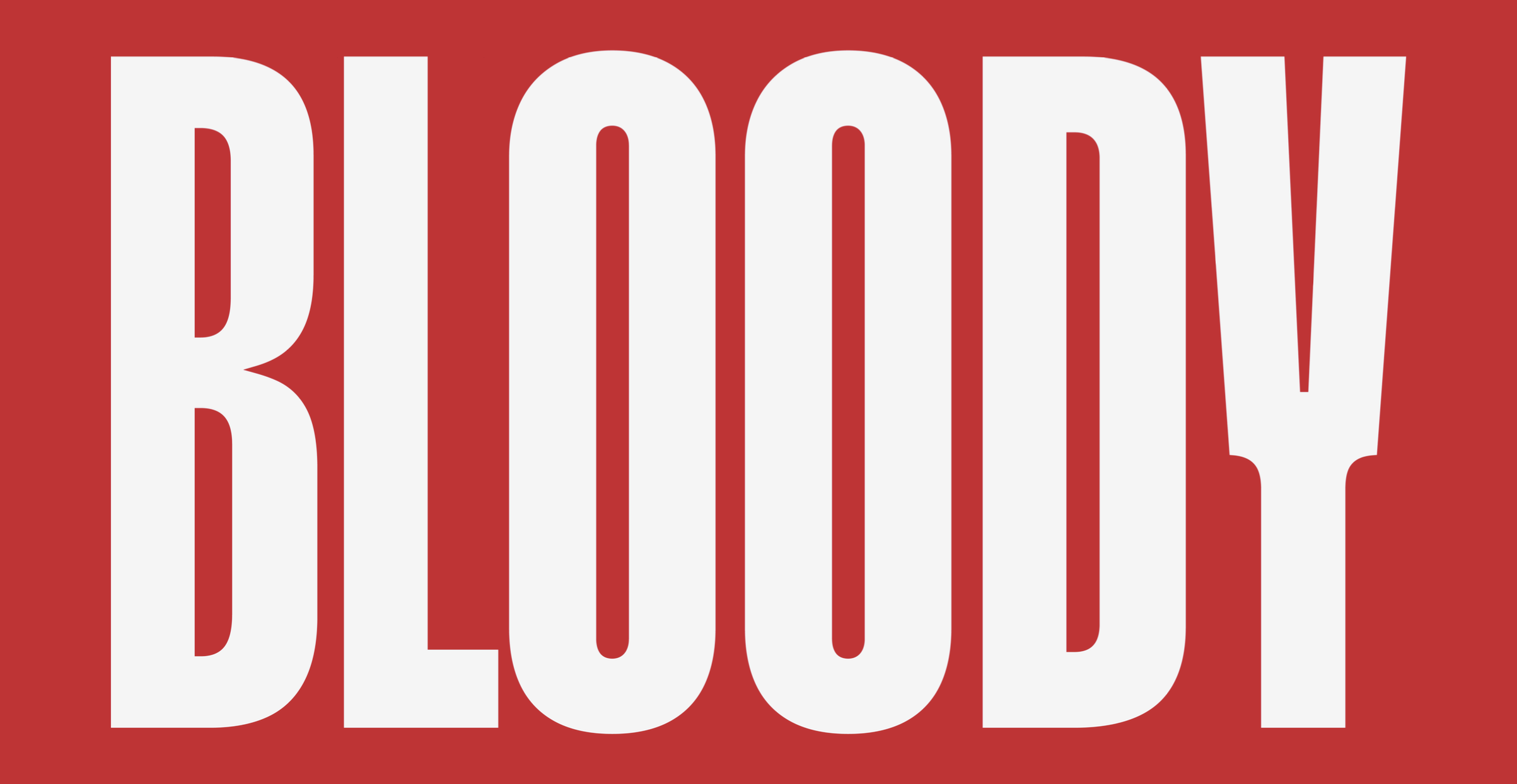
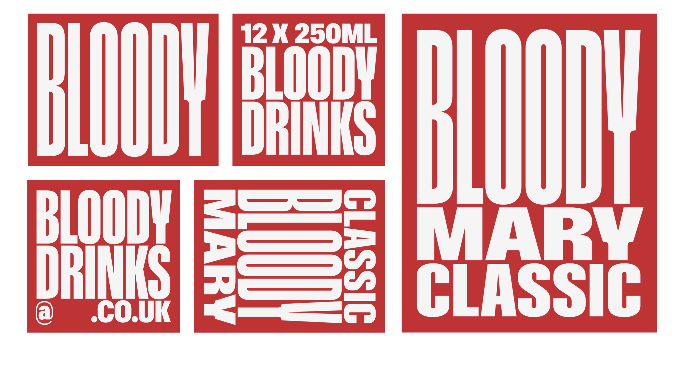
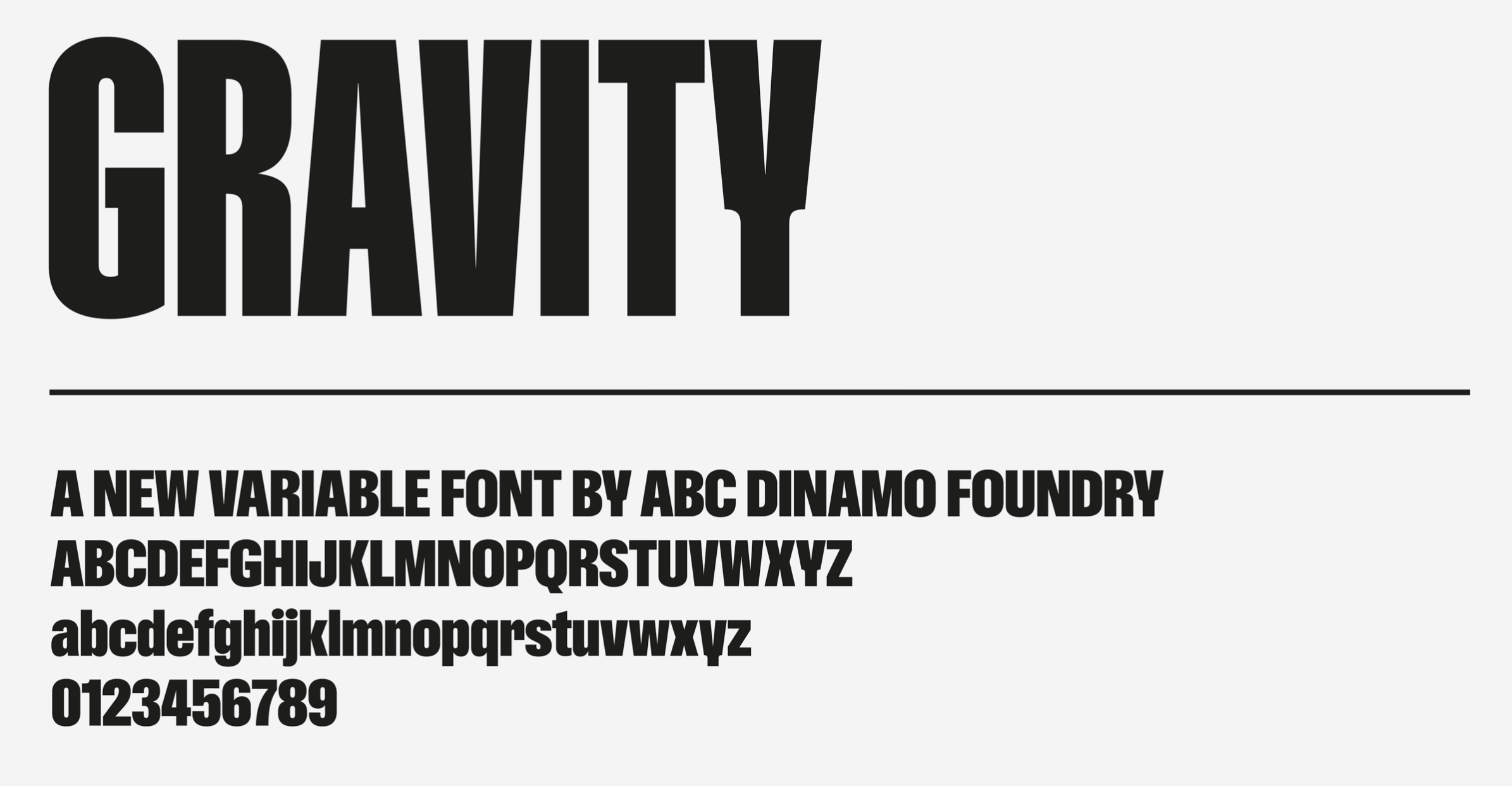
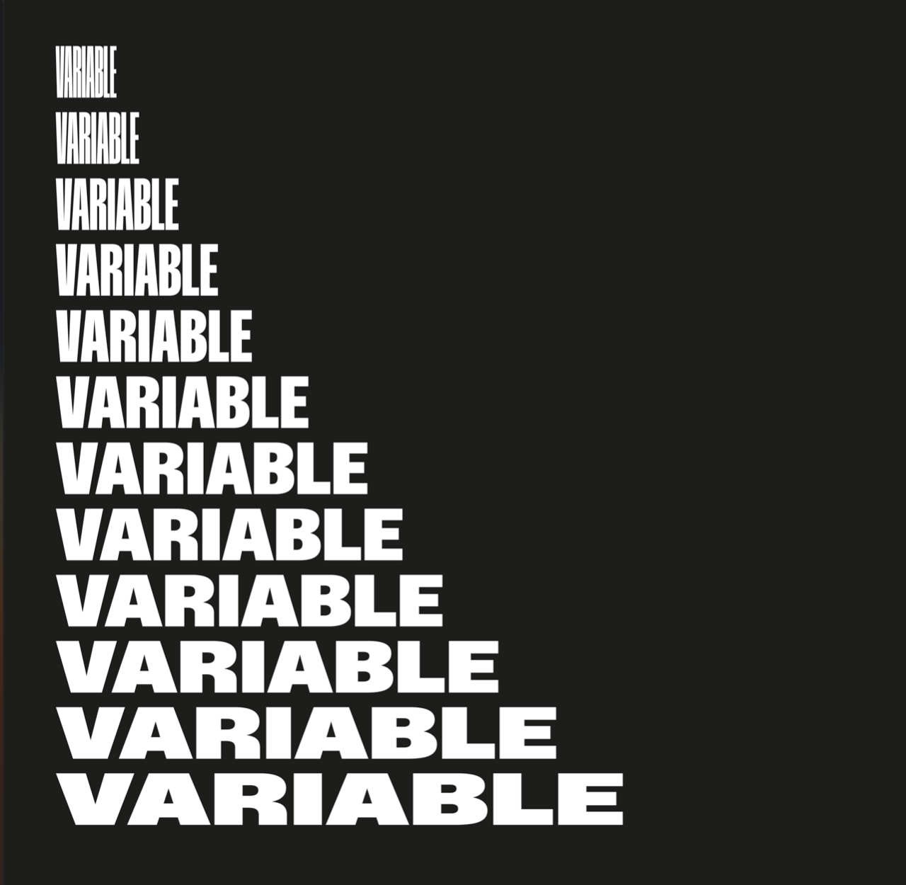
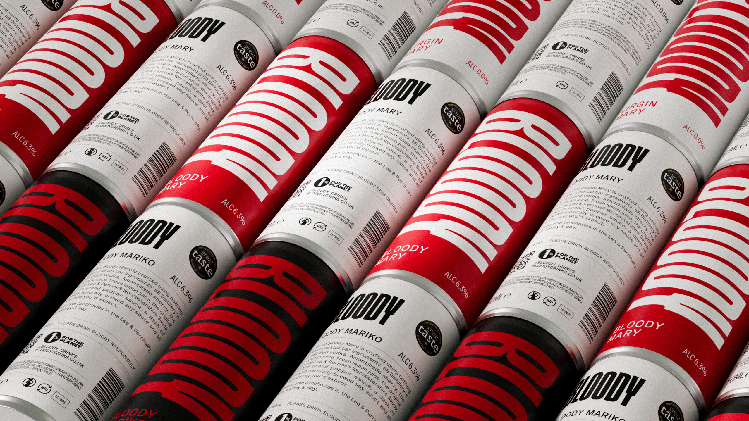
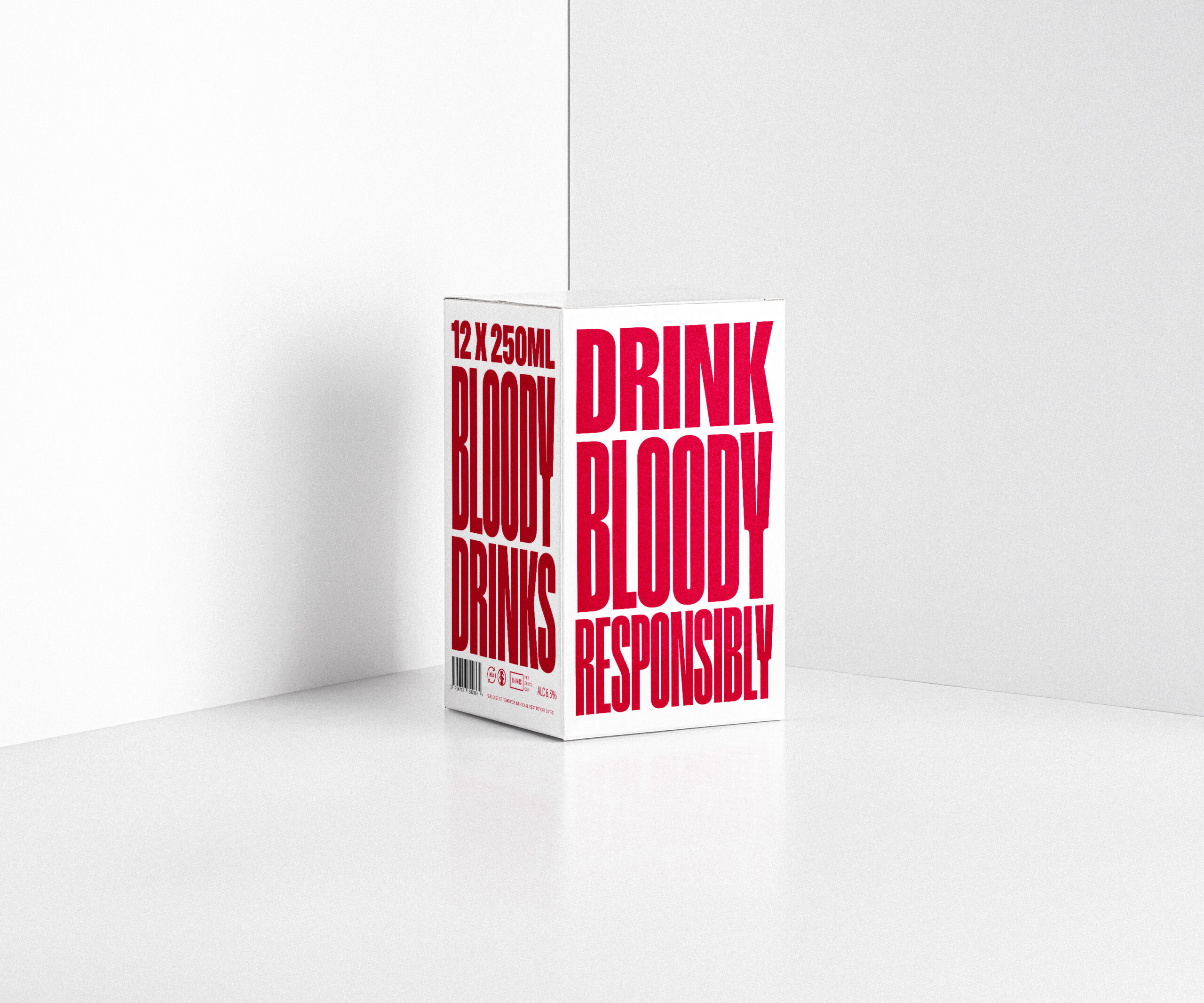
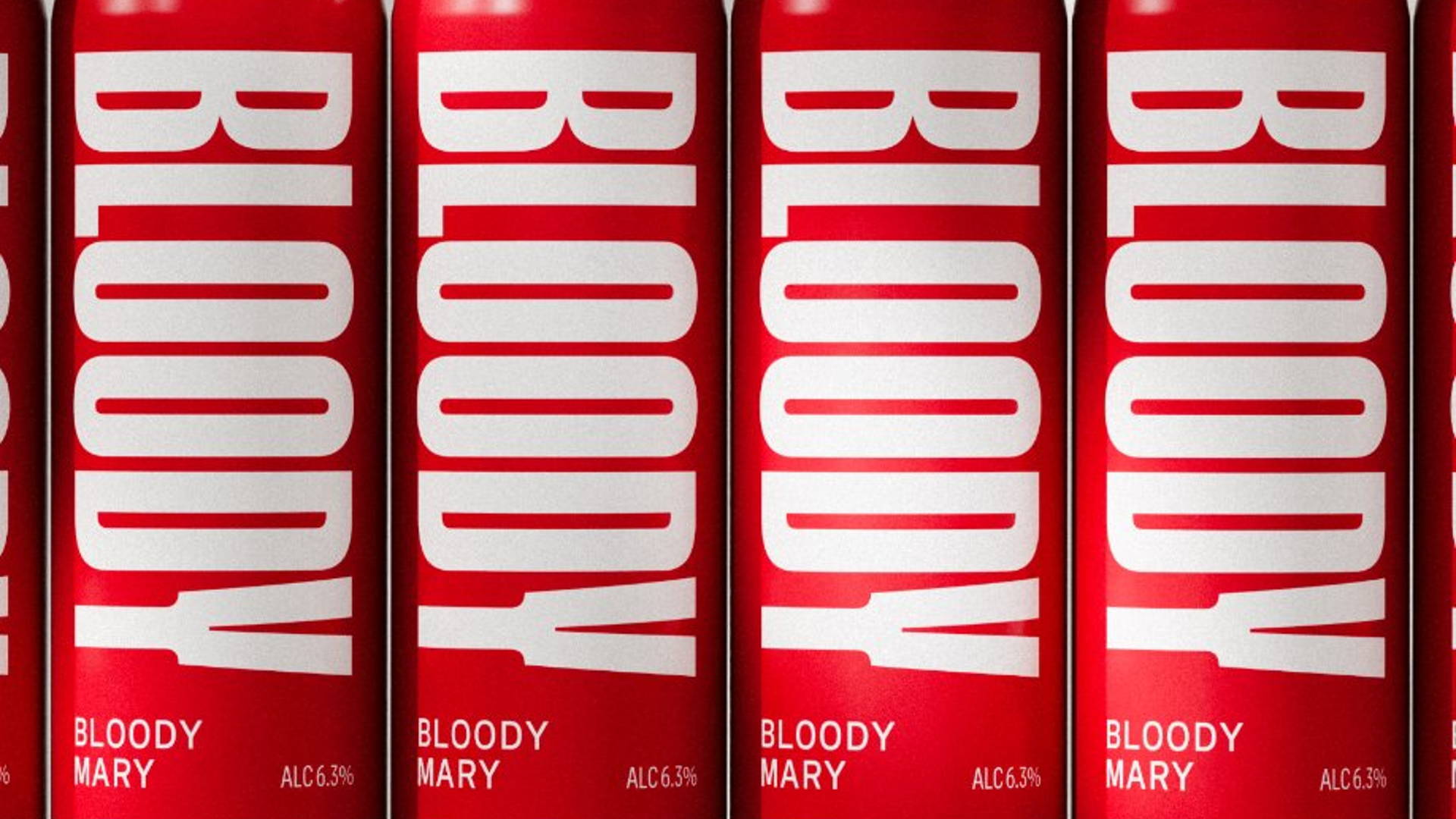
The attention-grabbing design is the brainchild of Glaswegian design agency Freytag Anderson. Their design approach incorporated a simple yet striking color palette and bespoke typography by ABC Dinamo. A specific feature is the unique font, that has 12 different weights that adapt according to the amount of text lines.

BLOODY_GFX_0.png


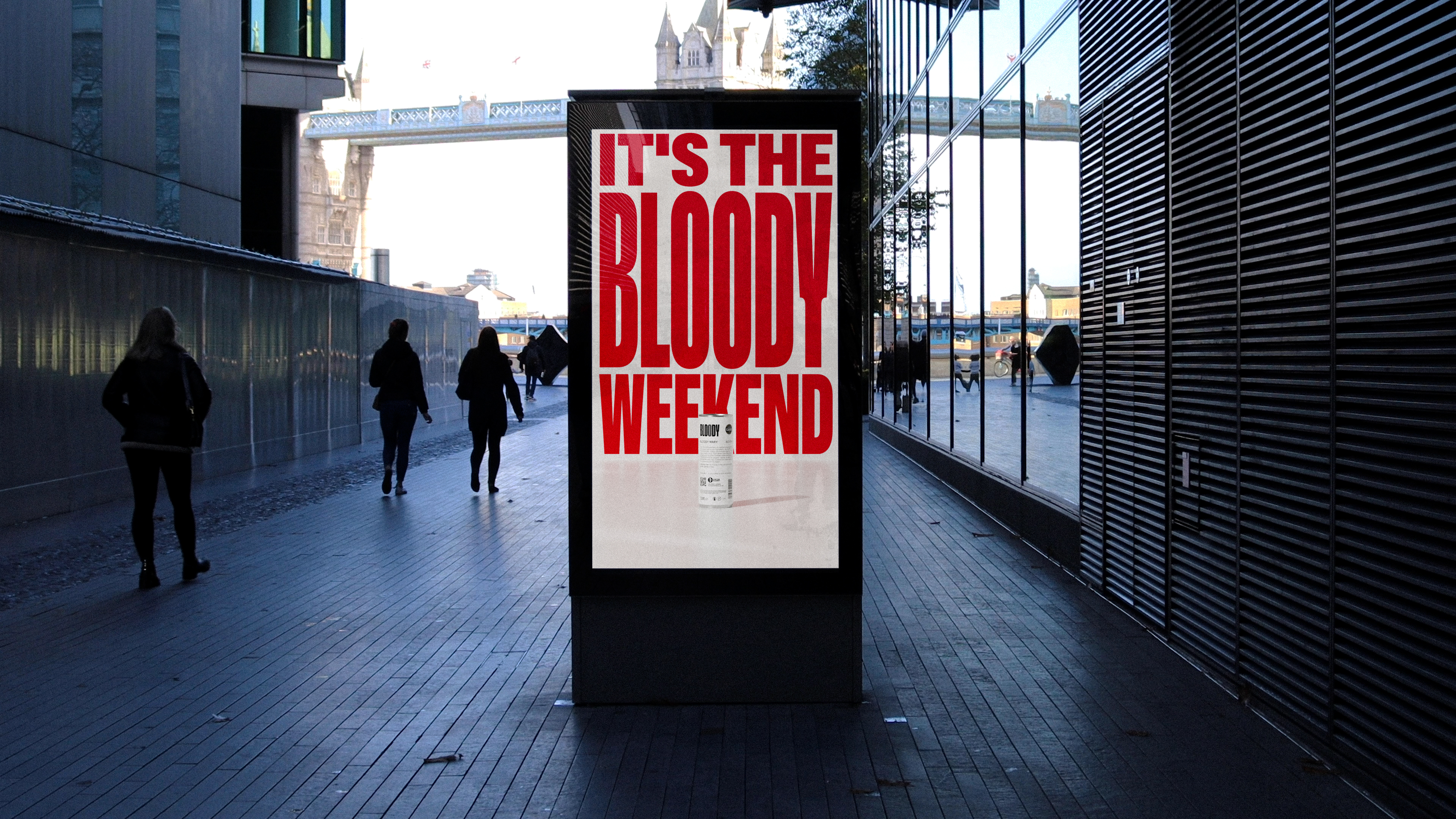
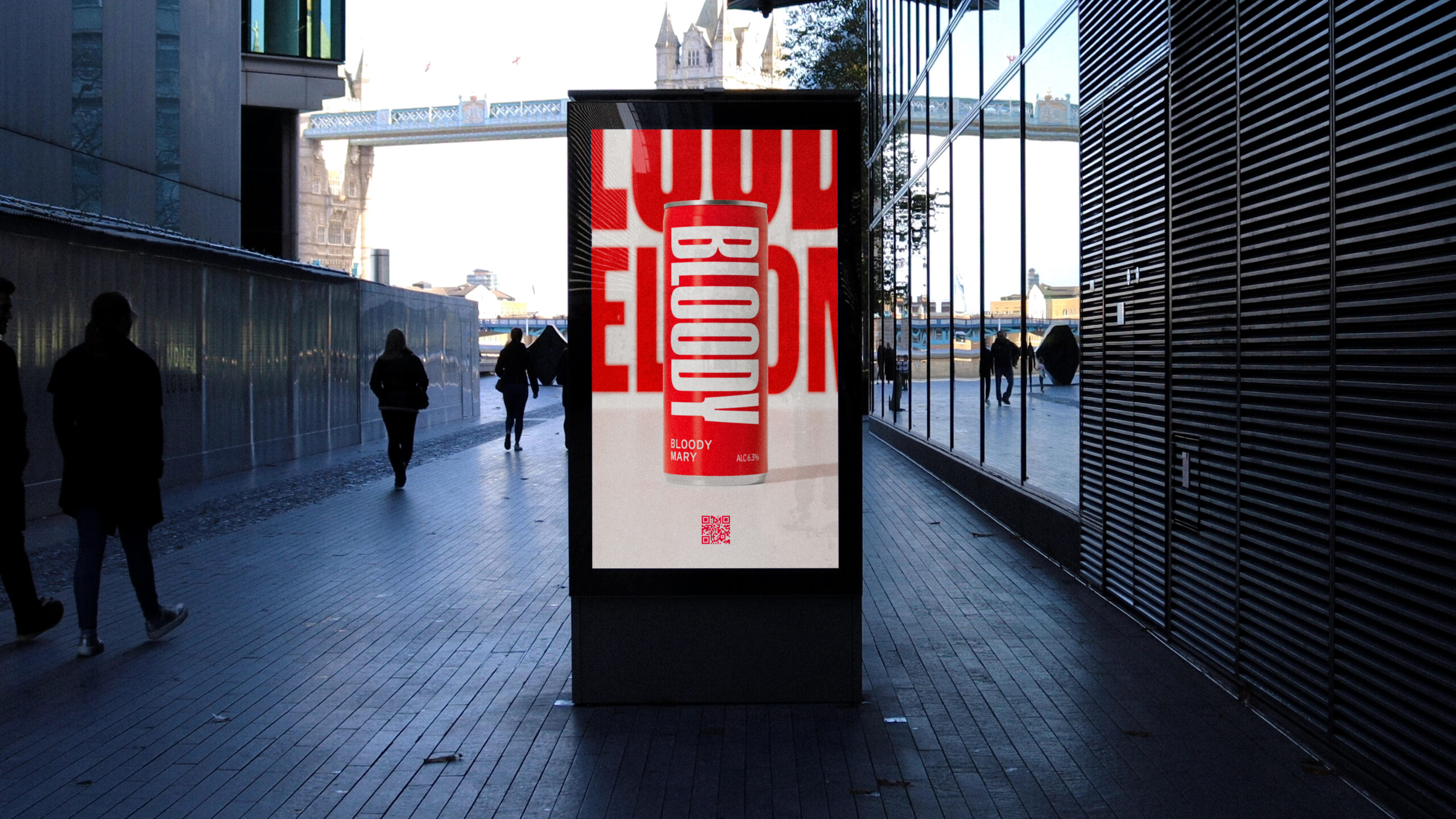
The design team collaborated with Bloody Drinks to develop their brand identity and assortment of ready-to-drink alcoholic and non-alcoholic beverages. The focus was primarily on their acclaimed Bloody Mary. Embracing the brand’s daring name, they created a provocative identity, using dynamic typography to express assertive brand messages suitable for can designs, social media, and outdoor advertising.
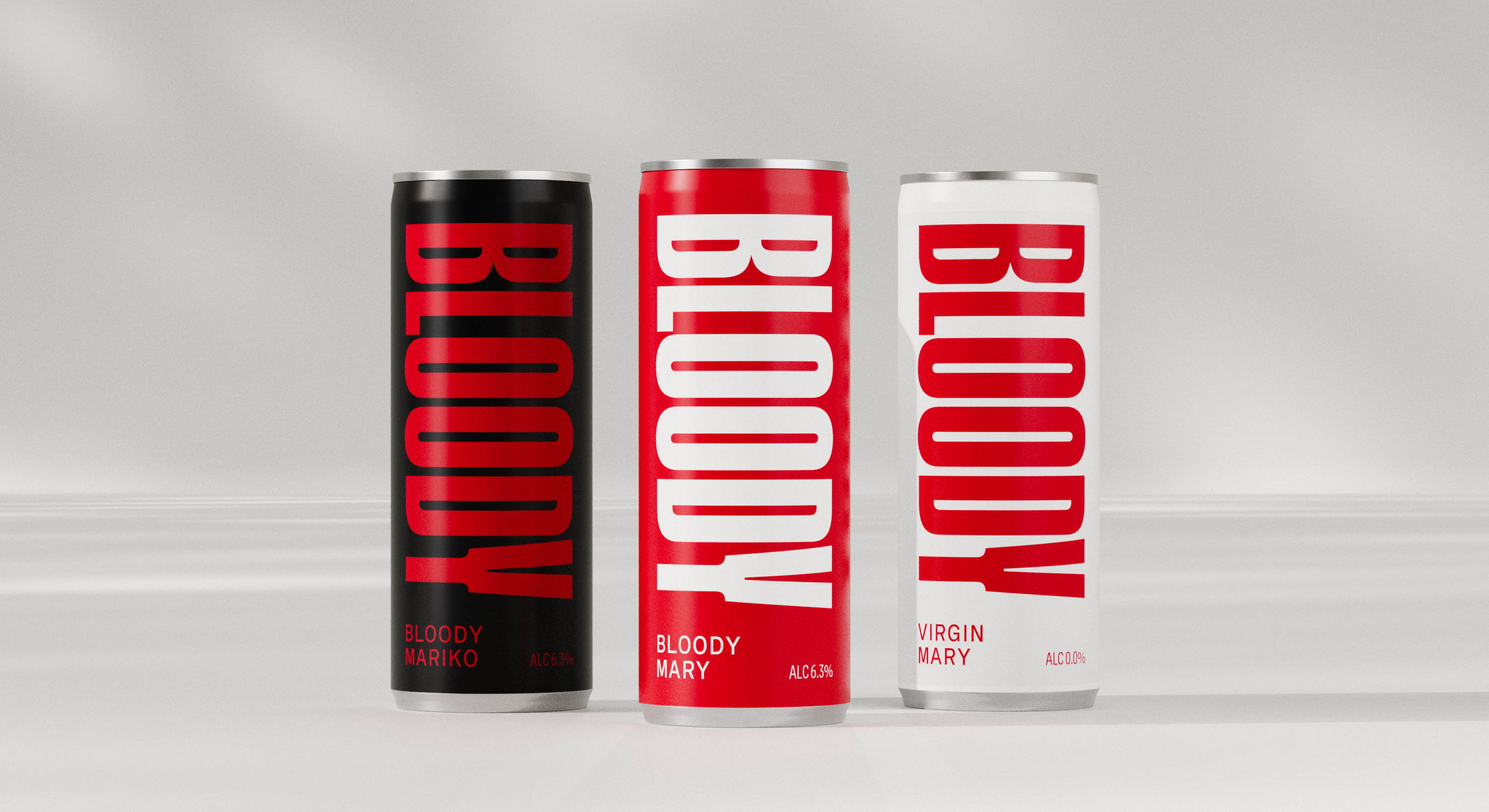
CAN_LINEUP.jpg


BLOODY_GFX_3.png


BLOODY_GFX_2.png


BLOODY_GFX_1.png


DISPLAY_1.jpg


DISPLAY_2.jpg


CAN_WALL_2.jpg


BOX_WHITE.jpg


Featured image for Bloody Drinks Gets Right to the Point with Daring Design & Bespoke Typography

12

Get the latest packaging design inspiration in your inbox:

Popular designs

Unique Whisky Packaging Design Celebrates 40-Year Legacy

Stckmn crafted ‘The Only Drop,’ a unique whisky packaging celebrating liquid and cask unity. Featuring handcrafted paper pulp sculptures and transparent bottle designs, the project fetched £18,750 at auction, aiding Scottish youth.

Designed by: PepsiCo Design & Innovation
Country: United States

Bloody Drinks: Bold Packaging Design and Typography for a Striking Brand

12
"Bloody Drinks: Daring Design and Bespoke Typography for a Striking

At first glance, the bright red can and bold declaration of “BLOODY” on Bloody Drinks might be mistaken for a scream of someone stubbing their toe.

The attention-grabbing design is the brainchild of Glaswegian design agency Freytag Anderson. Their design approach incorporated a simple yet striking color palette and bespoke typography by ABC Dinamo. A specific feature is the unique font, that has 12 different weights that adapt according to the amount of text lines.

BLOODY_GFX_0.png


The design team collaborated with Bloody Drinks to develop their brand identity and assortment of ready-to-drink alcoholic and non-alcoholic beverages. The focus was primarily on their acclaimed Bloody Mary. Embracing the brand’s daring name, they created a provocative identity, using dynamic typography to express assertive brand messages suitable for can designs, social media, and outdoor advertising.

CAN_LINEUP.jpg


BLOODY_GFX_3.png


BLOODY_GFX_2.png


BLOODY_GFX_1.png


DISPLAY_1.jpg


DISPLAY_2.jpg


CAN_WALL_2.jpg


BOX_WHITE.jpg


Featured image for Bloody Drinks Gets Right to the Point with Daring Design & Bespoke Typography

12
Previous slide
Next slide
Get the latest on packaging design in your inbox: