Designed by: PepsiCo Design & Innovation
Country: United States

Bloomy Wellness Packaging Design

1

Designed by: Marka Works | Country: Turkey

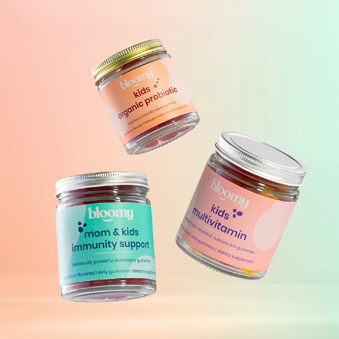
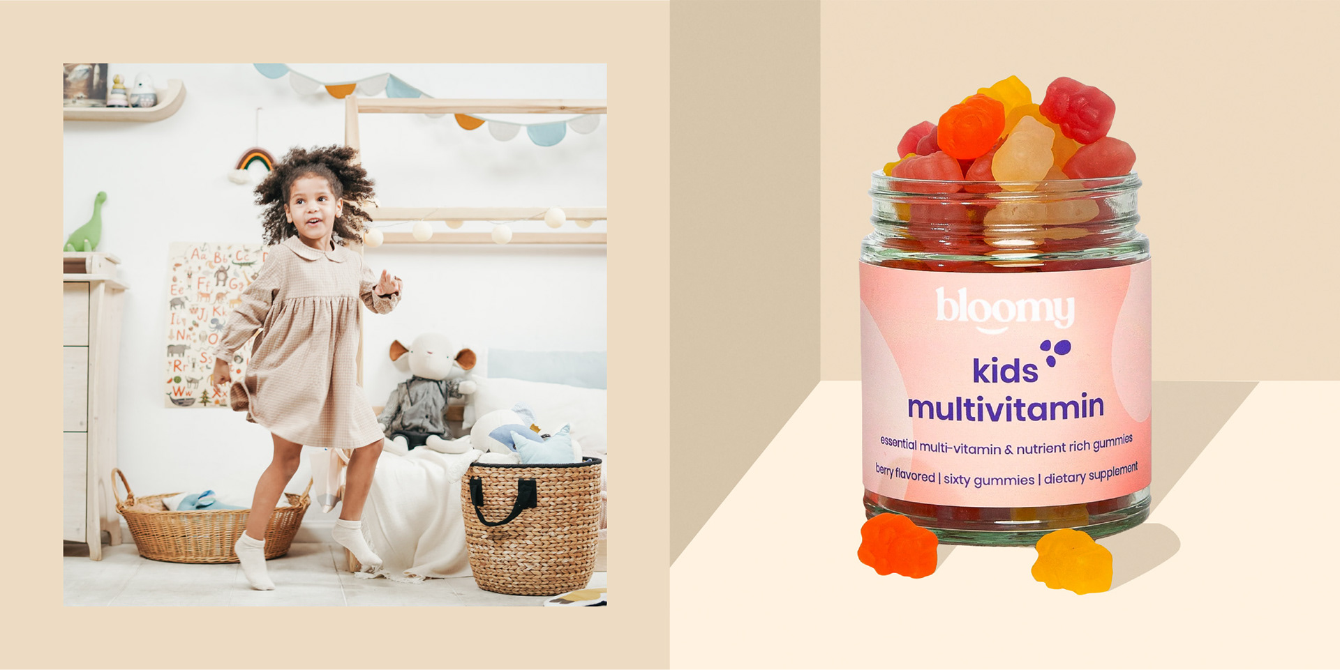
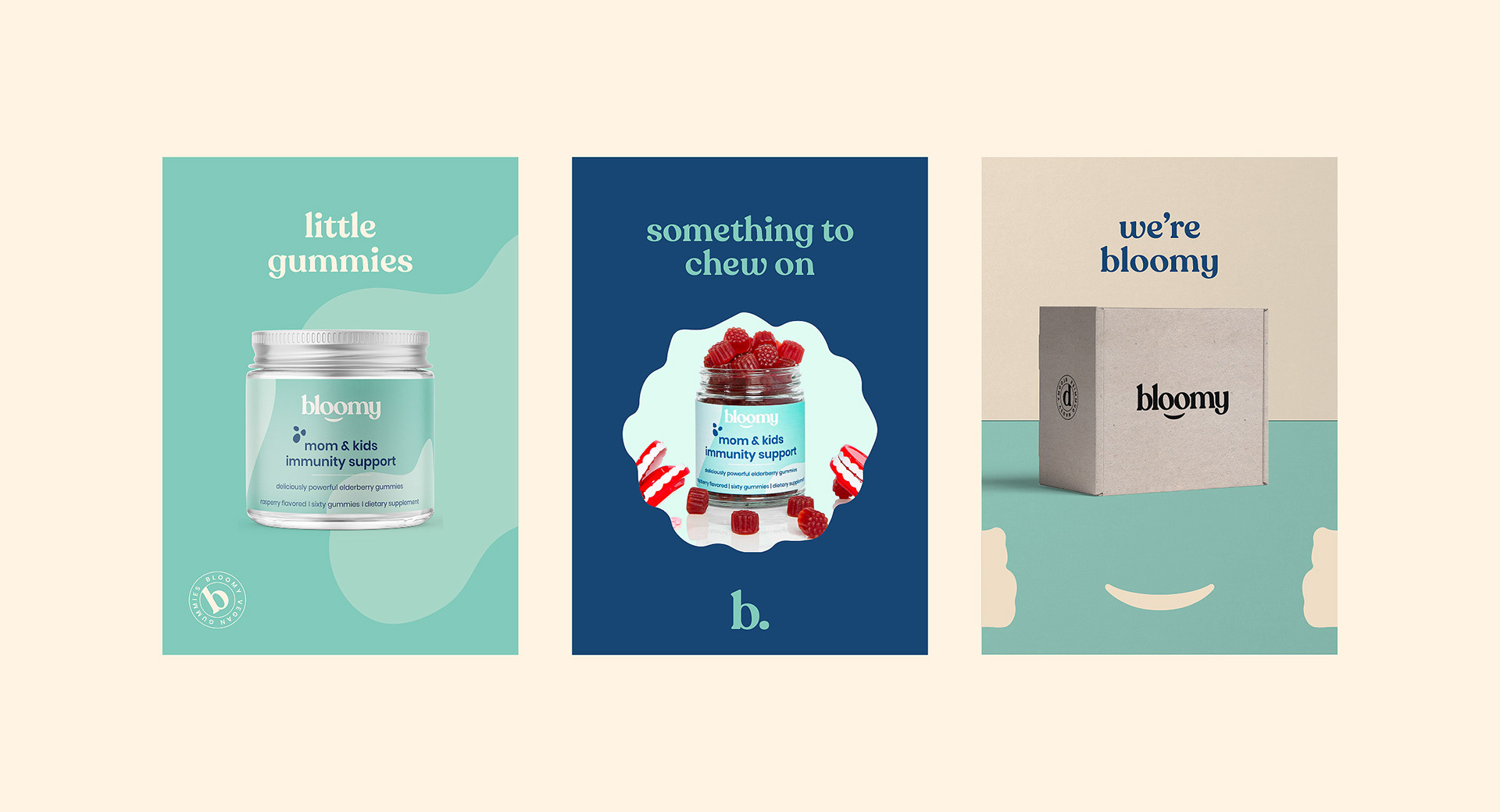
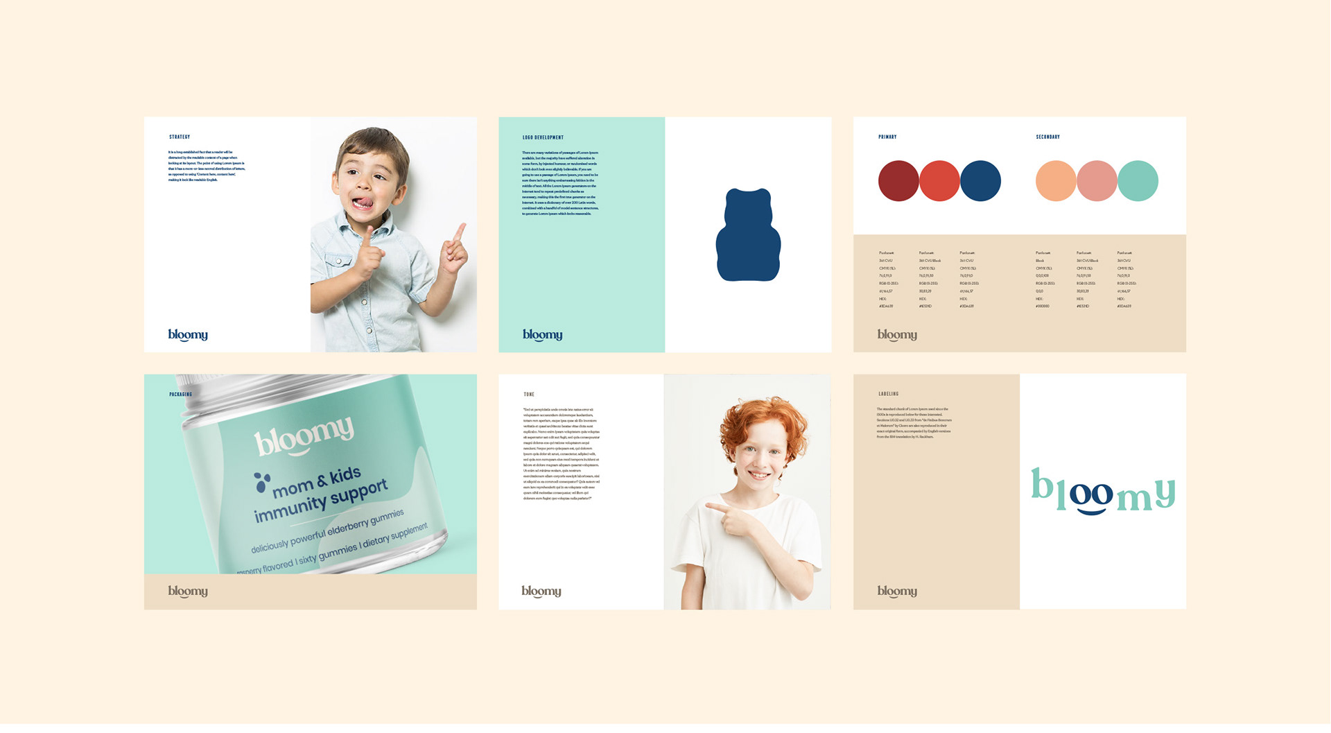
Bloomy is a vitamin supplement that regulates the immune system and has been specially designed for mothers and children. The aim was to design three packaging systems for the three products manufactured by the company.

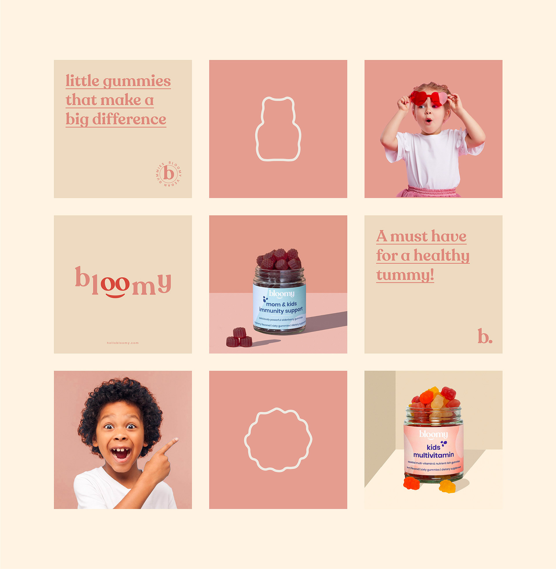
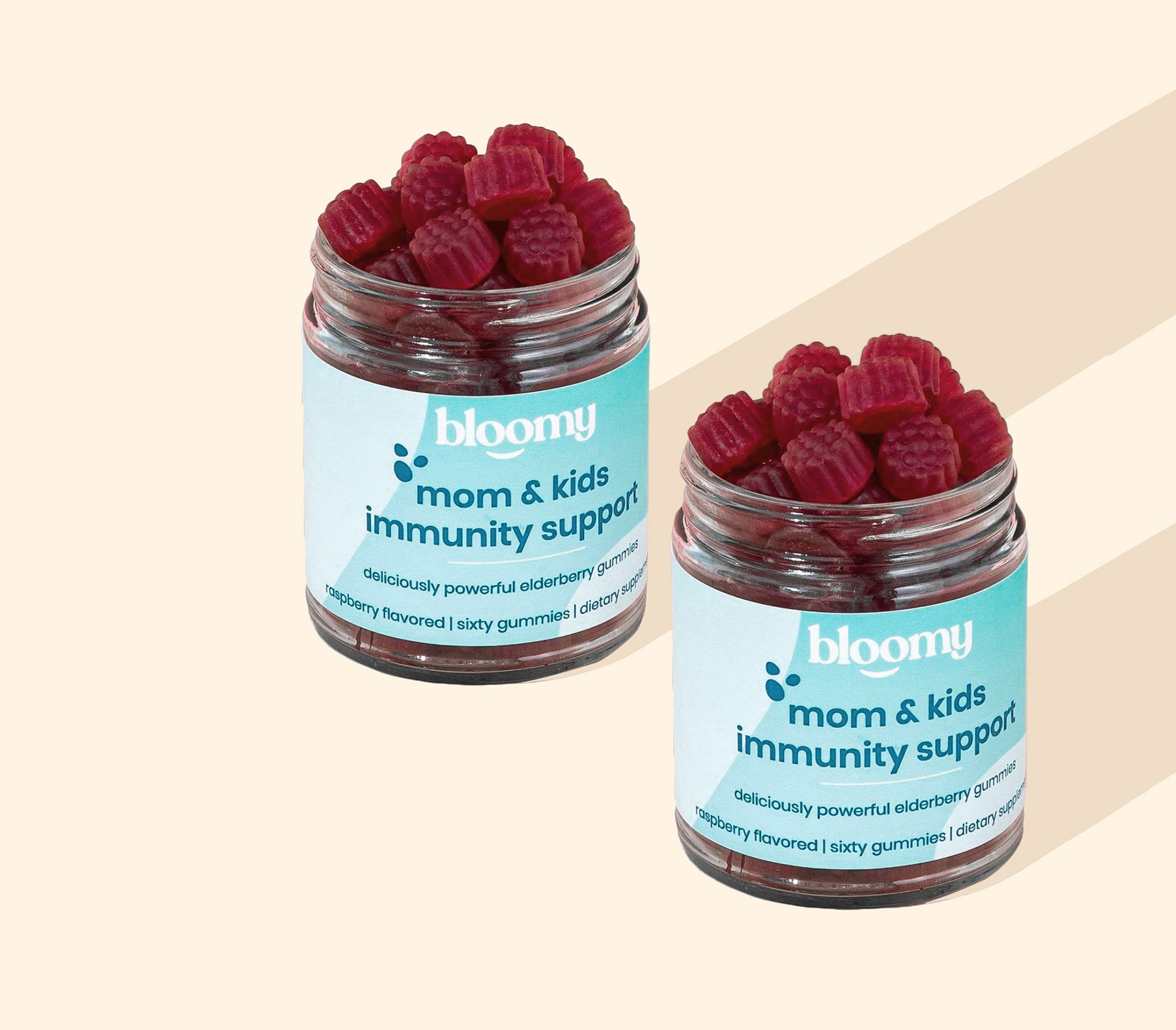
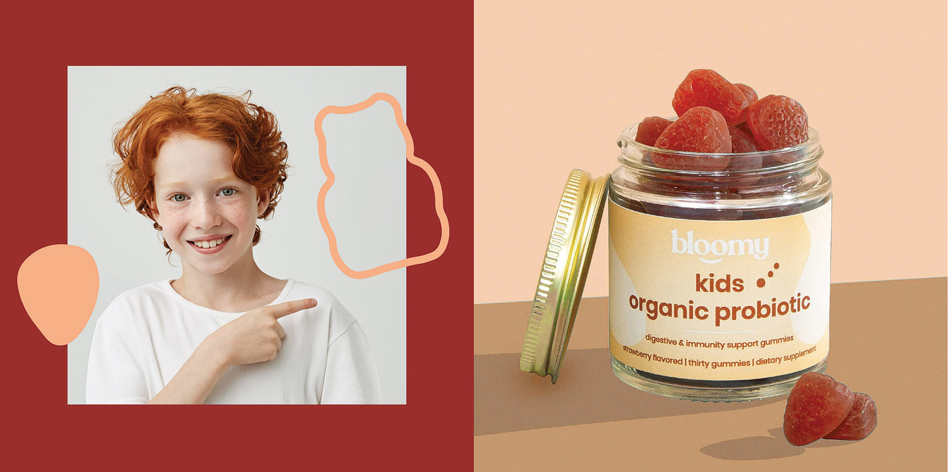
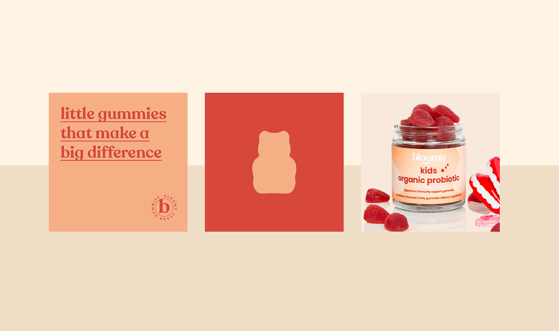
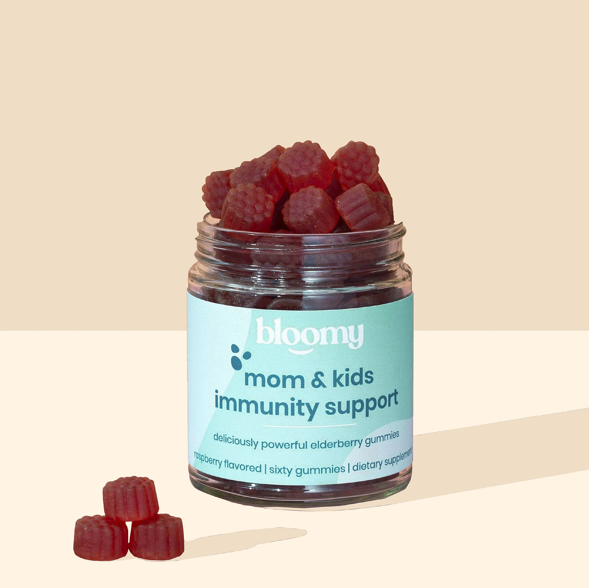
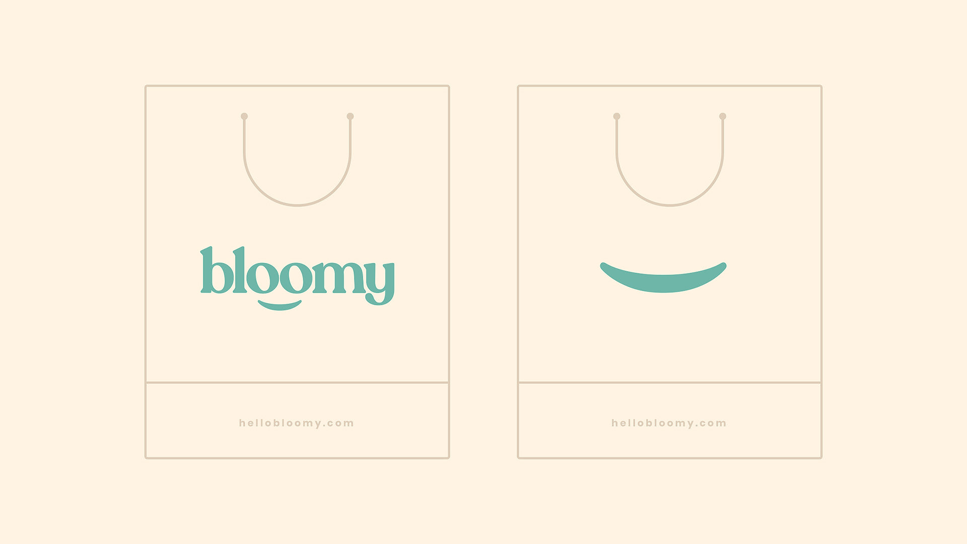
For Bloomy, we aimed to place an emblem inside the logo. We also aimed to design three different packages for three different products. We differentiated these products from each other with the color palettes we created. We have designed the product names on the packaging of each product in such a way that they do not get in the way of the brand identity, and at the same time, we have created them so that they can be seen clearly.

Bloomy Wellness Packaging Design

The packaging

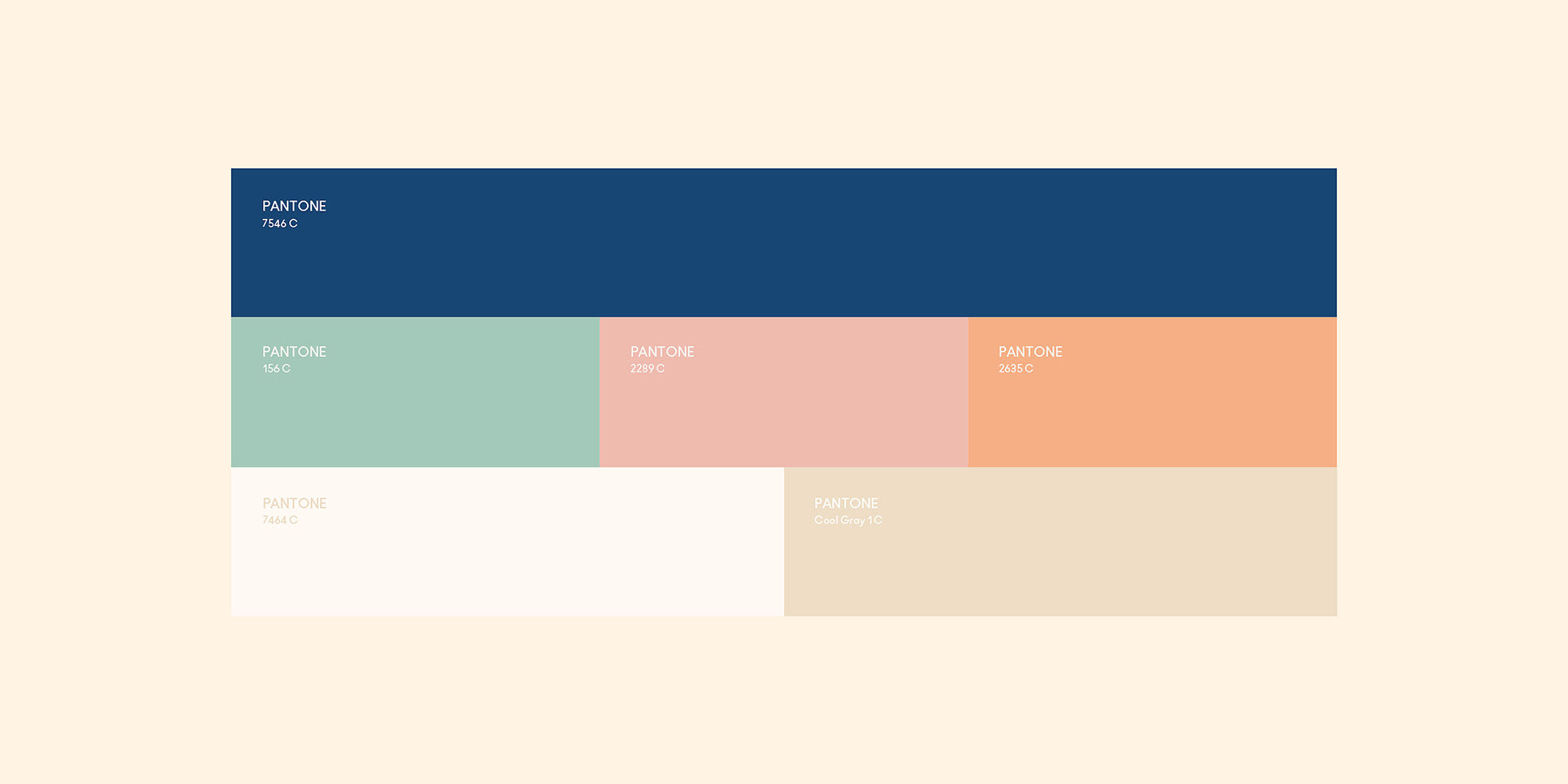
Bloomy approached Marka Works, an Istanbul-based branding agency, to create packaging illustrations that could appeal to the targeted audience. The branding agency used pastel colors to enhance the attractive quotient of the packaging.

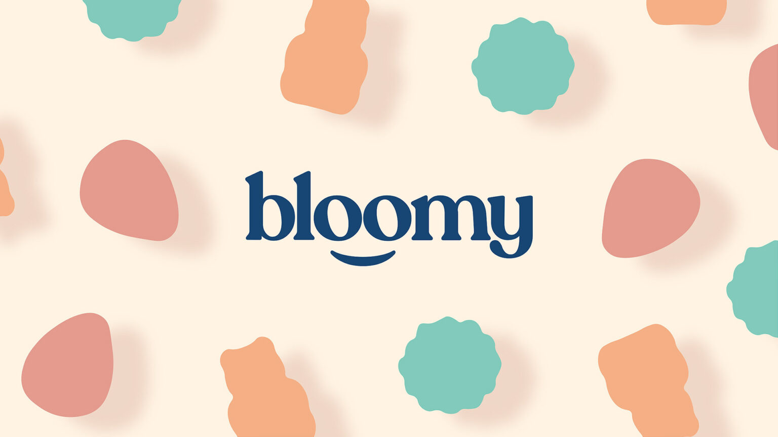
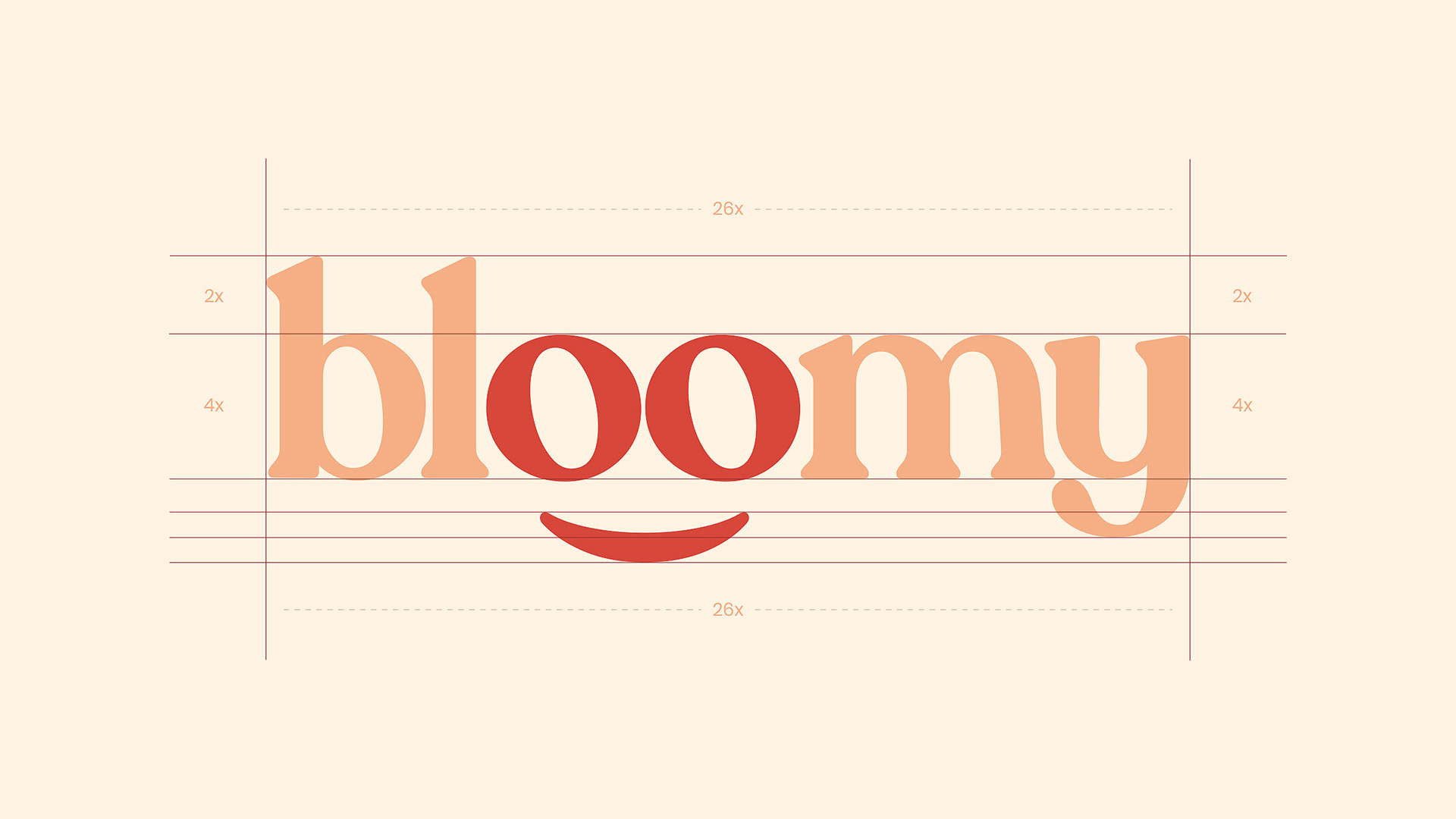
“While creating the Bloomy brand identity, we aimed for the logo to look sympathetic and cute, and we achieved this through the letters “o”. We integrated the emblem with the logo and created a brand identity that could appeal to its target audience. We also achieved an energetic atmosphere with the pastel tones we created for the packaging. In addition, we brought the product names to the fore as much as possible and ensured that they were at least as prominent as the brand.

1

Get the latest packaging design inspiration in your inbox:

Popular designs

The Bra Guru

Most women are wearing the wrong size bra and that is a fact. The Bra Guru® is the first and only professional

Burma Love Rebrand

Love at First BiteAs an extension of the Burma Superstar restaurant in San Francisco, Burma Love Foods gives diners an opportunity to

Far Out Bar

Description: Far Out Bar is a cutting-edge packaging design project created for High Life Farms’ macrodose THC chocolate bars. This project involved

Designed by: PepsiCo Design & Innovation
Country: United States

Bloomy Wellness Packaging Design

1
17

Designed by: Marka Works | Country: Turkey

Bloomy is a vitamin supplement that regulates the immune system and has been specially designed for mothers and children. The aim was to design three packaging systems for the three products manufactured by the company.

For Bloomy, we aimed to place an emblem inside the logo. We also aimed to design three different packages for three different products. We differentiated these products from each other with the color palettes we created. We have designed the product names on the packaging of each product in such a way that they do not get in the way of the brand identity, and at the same time, we have created them so that they can be seen clearly.

Bloomy Wellness Packaging Design

The packaging

Bloomy approached Marka Works, an Istanbul-based branding agency, to create packaging illustrations that could appeal to the targeted audience. The branding agency used pastel colors to enhance the attractive quotient of the packaging.

“While creating the Bloomy brand identity, we aimed for the logo to look sympathetic and cute, and we achieved this through the letters “o”. We integrated the emblem with the logo and created a brand identity that could appeal to its target audience. We also achieved an energetic atmosphere with the pastel tones we created for the packaging. In addition, we brought the product names to the fore as much as possible and ensured that they were at least as prominent as the brand.

1

Explore more great package design

Get the latest on packaging design in your inbox: