Designed by: PepsiCo Design & Innovation
Country: United States

Blue Bottle Coffee Brand Identity and Packaging Design


Designed by Pearlfisher | Country: United States

Blue Bottle teamed up with Pearlfisher To create a new expression for Blue Bottle’s New Orleans Iced Coffee, extending the intimate Blue Bottle experience from carefully curated cafes to a carton, reaching a larger audience and standing out on shelves in mass retailers.”
Pearlfisher, the London-based design agency, crafted the new look of Blue Bottle Coffee’s New Orleans Iced Coffee. While there are a large number of iced coffee brands that crowd the shelves, Blue Bottle has something unique to offer. With six cafes in New York City and eight in the San Francisco area, Blue Bottle has been proudly serving its artisan roasted coffee since the early 2000s.

With the desire to reach a larger audience, Blue Bottle has come out of its cafes to stand out on the shelves.

Blue Bottle teamed up with Pearlfisher To create a new expression for Blue Bottle’s New Orleans Iced Coffee, extending the intimate Blue Bottle experience from carefully curated cafes to a carton, reaching a larger audience and standing out on shelves in mass retailers.”
Blue Bottle Coffee Brand Identity and Packaging Design

The Challenge

While Blue Bottle wanted to reach a wider consumer segment, it lacked the idea of sharing its unique offering. The real challenge was to share the deep-seated Blue Bottle experience out of their beautifully curated cafes to a carton.

In order to overcome the challenge, Peralfisher created designs in line with Blue Bottle’s values and the company’s founder James Freeman’s vison.

Tess Wicksteed, Executive Vice President at Pearlfisher, mentioned the following:

“The challenge when working with a very simple and pure iconic brand is how to introduce a secondary visual language with depth that doesn’t complicate the purity of the existing design. Structure is one way to do this. The milk carton allowed us to play up the brand’s iconic equities without losing the crafted feel of the brand.”

The packaging

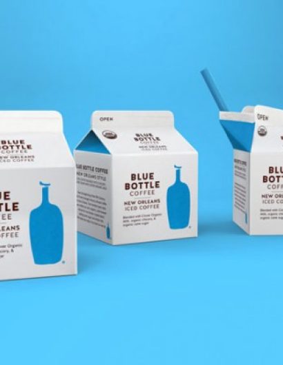
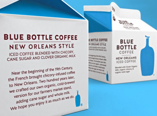
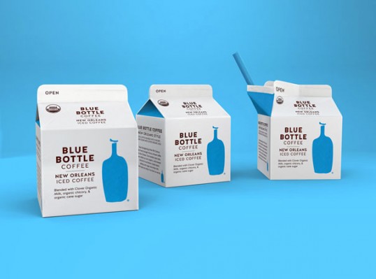
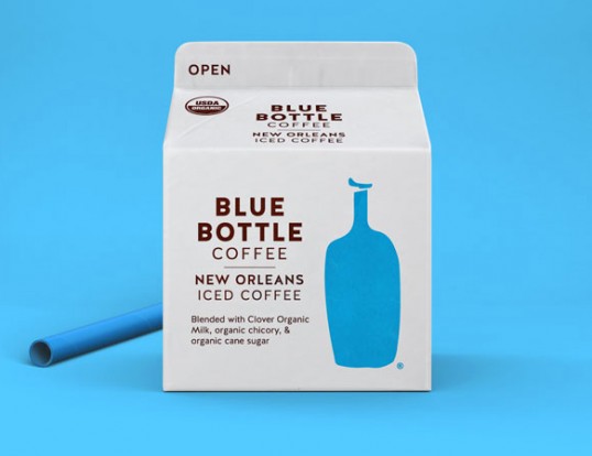
The iced coffee comes in elegant-looking cartons with the wordmark placed to the left of the Blue Bottle symbol. The packaging design evokes nostalgia, which allows Blue Bottle’s offer to stand apart from its competitors.

The new design for Blue Bottle’s New Orleans Iced Coffee stays true to the heart of Blue Bottle, challenging coffee category cues while remaining modest and utilitarian. Pearlfisher has elevated Blue Bottle’s current equities and clarified their wordmark to increase its stature, simplifying messaging on pack and playing up the Blue Bottle blue to increase shelf impact.”

Hamish Campbell, Creative Director at Pearlfisher New York says, “Blue Bottle has always approached coffee differently than their competitors and it was really important that we applied that same thinking to their RTD. We were able to elevate Blue Bottle’s current equities by clarifying their word mark to increase its stature, simplifying messaging on pack and playing up the Blue Bottle blue in unexpected ways, like the saturated gable, which is incredibly impactful on shelf.”

Get the latest packaging design inspiration in your inbox:

Popular designs

Designed by: PepsiCo Design & Innovation
Country: United States

Blue Bottle Coffee Brand Identity and Packaging Design

lovely-package-blue-bottle-coffee-2-e1401927103486


Designed by Pearlfisher | Country: United States

Blue Bottle teamed up with Pearlfisher To create a new expression for Blue Bottle’s New Orleans Iced Coffee, extending the intimate Blue Bottle experience from carefully curated cafes to a carton, reaching a larger audience and standing out on shelves in mass retailers.”
Pearlfisher, the London-based design agency, crafted the new look of Blue Bottle Coffee’s New Orleans Iced Coffee. While there are a large number of iced coffee brands that crowd the shelves, Blue Bottle has something unique to offer. With six cafes in New York City and eight in the San Francisco area, Blue Bottle has been proudly serving its artisan roasted coffee since the early 2000s.

With the desire to reach a larger audience, Blue Bottle has come out of its cafes to stand out on the shelves.

Blue Bottle teamed up with Pearlfisher To create a new expression for Blue Bottle’s New Orleans Iced Coffee, extending the intimate Blue Bottle experience from carefully curated cafes to a carton, reaching a larger audience and standing out on shelves in mass retailers.”

Blue Bottle Coffee Brand Identity and Packaging Design

The Challenge

While Blue Bottle wanted to reach a wider consumer segment, it lacked the idea of sharing its unique offering. The real challenge was to share the deep-seated Blue Bottle experience out of their beautifully curated cafes to a carton.

In order to overcome the challenge, Peralfisher created designs in line with Blue Bottle’s values and the company’s founder James Freeman’s vison.

Tess Wicksteed, Executive Vice President at Pearlfisher, mentioned the following:

“The challenge when working with a very simple and pure iconic brand is how to introduce a secondary visual language with depth that doesn’t complicate the purity of the existing design. Structure is one way to do this. The milk carton allowed us to play up the brand’s iconic equities without losing the crafted feel of the brand.”

The packaging

The iced coffee comes in elegant-looking cartons with the wordmark placed to the left of the Blue Bottle symbol. The packaging design evokes nostalgia, which allows Blue Bottle’s offer to stand apart from its competitors.

The new design for Blue Bottle’s New Orleans Iced Coffee stays true to the heart of Blue Bottle, challenging coffee category cues while remaining modest and utilitarian. Pearlfisher has elevated Blue Bottle’s current equities and clarified their wordmark to increase its stature, simplifying messaging on pack and playing up the Blue Bottle blue to increase shelf impact.”

Hamish Campbell, Creative Director at Pearlfisher New York says, “Blue Bottle has always approached coffee differently than their competitors and it was really important that we applied that same thinking to their RTD. We were able to elevate Blue Bottle’s current equities by clarifying their word mark to increase its stature, simplifying messaging on pack and playing up the Blue Bottle blue in unexpected ways, like the saturated gable, which is incredibly impactful on shelf.”

Explore more great package design

Get the latest on packaging design in your inbox: