Designed by: PepsiCo Design & Innovation
Country: United States

BoB

BoB

Designed by Distil Studio | Country: United Kingdom

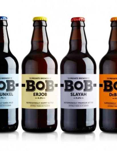
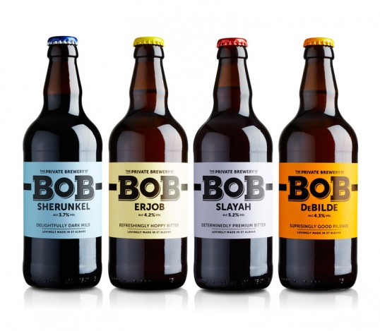
“What do you get when you combine words and phrases with good honest beer?… BoB.

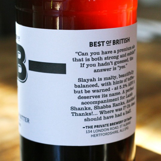
Short for ‘Best of British’, this St Albans based microbrewery uses quirky wordplay to set them apart.

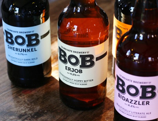
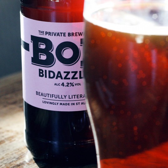
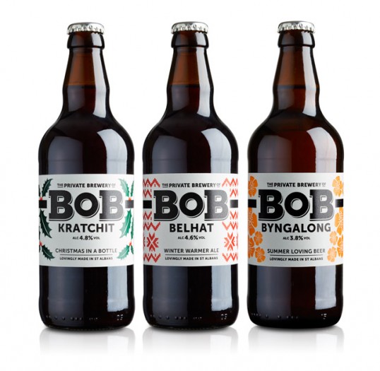
We’ve worked with BoB to develop a modern and distinctive brand identity, with a touch of tradition for good measure, and a label system that can adapt to an ever increasing range of amazing beers, bitters and ales. With such inspired beer names as ‘BoB Shurunkel’, ‘BoB Erjob’ and ‘BoB Bidazzler’, we’ve let the beers do the talking.

The visual hierarchy ensures that the ‘BoB’ identity works hand-in-hand with each beer name whilst an unconventional colour palette marks this friendly brewery as a true one-off – now fully prepared for an ever increasing demand from local restaurants and pubs.”

BoB

BoB

BoB

BoB

BoB

BoB

Get the latest packaging design inspiration in your inbox:

Popular designs

The Port Vodka Lemon Water

Overview: In response to my client’s vision for a Cape Cod themed beverage brand, I embarked on the journey to create The Port

Pure Persian Honey

When we look closely at honey packaging, they are almost all in the usual format, and the ultimate in creativity is that

Far Out Bar

Description: Far Out Bar is a cutting-edge packaging design project created for High Life Farms’ macrodose THC chocolate bars. This project involved

Designed by: PepsiCo Design & Innovation
Country: United States

BoB

lovely-package-bob-3

BoB

Designed by Distil Studio | Country: United Kingdom

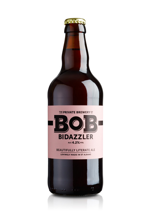
“What do you get when you combine words and phrases with good honest beer?… BoB.

Short for ‘Best of British’, this St Albans based microbrewery uses quirky wordplay to set them apart.

We’ve worked with BoB to develop a modern and distinctive brand identity, with a touch of tradition for good measure, and a label system that can adapt to an ever increasing range of amazing beers, bitters and ales. With such inspired beer names as ‘BoB Shurunkel’, ‘BoB Erjob’ and ‘BoB Bidazzler’, we’ve let the beers do the talking.

The visual hierarchy ensures that the ‘BoB’ identity works hand-in-hand with each beer name whilst an unconventional colour palette marks this friendly brewery as a true one-off – now fully prepared for an ever increasing demand from local restaurants and pubs.”
BoB

BoB

BoB

BoB

BoB

BoB

Previous slide
Next slide

Explore more great package design

Get the latest on packaging design in your inbox: