Designed by Anagrama | Country: Mexico
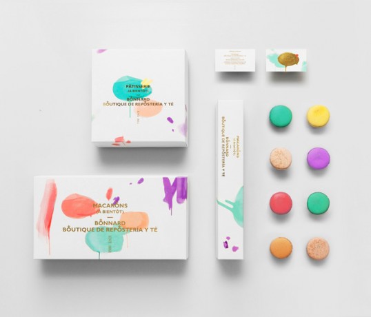
“Bonnard is a Mexican french-inspired tea and confectionary shop.
The brand’s distinct brush strokes and color selection are based on Pierre Bonnard’s postimpressionist paintings. The simple art direction, together with french words and phonetics round up the brand’s gallic concept effortlessly, spontaneously and efficiently.
Our approach with clean, sans-serif typography gives Bonnard a luxurious feel mostly associated with high-end fashion brands.The gold foil stamp and clean type directly contrasts and at the same time elevates the would-be informal paint marks.
The rounded cross icon detail found in the wording relates to the shapes of macaroons, one of Bonnard’s prime delicacies.”