Designed by: PepsiCo Design & Innovation
Country: United States

Both Branding and Packaging Design

Designed by:  Pavement | Country: US

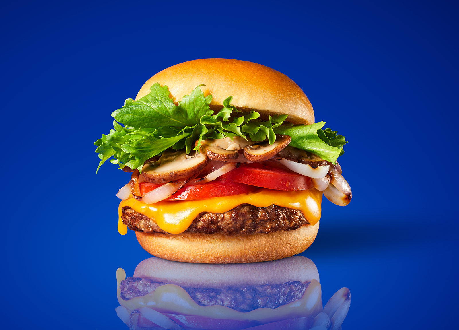
While the world is slowly moving towards a sustainable future and adopting a healthy lifestyle, the founders of Both found that it was impractical to expect meat eaters to change into vegetarians overnight. With that in mind, the founders developed a product that would have all the favorite flavors of meat eaters in their new burger.

Both is the burger that’s going to change everything – a 50% grass-fed beef and 50% all-natural veggie burger that is Both delicious and nutritious. Unimpressed by the taste of “plant-based” burgers, and unconvinced most meat eaters would suddenly become vegetarians, the founders had the radically simple idea to put your favorite flavor enhancing toppings inside the burger patty.

With Both, carnivores now have a realistic way to cut their meat consumption for better health and a lessened environmental impact, while still eating what they love.”
Both Branding and Packaging Design

The packaging

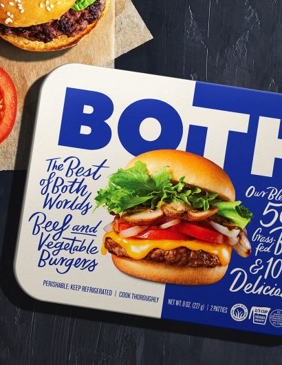
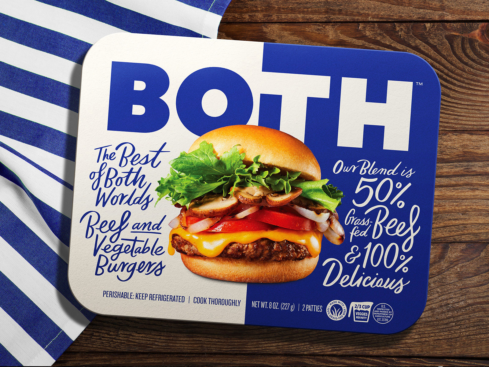
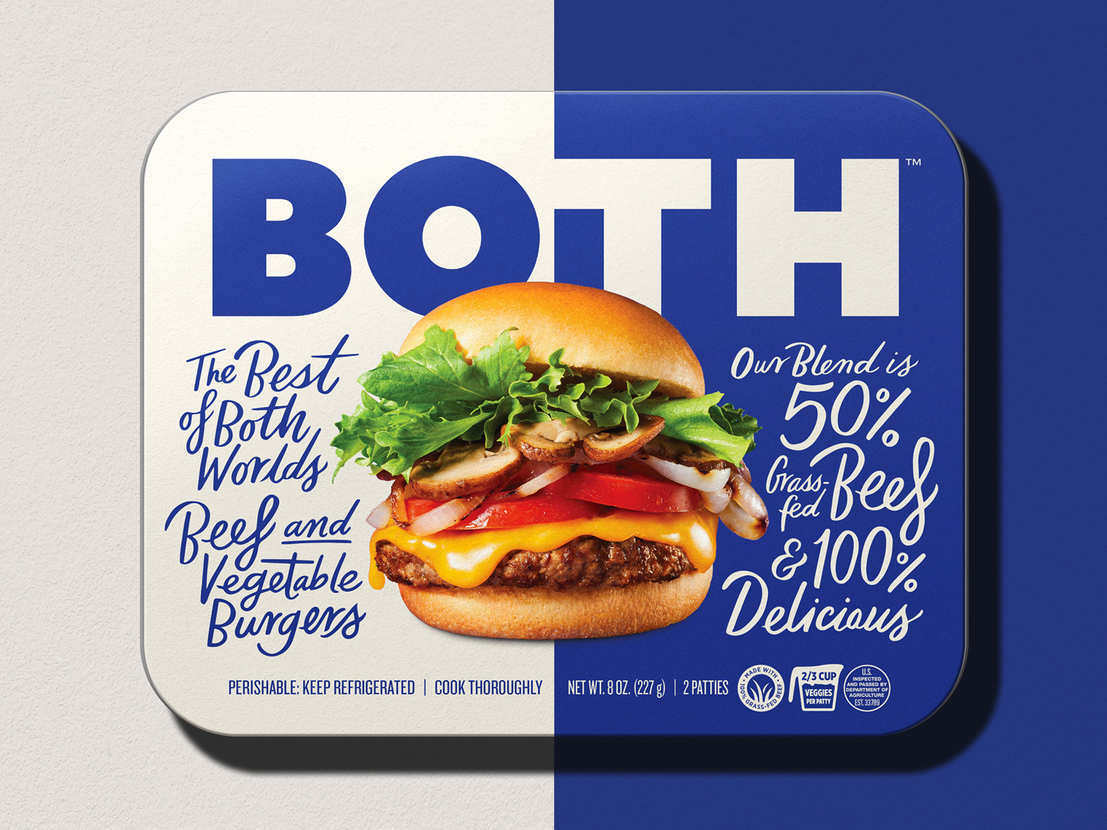
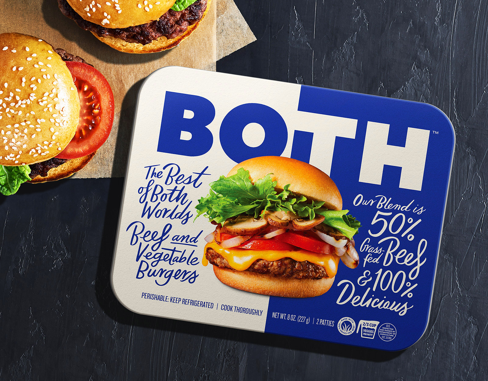
Both partnered with Pavement, an Oakland-based design agency, to create packaging designs that would highlight the duality of the product. The two-color palette and the handwritten fonts establish the dual character of the brand, along with increasing its shelf value.

Capturing the duality of the product was essential when establishing the brand tone, so a bold split-color identity was paired with inviting food photography and handwritten product description copy to create immediate shelf impact in the grocery aisle.

The overall package feels inviting yet innovative to help signal to the consumer the arrival of this delicious alternative.”

Get the latest packaging design inspiration in your inbox:

Popular designs

Tropicana’s Branding & Packaging Redesign by Sunhouse

Tropicana rejuvenates its brand with Sunhouse, blending modern iconicity and heritage. The redesign emphasizes Tropicana’s legacy, highlighting its unique story and craftsmanship, making it stand out as the original, superior orange juice.

Creating a Strong Brand Identity: The Journey of Living Things Packaging Design

“Developing Living Things packaging involved multiple design stages, feedback, and refinement. With extensive market research, collaboration with brand strategist Jose Debate and design agency Studio Nari, we created a strong, recognizable brand identity appealing to health-conscious, trend-setting millennials and Gen Z.”

Designed by: PepsiCo Design & Innovation
Country: United States

Both Branding and Packaging Design

Both Burger 1

Designed by:  Pavement | Country: US

While the world is slowly moving towards a sustainable future and adopting a healthy lifestyle, the founders of Both found that it was impractical to expect meat eaters to change into vegetarians overnight. With that in mind, the founders developed a product that would have all the favorite flavors of meat eaters in their new burger.

Both is the burger that’s going to change everything – a 50% grass-fed beef and 50% all-natural veggie burger that is Both delicious and nutritious. Unimpressed by the taste of “plant-based” burgers, and unconvinced most meat eaters would suddenly become vegetarians, the founders had the radically simple idea to put your favorite flavor enhancing toppings inside the burger patty.

With Both, carnivores now have a realistic way to cut their meat consumption for better health and a lessened environmental impact, while still eating what they love.”
Both Branding and Packaging Design

The packaging

Both partnered with Pavement, an Oakland-based design agency, to create packaging designs that would highlight the duality of the product. The two-color palette and the handwritten fonts establish the dual character of the brand, along with increasing its shelf value.

Capturing the duality of the product was essential when establishing the brand tone, so a bold split-color identity was paired with inviting food photography and handwritten product description copy to create immediate shelf impact in the grocery aisle.

The overall package feels inviting yet innovative to help signal to the consumer the arrival of this delicious alternative.”

Previous slide
Next slide
Get the latest on packaging design in your inbox: