Designed by: PepsiCo Design & Innovation
Country: United States

Brand Refresh: Deep South Premium Ice Cream

Designed by: Onfire Design | Country: New Zealand

eep South is an iconic ice cream brand in New Zealand. Established in South Island in 1978, the brand is known for its wide range of flavors. While the current design has become iconic, it fails to communicate the pack messaging. The livery designs that depict the scenic beauty of South Island had been with the brand for decades. However, Deep South wanted to strengthen its brand positioning Downunder.

In addition to strengthening its position in New Zealand markets, the refresh was aimed at export growth.

The redesign was based on different price points, which is why Onfire Design, the global award-winning branding, and packaging design agency, split the range into premium and mainstream offerings.
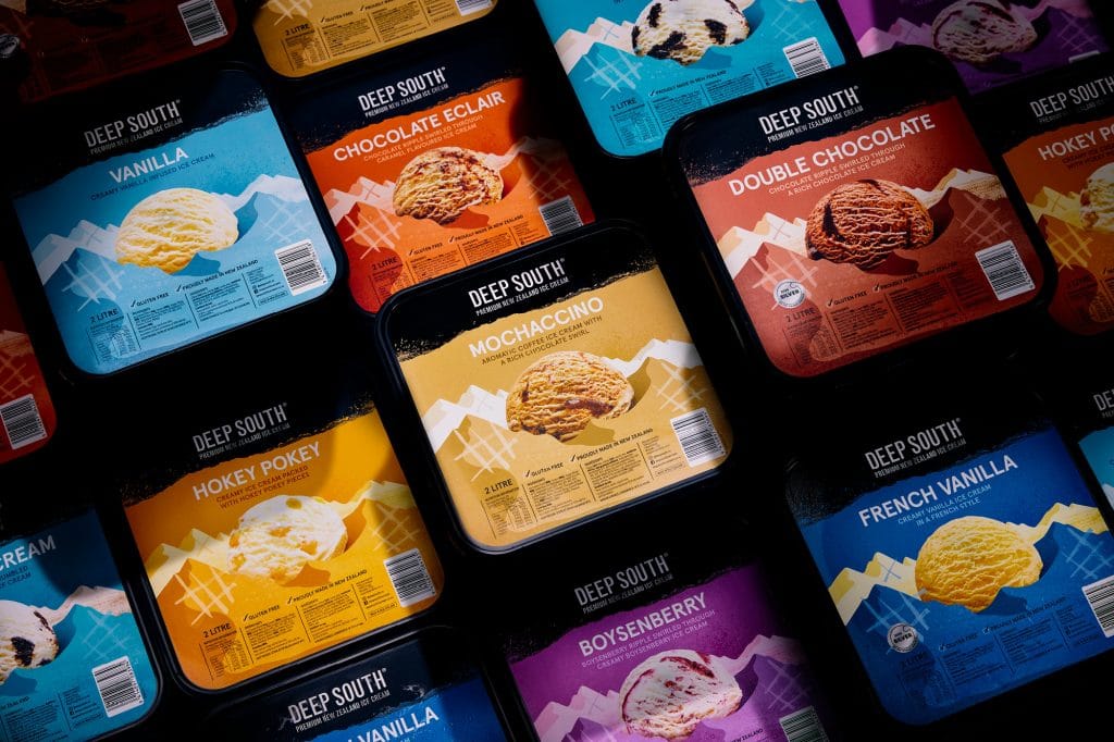
Brand Refresh: Deep South Premium Ice Cream

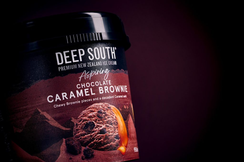
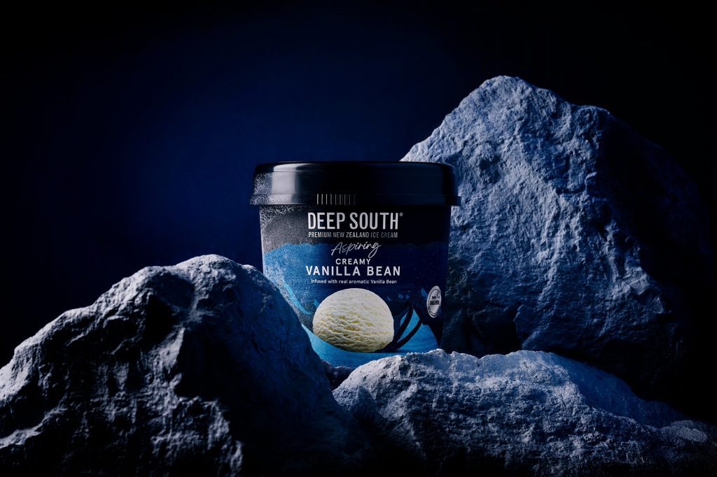
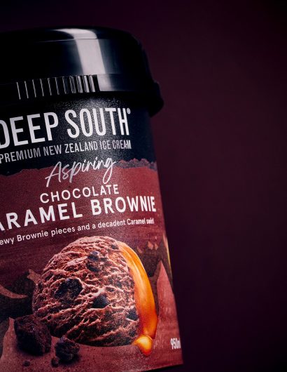
The premium offering was named after a national park and mountain range in South Island: ‘Aspiring.’ For the everyday ice cream-loving customer, a simplified version of Aspiring was created to maintain brand cohesion.

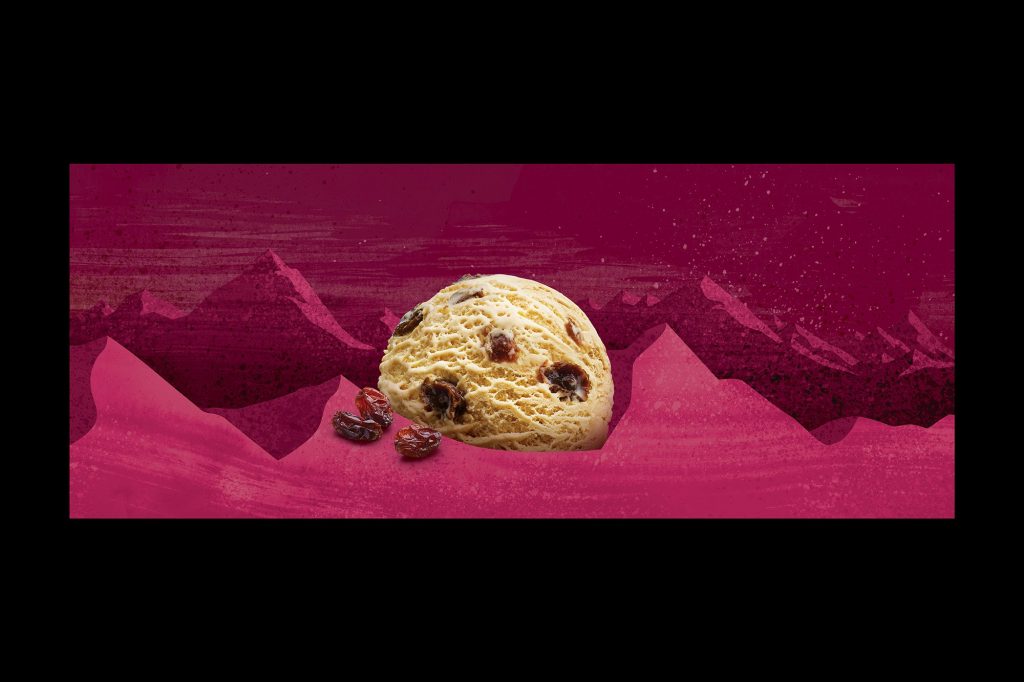
While the new packaging is attractive, it does not deviate from its root—South Island. Every pack of Deep South has South Island written all over it.

Get the latest packaging design inspiration in your inbox:

Popular designs

Far Out Bar

Description: Far Out Bar is a cutting-edge packaging design project created for High Life Farms’ macrodose THC chocolate bars. This project involved

The Bra Guru

Most women are wearing the wrong size bra and that is a fact. The Bra Guru® is the first and only professional

Designed by: PepsiCo Design & Innovation
Country: United States

Brand Refresh: Deep South Premium Ice Cream

Onfire_DeepSouth-3

Designed by: Onfire Design | Country: New Zealand

eep South is an iconic ice cream brand in New Zealand. Established in South Island in 1978, the brand is known for its wide range of flavors. While the current design has become iconic, it fails to communicate the pack messaging. The livery designs that depict the scenic beauty of South Island had been with the brand for decades. However, Deep South wanted to strengthen its brand positioning Downunder.

In addition to strengthening its position in New Zealand markets, the refresh was aimed at export growth.

The redesign was based on different price points, which is why Onfire Design, the global award-winning branding, and packaging design agency, split the range into premium and mainstream offerings.
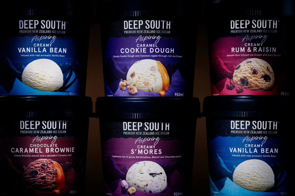
Brand Refresh: Deep South Premium Ice Cream

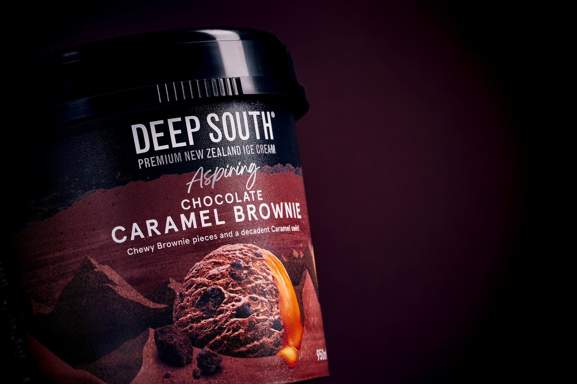
The premium offering was named after a national park and mountain range in South Island: ‘Aspiring.’ For the everyday ice cream-loving customer, a simplified version of Aspiring was created to maintain brand cohesion.

While the new packaging is attractive, it does not deviate from its root—South Island. Every pack of Deep South has South Island written all over it.

Previous slide
Next slide

Explore more great package design

Get the latest on packaging design in your inbox: