Designed by: PepsiCo Design & Innovation
Country: United States

Branding And Packaging Design: Budapest Coffee Stand

2

Designed by: Corvin Art School | Country: Hungary

Budapest Coffee Stand is a brand that invites lovers of coffee to discover Budapest’s hidden treasures in every sip. The branding project developed illustrations that highlight the company’s core values.

Budapest Coffee Stand is the Hungarian capital’s best-kept secret: there are 3 tiny stands scattered throughout downtown Pest that offer the most delicious new-wave specialty coffee.

The project aimed to build a distinctive brand with unique visuals that align with the company’s core values: offering high-quality products but also sharing love and respect for our environment and architectural heritage.”
Branding And Packaging Design: Budapest Coffee Stand

The packaging

Budapest Coffee Stand partnered with Covin Art School to create a packaging system that would highlight the richness of cold brew coffee drinks.

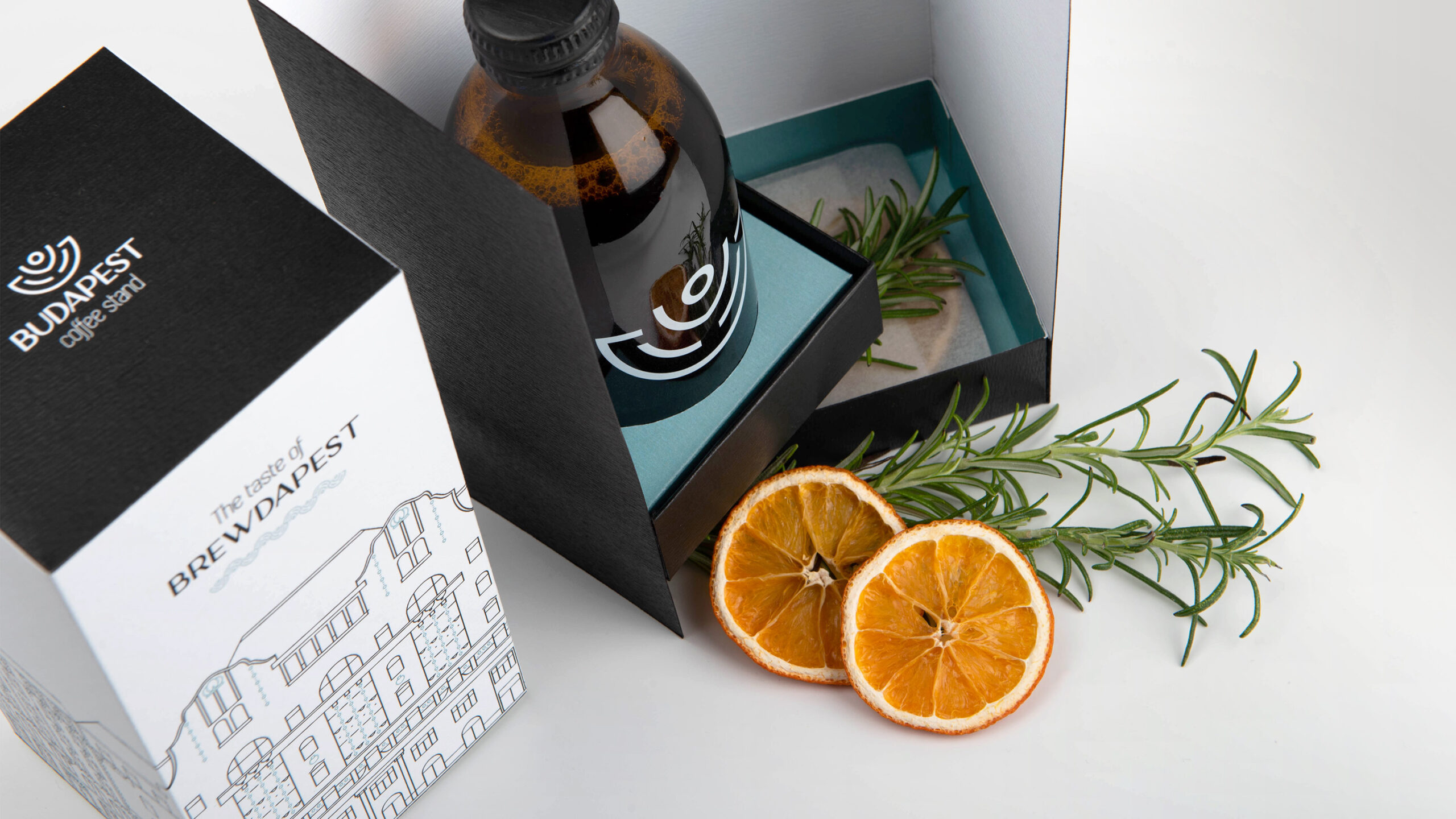
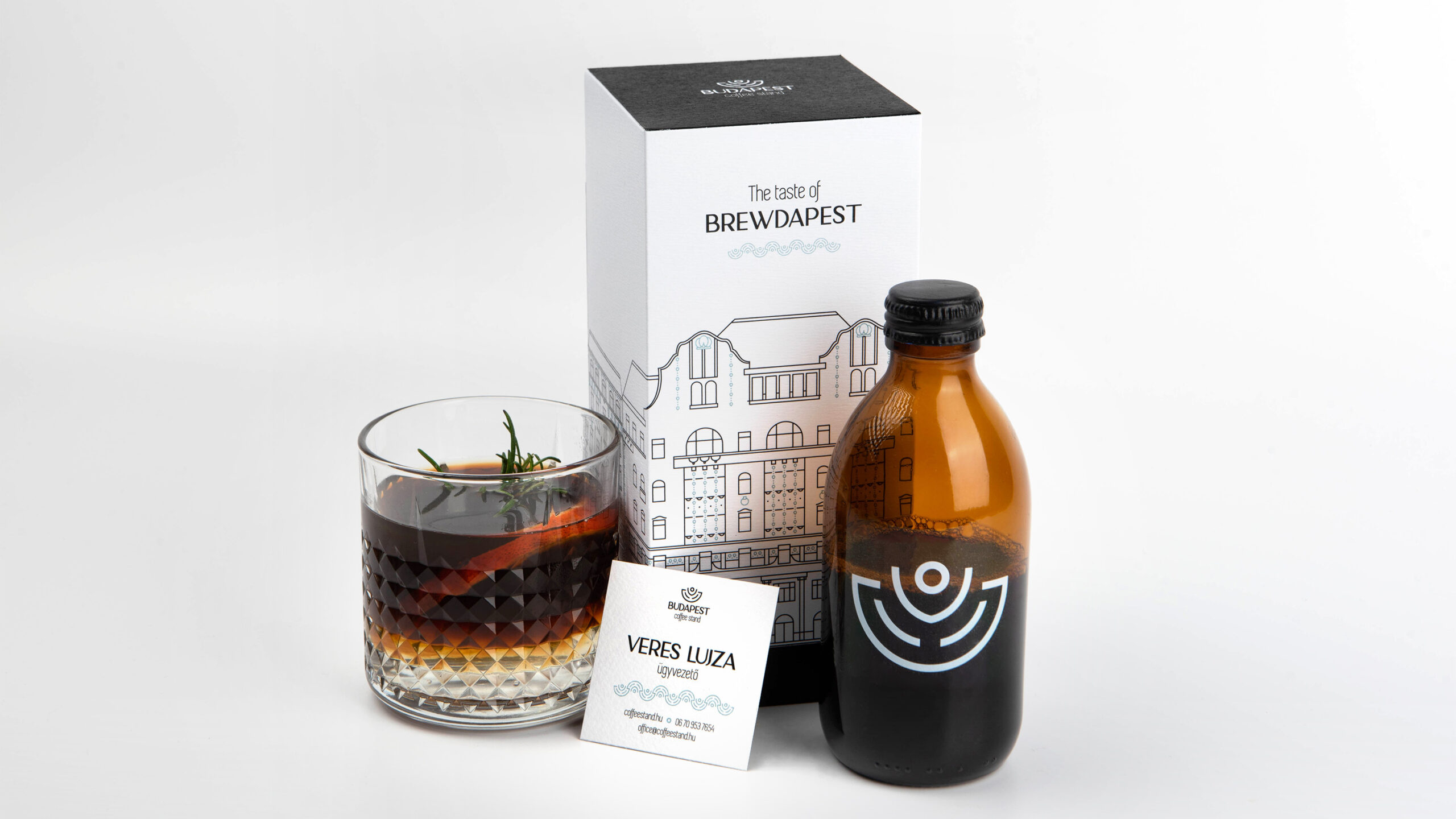
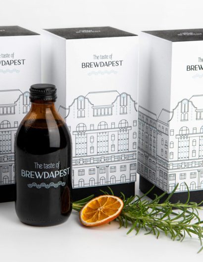
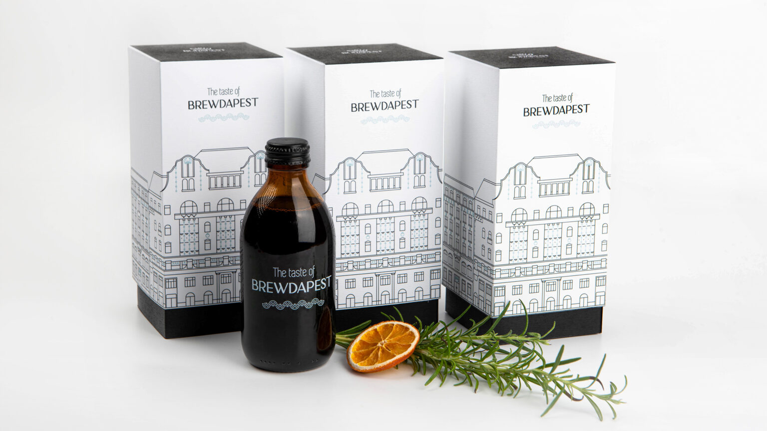
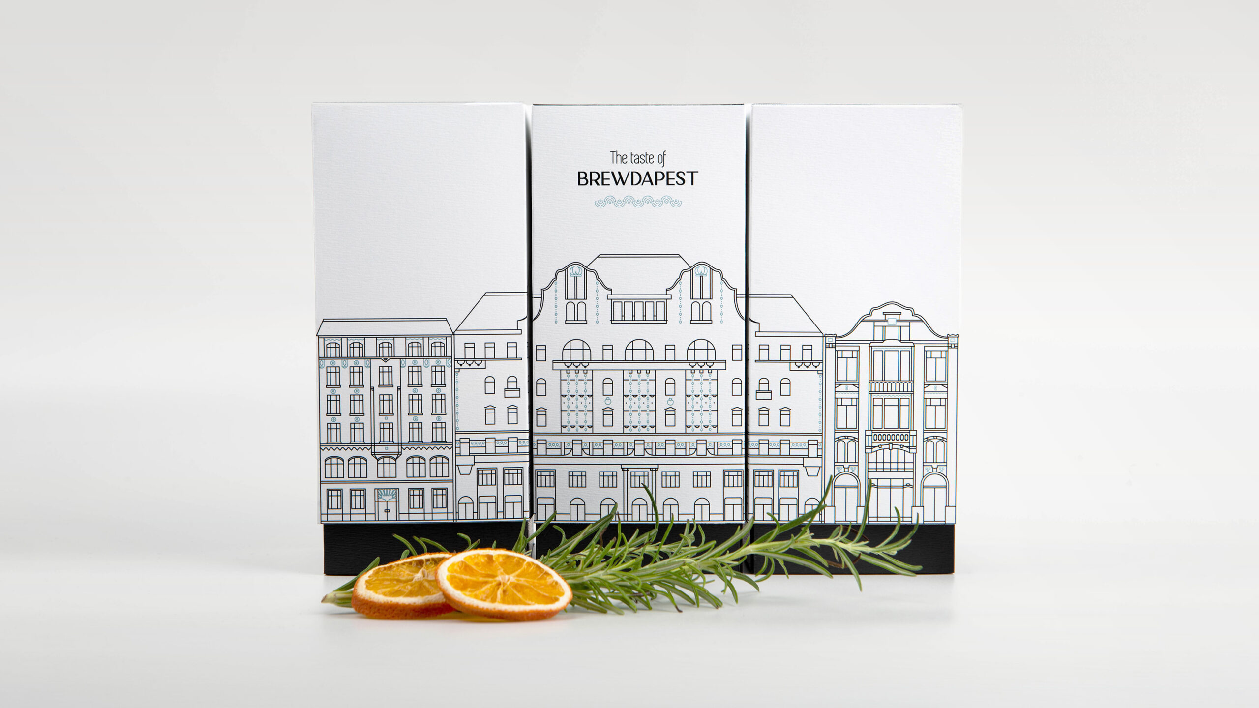
Covin Art School used sophisticated illustrations, which include a range of color palettes and three art deco palaces of the city streets, for the packaging designs. Furthermore, the art school introduced a new product for the company aptly titled “The Taste of Brewdapest.” The new product is “a smooth-flavored cold brew served in glass bottles.”

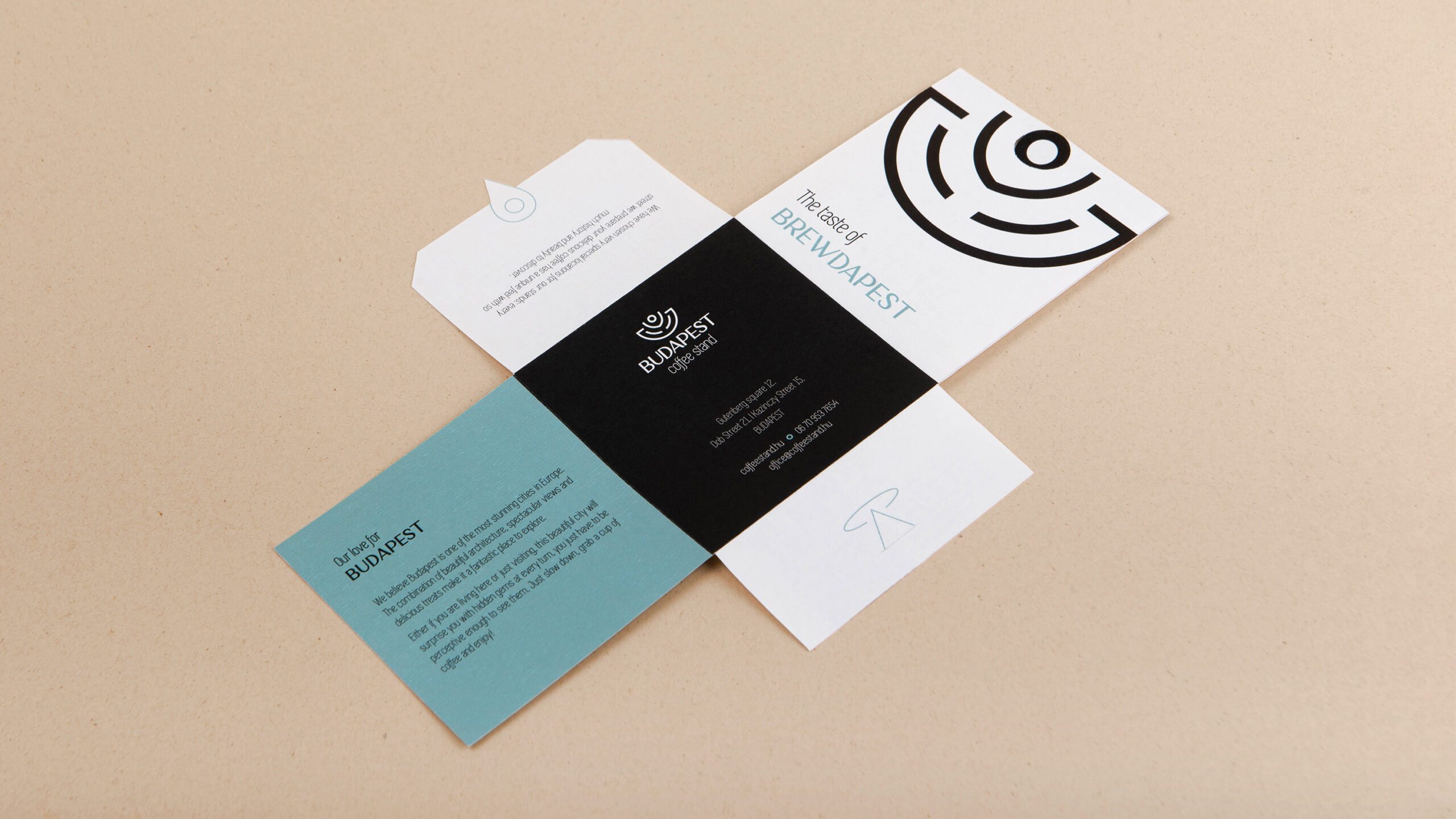
“The brand invites coffee lovers to slow down and discover the hidden treasures of Budapest. This concept was carried through to the design of the brand identity and packaging, which use elegant, illustrative imagery. The color scheme of all visuals is mainly limited to the black-and-white contrast, but it also introduces a pop of color: turquoise blue, a characteristic shade of the local art deco architecture. The illustration highlights three art deco palaces from the streets where the Budapest Coffee Stands are located. The logo’s emblem was also inspired by one of the building’s elegant ceramic decor pieces.

With this packaging, we introduced a new product for the company: a smooth-flavored cold brew served in glass bottles called “The Taste of Brewdapest.” The box itself may seem simple from the outside, but once it’s open, it also creates the opportunity for more discoveries. Under the bottle, there is a hidden compartment with special ingredients: dried oranges and rosemary, which give the richest and most refreshing flavor to a cold, brew coffee drink.“

2

Get the latest packaging design inspiration in your inbox:

Popular designs

Over the wave

This Kombucha originates in Lombok, Indonesia, where its paradise beaches attract hundreds of surfers eager to ride the waves. When you surf,

The Bra Guru

Most women are wearing the wrong size bra and that is a fact. The Bra Guru® is the first and only professional

The Port Vodka Lemon Water

Overview: In response to my client’s vision for a Cape Cod themed beverage brand, I embarked on the journey to create The Port

Designed by: PepsiCo Design & Innovation
Country: United States

Branding And Packaging Design: Budapest Coffee Stand

2
Budapest-Coffee-Stand_01-1536x864

Designed by: Corvin Art School | Country: Hungary

Budapest Coffee Stand is a brand that invites lovers of coffee to discover Budapest’s hidden treasures in every sip. The branding project developed illustrations that highlight the company’s core values.

Budapest Coffee Stand is the Hungarian capital’s best-kept secret: there are 3 tiny stands scattered throughout downtown Pest that offer the most delicious new-wave specialty coffee.

The project aimed to build a distinctive brand with unique visuals that align with the company’s core values: offering high-quality products but also sharing love and respect for our environment and architectural heritage.”
Branding And Packaging Design: Budapest Coffee Stand

The packaging

Budapest Coffee Stand partnered with Covin Art School to create a packaging system that would highlight the richness of cold brew coffee drinks.

Covin Art School used sophisticated illustrations, which include a range of color palettes and three art deco palaces of the city streets, for the packaging designs. Furthermore, the art school introduced a new product for the company aptly titled “The Taste of Brewdapest.” The new product is “a smooth-flavored cold brew served in glass bottles.”

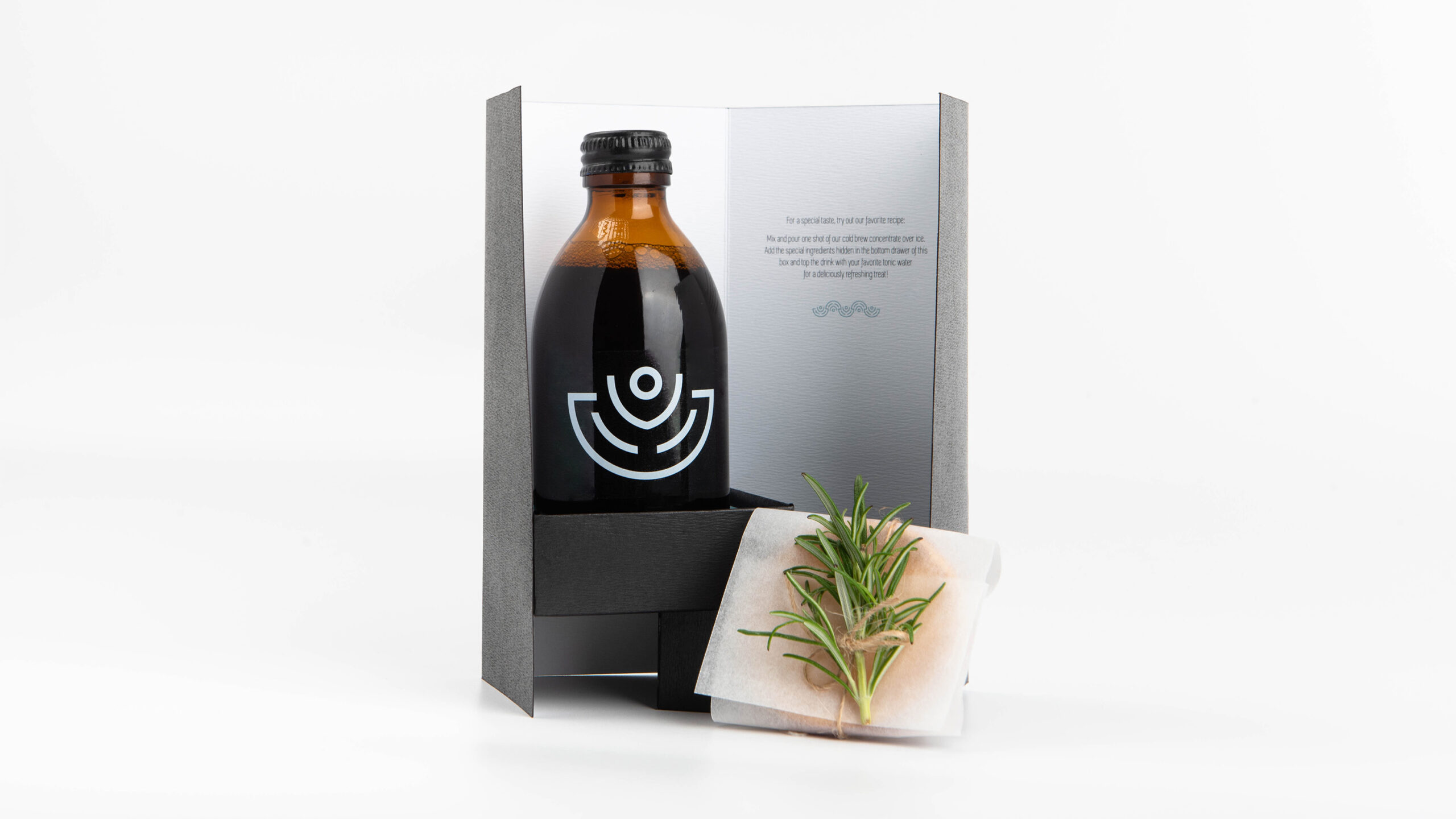
“The brand invites coffee lovers to slow down and discover the hidden treasures of Budapest. This concept was carried through to the design of the brand identity and packaging, which use elegant, illustrative imagery. The color scheme of all visuals is mainly limited to the black-and-white contrast, but it also introduces a pop of color: turquoise blue, a characteristic shade of the local art deco architecture. The illustration highlights three art deco palaces from the streets where the Budapest Coffee Stands are located. The logo’s emblem was also inspired by one of the building’s elegant ceramic decor pieces.

With this packaging, we introduced a new product for the company: a smooth-flavored cold brew served in glass bottles called “The Taste of Brewdapest.” The box itself may seem simple from the outside, but once it’s open, it also creates the opportunity for more discoveries. Under the bottle, there is a hidden compartment with special ingredients: dried oranges and rosemary, which give the richest and most refreshing flavor to a cold, brew coffee drink.“

2
Previous slide
Next slide

Explore more great package design

Get the latest on packaging design in your inbox: