


Designed by: Pencil Studio | Country: UK
Devoted Pet Food approached the Frome-based design agency, Pencil Studio, to reposition their brand to reach a younger target audience without losing existing customers. While Devoted is a popular company, it was losing its grip in the market and its identity in a sea of similar brands.
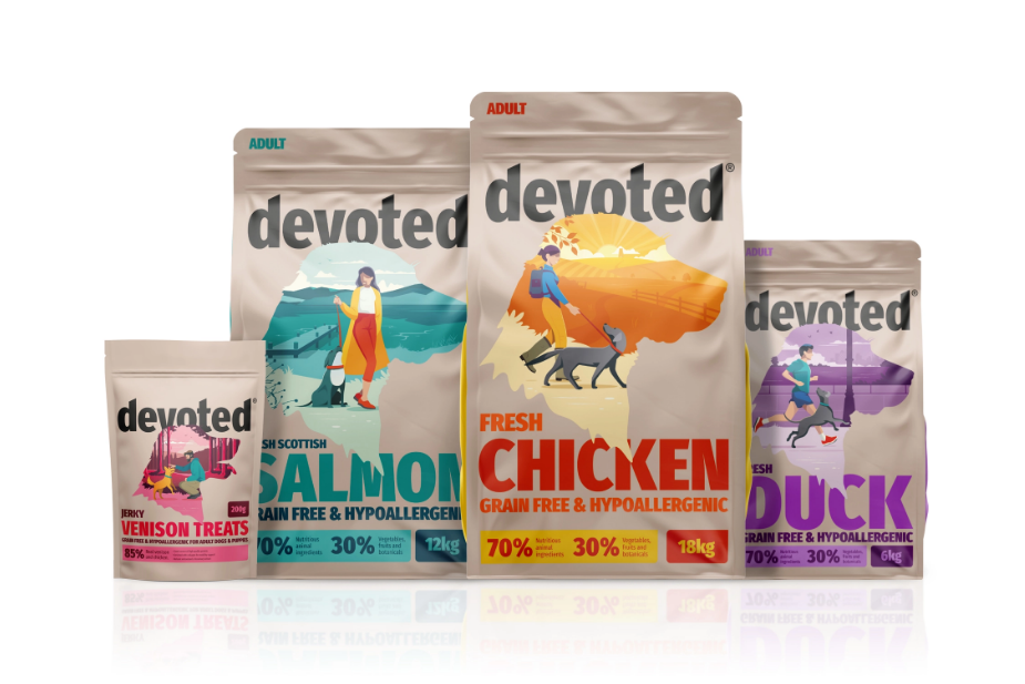
“Over the years the brand had become stagnant and was lost in a sea of other brands that all seemed to be working from the pet food design guidelines. It was time to give the Devoted a bold and confined brand and packaging that is deserved.
It was also crucial to elevate the brand status and be able to reflect that it was a British brand but without shouting or plastering union jacks over the packs. From this we devoted scenery scenarios from around the United Kingdom where people take their pets to get out and enjoy.”


Pencil Studio began its work by cleaning up the wordmark. You may have a great logo, but if it is cluttered with multilayered design elements, it fails to be relevant and effective. The new wordmark makes the brand look confident and approachable.
For the packaging, Pencil Studio created a series of illustrations that had silhouettes of dog heads and pet owners. The new packaging sets the brand apart from its competitors. Furthermore, it increases the product’s shelf value.
“The dog heads were great identifiers for the sector the product sat in (as there are other pet variations to follow). The use of bold type and colors lifted the brands aesthetics to deliver a more youthful feel and allow consumers to easily see the product descriptors.
The pet illustrations from these core packaging formats could then be deconstructed to be used for brand activation, focussing on the playful and loving characteristics that pets have. These illustrations can then interact with type and work mark and create endless combinations to work with allowing the brand to stay fluid.”


