


Designed by: Volta Studio | Country: Portugal
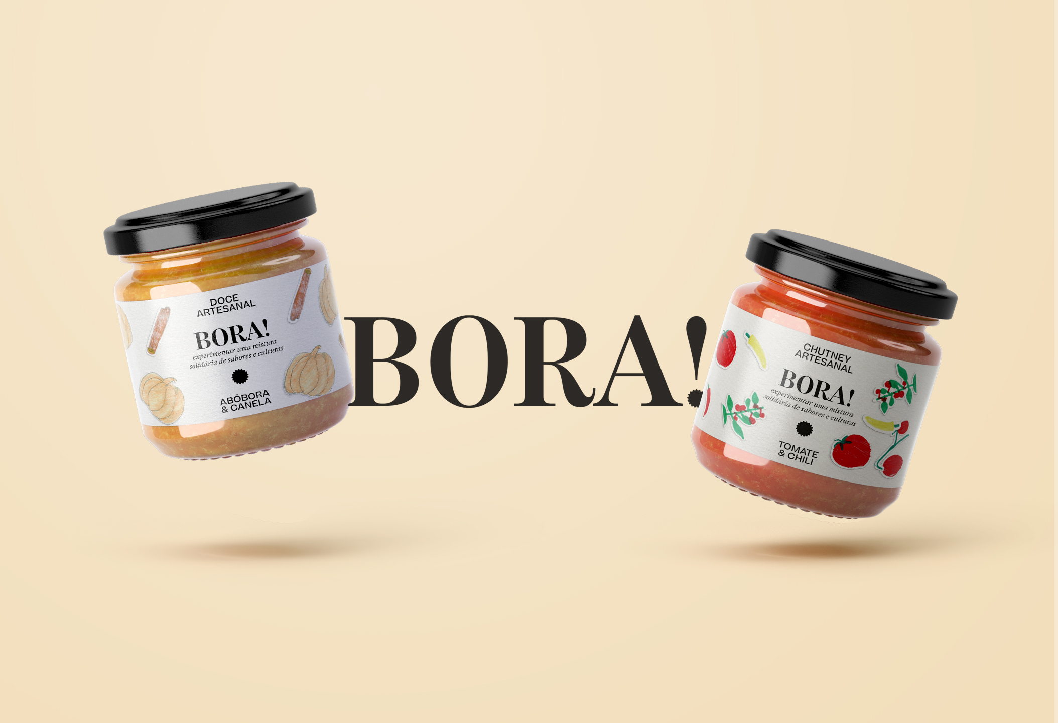
Bora is a Swahili word meaning best; however, for refugee families: the term portrays new opportunities and hope. Associação Lar integrated the refugee families in villages that were facing depopulation challenges. The families transported to these regions also brought unique recipes that have now found their way into Bora!
“Bora! is the product, but above all the symbol, of this initiative: prepared with the products planted in the village, according to recipes from the countries of origin, each jar is decorated with fruits that were hand drawn by the children of these communities.”


The name Bora! and the decoration on the label have been created by the children of this community. The illustrations and layouts are simple and colorful, which encourages one to face challenges of daily life with positivity.
“…The drawings are colorful, happy and naive, typical of happy children who face tomorrow with optimism. Used as stickers meant to be applied manually and freely, each packaging is as unique and unpredictable as child’s play.”


