


Designed by: Dozen Agency | Country: Ukraine
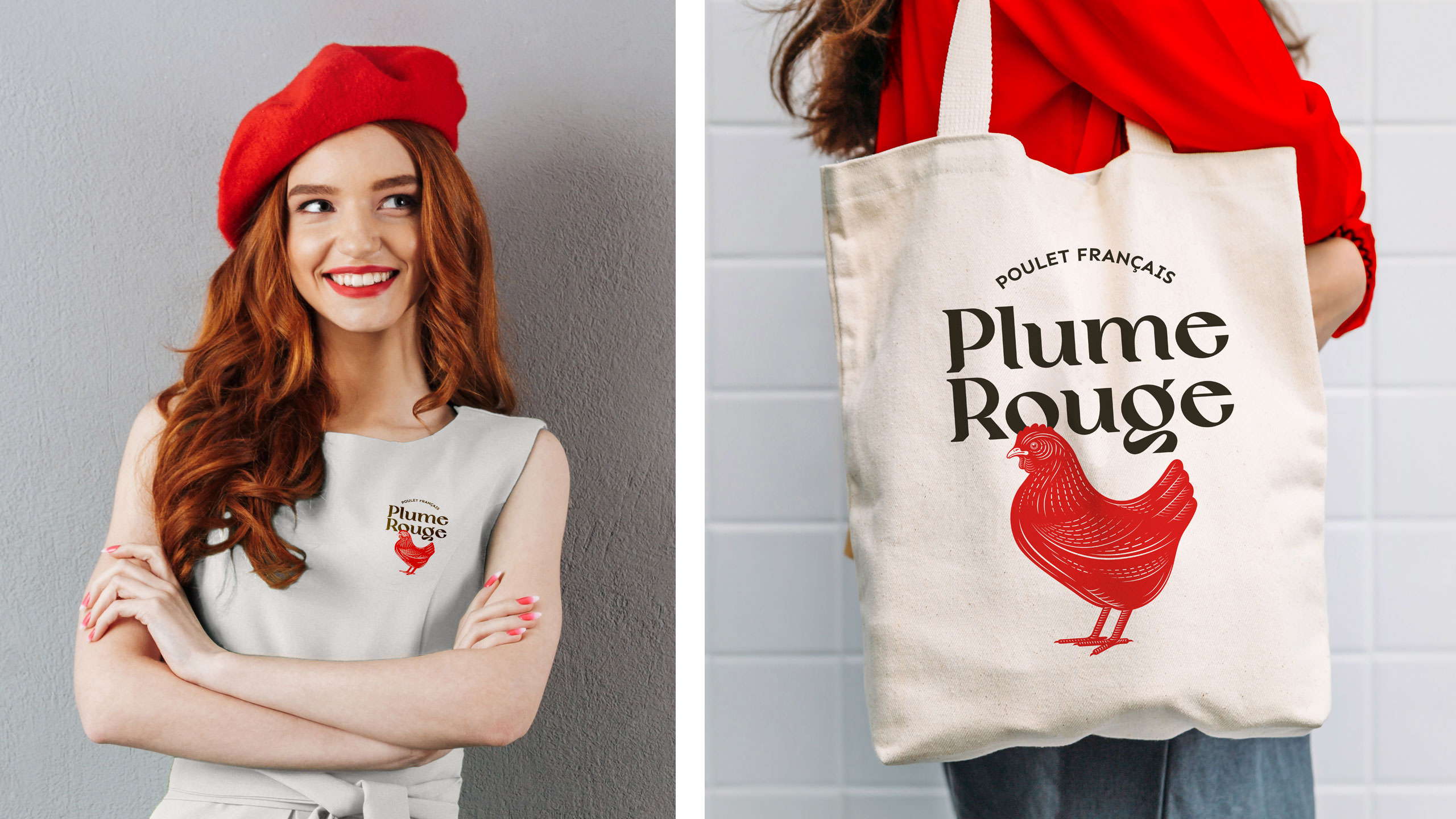
The search for the red bird which braces the packaging of Plume Rogue ended in France. The French Sasso chicken, with red and brown feathers, was brought back to the pollution-free environment of the Carpathian mountain foothills, where it was bred according to the guidelines laid by the French Label Rouge. The national sign is only awarded to brands and products that follow the strict guidelines of Label Rouge.
Kyiv-based design company, Dozen Agency, mentions:
“…that’s how we started working on the project. The strategy defined the overall brand positioning: purebred chicken. It’s meant for people who are meticulous and demanding in cooking and eating… And the Plume Rouge name (which means ‘red feather’) accentuates the brand’s breed—French red chicken bred according to the French Label Rouge standard as a homage to the famous red Gallic rooster.”


The packaging design of Plume Rogue is simple and attractive. The wordmark, along with the French Sasso on the label, looks clean and contemporary.
“At first, we even thought of dressing the red chicken in a red beret, but then decided it wouldn’t be ‘comme il faut.’ We are happy and satisfied that our chicken gets a delicious crust when cooked and our brand is after all about expertise rather than ‘absolute Frenchness.’”


