


Designed by: Studio Metis | Market region: Europe, America
Rhino is a contemporary company that deals with seafood. From preparation to packaging, the company uses modern world-class equipment, which sets the brand apart from its competitors.
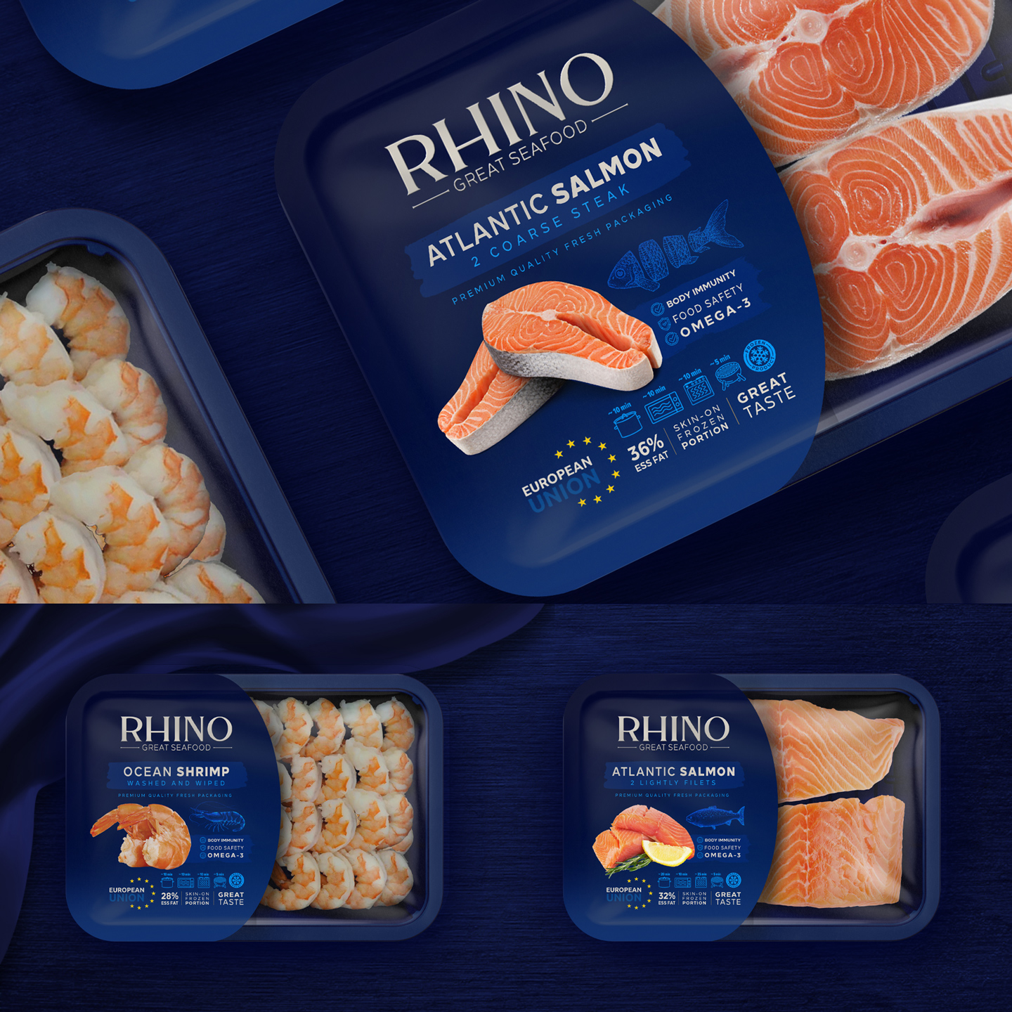
Rhino kept its packaging simple and without labels because it supplied its products to restaurants; however, with the brand‘s ambition to disrupt the seafood market, it had to think of attractive branding and packaging design.
“The first priority of Metis design team for ideation and branding design was luxury along with simple and stylish concept.
Regarding the use of blue as the main color, it represents the sea and is also the main color scheme of European countries. Also, the use of cream color as a complementary color was part of the original and previous color scheme of Rhino company.”


The centerpiece of the packaging and the logo design is the curved-tailed fish. In addition to portraying the sea and marine life, the fish also highlights the main product of the brand—salmon.
“The use of sequins is obtained from the inside of the fish, which is the main symbol. The reason for using it in the original form is completely aesthetic and visual. In this way, it forms the main basis for the formation of the visual identity and organizational identity of the brand.”


