


Designed by: RitaRivotti | Country: Portugal
Can you figure out which country I am talking about? Here are the clues:
Piri Piri Chicken
Surfing
Football
Port Wine
The last one revealed it, I know, but for those of you who are still wondering which country I am talking about, it is none other than Portugal.
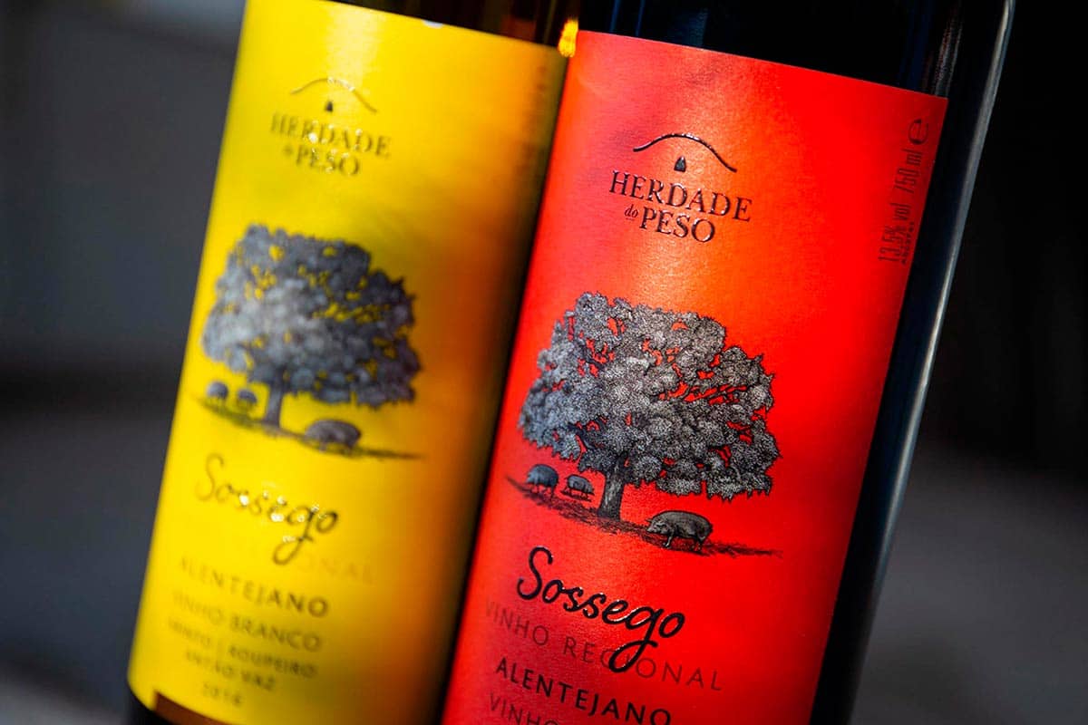
Alentejo is known for its scenic beauty, heat, tranquility, and wineries. The area was also declared the top wine region in the world not too long ago. Among many top wine brands in the region is Herdade do Peso. The brand approached RitaRivotti, an award-winning branding agency, for its branding and packaging needs.


Sossego, the new range of wines from Herdade do Peso, required an attractive packaging design that would set itself apart from the crowd.
RitaRivotti mentions:
“For its new range of wines, we built a disruptive image, a tribute to Alentejo’s more genuine side, which we wanted to dissociate from the convention. Using vibrant and attractive colors, we gave new light to this Sossego, making it a strong and unforgettable symbol for the consumer. A seemingly contradictory image that begins by troubling us, but then captivates us like no other. A youthful and modern project that reveals what lies behind the Alentejo tranquility and earns a prominent position on any shelf.”


