Designed by Swear Words | Country: Australia
“Brief: Create a logotype and symbol, style guide (font choices, colour palette), wine labels and stationery set. The Brash Higgins brand needs to be strong enough to stand on its own, yet be complimentary to their sister brand Omensetter.
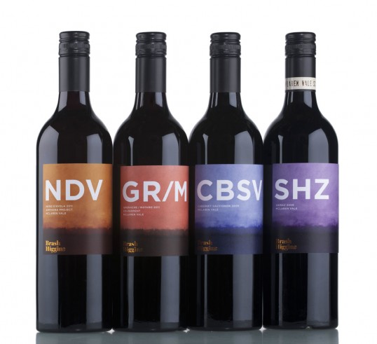
Result: The visual identity of Brash Higgins is unique, clever, playful and memorable. The wine labels have been very well received by trade and media, helping the brand to gain widespread trial and acceptance. The labels are iconic and memorable without being bombastic or crass so they will retain a timeless appeal yet incredibly strong brand recall.”